Data Manipulation in Table Charts - Grouping for multiple levels & in both dimensions
414 views
Skip to first unread message

Jamie
Dec 9, 2020, 2:55:38 AM12/9/20
to Google Visualization API
I have a simple data set with two attributes that I want to group in hierarchical rows and a date that I want to drive columns according to a fiscal calendar (with expand/collapse of period-quarter-year). The data point in each cell is the sum of a quantity for the intersection of the attributes and the time period.
![]()
![]()
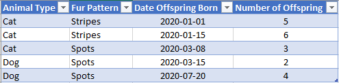
For example, if I have the following raw data set:
For simplicity, let's assume my fiscal calendar matches the Gregorian calendar year. I will transform my data to include fiscal-calendar attributes like this (month value may differ based on technical requirements):
If my time range were one year, I would want to see something like the following table:
Within this table, I want to be able to click on any numeric value to see a list of the relevant source records.
The only type of grouping I see as being clearly supported is what is shown above for Fur Pattern, which leads to my questions:
- Does Google Charts API support multiple levels of grouping such as Animal Type > Fur Pattern?
- Can grouping be applied to columns (date component) as well as rows?
- If the answer to the above questions are no, is there another way for me to tie each cell value in the aggregate table to the underlying data to achieve the desired "click-to-view-list" functionality since the raw data (and list view) would be different data from the aggregate table (from the API's perspective).
- The way I'm thinking of now would be to add a computed column to the source data that includes an array of aggregate cell keys and write a function that will display any records where the clicked cell's key is included in the array.
Attached Excel workbook shows the source of the screenshots.
Many thanks in advance for any insight on this topic.

Daniel LaLiberte
Dec 9, 2020, 12:36:09 PM12/9/20
to Google Visualization API
Hi Jamie,
While the Table chart does not support a multi-level structure of rows or columns, we have been thinking about adding support for it eventually.
Not that it will help for your case, but there are a couple charts that support two levels of groupings that generalize to any number of levels. See the Treemap and WordTree. The Timeline and Gantt charts have a two-level structure as well, but not in a way that generalizes to more levels.
You can add additional properties to rows, columns, or cells of a DataTable. And then respond to clicks in the Table chart with a click handler you provide that would look up the associated properties and use them to display something outside of the chart. Redisplaying the Table chart with additional rows or columns is also possible, but starts to get more complex. I hope that gives you a rough idea of how to proceed.
--
You received this message because you are subscribed to the Google Groups "Google Visualization API" group.
To unsubscribe from this group and stop receiving emails from it, send an email to google-visualizati...@googlegroups.com.
To view this discussion on the web visit https://groups.google.com/d/msgid/google-visualization-api/17dda801-49c0-4575-b361-e74bd6bf0621n%40googlegroups.com.
Jamie
Dec 9, 2020, 12:54:41 PM12/9/20
to Google Visualization API
Thanks, Daniel, I'll look forward to that new functionality and see if I can get to my goal another way in the meantime.
Reply all
Reply to author
Forward
0 new messages