How to have the Y axis labels show both Celsius and Fahrenheit in a line chart
283 views
Skip to first unread message

Gabriel Peterson
Dec 14, 2022, 9:39:49 PM12/14/22
to Google Visualization API
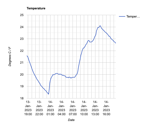
I'm using the line chart and having some trouble formatting the y-axis grid markers. The data provided is stored in Celsius, but I'd like the labels on the left to also show Fahrenheit. For example one of the markers is showing 22, but I'd like it to show something like 22 / 71.6. This is my first time using Google Charts and I couldn't find anything in the documentation about manually adjusting automatic values. Can anyone point me in the right direction?

Ray Thomas
Dec 16, 2022, 10:30:19 PM12/16/22
to Google Visualization API
I don't think you can do exactly what you want to do because the scale and grid markers are calculated by the API.
But what you could do is add a calculated column either in the original data or create it before the API processes the data, that contains the fahrenheit values and display that on the right hand side. See the help for series and vAxes at https://developers.google.com/chart/interactive/docs/gallery/linechart?csw=1#dual-y-charts and the JSFiddle at https://jsfiddle.net/api/post/library/pure/
Something else you can do is add both values to the tooltips. The help for customizing the tooltips is at https://developers.google.com/chart/interactive/docs/customizing_tooltip_content
Message has been deleted
Ray Thomas
Dec 18, 2022, 5:07:19 PM12/18/22
to Google Visualization API
It doesn't work properly! I used
<script type="text/javascript">
// Load Charts and the corechart package.
google.charts.load('current', {'packages':['corechart']});
google.charts.setOnLoadCallback(drawChart);
function drawChart() {
var queryString = encodeURIComponent('SELECT A,B ORDER BY A');
var query = new google.visualization.Query('https://docs.google.com/spreadsheets/d/1tswaWUAbeBijHq4o505w0h7TmbD-qGhR3jBactcbGq0/gviz/tq?gid=464392919&headers=1&tq=' + queryString);
query.send(handleQueryResponse);
}
function handleQueryResponse(response) {
if (response.isError()) {
alert('Error in query: ' + response.getMessage() + ' ' + response.getDetailedMessage());
return;
}
var data = response.getDataTable();
// Set the column label properly for Fahrenheit
data.setColumnLabel(1, "Fahrenheit");
// Create a new column to hold the Celcius values
data.addColumn("number", "Celcius");
// Get the number of rows in the data
var totalRows= data.getNumberOfRows();
for (i = 0; i < totalRows; i++) {
fTemp = data.getValue(i,1);
cTemp = (fTemp - 32) * 0.5556;
data.setCell(i, 2, cTemp);
}
var options = {
series: {
0: {targetAxisIndex: 0},
1: {targetAxisIndex: 1}
},
vAxes: {
// Adds titles to each axis.
0: {title: 'Temp: Fahrenheit'},
1: {title: 'Temp: Celcius'}
},
};
var Chart = new google.visualization.LineChart(document.getElementById('switch-chart'));
Chart.draw(data, options);
}
</script>
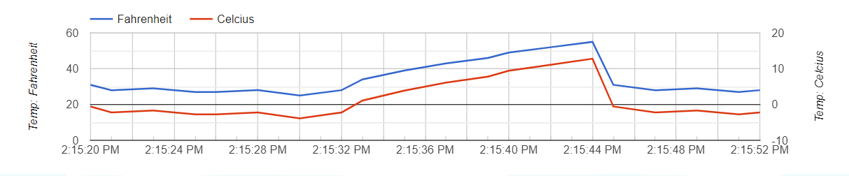
What that gives is:
What I expected to happen is for the lines to line up with each other, but they don't. I will look at this again, it would be useful for other values, mph and km/hr etc.

Daniel LaLiberte
Dec 18, 2022, 6:34:49 PM12/18/22
to google-visua...@googlegroups.com
You'll have to set the viewWindow min and max values of one axis so that it matches the min and max extreme values of the other axis. It's also useful to specify the axis tick values you want to see using the ticks option.
I did this using Ray's code. See https://jsfiddle.net/dlaliberte/91wef0ga/14/
--
You received this message because you are subscribed to the Google Groups "Google Visualization API" group.
To unsubscribe from this group and stop receiving emails from it, send an email to google-visualizati...@googlegroups.com.
To view this discussion on the web visit https://groups.google.com/d/msgid/google-visualization-api/aab92913-58a2-4a54-b8b2-3dee7f19387bn%40googlegroups.com.

Ray Thomas
Dec 18, 2022, 6:58:58 PM12/18/22
to Google Visualization API
Thanks Daniel,
I've just been reading this https://github.com/google/google-visualization-issues/issues/1769 about this very thing.
Ray Thomas
Dec 20, 2022, 10:08:34 PM12/20/22
to Google Visualization API
Here's what I came up with:
// Load Charts and the corechart package.
google.charts.load('current', {'packages':['corechart']});
google.charts.setOnLoadCallback(drawChart);
function drawChart() {
var queryString = encodeURIComponent('SELECT A,B ORDER BY A');
var query = new google.visualization.Query('https://docs.google.com/spreadsheets/d/1tswaWUAbeBijHq4o505w0h7TmbD-qGhR3jBactcbGq0/gviz/tq?gid=464392919&headers=1&tq=' + queryString);
query.send(handleQueryResponse);
}
function handleQueryResponse(response) {
if (response.isError()) {
alert('Error in query: ' + response.getMessage() + ' ' + response.getDetailedMessage());
return;
}
var data = response.getDataTable();
return (temp - 32) * 0.5556;
}
// Set the column label properly for Fahrenheit
data.setColumnLabel(1, "Fahrenheit");
data.addColumn({'type': 'string', 'role': 'tooltip', 'p': {'html': true}});
// Create a new column to hold the Celcius values
data.addColumn("number", "Celcius");
data.addColumn({'type': 'string', 'role': 'tooltip', 'p': {'html': true}});
// Data table is now Date/Time | Fahrenheit | Fahrenheit Tooltip | Celcius | Celcius Tooltip
// Get the number of rows in the data
var totalRows= data.getNumberOfRows();
for (i = 0; i < totalRows; i++) {
fTemp = data.getValue(i,1);
cTemp = doConversion(fTemp)
data.setCell(i, 3, cTemp);
// Create the tooltip string in columns 2 and 4
var tooltipStr = '<div style="padding:0 10px;"><p>Date/Time: <b>' + data.getFormattedValue(i,0) + '</b></p><p>Fahrenheit: <b>' + data.getValue(i,1) + '</b><br>Celcius: <b>' + Math.round((data.getValue(i,3)+ Number.EPSILON) * 100) / 100 + '</b></p></div>';
data.setValue(i, 2, tooltipStr);
data.setValue(i, 4, tooltipStr);
}
var fMin = data.getColumnRange(1).min -5;
var cMin = doConversion(fMin)
var fMax = data.getColumnRange(1).max + 5;
var cMax = doConversion(fMax)
var options = {
tooltip: {isHtml: true},
legend: 'none',
height: '200',
hAxis: {format: 'M/d/yyyy H:m:s'},
series: {
0: {targetAxisIndex: 0,},
1: {targetAxisIndex: 1,}
},
vAxes: {
0: {title: 'Temp: Fahrenheit',
min: fMin,
max: fMax
}
},
1: {title: 'Temp: Celcius',
min: cMin,
max: cMax
},
ticks: [ -15, -10, 0, 10, 15, 20, 30 ]
}
}
};
var Chart = new google.visualization.LineChart(document.getElementById('chart-div'));
Chart.draw(data, options);
}
</script>
Reply all
Reply to author
Forward
0 new messages