Tips to Maximize ChartArea please!!
618 views
Skip to first unread message
Jimmy Genslinger
Jan 31, 2014, 4:40:02 PM1/31/14
to google-c...@googlegroups.com
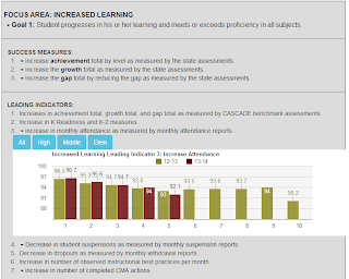
Developing my first batch of Google charts and so far they are pretty nifty! One thing I'm having problems with, however, is maximizing my chartarea space. The chart seems nice and centered in the middle, and there's lots of wasted space around the edges. I've been playing with the settings, and nothing seems to change either the chartarea or the bardwith. My Options array that I've built looks like this:
// Set chart options
var options = {
'title': 'Increased Learning Leading Indicator 3: Increase Attendance',
'width': 'Auto',
'height': 'Auto',
'chartArea': { left: 0, top: 0, width: "100%", height: "100%" },
'legend': { position: "top", alignment: "center" },
'bar': { groupWidth: "90%" },
'dataOpacity': "0.8",
'series': { 0: { color: "#888614", visibleInLegend: true }, 1: { color: "#660000", visibleInLegend: true} },
'vAxis': { viewWindowMode: "explicit", viewWindow: { max: 100, min: 85} },
'chartArea': {
'backgroundColor': 'WhiteSmoke',
'opacity': 5
}
};
the bar groupwidth option helped, and I thought the chartArea settings would expand the chart, but it doesn't seem to have done that. Any help or suggestions would be greatly appreciated! Below is a pic of what it looks like currently:
Jimmy Genslinger
Feb 3, 2014, 11:56:41 AM2/3/14
to google-c...@googlegroups.com
I figured it out! As you may have noticed in my Options settings, I declared the ChartArea twice, the first time specifying the width/height. I'm guessing with the second declaration, it overwrote my first one and since I didn't specify height/width in it, it just resorted to the default settings. My options settings now look like this, and everything is nice and stretched out now!!
// Set chart options
var options = {
'title': 'Increased Learning Leading Indicator 3: Increase Attendance',
'width': 'Auto',
'height': 'Auto',
'legend': { position: "top", alignment: "center" },
'bar': { groupWidth: "90%" },
'dataOpacity': "0.8",
'series': { 0: { color: "#888614", visibleInLegend: true }, 1: { color: "#660000", visibleInLegend: true} },
'vAxis': { viewWindowMode: "explicit", viewWindow: { max: 100, min: 85} },
'chartArea': { width: "90%", height: "65%",
Reply all
Reply to author
Forward
0 new messages

