Plotting a probability mass function
1,578 views
Skip to first unread message

Douglas Bates
Sep 10, 2010, 2:09:57 PM9/10/10
to ggplot2
I am trying to create in ggplot2 a plot of a probability mass function
in the form of vertical bars, such as would be produced by type="h" in
lattice or in base graphics. I am not having a lot of luck. Am I
missing an obvious geom that I should be using?
in the form of vertical bars, such as would be produced by type="h" in
lattice or in base graphics. I am not having a lot of luck. Am I
missing an obvious geom that I should be using?
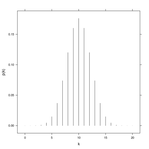
For example, I would like to produce a plot like the enclosed for a
binomial distribution with size=20 and prob=0.5. Should I use
geom_rect or is there a better way?

David Kahle
Sep 10, 2010, 2:17:30 PM9/10/10
to Douglas Bates, ggplot2
How about
x <- 0:20
qplot(factor(x), dbinom(x, 20, .5), geom = 'bar')
Cheers
david
--
You received this message because you are subscribed to the ggplot2 mailing list.
Please provide a reproducible example: http://gist.github.com/270442
To post: email ggp...@googlegroups.com
To unsubscribe: email ggplot2+u...@googlegroups.com
More options: http://groups.google.com/group/ggplot2
<foo.png>
Douglas Bates
Sep 10, 2010, 2:27:03 PM9/10/10
to David Kahle, ggplot2
On Fri, Sep 10, 2010 at 1:17 PM, David Kahle <david...@gmail.com> wrote:
> How about
> x <- 0:20
> qplot(factor(x), dbinom(x, 20, .5), geom = 'bar')
> Cheers
> david
> How about
> x <- 0:20
> qplot(factor(x), dbinom(x, 20, .5), geom = 'bar')
> Cheers
> david
Thank you. I was missing the factor(x) part and couldn't get
geom="bar" to be happy

Luciano Selzer
Sep 10, 2010, 2:28:05 PM9/10/10
to David Kahle, Douglas Bates, ggplot2
2010/9/10 David Kahle <david...@gmail.com>
How aboutx <- 0:20qplot(factor(x), dbinom(x, 20, .5), geom = 'bar')
or
qplot(factor(x), ymin = 0, ymax = dbinom(x, 20, .5), geom = "linerange")
if you want a plat that closely resembles type "h"
HTH

James Howison
Sep 10, 2010, 2:29:29 PM9/10/10
to ggplot2
You might already be happy but another, more tweakable, alternative would be:
myData <- data.frame( k = factor(0:20), pK = dbinom(x, 20, .5))
ggplot(myData,aes(k,ymin=0,ymax=pK)) + geom_linerange() + ylab("p(k)") + scale_x_discrete(breaks=seq(0,20,5))


Dennis Murphy
Sep 10, 2010, 3:59:52 PM9/10/10
to Douglas Bates, ggplot2
Hi:
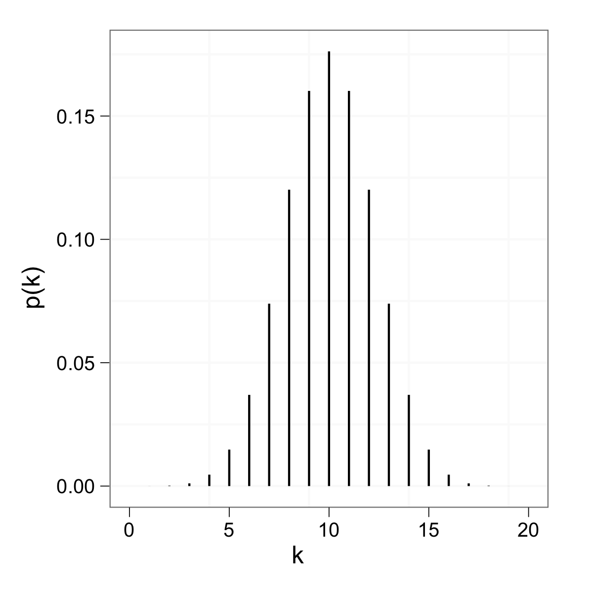
Here's an example with geom_segment(), similar to the last example on its help page:
dat <- data.frame(k = 0:20, prob = dbinom(0:20, n = 20, p = 0.5))
p <- ggplot(dat, aes(x = k, y = prob))
p + geom_segment(aes(xend = k, yend = 0)) + ylab('p(k)')
To play with the width of the bars, try as an alternative
p + geom_segment(aes(xend = k, yend = 0), size = 3) + ylab('p(k)')
This produces the attachment.
HTH,
Dennis

Touqeer Ahmad
Oct 6, 2021, 9:13:15 AM10/6/21
to ggplot2
Hi Denis,
Your example was really helpful for me, one more question how we plot two binomial densities with different on one graph theough these geom_segement
best
best
touqeer
Reply all
Reply to author
Forward
0 new messages