coord_polar ggplot2

Tiago Branquinho
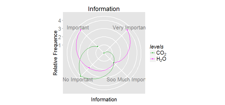
library(ggplot2)
levels=c("H2O","CO2","H2O","CO2","H2O","CO2","H2O","CO2")
Information=c("Important","Important","Very Important","Very Important", "Soo Much Important", "Soo Much Important", "No Important", "No Important")
Values=c(1, 0.28 , 1 , 0 , 0.42 , 0.42 , 0.64, 1)
Table= data.frame(levels,Information,Values)
pg6 = ggplot(Table, aes(x = Information, y = Values, group = levels)) + geom_line(aes(colour = levels)) + geom_point(aes(colour=levels))+ coord_polar(theta = "x", direction = -1) + scale_y_continuous("Relative Frequence", breaks=c(0.25,0.5,0.75,1.0), labels=c("1", "2", "3", "4"))+ggtitle("Information")+theme(axis.text.x = element_text(angle = 0), axis.text = element_text(size = 20), axis.title=element_text(size = 20),title=element_text(size = 20),panel.grid.major = element_line(size = 1),legend.title = element_text(face = "italic",size=20),legend.text = element_text(size = 20))
print(pg6)

William Beasley
- I can see the words "Information" fine on the top and bottom even when the graphic is only 400 pixels tall. See below. How are you saving the graphic to a file?
- scale_color_manual(labels=c(expression(CO[2]), expression(H[2]*O)))
- I haven't done this with ggplot (I used grid when I needed to do something nonstandard with polar coordinates a few years ago). But I think it's possible if you treat your x/theta variable as a continuous number, and layer on the labels with annotation. See Recipe 8.16 in Winston's book for an example of wrapping around with a continuous variable.
- scale_color_manual(values=c("#22AA22", "#FF00FF"))