ggplot legend problem with facet_grid

maziar
I just posted this. I can't see it in the list of open topics so I am trying again. I am creating a 3x3 faceted graph using the code shown below. The problem is I get no legend.
# Create column vectors
XID <- rep(c(1,5,10), each=57)
TAD.unit <- c(0, 0.25, 0.5, 0.75, 1, 1.5, 2, 3, 4, 6, 8, 10, 12, 16, 20, 24, 36, 48, 72)
TAD <- rep(TAD.unit, length=length(XID))
FID <-rep(c(1,2,3),each=length(TAD.unit),length=length(XID))
time <- TAD + (FID-1)*14*24
dist1 <- pweibull(TAD,2,2)
dist2 <- pweibull(TAD,2,4)
# Create data frame
data.df <- as.data.frame(cbind(XID,time, FID, dist1, dist2, TAD))
library(ggplot2)
label_both = function(column,value){paste(column,"=",value)}
# Create plot
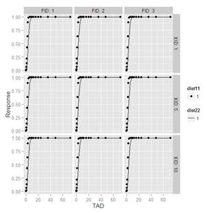
my.plot1 <- ggplot(data.df, aes(x=TAD, y=dist1)) + geom_point() +
geom_line(aes(x=TAD, y=dist2)) +
facet_grid(XID ~ FID, labeller=label_both) +
labs(x = "TAD", y = "Response")
# alternative data structure per recommendation in
# http://stackoverflow.com/questions/15418302/ggplot2-how-to-show-the-legend?rq=1
library(reshape)
df.2 <- melt(data.df, id=c("XID","FID","TAD","time"))
I tried using data frame df.2 to see if that helps per the recommendation in the stack overflow thread I provide the link for. I tried various ggplot commands, but I still can't get it to work.
Can someone please help me?
Also, how can I position the legend somewhere inside the 3x3 where there is blank space?
Thank you very much!
Maziar

Ito, Kaori (Groton)
To get a legend, you need to map aes (such as shape, color, linetype). In general, we need a legend if we want to differentiate data by variable (such as gender, group, etc), for example, aes(x=x, y=y, shape=group), then a legend is automatically created (note: variable (for this example, “group”) should be in the dataset in ggplot() call)
However, if I read your question, you don’t need to differentiate by variable, but still want to show what point and line means. In that case, one way to work around would be:
#make fake data (factor level 1) for dist1 and dist2
data.df$dist11 <- as.factor(rep(1, dim(data.df)[1]))
data.df$dist22 <- data.df$dist11 #just copy from dist11
# Create plot
my.plot1 <- ggplot(data.df, aes(x=TAD, y=dist1)) + geom_point(aes(shape=dist11)) +
geom_line(aes(x=TAD, y=dist2, linetype=dist22)) +
facet_grid(XID ~ FID, labeller=label_both) +
labs(x = "TAD", y = "Response")
Is this what you expected….?
Let me know if you have more questions…
Kaori
--
--
You received this message because you are subscribed to the ggplot2 mailing list.
Please provide a reproducible example:
https://github.com/hadley/devtools/wiki/Reproducibility
To post: email ggp...@googlegroups.com
To unsubscribe: email ggplot2+u...@googlegroups.com
More options: http://groups.google.com/group/ggplot2
---
You received this message because you are subscribed to the Google Groups "ggplot2" group.
To unsubscribe from this group and stop receiving emails from it, send an email to ggplot2+u...@googlegroups.com.
For more options, visit https://groups.google.com/groups/opt_out.
maziar
First of all, thanks for suggesting this. It's the closest solution I have seen to what I want.
The legend now has dist11 and dist22 written at the top of each respective legend box. Ideally I want to suppress dist11 and dist22 as they are not really relevant to the information I want to convey. Furthermore, I would also place the entire legend inside the faceted graphs in order not to use up space in the margin just for the legend.
Is that possible? Once again, many thanks for your response.
Maziar.
Ito, Kaori (Groton)
Dear Maziar,
There should be a way to put 2 legends closer together, but I need to search how to do it (so I don’t have quick answer…).
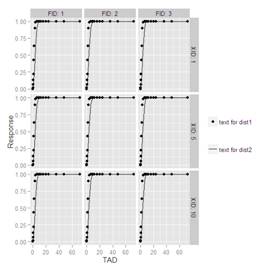
However, to change the legend title and labels, try this:
my.plot1 + scale_shape_manual(name="", values=16, labels="text for dist1") +
scale_linetype_manual(name="", values=1, labels="text for dist2")
--
maziar
Thank you very much for your timely response. Your suggestions led to the creation of a legend and the dist11, dist22 titles were removed. I was even able to position it with
opts(legend.position = c(0.85, 0.5))
However, R did provide a warning about 'opts' being deprecated - whatever that means. With reference to bringing the legends closer together, I found the following Stack Overflow threads:
http://stackoverflow.com/questions/14103920/smaller-gap-between-two-legends-in-one-plot-e-g-color-and-size-scale
http://stackoverflow.com/questions/13143894/how-do-i-position-two-legends-independently-in-ggplot
My conclusion is: ggplot2 is clearly very complex and powerful, but it requires considerable effort to do things which otherwise seem rather trivial. I personally will take the nice faceted 3x3 graphic, import it into PowerPoint and manually create my own legend. It's so much faster!
Once again, many thanks for your suggestions.
On Wednesday, May 15, 2013 5:23:09 PM UTC-4, maziar wrote:
Ito, Kaori (Groton)
Dear Maziar,
For opts() , as the warning said, it is “deprecated” in the recent versions of ggplot2 (>0.9.2) . You can simply replace it with theme() in your code.
I think for your situation, “import it into PowerPoint and manually create my own legend” is probably the best since you don’t have variable to be differentiated by mapping (aesthetics).
In general, ggplot2 can do lot of things for you without much effort J
Kaori
From: ggp...@googlegroups.com [mailto:ggp...@googlegroups.com]
On Behalf Of maziar
Sent: Thursday, May 16, 2013 4:21 PM
To: ggp...@googlegroups.com
Subject: Re: ggplot legend problem with facet_grid
Dear Kaori,
--
maziar
Just to wrap this up, when you write: "you don’t have variable to be differentiated by mapping (aesthetics)", what would my data have to look like in order to accommodate this? You mentioned this in your initial response, but I didn't understand it because I was too focused on 'getting it to work', which is generally what most beginners strive to do.
For example, if I am plotting two responses on the same graph and I choose to represent one by a series of points and another as a line (against a common x-axis variable - as I am doing in my example), what is the "variable to be differentiated by mapping (aesthetics)"?
Thanks.
Maziar.
On Wednesday, May 15, 2013 5:23:09 PM UTC-4, maziar wrote:
Ito, Kaori (Groton)
Dear Maziar,
I am sorry I was not clear enough. Mapping aes means, you map some variable (which is available in the dataset (eg, column name “group” contains “A”, “B”)) to some specific aes, for example, color (such as “red”, ”blue”, for “A”,”B”). We can’t map “red” color for group “A” , circle shape for group “B” if you don’t map aes, ggplot doesn’t create a legend.
See the difference with the simple example below.
Data <- data.frame(x1 = 1:10,
y1 = 0.5*1:10 + rnorm(10),
y2 = 0.5*1:10 + rnorm(10),
group=rep(factor(c("A","B")),
each=5))
#this is you are currently doing (no legend)
ggplot(Data, aes(x=x1, y=y1)) + geom_point() +
geom_line(aes(y=y2))
#map aes (color)----different colors are used for group
ggplot(Data, aes(x=x1, y=y1, color=group)) + geom_point() +
geom_line(aes(y=y2))
#map shape for point---different shape is used
ggplot(Data, aes(x=x1, y=y1, color=group)) + geom_point(aes(shape=group), size=3) +
geom_line(aes(y=y2))
I hope this explains a bit more what I meant in the previous reply….
Kaori
From: ggp...@googlegroups.com [mailto:ggp...@googlegroups.com]
On Behalf Of maziar
Sent: Thursday, May 16, 2013 4:55 PM
To: ggp...@googlegroups.com
Subject: Re: ggplot legend problem with facet_grid
Kaori,
--