Set different colors to one single variable using geom_col or other bar graphic function
76 views
Skip to first unread message

Julio Torres
Jan 26, 2021, 8:56:05 PM1/26/21
to ggplot2
Hi folks,
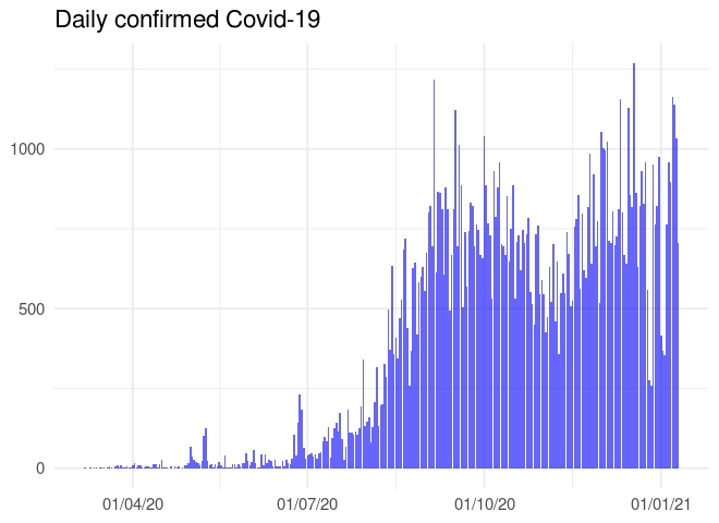
I'm trying to make a simple graphic to visualize the daily confirmed cases of covid-19 in my country and the different period of time (dates) that goverment implemented restrictions such as lockdown, social distancing and movement restrictions.
To visualize this I was thinking that the easiest way would be setting different colors to these period of time for restrictions.
I will thank you a lot if some of you can suggest me how to address this. Others suggestion for different type of graphics also are welcome.
Below is my code and I also attached the graphic I've obtained and a example of the graphic a I want.
Best
Julio
### My code
ggplot(df_daily, aes(x= dates, y= Confirmed))+
geom_col(fill= "blue", alpha= 0.6) +
theme_minimal(base_size = 14) +
xlab(NULL) + ylab(NULL) +
scale_x_date(date_labels = "%d/%m/%y")+
labs(title = " Daily confirmed Covid-19")
## My plot
# Example of graphic I want


David Kahle
Jan 26, 2021, 9:47:45 PM1/26/21
to Julio Torres, ggplot2
Hi Julio –
I started to put together a little write up for you, and then realized that it started growing! Hopefully this helps. With ggplot once you start polishing a graphic the code can get pretty long, so don't be intimidated by it.
Hope it helps
david.
library("tidyverse")
library("lubridate")
#>
#> Attaching package: 'lubridate'
#> The following objects are masked from 'package:base':
#>
#>     date, intersect, setdiff, union


# generate fake data
set.seed(1)
(data <- tibble(
  date = seq(mdy("Jan 1, 2020"), today(), by = "day"),
  val = round(exp(cumsum(rnorm(length(date), 0, .1))))
))
#> # A tibble: 392 x 2
#>    date         val
#>    <date>     <dbl>
#>  1 2020-01-01     1
#>  2 2020-01-02     1
#>  3 2020-01-03     1
#>  4 2020-01-04     1
#>  5 2020-01-05     1
#>  6 2020-01-06     1
#>  7 2020-01-07     1
#>  8 2020-01-08     1
#>  9 2020-01-09     1
#> 10 2020-01-10     1
#> # … with 382 more rows


# plot
data %>%
  ggplot(aes(date, val)) +
    geom_col()
# generate labels for time ranges
# note that this works because the cases are assigned sequentially
(data <- data %>% mutate(
  status = case_when(
    date <  mdy("March 1, 2020") ~ "pre-shutdown",
    date <  mdy("June 1, 2020")  ~ "shutdown",
    date <  mdy("Nov 1, 2020")   ~ "open",
    date <= today()              ~ "shutdown"
  )
))
#> # A tibble: 392 x 3
#>    date         val status
#>    <date>     <dbl> <chr>
#>  1 2020-01-01     1 pre-shutdown
#>  2 2020-01-02     1 pre-shutdown
#>  3 2020-01-03     1 pre-shutdown
#>  4 2020-01-04     1 pre-shutdown
#>  5 2020-01-05     1 pre-shutdown
#>  6 2020-01-06     1 pre-shutdown
#>  7 2020-01-07     1 pre-shutdown
#>  8 2020-01-08     1 pre-shutdown
#>  9 2020-01-09     1 pre-shutdown
#> 10 2020-01-10     1 pre-shutdown
#> # … with 382 more rows


# plot
data %>%
  ggplot(aes(date, val)) +
    geom_col(aes(fill = status))
# polish up a bit
data %>%
  ggplot(aes(date, val)) +
    geom_col(aes(fill = status)) +
    scale_x_date(
      date_breaks = "1 month", date_labels = "%b"
    ) +
    scale_y_continuous(sec.axis = dup_axis()) +
    ggtitle("Value over time") +
    theme_minimal() +
    theme(
      axis.title.x = element_blank(),
      axis.title.y = element_blank(),
      axis.text.y.left = element_blank(),
      panel.grid.major.x = element_blank(),
      panel.grid.minor.x = element_blank(),
      legend.position = c(.15, .75),
      legend.background = element_rect(fill = "white", color = NA)
    )
# if you want a rolling average, you can use the slider package
# https://davisvaughan.github.io/slider/
library("slider")
(data <- data %>% mutate(
  avg_7day = slide_dbl(val, mean, .before = 6)
))
#> # A tibble: 392 x 4
#>    date         val status       avg_7day
#>    <date>     <dbl> <chr>           <dbl>
#>  1 2020-01-01     1 pre-shutdown        1
#>  2 2020-01-02     1 pre-shutdown        1
#>  3 2020-01-03     1 pre-shutdown        1
#>  4 2020-01-04     1 pre-shutdown        1
#>  5 2020-01-05     1 pre-shutdown        1
#>  6 2020-01-06     1 pre-shutdown        1
#>  7 2020-01-07     1 pre-shutdown        1
#>  8 2020-01-08     1 pre-shutdown        1
#>  9 2020-01-09     1 pre-shutdown        1
#> 10 2020-01-10     1 pre-shutdown        1
#> # … with 382 more rows


# add 7 day average to plot, polish a little
data %>%
  ggplot(aes(date, val)) +
    geom_col(aes(fill = status), alpha = .5) +
    geom_line(aes(y = avg_7day)) +
    geom_text(
      aes(
        x = date + days(1),
        y = avg_7day,
        label = round(avg_7day, digits = 2)
      ),
      hjust = "left",
      data = data %>% slice_max(date)
    ) +
    scale_x_date(
      date_breaks = "1 month", date_labels = "%b",
      expand = expansion(c(.05, .10)) # add space to right
    ) +
    scale_y_continuous(sec.axis = dup_axis()) +
    ggtitle("Value over time") +
    theme_minimal() +
    theme(
      axis.title.x = element_blank(),
      axis.title.y = element_blank(),
      axis.text.y.left = element_blank(),
      panel.grid.major.x = element_blank(),
      panel.grid.minor.x = element_blank(),
      legend.position = c(.15, .75),
      legend.background = element_rect(fill = "white", color = NA)
    )
Created on 2021-01-26 by the reprex package (v0.3.0)
<my_graphic.jpeg># Example of graphic I want
<graphic_I_want.jpeg>--
--
You received this message because you are subscribed to the ggplot2 mailing list.
Please provide a reproducible example: https://github.com/hadley/devtools/wiki/Reproducibility
To post: email ggp...@googlegroups.com
To unsubscribe: email ggplot2+u...@googlegroups.com
More options: http://groups.google.com/group/ggplot2
---
You received this message because you are subscribed to the Google Groups "ggplot2" group.
To unsubscribe from this group and stop receiving emails from it, send an email to ggplot2+u...@googlegroups.com.
To view this discussion on the web visit https://groups.google.com/d/msgid/ggplot2/ca45ee53-100d-4b78-9796-e6bad10fdcb5n%40googlegroups.com.
<my_graphic.jpeg><graphic_I_want.jpeg>
Julio Torres
Jan 27, 2021, 6:51:23 AM1/27/21
to David Kahle, ggplot2
Great! Thank you guys. Your recommendation and code are very clear!
Best regards!
Julio

Ram Siwakoti
Jan 27, 2021, 6:51:23 AM1/27/21
to Julio Torres, ggplot2
Hi Julio,
I would first define the period as desired and then specify that period in the fill option (for example, aes(fill = period).
Thanks,
Ram
--
Reply all
Reply to author
Forward
0 new messages