Overlaying a transparent map on top of another map

gafna jeff
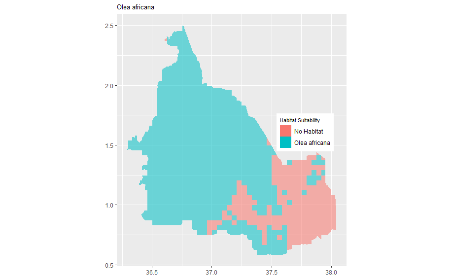
I have two rasters. One is a continuous raster showing species richness, while the other one is a binary raster of just one plant species called Olea Africana. I would like to plot the two maps at the same time with one transparent map (Olea africana map) overlayed on top of the other map (species richness map).
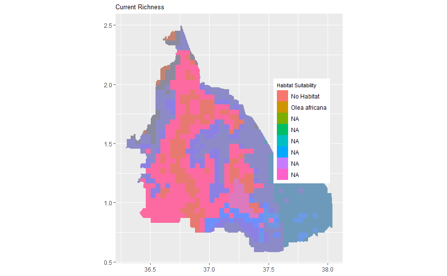
When I plot the two maps separately in ggplot2 separately, they look good. But now when I plot them together (in the last step), making Olea africana binary map transparent so as to see through to the richness map, I get a funny map. What am I doing wrong. I would appreciate your help or leads to any material. Here is my code. Attached are the richness map, Olea africana map and the funny map I get after com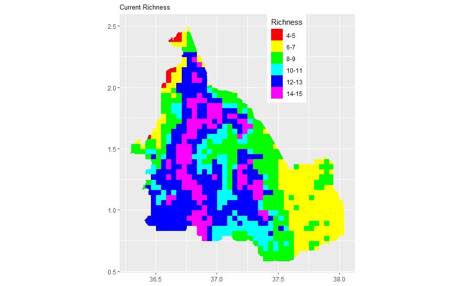
 bining the two maps
library(raster)
library(ggplot2)
library(tidyverse)
library(viridis)
library(see)
#read the overal reachness map
richness <- raster("Outputs/all_final_rasters/species/final_masked_all_richness.tif")
plot(richness)
# convert to a df for plotting in two steps,
# First, to a SpatialPointsDataFrame
mal_ras_pts <- rasterToPoints(richness, spatial = TRUE)
# Then to a 'conventional' dataframe
mal_ras_df <- data.frame(mal_ras_pts)
rm(mal_ras_pts, richness)
names(mal_ras_df)
species_richness_df <- mal_ras_df %>%
mutate(fct_my_richness = cut(final_masked_all_richness, breaks = 6))
names(species_richness_df)
#plot using ggplot
ggplot() +
geom_raster(data = species_richness_df , aes(x = x, y = y, fill = fct_my_richness)) +
scale_fill_manual(values = rainbow(6), name = "Richness", labels = c("4-5", "6-7", "8-9", "10-11", "12-13", "14-15")) + ggtitle("Current Richness") + theme(axis.title.x = element_blank(), axis.title.y = element_blank()) + theme(plot.title=element_text(size=10)) + theme(axis.title.x = element_blank(), axis.title.y = element_blank()) + coord_quickmap() + theme(legend.position = c(0.71, 0.83))
##Read Olea africana binary raster
olea <- raster("Outputs/all_final_rasters/Current_species/masked_binary_current_species/Olea_africana.tif")
plot(olea)
# convert to a df for plotting in two steps,
# First, to a SpatialPointsDataFrame
olea_pts <- rasterToPoints(olea, spatial = TRUE)
# Then to a 'conventional' dataframe
olea_df <- data.frame(olea_pts)
rm(olea_pts, olea)
names(olea_df)
ggplot() +
geom_raster(data = olea_df , aes(x = x, y = y, fill = as.factor(Olea_africana), alpha = 0.2)) + scale_alpha(guide = 'none') + scale_color_manual(values=c('#999999','#E69F00')) + theme(legend.title = element_text(color = "black", size = 8), legend.text = element_text(color = "black")) + ggtitle("Olea africana") + labs(fill = "Habitat Suitability") + scale_fill_discrete(labels = c("No Habitat", "Olea africana")) + theme(axis.title.x = element_blank(), axis.title.y = element_blank()) + theme(plot.title=element_text(size=10)) + theme(axis.title.x = element_blank(), axis.title.y = element_blank()) + coord_quickmap() + theme(legend.position = c(0.82, 0.53))
##combine the two maps with olea Africana map on top as transparent
ggplot() +
geom_raster(data = species_richness_df , aes(x = x, y = y, fill = fct_my_richness)) +
scale_fill_manual(values = rainbow(6), name = "Richness", labels = c("4-5", "6-7", "8-9", "10-11", "12-13", "14-15")) + ggtitle("Current Richness") + theme(axis.title.x = element_blank(), axis.title.y = element_blank()) + theme(plot.title=element_text(size=10)) + theme(axis.title.x = element_blank(), axis.title.y = element_blank()) + coord_quickmap() + theme(legend.position = c(0.71, 0.75)) +
geom_raster(data = olea_df , aes(x = x, y = y, fill = as.factor(Olea_africana), alpha = 0.2)) + scale_alpha(guide = 'none') + scale_color_manual(values=c('#999999','#E69F00')) + theme(legend.title = element_text(color = "black", size = 8), legend.text = element_text(color = "black")) + labs(fill = "Habitat Suitability") + scale_fill_discrete(labels = c("No Habitat", "Olea africana")) + theme(axis.title.x = element_blank(), axis.title.y = element_blank()) + theme(plot.title=element_text(size=10)) + theme(axis.title.x = element_blank(), axis.title.y = element_blank()) + coord_quickmap() + theme(legend.position = c(0.82, 0.53))
Regards,
Jeff

Tom Philippi
--
--
You received this message because you are subscribed to the ggplot2 mailing list.
Please provide a reproducible example: https://github.com/hadley/devtools/wiki/Reproducibility
To post: email ggp...@googlegroups.com
To unsubscribe: email ggplot2+u...@googlegroups.com
More options: http://groups.google.com/group/ggplot2
---
You received this message because you are subscribed to the Google Groups "ggplot2" group.
To unsubscribe from this group and stop receiving emails from it, send an email to ggplot2+u...@googlegroups.com.
To view this discussion on the web visit https://groups.google.com/d/msgid/ggplot2/3e567618-f878-413e-8e87-4d7759c18494n%40googlegroups.com.
gafna jeff
gafna jeff

Brandon Hurr
To view this discussion on the web visit https://groups.google.com/d/msgid/ggplot2/CAABPRJeAPJdQP1fjh4_Uv%2BqOGhn%2BR7ykHisyD0pb9E6%3DK-%3DTSg%40mail.gmail.com.

Brad Udall
On May 11, 2021, at 6:43 AM, Brandon Hurr <brando...@gmail.com> wrote:
Could you make a reprex? I'm happy to play around with it, but I can't because I don't have your rasters.I agree with what was proposed. I would keep your species richness as it is, but then apply the olea africana binary map as an alpha layer. 1 for present and 0.1 or so for not. You can still see the colors, but they would be very faint. Not sure if you can do that with rasters or not though.B
On Tue, May 11, 2021 at 3:32 AM gafna jeff <gafn...@gmail.com> wrote:
The main goal of my idea is the following1 Identify area with high species richness but no Olea africana2 identify area with low species richness and with Olea africana3 Identify the areas with moderate species richness and with no Olea africana
On Tue, May 11, 2021 at 5:47 AM Tom Philippi <tephi...@gmail.com> wrote:
Jeff--What do you want the resulting map to look like? [That may be why no one has replied yet.]My first idea would be the color-ramp of categorical species richness as a basemap plotted just as you do, but then black (or red) dots for just the Oleea habitat cells usinggeom_point(data = olea_df[olea_df$Olea_africana,.], aes(x = x, y = y), color = "red") +But, actually looking at your maps of species richness and your Olea, the Olea isn't a patchy distribution but rather all but the lower right quadrant. Thus, if the raster grid cells align, I would merge the Olea habitat as a {0,1} numeric variable (or logical) to species_richness_df, then use the value of that variable to control alpha, so alpha = 1 for the Olea habitat and alpha = .4 or so for the non-habitat, which would thus be washed out in appearance. That would emphasize where the Olea are.Or, you could compute a new variable junk <- fct_my_richness + 100 * Olea_africanaspecies and create a new color palette with the same 6 hues repeated twice, but luminosity or something else differing between the habitat and non-habitat.If you want something else from this list, please give the ggplot2 experts an idea of what you're striving for.Tom
On Mon, May 10, 2021 at 12:15 AM gafna jeff <gafn...@gmail.com> wrote:
Hello,
I have two rasters. One is a continuous raster showing species richness, while the other one is a binary raster of just one plant species called Olea Africana. I would like to plot the two maps at the same time with one transparent map (Olea africana map) overlayed on top of the other map (species richness map).
When I plot the two maps separately in ggplot2 separately, they look good. But now when I plot them together (in the last step), making Olea africana binary map transparent so as to see through to the richness map, I get a funny map. What am I doing wrong. I would appreciate your help or leads to any material. Here is my code. Attached are the richness map, Olea africana map and the funny map I get after com<Richness map.png><Olea africana map.png><Combined map with transparency.png>bining the two maps
To view this discussion on the web visit https://groups.google.com/d/msgid/ggplot2/CAG2OMvt0g%3DaBbTDW6SuydUFWH8OtqjQnr1ezU%3Dhn9gmBTbE_0A%40mail.gmail.com.
gafna jeff
Brad Udall
Brad Udall
gafna jeff
Tom Philippi
To view this discussion on the web visit https://groups.google.com/d/msgid/ggplot2/CAABPRJerzNWgq05sRUCygtO3o5O1Fm9kSYzsNUqCgHr5u%2BEpjA%40mail.gmail.com.
gafna jeff
gafna jeff
library(ggplot2)
library(tidyverse)
library(viridis)
library(see)
#read in olea africana data
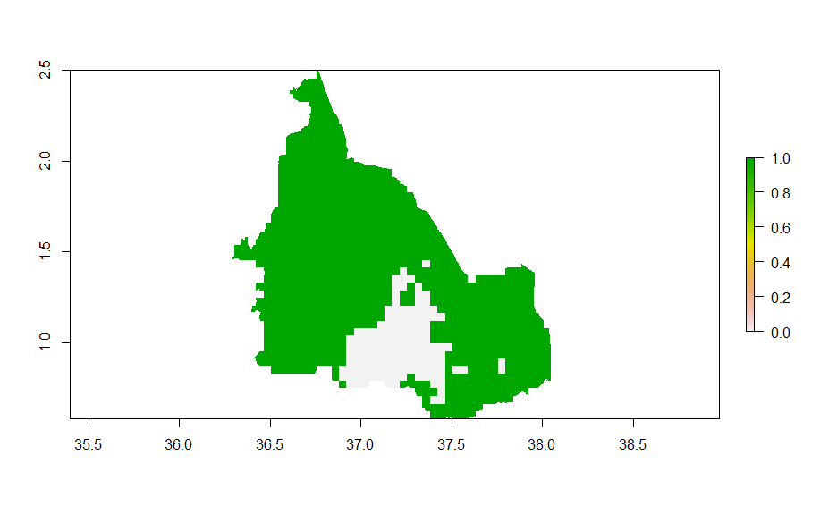
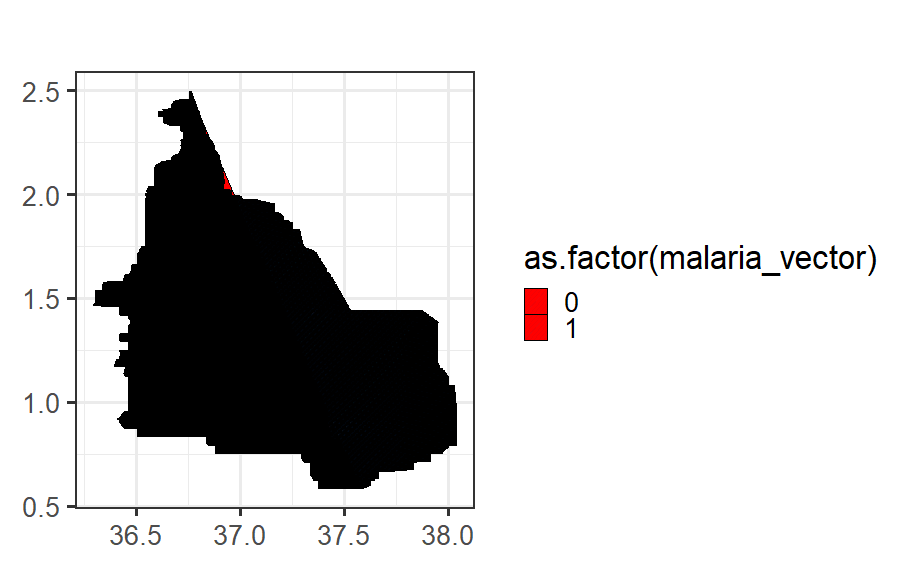
olea <- raster("Outputs/all_final_rasters/Current_species/masked_binary_current_species/malaria_vector.tif")
plot(olea)
# convert to a df for plotting in two steps,
# First, to a SpatialPointsDataFrame
olea_pts <- rasterToPoints(olea, spatial = TRUE)
# Then to a 'conventional' dataframe
olea_df <- data.frame(olea_pts)
rm(olea_pts, olea)
names(olea_df)
#Convert to tibble object or dataframe
olea_df_new<- as_tibble(olea_df)
class(olea_df_new)
olea_df_new <- olea_df_new[,-4]
names(olea_df_new)
#plot with cross hatchings
ggplot(olea_df_new, aes(x = x, y = y)) +
geom_polygon_pattern(aes(pattern_fill = as.factor(malaria_vector)),
fill = 'red',
colour = 'black',
pattern_spacing = 0.01,
pattern_density = 0.01,
pattern_colour = '#002366',
pattern_alpha =0.05,
pattern_angle = 45
) +
labs(title = "") +
coord_equal() +
theme_bw(25) +
theme(legend.position = 'right') +
theme(axis.title = element_blank())

Rainer Hurling
Am 19.05.21 um 13:41 schrieb gafna jeff:
>
> Am using ggpattern package to plot cross hatching of my Olea africana
> binary raster. My idea is to convert the raster to tibble data frame
> format (the format used used in ggpattern package for
> geom_polygon_pattern). And then plot it as hatching
> using geom_polygon_pattern() function. I did not use the conversion of
> raster to polygon approach suggested by Tom ( Olea_polys <- as(olea,
> "SpatialPolygonsDataFrame")) since it limits me by not giving me the x
> and y which I need to plot. The binary map of Olea africana and the
> resultant map after cross hatching look very different. The cross
> hatching map is very bad. What am I doing wrong? I would really
> appreciate any help or advice. Below is my code
>
> library(raster)
> library(ggplot2)
> library(tidyverse)
> library(viridis)
> library(see)
> library(ggpattern)
>
>
> #read in olea africana data
> olea <-
> raster("Outputs/all_final_rasters/Current_species/masked_binary_current_species/malaria_vector.tif")
Best wishes,
Rainer
>>
>> Jeff,
>>
>> Can’t say that I do.
>>
>> A quick google came up with one idea: create a new
>> shape file for the hatchings with just lines.
>>
>> That shape would be overlaid on top of the colors, but
>> transparent I think.
>>
>> One other thought….
>>
>> The ggplot model is supposed to be simple
>> conceptually. The hatchings feel like an aesthetic,
>> like color. Maybe a ‘fill’ aesthetic would work somehow.
>>
>> I’m reasonably certain this can be done, but that’s
>> probably little consolation.
>>
>> Brad
>>
>>
>>
>>
>>> On May 11, 2021, at 8:16 AM, gafna jeff
>>>>
>>>> Could you make a reprex? I'm happy to play
>>>> around with it, but I can't because I don't have
>>>> your rasters.
>>>>
>>>> I agree with what was proposed. I would keep
>>>> your species richness as it is, but then apply
>>>> the olea africana binary map as an alpha layer.
>>>> 1 for present and 0.1 or so for not. You can
>>>> still see the colors, but they would be very
>>>> faint. Not sure if you can do that with rasters
>>>> or not though.
>>>>
>>>> B
>>>>
>>>> On Tue, May 11, 2021 at 3:32 AM gafna jeff
>>>> <gafn...@gmail.com
>>>>
>>>> The main goal of my idea is the following
>>>>
>>>> 1 Identify area with high species richness
>>>> but no Olea africana
>>>> 2 identify area with low species richness
>>>> and with Olea africana
>>>> 3 Identify the areas with moderate species
>>>> richness and with no Olea africana
>>>>
>>>> On Tue, May 11, 2021 at 5:47 AM Tom Philippi
>>>> <tephi...@gmail.com
>>>> To unsubscribe: email
>>>> ggplot2+u...@googlegroups.com
>>>> <mailto:ggplot2%2Bunsu...@googlegroups.com>
>>>> More options:
>>>> http://groups.google.com/group/ggplot2
>>>>
>>>> ---
>>>> You received this message because
>>>> you are subscribed to the Google
>>>> Groups "ggplot2" group.
>>>> To unsubscribe from this group and
>>>> stop receiving emails from it, send
>>>> an email to
>>>> ggplot2+u...@googlegroups.com
>>>> visit
>>>> https://groups.google.com/d/msgid/ggplot2/3e567618-f878-413e-8e87-4d7759c18494n%40googlegroups.com
>>>>
>>>> --
>>>> --
>>>> You received this message because you are
>>>> subscribed to the ggplot2 mailing list.
>>>> Please provide a reproducible example:
>>>> https://github.com/hadley/devtools/wiki/Reproducibility
>>>> <https://github.com/hadley/devtools/wiki/Reproducibility>
>>>>
>>>> To post: email ggp...@googlegroups.com
>>>> To unsubscribe: email
>>>> ggplot2+u...@googlegroups.com
>>>> <mailto:ggplot2%2Bunsu...@googlegroups.com>
>>>> More options:
>>>> http://groups.google.com/group/ggplot2
>>>>
>>>> ---
>>>> You received this message because you are
>>>> subscribed to the Google Groups "ggplot2" group.
>>>> To unsubscribe from this group and stop
>>>> receiving emails from it, send an email to
>>>> ggplot2+u...@googlegroups.com
>>>> <https://groups.google.com/d/msgid/ggplot2/CAABPRJeAPJdQP1fjh4_Uv%2BqOGhn%2BR7ykHisyD0pb9E6%3DK-%3DTSg%40mail.gmail.com?utm_medium=email&utm_source=footer>.
>>>>
>>>> --
>>>> --
>>>> You received this message because you are
>>>> subscribed to the ggplot2 mailing list.
>>>> Please provide a reproducible example:
>>>> https://github.com/hadley/devtools/wiki/Reproducibility
>>>> <https://github.com/hadley/devtools/wiki/Reproducibility>
>>>>
>>>> To post: email ggp...@googlegroups.com
>>>> To unsubscribe: email
>>>> ggplot2+u...@googlegroups.com
>>>> <mailto:ggplot2+u...@googlegroups.com>
>>>> http://groups.google.com/group/ggplot2
>>>> <http://groups.google.com/group/ggplot2>
>>>>
>>>> ---
>>>> You received this message because you are
>>>> subscribed to the Google Groups "ggplot2" group.
>>>> To unsubscribe from this group and stop
>>>> receiving emails from it, send an email to
>>>> ggplot2+u...@googlegroups.com
>>>> <https://groups.google.com/d/msgid/ggplot2/CAG2OMvt0g%3DaBbTDW6SuydUFWH8OtqjQnr1ezU%3Dhn9gmBTbE_0A%40mail.gmail.com?utm_medium=email&utm_source=footer>.
>>
>
> --
> --
> You received this message because you are subscribed to the
> ggplot2 mailing list.
> Please provide a reproducible example:
> https://github.com/hadley/devtools/wiki/Reproducibility
> <https://github.com/hadley/devtools/wiki/Reproducibility>
>
> To post: email ggp...@googlegroups.com
> To unsubscribe: email ggplot2+u...@googlegroups.com
> <mailto:ggplot2%2Bunsu...@googlegroups.com>
> More options: http://groups.google.com/group/ggplot2
>
> ---
> You received this message because you are subscribed to the
> Google Groups "ggplot2" group.
> To unsubscribe from this group and stop receiving emails
> from it, send an email to
> ggplot2+u...@googlegroups.com
> <https://groups.google.com/d/msgid/ggplot2/CAABPRJerzNWgq05sRUCygtO3o5O1Fm9kSYzsNUqCgHr5u%2BEpjA%40mail.gmail.com?utm_medium=email&utm_source=footer>.
> --
> --
> You received this message because you are subscribed to the ggplot2
> mailing list.
> Please provide a reproducible example:
> https://github.com/hadley/devtools/wiki/Reproducibility
> <https://github.com/hadley/devtools/wiki/Reproducibility>
>
> To post: email ggp...@googlegroups.com
> To unsubscribe: email ggplot2+u...@googlegroups.com
> More options: http://groups.google.com/group/ggplot2
> <http://groups.google.com/group/ggplot2>
>
> ---
> You received this message because you are subscribed to the Google
> Groups "ggplot2" group.
> To unsubscribe from this group and stop receiving emails from it, send
> an email to ggplot2+u...@googlegroups.com
> <https://groups.google.com/d/msgid/ggplot2/CAABPRJeje49Q%3D998QpJ9m0wS4b7eRPo_qduK2VtRYRUdxgJdJw%40mail.gmail.com?utm_medium=email&utm_source=footer>.
Brandon Hurr
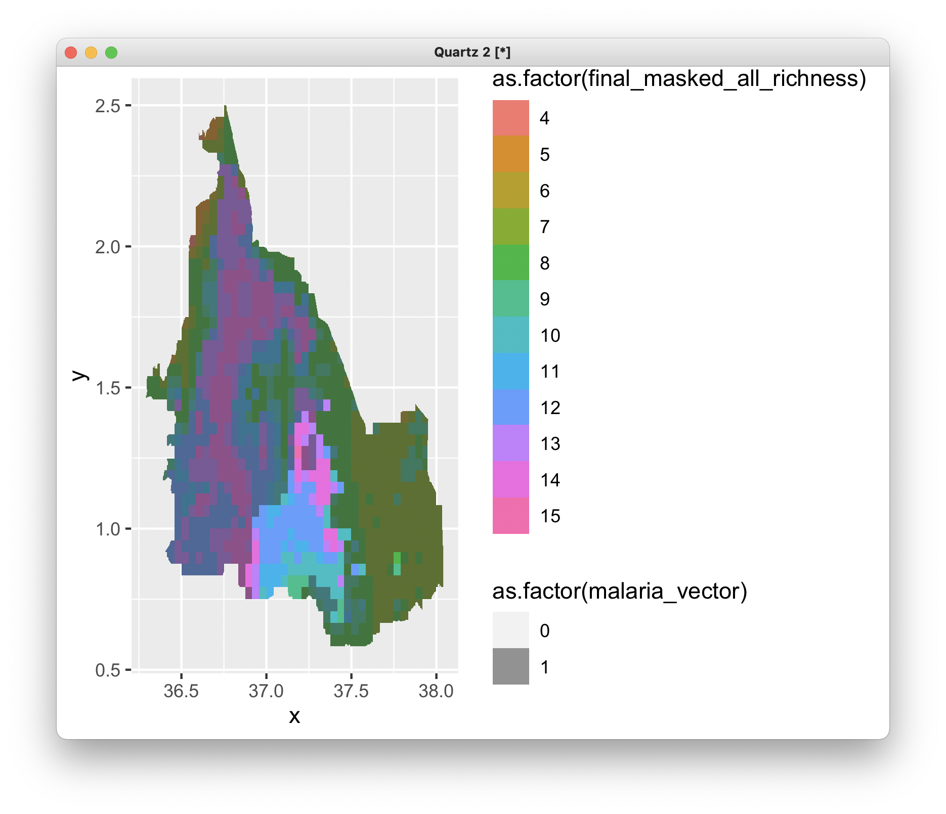
library(raster)
library(see)
library(ggpattern)
library(tidyverse)
library(viridis)
#read in olea africana data
olea <- raster("~/Downloads/malaria_vector.tif")
richness <- raster("~/Downloads/final_masked_all_richness.tif")
# convert to a df for plotting in two steps,
# First, to a SpatialPointsDataFrame
olea_pts <- rasterToPoints(olea, spatial = TRUE)
richness_pts <- rasterToPoints(richness, spatial = TRUE)
# Then to a 'conventional' dataframe
olea_df <- tibble(as.data.frame(olea_pts))
richness_df <- tibble(as.data.frame(richness_pts))
ggplot() +
geom_raster(data = richness_df , aes(x = x, y = y, fill = as.factor(final_masked_all_richness))) +
geom_raster(data = olea_df, aes(x = x, y = y, alpha = as.factor(malaria_vector))) + scale_alpha_discrete(range = c(0, 0.5))
To unsubscribe from this group and stop receiving emails from it, send an email to ggplot2+u...@googlegroups.com.
To view this discussion on the web visit https://groups.google.com/d/msgid/ggplot2/CAABPRJcokzqocx4cYWzz%3D%2BBtobQVvTNZ8PbN%3D4q6xgSaaZipLQ%40mail.gmail.com.