polar coordinate plot with 2 geoms
149 views
Skip to first unread message

Frank
Feb 27, 2021, 9:28:12 AM2/27/21
to ggplot2
Hi there,
I'm completely new to R and ggplot2 but fedup with Excel.
I have data on discrete positions on a circular object, which I want to show in a polar coordinate plot. To each position there are multiple observations. I have sample data with 10 positions and 22 observations each.
What I want to create is a simple scatterplot (with some jitter as differences in points aren't that large) and in addition a lineplot connecting dots but not for each row, only for selected rows, like every 4th or 5th.
What I did was this:
library(ggplot2)
Daten = read.table("/home/frank/data")
KV = data.frame(Daten) # I did this, because I was getting errors about some non implementation of "list". No idea if it actually helped.
Bild = ggplot() + coord_polar() + ylim(-30, NA) + scale_x_continuous(breaks = seq(1, 10, by = 1), limits = c(1,11), minor_breaks = NULL)
for (i in 2 : 11) { # this loop runs fine and produces exactly what I want
Bild = Bild + geom_jitter(aes_string(x = KV[2,i], y = KV[,i]), width = 0.15)
}
#for (i in 3 : 23){
# Bild = Bild + geom_line(aes_string(x = KV[2, 2 : 11], y = KV[i, 2 : 11]))
#}
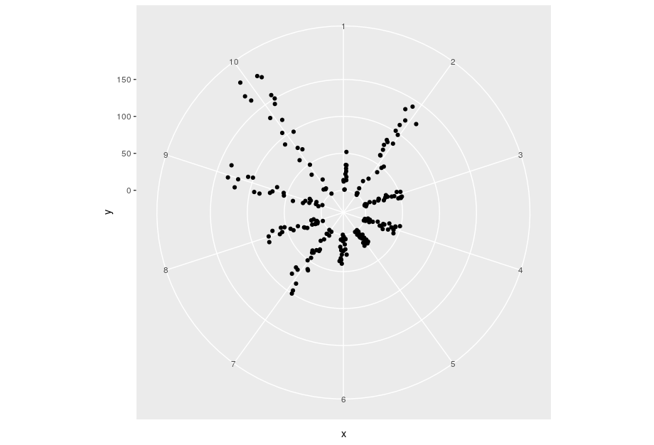
I don't seem to get the second part to run, having additional lines connecting the points. I left out some conditional i mod 4 in an attempt to get any lines to show.I get the error message "Unknown input: data.frame"
Is there a way to have ordered jitter, pushing points only to one direction or along a curve?

Ron Crump
Mar 1, 2021, 4:21:02 AM3/1/21
to Frank, ggplot2
Hi Frank,
> I'm completely new to R and ggplot2 but fedup with Excel.
Welcome. You'll find there is a bit of a learning curve, but
I think the results are worth it in the end - quality of graphics,
reproducibility etc.
This list is a bit quiet these days, as we are being encouraged
to use the RStudios Community web site for tidyverse (includes
ggplot2) support (https://community.rstudio.com/)
First thing to note is that it is good preactice to provide a
minimal reproducibe example (reprex), including data, in order that
people can easily cut and paste your data and code, run it and
make any changes. (see
https://community.rstudio.com/t/faq-whats-a-reproducible-example-reprex-and-how-do-i-create-one/5219).
This
applies both to the forums and this mailing list.
I believe most of your difficulties are a result of having 'wide'
rather than 'long' data. That is, you have multiple columns
of y data rather than one long column with a second column. Switching to
long format would, for example, remove the need for a loop in your
geom_jitter call and should at least resolve the Unknown input (you are
providing a data.frame to y when it wants a vector) in the geom_line.
Without seeing your data, I don't think I understand the second loop.
I hope this is some help, but if you post your query with a reprex
on the rstudio community forums I am sure you will get a complete
solution from one of the lovely people that hang out there.
Best wishes,
Ron.
> I'm completely new to R and ggplot2 but fedup with Excel.
I think the results are worth it in the end - quality of graphics,
reproducibility etc.
This list is a bit quiet these days, as we are being encouraged
to use the RStudios Community web site for tidyverse (includes
ggplot2) support (https://community.rstudio.com/)
First thing to note is that it is good preactice to provide a
minimal reproducibe example (reprex), including data, in order that
people can easily cut and paste your data and code, run it and
make any changes. (see
https://community.rstudio.com/t/faq-whats-a-reproducible-example-reprex-and-how-do-i-create-one/5219).
This
applies both to the forums and this mailing list.
I believe most of your difficulties are a result of having 'wide'
rather than 'long' data. That is, you have multiple columns
of y data rather than one long column with a second column. Switching to
long format would, for example, remove the need for a loop in your
geom_jitter call and should at least resolve the Unknown input (you are
providing a data.frame to y when it wants a vector) in the geom_line.
Without seeing your data, I don't think I understand the second loop.
I hope this is some help, but if you post your query with a reprex
on the rstudio community forums I am sure you will get a complete
solution from one of the lovely people that hang out there.
Best wishes,
Ron.
Frank
Mar 1, 2021, 11:42:39 AM3/1/21
to ggplot2
I found the button to attach pictures but not for files.
Anyway it looks like this.
text 1 2 3 4 5 6 7 8 9 10
0 1 2 3 4 5 6 7 8 9 10
0 0 0 0 0 0 0 0 0 0 0
100 4 4 4 3 8 0 2 2 1 2
200 11 9 10 5 14 1 5 3 3 4
300 12 10 11 5 19 1 9 5 6 9
400 18 15 16 9 27 1 10 7 6 13
500 18 15 17 12 35 1 12 9 10 16
600 25 21 21 12 35 3 16 9 12 17
700 30 22 25 14 38 5 20 10 12 22
800 35 27 30 14 40 5 24 10 13 22
900 37 28 34 18 41 6 24 12 19 26
1000 39 33 39 21 43 6 24 13 24 26
1100 39 39 44 22 50 8 27 15 25 31
1200 39 44 44 23 50 9 29 15 29 33
1300 46 49 46 23 58 9 30 17 29 33
1400 53 52 48 23 65 9 31 19 32 34
1500 59 52 51 26 70 10 35 20 35 42
1600 64 52 54 28 74 12 36 22 36 49
1700 64 57 58 28 77 13 38 24 37 49
1800 70 62 64 29 83 14 39 24 42 57
1900 77 65 67 30 85 14 42 24 48 63
2000 77 70 67 34 87 16 45 25 48 64
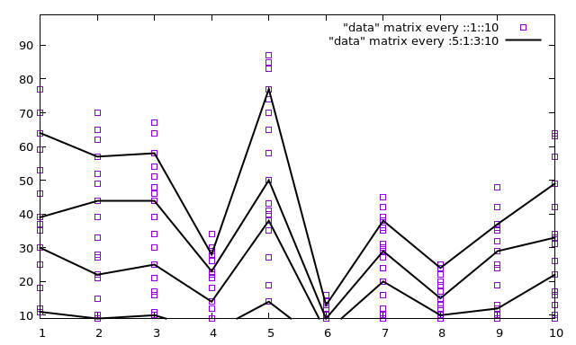
The code I posted above is everything I wrote in my attempt to graph the data.The columns are my positions of observation and in each row are observed events. As you can see I was able to plot all events corresponding to each position. Now I want additional line graphs for say row 5, 10, 15, 20 connecting the points (along the columns). That is what the second loop was for. This is the format I enter data and I thought the data is internally handled as a matrix from which I simply choose which row or column I want the values to be represented on the x axes and some other row or column for the y axes. But I guess this a lack of understanding on my end. I don't want to set up a new file simply because in addition I want to look at a graph of position 5 plotted from 0 to 2000. I thought of it as geom_line(aes(x = column1, y = column5)), boom finished.
In gnuplot it looks like this in a cartesian coordinate system (looks ugly in polar). Axes limits aren't set up properly.
Thanks for the help so far. I will definitely check out the
Anyway it looks like this.
text 1 2 3 4 5 6 7 8 9 10
0 1 2 3 4 5 6 7 8 9 10
0 0 0 0 0 0 0 0 0 0 0
100 4 4 4 3 8 0 2 2 1 2
200 11 9 10 5 14 1 5 3 3 4
300 12 10 11 5 19 1 9 5 6 9
400 18 15 16 9 27 1 10 7 6 13
500 18 15 17 12 35 1 12 9 10 16
600 25 21 21 12 35 3 16 9 12 17
700 30 22 25 14 38 5 20 10 12 22
800 35 27 30 14 40 5 24 10 13 22
900 37 28 34 18 41 6 24 12 19 26
1000 39 33 39 21 43 6 24 13 24 26
1100 39 39 44 22 50 8 27 15 25 31
1200 39 44 44 23 50 9 29 15 29 33
1300 46 49 46 23 58 9 30 17 29 33
1400 53 52 48 23 65 9 31 19 32 34
1500 59 52 51 26 70 10 35 20 35 42
1600 64 52 54 28 74 12 36 22 36 49
1700 64 57 58 28 77 13 38 24 37 49
1800 70 62 64 29 83 14 39 24 42 57
1900 77 65 67 30 85 14 42 24 48 63
2000 77 70 67 34 87 16 45 25 48 64
The code I posted above is everything I wrote in my attempt to graph the data.The columns are my positions of observation and in each row are observed events. As you can see I was able to plot all events corresponding to each position. Now I want additional line graphs for say row 5, 10, 15, 20 connecting the points (along the columns). That is what the second loop was for. This is the format I enter data and I thought the data is internally handled as a matrix from which I simply choose which row or column I want the values to be represented on the x axes and some other row or column for the y axes. But I guess this a lack of understanding on my end. I don't want to set up a new file simply because in addition I want to look at a graph of position 5 plotted from 0 to 2000. I thought of it as geom_line(aes(x = column1, y = column5)), boom finished.
In gnuplot it looks like this in a cartesian coordinate system (looks ugly in polar). Axes limits aren't set up properly.
Thanks for the help so far. I will definitely check out the
Reply all
Reply to author
Forward
0 new messages