Stacked bar plot filled with symbols/lines

zelfortin
I have stacked bar plots that I want to fill with symbols/ lines rather than colors. Here is what my script looks like to fill with colors:
Coul <- c("#990000","#FF3300","#FF6633","#999999","#CCFF99","#33CC00")
Plot1 <- qplot(factor(Model),data=Best, geom="bar",fill=factor(Best$New.Curve), xlab="Model", ylab="Count") +
labs(title=paste("Best models by country for ", File[e], sep="")) +
scale_fill_manual(values=Coul)
Plot1
So I'm looking to get something more like this:

Rather than what I get:


Greg Snow
--
--
You received this message because you are subscribed to the ggplot2 mailing list.
Please provide a reproducible example: https://github.com/hadley/devtools/wiki/Reproducibility
To post: email ggp...@googlegroups.com
To unsubscribe: email ggplot2+u...@googlegroups.com
More options: http://groups.google.com/group/ggplot2
---
You received this message because you are subscribed to the Google Groups "ggplot2" group.
To unsubscribe from this group and stop receiving emails from it, send an email to ggplot2+u...@googlegroups.com.
For more options, visit https://groups.google.com/groups/opt_out.
Gregory (Greg) L. Snow Ph.D.
538...@gmail.com
zelfortin
finally I decided to dodge my stacked bar plot and use a scale of grey colors. I was afraid that on top of each other they might be hard to discern, especially since some categories have low values. Here's a final result:
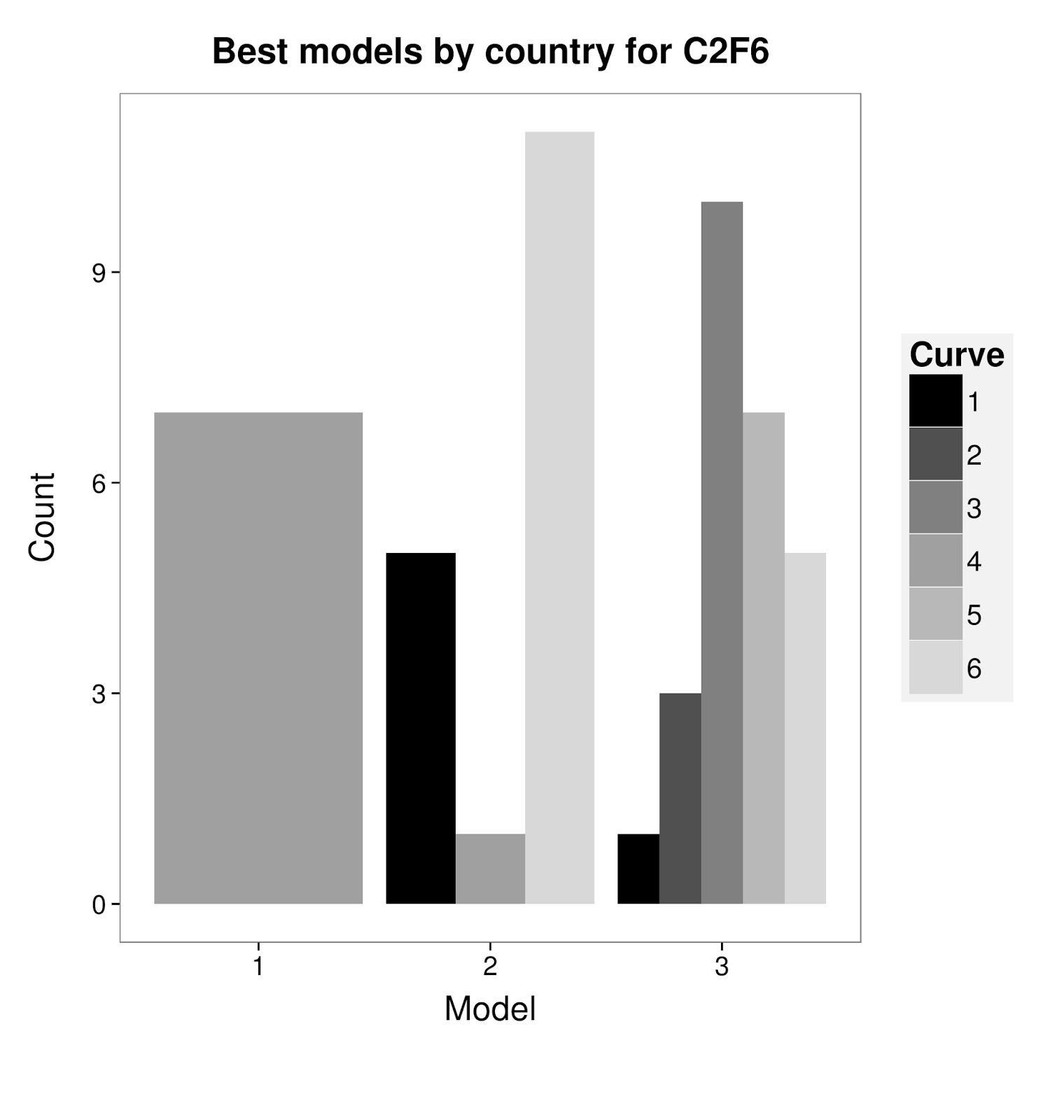
Here is the script if anyone needs to do something similar :
Plot1 <- ggplot(Data,aes(factor(Model),fill=factor(Data$New.Curve))) +
geom_bar(position="dodge") +
labs(x="Model", y="Count") +
ggtitle(paste("Best models by year for ", File[e], sep="")) +
scale_fill_manual(values=Coul) +
theme_bw() +
theme(axis.title = element_text(size= 18)) +
theme(legend.background = element_rect(fill="grey95"))+
theme(legend.key = element_rect(colour = "grey95",fill="grey95"))+
theme(legend.key.size = unit(1, "cm"))+
theme(legend.text = element_text(size = 15))+
theme(legend.title = element_text(size = 18))+
theme(axis.text = element_text(size = 14))+
theme(legend.margin = unit(1,"cm"))+
theme(axis.title.x = element_text(vjust=-0.5))+
theme(axis.title.y = element_text( vjust=0, angle=90))+
theme(plot.margin = unit(c(1,0.2,2,1), "cm"))+
theme(plot.title = element_text(size=19, face="bold", vjust=2.2))+
theme(panel.grid = element_blank())+
labs(fill="Curve")
Plot1
Cheers
JM