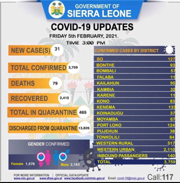
Daily COVID-19 Update for February 5, 2021
4 views
Skip to first unread message

fan...@aol.com
Feb 6, 2021, 4:16:28 AM2/6/21
to konosglo...@googlegroups.com, sierra-leone-...@googlegroups.com, fosl...@googlegroups.com, opwa-wash...@googlegroups.com
|
||||||||||||||||||||||||||||||||||||||

Anthony Mcmillon
Feb 9, 2021, 8:47:25 PM2/9/21
to fosl...@googlegroups.com
It's very easy to create visualizations of data. I have been using Google Data Studio, as well as Tableau Public to create visualizations of Covid 19 data for Sierra Leone from January, 2020 to the present. I produced the visualizations that I published to another organization's website below:
I was able to get the geographic coordinates for each district headquarters from a GIS maps published by GoSL that I used to create a map of Covid 19 cases by district, which I update daily from the daily Covid 19 briefing from the Ministry of Information and Communications. The size of the circle represents the relative number of cases reported from each district. I am including today's map for all of you to see how it appears .
--
FoSL website: http://fosalone.org
Join FoSL $25 membership: https://fosalone.org/mbrs.php
---
You received this message because you are subscribed to the Google Groups "Friends of Sierra Leone" group.
To unsubscribe from this group and stop receiving emails from it, send an email to fosl_mbr+u...@googlegroups.com.
To view this discussion on the web visit https://groups.google.com/d/msgid/fosl_mbr/405984793.3203804.1612602982787%40mail.yahoo.com.
Reply all
Reply to author
Forward
0 new messages