Aim for the yellow?! - Mission Planner compass calibration

BayAreaCrasher
- Two things on the screen started spinning. They have colored axes that represent something. Why do they spin?
- Dots appear randomly on the spinning things. What do the dots represent?
- I'm getting a bit dizzy now.
- Samples are being collected, up to 500 or so now...more data needed is what I'm told.
- When is sufficient data collected?
- Something on the screen says "Aim for the yellow". I tried but my spatial capabilities were matched and I had no idea how to aim for the yellow while spinning around and watching the screen at the same time. Still dizzy but better.
- I finally clicked done after 1000+ samples and it saved some offsets. They look OK (under 250).
BayAreaCrasher

Graham Abell

Arthur Benemann
--
You received this message because you are subscribed to the Google Groups "drones-discuss" group.
To unsubscribe from this group and stop receiving emails from it, send an email to drones-discus...@googlegroups.com.
For more options, visit https://groups.google.com/d/optout.
Arthur Benemann
Pablo Lema
--
You received this message because you are subscribed to a topic in the Google Groups "drones-discuss" group.
To unsubscribe from this topic, visit https://groups.google.com/d/topic/drones-discuss/QBtCNjTl7_o/unsubscribe.
To unsubscribe from this group and all its topics, send an email to drones-discus...@googlegroups.com.

Mark Jacobsen
On Tuesday, October 14, 2014 11:46:13 AM UTC-7, BayAreaCrasher wrote:

Michael Oborne
Ill try answer all your questions.
Why do they spin? Because if it didn’t you cant see if you had points on the backside of the sphere. At one stage it had the current captured point always at the front, this however creates jumping and was not usefull.
What do the dots represent? They are the vector of the raw mag data, ie the position on the sphere from the mag x,y,z’s, each axis is given a different colour
When is sufficient data collected? When you have collected data that are within 1/3rd of the radius of the yellow target dots, the dots vanish when you have acquired that point.
Michael
--

Jonathan Challinger
We need a Pixhawk model or something to put in the middle. That would make it way more clear.
Jonathan Challinger
Arthur, I am all for faster calibration, but we are going to need more points than that to get soft iron, scaling and non-orthagonality calibrated. Also, are there sufficient checks to ensure that the user can't do a bad calibration?

David Pawlak

Robert Lefebvre
+1 Is there a way to put a little aircraft icon in there? I was confused by this for a while until I realized usually what I was missing was data with the craft upside-down.

Samuel Grob
Everytime I endured it I was painfully aware that the NAZA calibration routine
- is initiated from the TX (big plus)
- can therefore be done in the field (big plus)
- takes a mere two turns in the Y axis (HUGE plus)
- take about 10 seconds to do (HUGE plus)
Is their routine lousy (despite the result being excellent) or are we overdoing it here a little ?

Jason Short
Robert Lefebvre
--
Pablo Lema
--
You received this message because you are subscribed to a topic in the Google Groups "drones-discuss" group.
To unsubscribe from this topic, visit https://groups.google.com/d/topic/drones-discuss/QBtCNjTl7_o/unsubscribe.
To unsubscribe from this group and all its topics, send an email to drones-discus...@googlegroups.com.

Kristian Klausen
I just wanted to add my thoughts on this. For me, coming from a control engineering perspective, I think the calibration visualization is pretty clever. It gives a clear indication that certain areas are not covered. I usually do the 360 on all axis first, and then fill the holes using the spinning globes. Granted, I don't have any experience as to how other flight controllers have implemented this.
But, I agree that it would be easier to see where those holes are if the vehicle orientation was depicted in the center. The problem is of course that getting a correct orientation depends on the mag, which is what we are calibrating in the first place.
Regards,
Kristian

Chris Anderson
--
You received this message because you are subscribed to the Google Groups "drones-discuss" group.
To unsubscribe from this group and stop receiving emails from it, send an email to drones-discus...@googlegroups.com.
For more options, visit https://groups.google.com/d/optout.

Craig Elder
Jason Short
Pablo Lema
--
You received this message because you are subscribed to a topic in the Google Groups "drones-discuss" group.
To unsubscribe from this topic, visit https://groups.google.com/d/topic/drones-discuss/QBtCNjTl7_o/unsubscribe.
To unsubscribe from this group and all its topics, send an email to drones-discus...@googlegroups.com.
Mark Jacobsen
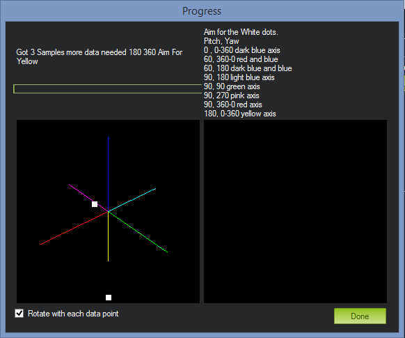
This is a screen for engineers, not for users. Cleaning this up and putting it into plain-language would radically improve the process. For starters, it looks like there are four lines of text mashed together above the picture: got 3 samples // more data needed // 180 360 // aim for yellow. That confused me for ages. And while I suppose the numbers on the right are supposed to be helpful, I find them confusing and threatening to beginners (they make the process look unnecessarily complex). There is also no description of what the user is actually DOING, or how to know if the calibration is progressing, or how to know when the calibration is finished. If you browse the forums, you'll find numerous posts where people get tired and give up after 2000+ data points because they assume the calibration isn't working. That may not be the case, but the user doesn't know that.
How about putting a nice, plain-English block of text a the top of the screen describing what the user will be asked to do, and telling them how they will know when the test is complete.
Then get rid of those 4 lines of mashed-together jargon, and put something in plain English like "Step 1/X: rotate your aircraft until the red dot lands in the yellow-green region." As the user advances from color to color, they will have the satisfaction of seeing the step increment and knowing the calibration is progressing. When enough data is gathered, change the message to "Your compass calibration is complete. Please click DONE." Voila, you've eliminated most of the confusion. People will still probably struggle with getting the orientation right at each step (I still do), but they'll get it eventually.
With a very small time investment cleaning up labels, you could improve one of the most difficult and problematic aspects of the user experience.
Mark
David Pawlak
Mark Jacobsen
Sent from my iPhone
--
You received this message because you are subscribed to a topic in the Google Groups "drones-discuss" group.
To unsubscribe from this topic, visit https://groups.google.com/d/topic/drones-discuss/QBtCNjTl7_o/unsubscribe.
To unsubscribe from this group and all its topics, send an email to drones-discus...@googlegroups.com.

Scott Simpson
Jonathan Challinger
Clearing a solid sphere might be easier since you would be able to see where you haven't been.I'm all for initiating this from the radio though. I have one APM without telemetry and my neighbours think I'm wacko when I'm fumbling with a USB tethered quadcopter in the middle of my yard. :)
--
You received this message because you are subscribed to the Google Groups "drones-discuss" group.
To unsubscribe from this group and stop receiving emails from it, send an email to drones-discus...@googlegroups.com.

 )
)Pablo Lema
Clearing a solid sphere might be easier since you would be able to see where you haven't been.I'm all for initiating this from the radio though. I have one APM without telemetry and my neighbours think I'm wacko when I'm fumbling with a USB tethered quadcopter in the middle of my yard. :)
--
You received this message because you are subscribed to a topic in the Google Groups "drones-discuss" group.
To unsubscribe from this topic, visit https://groups.google.com/d/topic/drones-discuss/QBtCNjTl7_o/unsubscribe.
To unsubscribe from this group and all its topics, send an email to drones-discus...@googlegroups.com.
David Pawlak
Arthur Benemann
- Plot the data in two 2D plots. I think it's a little bit easier than the 3D scatterplot
- Collect data as fast as possible
- Fitting the data to an ellipsoid, using a nice library written by KEOpenSource (with some minor mods)
- Doing the estimation for every new datapoint, so we can follow the estimation "accuracy". When there is a minimal amount of points, and the fit is good enough finish the calibration.
- Convert the java code to C++, including all the used org.apache.commons.math3 linear algebra code.
- Implement the algorithm in a recursive least-squares fashion, so it doesn't take a huge performance hit when running on our CPU.
Arthur Benemann
Craig Elder
--
Jonathan Challinger

Tom Coyle
On Tuesday, October 14, 2014 2:46:13 PM UTC-4, BayAreaCrasher wrote:
Brandon Basso

--

David Seaman
On Thursday, 16 October 2014 13:11:31 UTC-4, Arthur Benemann wrote:
...

Xerr Avon
I love the current mag calibration, there is no time limit and I like being able to see where all I have pointed the copter. I go for a full globe. Its not like we have to do this very often..
thanks
John
On Tuesday, October 14, 2014 7:50:02 PM UTC-5, Michael Oborne wrote:
Ill try answer all your questions.
Why do they spin? Because if it didn’t you cant see if you had points on the backside of the sphere. At one stage it had the current captured point always at the front, this however creates jumping and was not usefull.
What do the dots represent? They are the vector of the raw mag data, ie the position on the sphere from the mag x,y,z’s, each axis is given a different colour
When is sufficient data collected? When you have collected data that are within 1/3rd of the radius of the yellow target dots, the dots vanish when you have acquired that point.
Michael
From: drones-...@googlegroups.com [mailto:drones-...@googlegroups.com] On Behalf Of BayAreaCrasher
Sent: Wednesday, 15 October 2014 2:46 AM
To: drones-...@googlegroups.com
Subject: [drones-discuss] Aim for the yellow?! - Mission Planner compass calibration
Hi all,
So I just updated to the latest Mission Planner and was trying to do a compass calibration on 3.2-rc12. Went into the trusty compass calibration page and started the Live Calibration.
Went a little like this (I'm a semi-well-informed user):
- Two things on the screen started spinning. They have colored axes that represent something. Why do they spin?
- Dots appear randomly on the spinning things. What do the dots represent?
- I'm getting a bit dizzy now.
- Samples are being collected, up to 500 or so now...more data needed is what I'm told.
- When is sufficient data collected?
- Something on the screen says "Aim for the yellow". I tried but my spatial capabilities were matched and I had no idea how to aim for the yellow while spinning around and watching the screen at the same time. Still dizzy but better.
- I finally clicked done after 1000+ samples and it saved some offsets. They look OK (under 250).
Is there somewhere in the wiki or elsewhere some details as to what a non-expert user needs to do in this screen? Half the time I revert to APM Planner because there it's just a timed based exercise for 60 seconds. Get slightly less dizzy.
One little thing that I think would be incredible would be some audio feedback from the Pixhawk when sufficient data has been obtained.
Thanks,
Pablo

Christoffer Johnson
For now I suggest a vehicle in the middle and better instructions.
Its a good way to see if your internal and external compass is in the right direction as well, looking at the vehicle in the middle.
I know I had problems figuring out the right direction on a external non 3DR HMC5893 compass which led to a crash.

WifiGuru
On Tuesday, October 14, 2014 2:46:13 PM UTC-4, BayAreaCrasher wrote:
Jonathan Challinger
--