plot() function - multiple variograms
130 views
Skip to first unread message

abern...@gmail.com
Aug 15, 2022, 6:14:15 PM8/15/22
to ctmm R user group
Hi again,
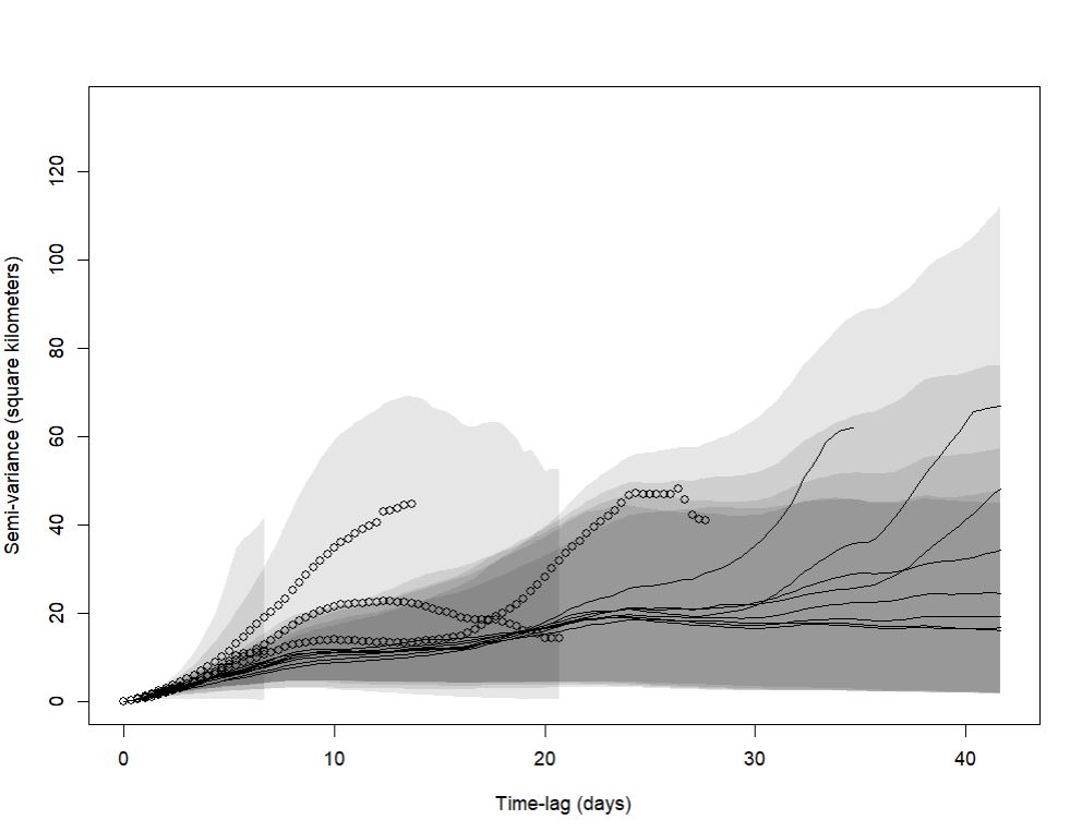
To aid in my variogram inspection/interpretation, and to determine how long I need to monitor caribou on their winter range before range residency is apparent in the data, I created a code that creates an animal's variogram after 1 wks, 2 wks, 3 wks, etc up to 12 wks (12 variograms total). These 12 variograms are in a list, and when I use the plot() function it plots each of the variograms on the same axis. However, I'm imagining a figure that plots these 12 variograms in a grid so I can view all 12 variograms on there own on one page (ie.a ggplot facet figure).I tried manipulating the plot into a tibble to feed into ggplot, which sorta works, but indicates tidy.numeric is deprecated, so thats not a true solution. The variograms show as a numeric object class(), any advice on how to manipulate these to be able to plot in other packages?
rda file attached for one animal, it loads as a list object of the 12 variograms. The short snippit of code below produces the plot with 12 variograms on one set of axis.
Thanks in advance!! Robin
load("rda/single_animal_varigrams_over_12wk.rda")
plot(example)
plot(example)

Christen Fleming
Aug 15, 2022, 7:25:02 PM8/15/22
to ctmm R user group
Hi Robin,
There is a function in ctmmweb that will make a grid plot. Also, you can just fiddle with par(mfrow) to make a grid plot as well.
Inside the variogram objects is just a data.frame, which you can plot in any package, but the ctmm::plot method is also calculating CIs, choosing aesthetic units (days and km^2 in your plot), and if the plotting area becomes small then it will start abbreviating the axis labels to save space, etc..
Best,
Chris
abern...@gmail.com
Aug 16, 2022, 6:55:32 PM8/16/22
to ctmm R user group
Thanks Chris! the par(mfrow) was the ticket. I realize now, in hindsight, that the structure of the variogram in the initial time lag doesn't change as you add more data over time, just more and more of the autocorrelation structure reveals itself as more time lags are analyzed. So, In looking at the one variogram for the 12-week period you can see it all. Good learning experience though:) R
Reply all
Reply to author
Forward
0 new messages