dot_line_plot() doesn't draw the dots
186 views
Skip to first unread message

rand0m
Sep 7, 2012, 10:12:56 AM9/7/12
to cair...@googlegroups.com
Hello cairoplot folks!

Im new to cairoplot and found it while googling for a python library to
generate good looking graphs.

What I need is the graph generated by cairoplot.dot_line_plot().

But whatever I do, the graphs are shown without the desired dots.

This is the example I use:

data = { "john" : [10, 10, 10, 10, 30], "mary" : [0, 0, 3, 5, 15],
"philip" : [13, 32, 11, 25, 2] }
x_labels = ["jan/2008", "feb/2008", "mar/2008", "apr/2008", "may/2008"]
cairoplot.dot_line_plot("tmp/graph_dot", data, 400, 300, axis = True,
grid = True, series_legend = True, x_labels = x_labels, dots=True)

I use this in a script on a Centos 6 server running python 2.6.6.

According to http://cairoplot.sourceforge.net/tutorials.html (ubuntu
install guide) it requires python 2.5. Is it incompatible with python 2.6.6?

I use cairoplot version 1.2.

thank you,

rand0m
rand0m
Sep 11, 2012, 4:59:42 AM9/11/12
to cair...@googlegroups.com
I've installed python2.5 now (via apt-get) and manually compiled pycairo-1.4.0.
If i execute the example code bellow with python2.5 I get the following error:
python2.5 cairoplot_.py
Traceback (most recent call last):
File "cairoplot_.py", line 13, in <module>
dot_line_plot("test", graphData, 500, 500)#, axis = True, grid = True, dots = True, series_colors = colors)
File "/usr/lib/python2.5/site-packages/cairoplot.py", line 2069, in dot_line_plot
plot.render()
File "/usr/lib/python2.5/site-packages/cairoplot.py", line 476, in render
self.calc_all_extents()
File "/usr/lib/python2.5/site-packages/cairoplot.py", line 441, in calc_all_extents
self.calc_extents(HORZ)
File "/usr/lib/python2.5/site-packages/cairoplot.py", line 414, in calc_extents
self.max_value[direction] = max(self.context.text_extents(item)[2] for item in self.labels[direction])
File "/usr/lib/python2.5/site-packages/cairoplot.py", line 414, in <genexpr>
self.max_value[direction] = max(self.context.text_extents(item)[2] for item in self.labels[direction])
TypeError: Context.text_extents() argument must be a string or unicode object
Anyone familiar with this problem?
thank you

Rodrigo Araújo
Sep 11, 2012, 8:02:01 AM9/11/12
to cair...@googlegroups.com
Hey rand0m,
--
Rodrigo Araújo
About your error, I haven't seen it but I believe one quick way to solve it would be to replace the line below
self.max_value[direction] = max(self.context.text_extents(item)[2] for item in self.labels[direction])
with this one
self.max_value[direction] = max(self.context.text_extents(str(item))[2] for item in self.labels[direction])
This is a quick and dirty fix though. We have an ongoing code refactoring and I'll gladly look into it when the time comes.
Are you using version 1.2 available on GitHub[1]?
For your first doubt, you should add the dots = True argument to the function like this
data = { "john" : [10, 10, 10, 10, 30], "mary" : [0, 0, 3, 5, 15], "philip" : [13, 32, 11, 25, 2] }x_labels = ["jan/2008", "feb/2008", "mar/2008", "apr/2008", "may/2008"]
cairoplot.dot_line_plot("tmp/graph_dot", data, 400, 300, axis = True, dots = True,
grid = True, series_legend = True, x_labels = x_labels, dots=True)
The desired dots should be shown then.
Best regards and sorry for the long delay,
Rodrigo Araújo
--To view this discussion on the web visit https://groups.google.com/d/msg/cairoplot/-/9JN74a2PKXMJ.
You received this message because you are subscribed to the Google Groups "CairoPlot" group.
To post to this group, send email to cair...@googlegroups.com.
To unsubscribe from this group, send email to cairoplot+...@googlegroups.com.
For more options, visit this group at http://groups.google.com/group/cairoplot?hl=en.
Rodrigo Araújo
rand0m
Sep 12, 2012, 5:41:50 AM9/12/12
to cair...@googlegroups.com
hi Rodrigo,
thank you for answering my questions. You are right, the dots are drawn. I guess my problem is an incorrect input of the data so that the dots were not drawn.
Thanks for the str() hint.
As you see in the attachment, the dots are pretty small. Is there a way to make the look bigger? I like the size as show in http://linil.files.wordpress.com/2008/06/cairoplot_dotlineplot.png?w=500.
cheers
rand0m
Rodrigo Araújo
Sep 12, 2012, 6:44:01 AM9/12/12
to cair...@googlegroups.com
Hello rand0m,
--
Rodrigo Araújo
The dots argument can be set to true/false but it can also be set to define the radius of the dots. Try to set it to something like 2 or 4.
Best regards,
Rodrigo Araújo
To view this discussion on the web visit https://groups.google.com/d/msg/cairoplot/-/k_cW-Mrt-GUJ.
To post to this group, send email to cair...@googlegroups.com.
To unsubscribe from this group, send email to cairoplot+...@googlegroups.com.
For more options, visit this group at http://groups.google.com/group/cairoplot?hl=en.
--
Rodrigo Araújo
rand0m
Sep 12, 2012, 7:25:00 AM9/12/12
to cair...@googlegroups.com
This works smoothly, thank you!
To unsubscribe from this group, send email to cairoplot+unsubscribe@googlegroups.com.
For more options, visit this group at http://groups.google.com/group/cairoplot?hl=en.
--
Rodrigo Araújo
Rodrigo Araújo
Sep 12, 2012, 7:41:20 AM9/12/12
to cair...@googlegroups.com
That's great!
--
Rodrigo Araújo
Be sure to follow the development on the mailing group and on Github, we'll have news soon :)
To view this discussion on the web visit https://groups.google.com/d/msg/cairoplot/-/UYl8q7Ow05AJ.
To post to this group, send email to cair...@googlegroups.com.
To unsubscribe from this group, send email to cairoplot+...@googlegroups.com.
For more options, visit this group at http://groups.google.com/group/cairoplot?hl=en.
Rodrigo Araújo
rand0m
Sep 12, 2012, 8:39:00 AM9/12/12
to cair...@googlegroups.com
Thanks for your quick response. But I still have issues.
data = { "john" : [10, 10, 10, 10, 30], "mary" : [0, 0, 3, 5, 15], "philip" : [13, 32, 11, 25, 2] }
x_labels = ["jan/2008", "feb/2008", "mar/2008", "apr/2008", "may/2008" ]
cairoplot.dot_line_plot( "tmp/graph_dot", data, 400, 300, axis = True, \
grid = True, dots=4, x_title = "xtitle", \
series_legend = True, x_labels = x_labels, y_labels = ["1", "2"])
This code generates me the image attached. But as you recognize, the legend and the x and y labels are missing. do you know why?
The dots still work as desired :)

Magnun Leno
Sep 12, 2012, 1:54:04 PM9/12/12
to cair...@googlegroups.com
rand0m
Sep 12, 2012, 4:24:38 PM9/12/12
to cair...@googlegroups.com
Hi Magnun,
this is strange idd. This is my setup:
$ python
Python 2.6.6 (r266:84292, Jun 18 2012, 14:18:47)
[GCC 4.4.6 20110731 (Red Hat 4.4.6-3)] on linux2
Type "help", "copyright", "credits" or "license" for more information.
>>> import cairoplot
>>> cairoplot.__version__
1.2
I've cloned it from github.
Cairo is in version1.8.8 and pycairo in 1.8.6.
I started this topics with the problem that the dots were not drawn. I've tested several parameters but nothing happend. Then I took the example from Rodrigo and it worked. It is really strange since I wasnt able to reproduce the problem again after it worked and the dots were drawn. It seems similar now. I dont know what component isnt working properly.
rand0m
Sep 26, 2012, 2:34:59 AM9/26/12
to cair...@googlegroups.com
I found out the problem (but i dont know why). The centos servers are currenlty local in a virtual machine. so I suspend them. after resuming it generates the broken graphs. now I made a reboot for totally different reasons - know the graphs are drawn absolutely correctly...
Rodrigo Araujo
Sep 26, 2012, 12:59:17 PM9/26/12
to cair...@googlegroups.com
Wow, the servers were interfering on the drawing? Very weird...
To view this discussion on the web visit https://groups.google.com/d/msg/cairoplot/-/_AHUesLn4ngJ.
Magnun Leno
Sep 26, 2012, 2:51:49 PM9/26/12
to cair...@googlegroups.com
Em 26-09-2012 03:34, rand0m escreveu:
> I found out the problem (but i dont know why). The centos servers are
> currenlty local in a virtual machine. so I suspend them. after
> resuming it generates the broken graphs. now I made a reboot for
> totally different reasons - know the graphs are drawn absolutely
> correctly...
>
Sorry for my language but... WTF?! Really?? This is absolutely strange!
> I found out the problem (but i dont know why). The centos servers are
> currenlty local in a virtual machine. so I suspend them. after
> resuming it generates the broken graphs. now I made a reboot for
> totally different reasons - know the graphs are drawn absolutely
> correctly...
>
But, YAY! I can finally stop scrambling with the source code looking for
a solution for your problem! Now I''ll go back to my C code....
--
Att,
Magnun Leno
rand0m
Sep 26, 2012, 2:54:49 PM9/26/12
to cair...@googlegroups.com
If you really want, i could try to reproduce the problem to ensure that this was the reason.
Magnun Leno
Sep 26, 2012, 2:57:16 PM9/26/12
to cair...@googlegroups.com
Em 26-09-2012 15:54, rand0m escreveu:
> If you really want, i could try to reproduce the problem to ensure
> that this was the reason.
>
Well, if you don't mind (and if your virtual servers don't mind being
> If you really want, i could try to reproduce the problem to ensure
> that this was the reason.
>
suspended a couple of times) it would be really interest to ensure this.
It might also be a Python-Cairo bug.
--
Att,
Magnun Leno
rand0m
Sep 26, 2012, 3:27:29 PM9/26/12
to cair...@googlegroups.com
Sure no problems. this servers are on my local computer and not hosted in a productive environment.
I suspended/resume 4 times now. The graphs are still drawn correctly. Maybe it is about the time. I didnt reboot this vm for 3 months. But right now I cannot reproduce it :(. I will suspend the vm for some weeks now and then I will see it this is the reason.
Btw, is there an option to define the width of each bar in a bar plot?
Rodrigo Araújo
Sep 26, 2012, 4:04:16 PM9/26/12
to cair...@googlegroups.com
The widths are calculated using the plot width so they're all the same, do you need to make one bar wider than the others?
--
--
Rodrigo Araujo
--
You received this message because you are subscribed to the Google Groups "CairoPlot" group.
To view this discussion on the web visit https://groups.google.com/d/msg/cairoplot/-/YSIyO3tCYJwJ.
rand0m
Sep 26, 2012, 4:35:38 PM9/26/12
to cair...@googlegroups.com
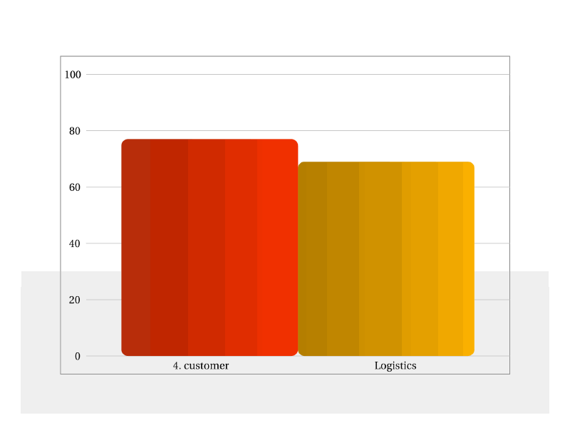
Im surprised you say that the plot width is the same as the bar width. See my image - imho the width is not the same.
No, i dont need one bar wider than the other. It would be great if the two bars (in the image) wouldnt be that wide. Thats all.
cheers
Rodrigo Araújo
Sep 26, 2012, 10:44:35 PM9/26/12
to cair...@googlegroups.com
I didn't mean it, but considering what I wrote, you have a valid point.
--
Rodrigo Araújo
What I really meant was that the bar widths are calculated based on the plot width, so the bar widths are all equal (that's why both the orange and red bars have the same width on your picture). Those are calculated by subtracting some predefined margin off the plot width and dividing the remaining value by the number of bars.
In order to achieve the effect you want, you'd have to modify the render_horz_labels and render_plot methods on the VerticalBarPlot class.
Sorry for the misunderstanding,
Rodrigo
To view this discussion on the web visit https://groups.google.com/d/msg/cairoplot/-/5tF3KtangIwJ.
To post to this group, send email to cair...@googlegroups.com.
To unsubscribe from this group, send email to cairoplot+...@googlegroups.com.
For more options, visit this group at http://groups.google.com/group/cairoplot?hl=en.
Rodrigo Araújo
rand0m
Sep 28, 2012, 10:47:41 AM9/28/12
to cair...@googlegroups.com
Hi Rodrigo,
See the attachment for the patch.
This patch lets a developer specify the width (see attachment: _vbar_6_x_labels.svg) of a bar instead of just using all available space (see attachment: ugly-width.png).
The drawback of this patch is that the bar width must be configured in the code and cannot be set via parameter.
If you like the patch, please add it to the next release of cairoplot.
I d appreciate any feedback on this patch, since it is the first time I wrote one for the public.
cheers
rand0m
Sep 28, 2012, 11:05:15 AM9/28/12
to cair...@googlegroups.com
Pls note I patched cairoplot.py in version 1.1.
rand0m
Sep 29, 2012, 7:25:09 AM9/29/12
to cair...@googlegroups.com
Could you tell me what version of cairo and pycairo you use to work with cairoplot?
On Thursday, September 27, 2012 4:44:36 AM UTC+2, Rodrigo Araujo wrote:
On Thursday, September 27, 2012 4:44:36 AM UTC+2, Rodrigo Araujo wrote:
rand0m
Oct 1, 2012, 4:40:21 AM10/1/12
to cair...@googlegroups.com
I've made a few changes and added the whole cairoplot.py file i've worked on. there are 3 TODO comments that are not yet working correctly. Maybe Rodrigo could have a quick look at them? Unfortunately I dont find the time to fix them.
On Friday, September 28, 2012 4:47:41 PM UTC+2, rand0m wrote:
On Friday, September 28, 2012 4:47:41 PM UTC+2, rand0m wrote:
Reply all
Reply to author
Forward
0 new messages