Thoughts on how the API should work

Rodrigo Araújo
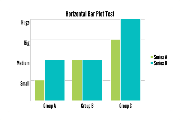
a_series = series.Series('Series A', [10, 20, 30])
b_Series = series.Series('Series B', [20, 20, 40])
data = [a_series, b_series)
#creating the chart
bar_chart = cairoplot.VerticalBarPlot(data, 600, 400)
#padding equal to 30 pixels | Default = 10 or 20 or 30
#it means 30px will be deduced from each side of the image
bar_chart.padding = 30
#displaying main axis variables | Default = (True, True)
#option 1
bar_chart.axis = (True, True)
#option 2
bar_chart.x_axis = True
bar_chart.y_axis = True
#displaying label lines | Default = True if vertical labels are provided
#it should be impossible to display vertical lines
bar_chart.label_lines = True
#displaying legend | Default = Right
#available options should include left, bottom, right and box
bar_chart.legend = 'right'
#defining labels | Default = no labels
#In the future, we might add support for multiple levels of labels
#option 1
bar_chart.labels = (('Group A', 'Group B'), ('Small', 'Medium', 'Big', 'Huge'))
#option 2
bar_chart.x_labels = ('Group A', 'Group B')
bar_chart.y_labels = ('Small', 'Medium', 'Big', 'Huge')
#defining focus on B Series | Default = no focus
#focused series have double the width of the other ones
bar_chart.focus = (False,True)
#setting the title | Default = no title
bar_chart.title = 'Horizontal Bar Plot Test'
#saving the chart
bar_chart.save('horizontal_example.png')
a_series = series.Series('Series A', [10, 20, 30])
b_Series = series.Series('Series B', [20, 20, 40])
data = [a_series, b_series)
bar_chart = cairoplot.VerticalBarPlot(data, 600, 400)
bar_chart.padding = 30
bar_chart.labels = (('Group A', 'Group B'), ('Small', 'Medium', 'Big', 'Huge'))
bar_chart.focus = (False,True)
bar_chart.title = 'Horizontal Bar Plot Test'
bar_chart.save('horizontal_example.png')
Rodrigo Araújo