[Breach] Showtime! Breach v0.3.15.apha.3 Release
106 views
Skip to first unread message

Stanislas Polu
Jun 24, 2014, 9:54:12 PM6/24/14
to breac...@googlegroups.com
Hi all!
Release: Breach v0.3.15-alpha.3
Download Links:
Darwin (ia32): http://bit.ly/1nDZ0KL
Linux (x64): http://bit.ly/1mlKhr9
Summary:
Third alpha-release candidate for Breach v0.3.x! Including:
- Onboarding
- Enhanced URL display
- Tab color sniffing and loading bar
- Tabs filtering
- Enhanced module manager (more commands)
- Enhanced module output
- Fixed devtools
- Fixed a nasty bug in the cookie storage layer
Dependencies Versions:
ExoBrowser: v0.6.1916
GiG.fs: v0.2.5
Chromium: 35.0.1916.114
Node.JS: 0.11.14
Instructions:
- If you don't have breach installed yet (WTF?):
Download. Run. Enjoy onboarding.
- If you already have breach installed (FTW!):
Go to the module manager to update breach and then `mod_layout` after restart.
You can replay the onboarding by removing all modules and restarting breach.
Known Issues:
- mod_stats still under development
- no update notification in `mod_layout`
Important Notice:
As always, your feedback is more than welcome!
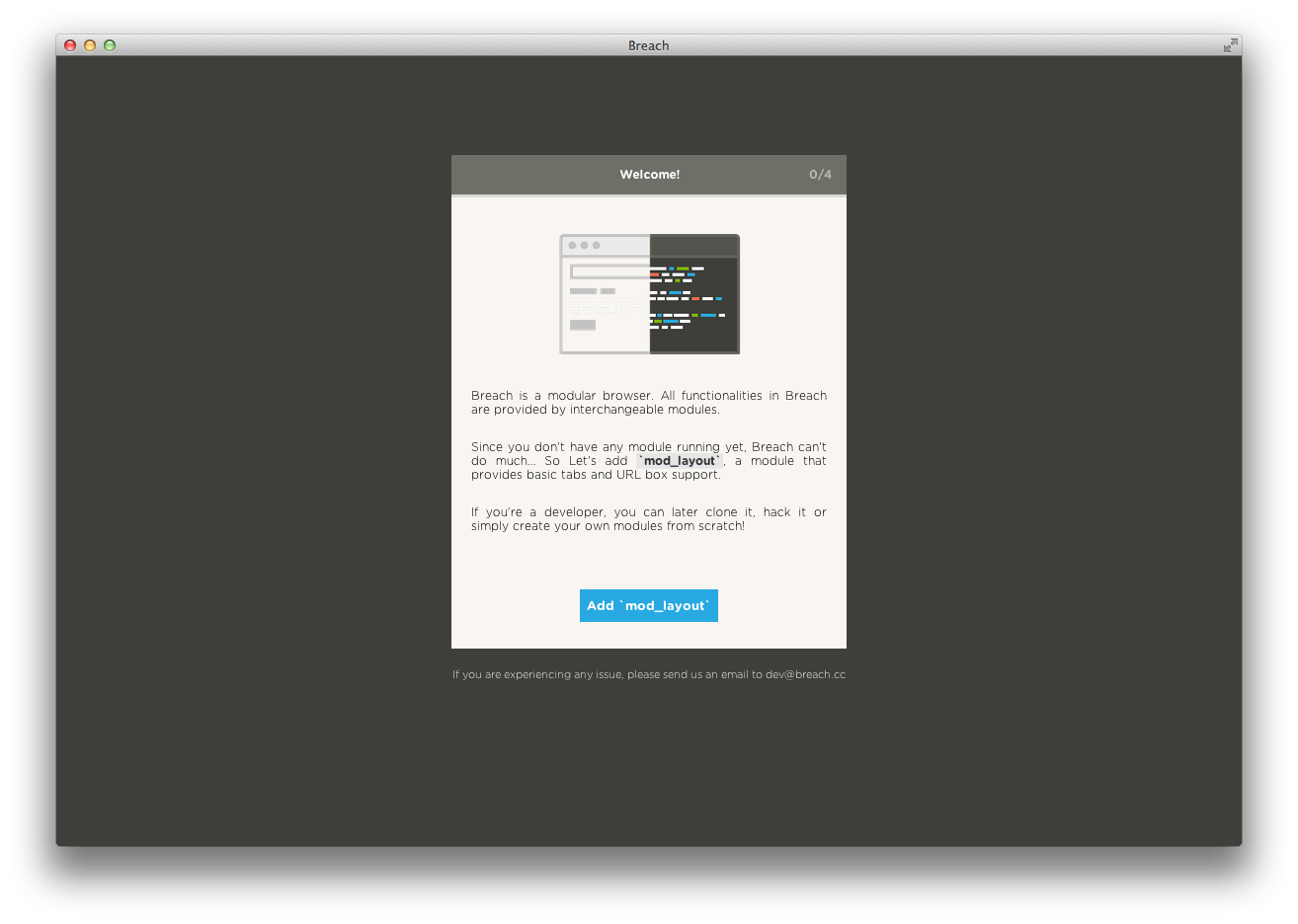
Onboarding:
Cheers!
-stan
Stanislas Polu
Mo: +1 415 216 5700 | Tw: @spolu

Yann Person
Jul 1, 2014, 5:10:46 PM7/1/14
to breac...@googlegroups.com
Hey Stan,
I reinstalled from scratch on Yosemite Beta 2. Nice onboarding. Just a small issue: the "1/4" displayed on top right wasn't updated during the process. Even when mod_layout was fully installed and running, it was still "1/4".
I'm not a big fan of the bold font for the address bar. All the other pieces of text in Breach are much thinner except this one. It doesn't feel "right", it seems too bold.
I still have the issue where the page is blank after loading (Yosemite /o\).
In the address bar, when you go on pages like https://fr-fr.facebook.com/, all the address is in bold except the "/" character. I understand that for any other more complex address it makes sense but here on a simple one I'd prefer everything in bold or everything normal. Not a mix :)
For the popup windows, is it possible to block them by default and let the user choose if he/she wants them or not?
Right now, it's a pain compared to other browsers because Breach always opens them.
Is it me or you added a search feature in the address bar that searches in the current opened tabs?
-> If it was there previously, I didn't see it.
-> If it's new: AWESOME. FAST. I WANT IT.
The colors for each tab are fine for me. Not too bright, not too pale, it really adds some kind of "feeling" I don't have with normal browsers like Chrome.
Why are the previous/next buttons always clickable (blue color when mouse over) even though I didn't navigate yet? For me just the previous one should be usable, not the next one.
That's it for tonight :)
Cheers,
Yann
Yann Person
Jul 1, 2014, 5:14:58 PM7/1/14
to breac...@googlegroups.com
Oh another thing, the horizontal scrolling when you have a lot of opened tabs is really cool. With the trackpad, it's really easy to go from a tab to another.
Combined with the Search feature, it can solve the "mystery of the lost tab" everyone has experienced at least once...
On Wednesday, June 25, 2014 3:54:12 AM UTC+2, Stanislas Polu wrote:
Stanislas Polu
Jul 1, 2014, 5:26:19 PM7/1/14
to Yann Person, breac...@googlegroups.com
Hey Yann! Comments inline:
On Tue, Jul 1, 2014 at 2:10 PM, Yann Person <dre...@gmail.com> wrote:
I reinstalled from scratch on Yosemite Beta 2. Nice onboarding. Just a small issue: the "1/4" displayed on top right wasn't updated during the process. Even when mod_layout was fully installed and running, it was still "1/4".
OK. Will check that!
I'm not a big fan of the bold font for the address bar. All the other pieces of text in Breach are much thinner except this one. It doesn't feel "right", it seems too bold.
Alright, I'll experiment with a different font
I still have the issue where the page is blank after loading (Yosemite /o\).
:/ It'll get better :)
In the address bar, when you go on pages like https://fr-fr.facebook.com/, all the address is in bold except the "/" character. I understand that for any other more complex address it makes sense but here on a simple one I'd prefer everything in bold or everything normal. Not a mix :)
Yep nice catch!
For the popup windows, is it possible to block them by default and let the user choose if he/she wants them or not?Right now, it's a pain compared to other browsers because Breach always opens them.
Not at the moment, this is definitely a feature we want to add later on. The APIs are here to do so but it's a little early for now I think.
Is it me or you added a search feature in the address bar that searches in the current opened tabs?-> If it was there previously, I didn't see it.-> If it's new: AWESOME. FAST. I WANT IT.
Yep it's new :) I like it as well :)
The colors for each tab are fine for me. Not too bright, not too pale, it really adds some kind of "feeling" I don't have with normal browsers like Chrome.Why are the previous/next buttons always clickable (blue color when mouse over) even though I didn't navigate yet? For me just the previous one should be usable, not the next one.
Yep will try to fix that as well!
Thank you so much again for all these comments! I'll file issues accordingly! I'm currently planning a launch on 7/9 or 7/10 on HN/Reddit/ProductHunt, but I'll send you guys un update about that!
Cheers.
Yann Person
Jul 2, 2014, 5:08:14 PM7/2/14
to Stanislas Polu, breac...@googlegroups.com
Hi Stan,
I used a little bit Breach tonight and something bothered me:
when I wanna close several tabs, I usually click on the "X" on the right of the tab, the next tab is displayed under my mouse and I can click again without moving my mouse. Here in Breach, as the "X" only appears when I move and mouse over, I can't close several tabs just by clicking. I have to move a little bit my mouse to get the "X", then click, then move and so on.
It would be perfect if the "X" was there under my mouse without moving. I don't want it to be here all the time, just when my mouse is on it.
Small thing I know, but I prefer to say it so that it's stored somewhere in the Breach features backlog :)
Cheers,
--
Yann Person
Stanislas Polu
Jul 2, 2014, 5:11:17 PM7/2/14
to Yann Person, breac...@googlegroups.com
Nice catch! that's indeed very annoying :)
I'll file an issue. Thanks!

Pedro Marques
Jul 10, 2014, 6:09:14 PM7/10/14
to breac...@googlegroups.com
Hey Stan!
Congratulations on this project! I just installed it and I have a a lot of ideias to work and put them on the street! I'm a UI/UX designer and front end developer, I would love to be part of it!
See ya!
Stanislas Polu
Jul 10, 2014, 6:12:21 PM7/10/14
to Pedro Marques, breac...@googlegroups.com
Thanks Pedro!
Feel free to ping we with whichever question you might have!
--You received this message because you are subscribed to the Google Groups "breach-dev" group.
To unsubscribe from this group and stop receiving emails from it, send an email to breach-dev+...@googlegroups.com.
For more options, visit https://groups.google.com/d/optout.
Stanislas Polu
Jul 11, 2014, 1:54:14 PM7/11/14
to Pedro Marques, breac...@googlegroups.com
Hi Pedro,
There's a new wiki page to list ideas of modules or modules that are work in progress:
On Thu, Jul 10, 2014 at 3:09 PM, Pedro Marques <pedromar...@gmail.com> wrote:
--
Reply all
Reply to author
Forward
0 new messages