Re: Breach UI
160 views
Skip to first unread message

Alejandro Vizio - Aerolab
Jun 3, 2014, 1:38:53 AM6/3/14
to Stanislas Polu, Antoine Llorca, Rauch Guillermo, Yann Person, breac...@googlegroups.com, Jean Lafleur
Hey guys! What´s up?
I’ve working on the browser/onboarding a little bit as we discussed with Stan on Hangout.
It’s very oriented to flat design and taking what Fede & Antoine did :)
I’ve looking very much at the new safari that comes with OS X Yosemite. They’ve managed to crush all features in a very small top bar, which I really like, but the tabs went to another screen, which I think it’s good to organice but highly unpractical for the more experienced user.
Either way what I tried to do In these versions, is play around with this concept. Having everything in a single bar. I’ve tested out a couple of ways of doing this. I’ve played a little bit around with color, black, white, grey. Also tested having a custom topbar or native OS bar.
All test are here for you to see:
A couple of important things/details/thoughts I found interesting:
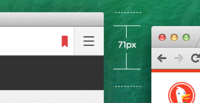
Browsers size is 71px, so if we can hunch everything into a single bar, that means that we save a lot of space. I know saving 21px it’s not that much, but in smaller screens it is :P
What do you think about having various colors to choose from, letting the user decide? This could be put in the settings page.
Maybe for the loading we could use a little load bar that loads the color? Here’s an example:

I thought of a cool idea speaking with Stan this afternoon, maybe we could use a single top bar with the url, and the tabs can be hidden. Maybe with some gesture or just by placing your mouse to the left corner the could appear or some keyboard shortcut. I illustrated a small example of how I would imagine. Check out image 01_breach_browser_ui_grey_single_01.png and 01_breach_browser_ui_grey_single_02.png to get a better understanding.
(@Stan I got confused with another thing for the safari tabs I told you in hangout)
And last but not least, I worked a little bit in on boarding. I think we can do something simple like this for starters and then go to something more complex or not. The idea of on boarding is to simple illustrate how to use breach. We could do it with tooltips or animated arrows. Everything could be driven by a button and a couple of illustrations. Maybe we could ad a skip below?
Check out 01_breach_browser_ui_onboarding.png for this.
Sorry for all the gibberish writing, sometimes I need to write down everything that’s in my head to get things straight.
Let’s discuss this if you’d like :)
Cheers,
 | Alejandro Vizio Creative Director @ aerolab.com.ar |
On Monday, June 2, 2014 at 10:20 PM, Stanislas Polu wrote:
Adding Ale here!Cheers,On Sun, May 11, 2014 at 7:41 PM, Stanislas Polu <polu.st...@gmail.com> wrote:Looks really great!As far as the short URL bar... I don't like it's a big issue. We can even think of UX solutions to easily see the whole URL?One "issue" that it raises still is how the autocomplete would show up with such a short URL bar?Awsome job!Cheers,On Sun, May 11, 2014 at 2:28 PM, Antoine Llorca <antoine...@gmail.com> wrote:Hey guys,Here’s a small iteration based on Federico’s previous mock: vertical and horizontal tabs. The cool thing here really is the small URL bar. I personally like the idea, but it’s unclear to me yet if it’s a good thing for "power users" or not. It’s definitely good for regular and non technical users though.Thoughts?-Antoine
--
Antoine Llorca
On May 7, 2014, at 11:09 PM, Antoine Llorca <antoine...@gmail.com> wrote:
Hey Federico,
Nice to meet you, and nice mock! I’ll sketch some thoughts I have as well and let’s talk from there.
Best,
-Antoine
--
Antoine Llorca
On May 7, 2014, at 7:09 PM, Stanislas Polu <polu.st...@gmail.com> wrote:Oh and also, as you must already know, we need to have a design that works for vertical and horizontal tabs as we'd like to have both disposition available as two different modules.
You can of course focus on the one you feel more confortable with first.
Cheers,
-stan
--
Stanislas Polu
Mo: +1 415 216 5700 | Tw: @spolu
On Wed, May 7, 2014 at 11:07 AM, Stanislas Polu <polu.st...@gmail.com> wrote:
Federico,
Please meet Antoine. Antoine is a designer at Palantir and a friend. He knows Breach very well and has already done some thinking on the UI.
Antoine,
Please meet Federico. Federico is one of the awesome guys behind Popcorn Time. He already proposed an interesting design for the UI of Breach.
Antoine, Federico, that would be awesome if you could join forces together on this one and collaborate to come up with the most awesome UI for Breach.
Some contraints: We mentioned the ability to have frameless windows. I think this is an important requirement but not important enough for the alpha release. So your first design will have to do with the standard OSX/GTK frame. I know it's a pain but we have to take it step by step and try to push an alpha version out there as fast as possible. I'm sure you'll understand! :)
Feel free to create an issue in Github / Join IRC / Use the mailing list to get feedback etc...
Cheers!
-stan
--
Stanislas Polu
Mo: +1 415 216 5700 | Tw: @spolu

Stanislas Polu
Jun 3, 2014, 11:51:02 AM6/3/14
to Alejandro Vizio - Aerolab, Antoine Llorca, Rauch Guillermo, Yann Person, breac...@googlegroups.com, Jean Lafleur
Thanks Ale for the hard work you've put in it! You rock. Comments inline!
On Mon, Jun 2, 2014 at 10:38 PM, Alejandro Vizio - Aerolab <alej...@aerolab.com.ar> wrote:
I’ve looking very much at the new safari that comes with OS X Yosemite. They’ve managed to crush all features in a very small top bar, which I really like, but the tabs went to another screen, which I think it’s good to organice but highly unpractical for the more experienced user.
Agreed, since we're targeting experienced users for now, we should stick with something very practical (I'm even having second thought about whether we should push for a vertical tabs layout along with the classical horizontal tab?). The whole point of breach is to empower our users to build what they want to use. I'm confident they'll come up with some crazy shit on their own :)
So as you suggest, let's focus on the simple, practical, classical horizontal tabs usecase. And let's try to take it to the next level and make it so awesome, no one will want to open safari/chrome again!
Either way what I tried to do In these versions, is play around with this concept. Having everything in a single bar. I’ve tested out a couple of ways of doing this. I’ve played a little bit around with color, black, white, grey. Also tested having a custom topbar or native OS bar.
All test are here for you to see:
This is sick!
Note: the custom topbars are so awesome! But as discused with Ale, this is possible later on. But it's a substantial amount of code to add to the platform and this is probably out of scope for the alpha. But be patient we'll come to it eventually! :)
Browsers size is 71px, so if we can hunch everything into a single bar, that means that we save a lot of space. I know saving 21px it’s not that much, but in smaller screens it is :P
I agree it does matter and it's a great thing to keep in mind IMHO.
What do you think about having various colors to choose from, letting the user decide? This could be put in the settings page.
We can totally make the module in charge of the tabs/layout react to some messages to change the css used (and let the users pick between dark / light during onboarding). We'll also be able to add a tutorial for the users to hack their own CSS.
Maybe for the loading we could use a little load bar that loads the color? Here’s an example:

LGTM!
I thought of a cool idea speaking with Stan this afternoon, maybe we could use a single top bar with the url, and the tabs can be hidden. Maybe with some gesture or just by placing your mouse to the left corner the could appear or some keyboard shortcut. I illustrated a small example of how I would imagine. Check out image 01_breach_browser_ui_grey_single_01.png and 01_breach_browser_ui_grey_single_02.png to get a better understanding.(@Stan I got confused with another thing for the safari tabs I told you in hangout)
We can make the left-side tabs control appear each time the user switch tab with the keyboard. I've played with it quite a bit
And last but not least, I worked a little bit in on boarding. I think we can do something simple like this for starters and then go to something more complex or not. The idea of on boarding is to simple illustrate how to use breach. We could do it with tooltips or animated arrows. Everything could be driven by a button and a couple of illustrations. Maybe we could ad a skip below?
Check out 01_breach_browser_ui_onboarding.png for this.
Looks great. Basically the onboarding is about making the user realise that he is installing a layout/tabbing module and configure it (black/white) (vertical/horizontal) so that she understands that she can write from scratch her own layouting module or customize the existing one, etc...
Questions:
@Ale: Loading bar: so the loading bar goes from grey to the color of the website. The color of the website being defined by the favicon right? Then the full bar stays displayed with the main color of the website right?
@Everyone: What do you think of the short URL bar next to the tabs in horizontal tabbing mode?
Cheers!

Guillermo Rauch
Jun 3, 2014, 1:18:06 PM6/3/14
to Stanislas Polu, Alejandro Vizio - Aerolab, Antoine Llorca, Yann Person, breac...@googlegroups.com, Jean Lafleur
For the progress bar color are you thinking about computing the average of the favicon color scheme, or reading it from the CSS of the page?
Stanislas Polu
Jun 3, 2014, 1:26:40 PM6/3/14
to Guillermo Rauch, Alejandro Vizio - Aerolab, Antoine Llorca, Yann Person, breac...@googlegroups.com, Jean Lafleur
That's a good question.
`dominant gammut bucket` of the favicon seems like a simple & good approach to me.
Going for the CSV might be too slow?
Stanislas Polu
Jun 3, 2014, 1:30:13 PM6/3/14
to Guillermo Rauch, Alejandro Vizio - Aerolab, Antoine Llorca, Yann Person, breac...@googlegroups.com, Jean Lafleur
Sorry I meant `dominant hue bucket` of the favicon
Alejandro Vizio - Aerolab
Jun 3, 2014, 2:48:50 PM6/3/14
to Stanislas Polu, Guillermo Rauch, Antoine Llorca, Yann Person, breac...@googlegroups.com, Jean Lafleur
Awesome! Glad you liked it @stan!
Regarding the colors, wasn’t the idea to use this http://lokeshdhakar.com/projects/color-thief/ ?
Find the dominant color in the webpage? or take the favicon was the idea, maybe that´s easier. Which ever works better for you :)
Let´s keep working on this, it´s looking cool :P
| Alejandro Vizio Creative Director @ aerolab.com.ar |
Stanislas Polu
Jun 3, 2014, 2:53:52 PM6/3/14
to Alejandro Vizio - Aerolab, Guillermo Rauch, Antoine Llorca, Yann Person, breac...@googlegroups.com, Jean Lafleur
Oh! didn't remember we metioned this one. Looks perfect!
Will work on the favicon perfectly.
Not a good idea to attempt running it on the webpage (even though we have the api to extract image dumps of a page) since we would have to wait for the whole page to load entirely and then dump it which is costly!
Let's kick it!

Antoine Llorca
Jun 3, 2014, 3:04:53 PM6/3/14
to Stanislas Polu, Alejandro Vizio - Aerolab, Guillermo Rauch, Yann Person, breac...@googlegroups.com, Jean Lafleur
Nice stuff. My only question: should we display the colored line only on the active tab? On the one hand, it's a good indicator to quickly recognize tabs - although some might often be similar -, and on the other hand it might become too colorful/rainbowy.
-Antoine
--
Antoine Llorca
Antoine Llorca
Stanislas Polu
Jun 3, 2014, 3:06:34 PM6/3/14
to Antoine Llorca, Alejandro Vizio - Aerolab, Guillermo Rauch, Yann Person, breac...@googlegroups.com, Jean Lafleur
Excellent point! I guess we'll be able to test it easily... fully saturated lines for all the tabs will probably be too rainbowy indeed... :)

Yann Person
Jun 3, 2014, 3:13:09 PM6/3/14
to Stanislas Polu, Alejandro Vizio - Aerolab, Guillermo Rauch, Antoine Llorca, breac...@googlegroups.com, Jean Lafleur
Hey everyone,
- onboarding:
Some remarks on the different designs from Ale (which are all pretty much awesome!):
- black.png:
Really like the address bar + tabs integrated in one single bar. One weird thing is the favicon repeated twice in this configuration, maybe it could be removed from one of the two, no?
For sure a smaller height is always interesting, I'm a big fan of "simple" things and this heads straight in that direction :)
- black&white_2bars:
Weird. The two bars seem completely different. So much space lost in the address bar. Definitely not the best one. It feels like a random browser...not an awesome one.
- black+topbar:
Like the first one, this one feels right. The topbar is a little bit "empty"... it looks like any other apps on Mac which is a good thing for "normal" users. Still the double favicon that bothers me
- grey_2bars:
Too big. It's better in grey than in b&w though.
- grey_2bars+topbar:
So so so so big.
- grey_single_01:
Looks like the latest Safari :) Just as Stan, I think the tabs are essential, at least at the beginning.
- grey_single_02:
The idea is good, could come later as an enhancement that users can easily hack.
- grey+topbar:
Really nice. Like the first (black) but with the topbar, could be a good first try.
- onboarding:
The green is perfect for the onboarding.
- white:
Really like the colored buttons (close/minimize/..)
- white+topbar:
A good compromise :)
Regarding the line for loading status of each page, can we have a colored line for the active tab and grey lines for the others ?
--
Yann Person
Stanislas Polu
Jun 3, 2014, 3:21:42 PM6/3/14
to Yann Person, Alejandro Vizio - Aerolab, Guillermo Rauch, Antoine Llorca, breac...@googlegroups.com, Jean Lafleur
Thanks Yann for the feedback, that's really helpful.
- The presence of the native topbar is more a constraint for now (we can free that constraint later on but that require quite some code). So we'll go with it for now even though we probably all prefer the design without the native topbar...
- Good to know you like the short url bar design on one line. I guess we'll experiment with it and se how it feels using it!
- We can totally go for grey for inactive and colored for active tabs as discussed with Antoine.
Thanks again! Super helpful feedback.
Cheers,
Antoine Llorca
Jun 3, 2014, 3:22:42 PM6/3/14
to Yann Person, Stanislas Polu, Alejandro Vizio - Aerolab, Guillermo Rauch, breac...@googlegroups.com, Jean Lafleur
To your point regarding the double favicon, in the mock I sent a while ago I had a padlock near the URL to indicate if it's secure or not (https vs http). I think we should keep that somehow, and the way I had it avoided double favicon.
I'd be curious to try a 100% Yosemite approach for Breach. The challenge would be to somehow add tabs in the new toolbar UI, but I think it's possible. We're actually not too far from it right now.
-Antoine
On Tue, Jun 3, 2014 at 12:12 PM, Yann Person <dre...@gmail.com> wrote:
Antoine Llorca
Yann Person
Jun 3, 2014, 3:24:26 PM6/3/14
to Antoine Llorca, Stanislas Polu, Alejandro Vizio - Aerolab, Guillermo Rauch, breac...@googlegroups.com, Jean Lafleur
Fully agree on the http/https icon, it would be like Chrome and it feels natural.
--
Yann Person
Stanislas Polu
Jun 3, 2014, 4:03:58 PM6/3/14
to Antoine Llorca, Yann Person, Alejandro Vizio - Aerolab, Guillermo Rauch, breac...@googlegroups.com, Jean Lafleur
On Tuesday, June 3, 2014, Antoine Llorca <antoine...@gmail.com> wrote:
To your point regarding the double favicon, in the mock I sent a while ago I had a padlock near the URL to indicate if it's secure or not (https vs http). I think we should keep that somehow, and the way I had it avoided double favicon.
Yep!
I'd be curious to try a 100% Yosemite approach for Breach. The challenge would be to somehow add tabs in the new toolbar UI, but I think it's possible. We're actually not too far from it right now.
What do you mean by the toolbar?
Cheers,
-stan
--
-stan
---
+1 415 216 5700 | @spolu
Alejandro Vizio - Aerolab
Jun 3, 2014, 4:36:49 PM6/3/14
to Stanislas Polu, Antoine Llorca, Yann Person, Guillermo Rauch, breac...@googlegroups.com, Jean Lafleur
Yep! I agree and maybe we can still use the https only. Http and the www. I think that chrome hides it and I like it, but if it´s secure it´s important to really let it show.
| Alejandro Vizio Creative Director @ aerolab.com.ar |
Yann Person
Jun 3, 2014, 4:38:04 PM6/3/14
to Alejandro Vizio - Aerolab, Stanislas Polu, Antoine Llorca, Guillermo Rauch, breac...@googlegroups.com, Jean Lafleur
Chrome hides the http/https in some cases but always shows the corresponding icon (secured or not).
--
Yann Person
Antoine Llorca
Jun 3, 2014, 5:24:16 PM6/3/14
to Yann Person, Alejandro Vizio - Aerolab, Stanislas Polu, Guillermo Rauch, breac...@googlegroups.com, Jean Lafleur
I'm all for hiding useless http(s) and www and actually displaying the corresponding padlock for secure or not (https vs http).
-Antoine
--
Antoine Llorca
Antoine Llorca
Alejandro Vizio - Aerolab
Jun 3, 2014, 11:41:44 PM6/3/14
to Antoine Llorca, Yann Person, Stanislas Polu, Guillermo Rauch, breac...@googlegroups.com, Jean Lafleur
+1
Here you gan see in detail the new safari http://www.apple.com/osx/preview/apps/
Looking nifty :)
I’m trying to get a copy of yosemite to test it out a little bit and see what’s it all about
| Alejandro Vizio Creative Director @ aerolab.com.ar |
Stanislas Polu
Jun 4, 2014, 12:10:32 AM6/4/14
to Alejandro Vizio - Aerolab, Antoine Llorca, Yann Person, Guillermo Rauch, breac...@googlegroups.com, Jean Lafleur
Nifty. Yes. But not as good as what we're working on ;-)
I wonder how do you quickly switch between your email and trello on the new Safari. Very curious to see what they pick as solution given their tab model...
-stan
Yann Person
Jun 4, 2014, 1:22:14 AM6/4/14
to Stanislas Polu, Alejandro Vizio - Aerolab, Antoine Llorca, Guillermo Rauch, breac...@googlegroups.com, Jean Lafleur
I installed Yosemite yesterday. In the latest Safari, you have two bars:
- first one on top with close/minimize buttons + address bar + buttons (share/favorites/downloads...)
- second one with the tabs opened. You can horizontally scroll to see all your open tabs.
Then you have the new "bird" view as they call it, you have to click on a button in the first bar to access it. Super NOT easy and NOT fast :-/
--
Yann Person

Anthony MOI
Jun 4, 2014, 2:45:09 AM6/4/14
to Yann Person, Stanislas Polu, Alejandro Vizio - Aerolab, Antoine Llorca, Guillermo Rauch, breac...@googlegroups.com, Jean Lafleur
Awesome!
I really like the unique top bar with everything in it. The colored tabs are very good, and I think it can be cool even with all tabs, if non active ones are not too bright.
The onboarding makes me think of node, but I think it's a good point, because if you think of node when you see it, it means you are in the right place.
Anthony.
--
You received this message because you are subscribed to the Google Groups "breach-dev" group.
To unsubscribe from this group and stop receiving emails from it, send an email to breach-dev+...@googlegroups.com.
For more options, visit https://groups.google.com/d/optout.
Alejandro Vizio - Aerolab
Jun 4, 2014, 9:24:07 AM6/4/14
to Anthony MOI, Yann Person, Stanislas Polu, Antoine Llorca, Guillermo Rauch, breac...@googlegroups.com, Jean Lafleur
Awesome, I think we´re all in the same page :)
@yann do you have a few screenshots of safari to see and measure a couple sizes, see tabs etc?
| Alejandro Vizio Creative Director @ aerolab.com.ar |
Yann Person
Jun 4, 2014, 9:25:12 AM6/4/14
to Alejandro Vizio - Aerolab, Anthony MOI, Stanislas Polu, Antoine Llorca, Guillermo Rauch, breac...@googlegroups.com, Jean Lafleur
I will take some and post them tonight.
--
Yann Person
Yann Person
Alejandro Vizio - Aerolab
Jun 4, 2014, 9:38:36 AM6/4/14
to Yann Person, Anthony MOI, Stanislas Polu, Antoine Llorca, Guillermo Rauch, breac...@googlegroups.com, Jean Lafleur
Stanislas Polu
Jun 4, 2014, 11:42:12 AM6/4/14
to Yann Person, Alejandro Vizio - Aerolab, Anthony MOI, Antoine Llorca, Guillermo Rauch, breac...@googlegroups.com, Jean Lafleur
Thanks Yann for the feedback that's awesome. So this is less disruptive than they let us think through the images they seeded :)
Looking forward to the screenshots!!
Stanislas Polu
Jun 4, 2014, 1:11:21 PM6/4/14
to Yann Person, breac...@googlegroups.com, Alejandro Vizio, Anthony MOI, Antoine Llorca, Guillermo Rauch, Jean Lafleur
Thanks! Well that looks a lot like the old one IMHO...
The bird biew includes top sites right?
That's not much different from the existing safari new tab page, is it?
... but that's probably WiP as well...
Thank you so much Yann!
Yann Person
Jun 4, 2014, 1:17:30 PM6/4/14
to breac...@googlegroups.com, dre...@gmail.com, alej...@aerolab.com.ar, xn1...@gmail.com, antoine...@gmail.com, rau...@gmail.com, jea...@gmail.com
The bird view only includes the tabs opened on your devices. You have all the tabs of your current devices + all tabs opened on your iPhone/iPad at the bottom (displayed as a list, not as a "bird").
The new tab page is almost the same as before. Now with the panel on the left for Shared Links/and so on...
Check the attachment :)
Stanislas Polu
Jun 4, 2014, 1:37:57 PM6/4/14
to Yann Person, breac...@googlegroups.com, Alejandro Vizio, Anthony MOI, Antoine Llorca, Guillermo Rauch, Jean Lafleur
Stanislas Polu
Jun 13, 2014, 4:34:08 PM6/13/14
to Yann Person, breac...@googlegroups.com, Alejandro Vizio, Anthony MOI, Antoine Llorca, Guillermo Rauch, Jean Lafleur
Hey guys, here's a `light` version I'm working on with a simplified version of colorthief (colorthief applies a complex algorithm that yields averages/medians when we want actual majoritary values... said simply we want the gmail icon red and not pink).

Let me know what you think. Ale, Antoine, I think we're getting close. This version simply needs a little pimping!
Cheers,
Stanislas Polu
Jun 13, 2014, 4:40:23 PM6/13/14
to Yann Person, breac...@googlegroups.com, Alejandro Vizio, Anthony MOI, Antoine Llorca, Guillermo Rauch, Jean Lafleur
Yann, just pushed a release on github. go to your module page and click update if you want tot try it out!
Cheers,
Alejandro Vizio - Aerolab
Jun 16, 2014, 10:36:05 AM6/16/14
to Stanislas Polu, Yann Person, breac...@googlegroups.com, Anthony MOI, Antoine Llorca, Guillermo Rauch, Jean Lafleur
Woa! looking really awesome!
It works perfectly in my Mavericks OS X
Sorry to be so dense with this, but I´m no convinced 100% with the separation line between the nav and the actual content. Maybe if it was a little bit thinner.
But maybe it´s just me :P
What do you think?
Stanislas Polu
Jun 16, 2014, 11:06:47 AM6/16/14
to Alejandro Vizio - Aerolab, Yann Person, breac...@googlegroups.com, Anthony MOI, Antoine Llorca, Guillermo Rauch, Jean Lafleur
Hehe! This was part of Fede's original design and I like the fact that it feels "different".
But we can definitely try to make it thinner!
Would love to have as many people opinions here!
It's currently 5px. It's chunky indeed. We can try 2 or 3 px thick?
Cheers,
Antoine Llorca
Jun 16, 2014, 11:12:16 AM6/16/14
to Stanislas Polu, Alejandro Vizio - Aerolab, Yann Person, breac...@googlegroups.com, Anthony MOI, Guillermo Rauch, Jean Lafleur
Agreed with the chunkiness! And as I expected, it’s very rainbowy. This piece of UI should get out of the way, and right now it’s all I’m seeing. Can we have the colored line only on the current tab?
-Antoine
On Jun 16, 2014, at 4:06 PM, Stanislas Polu <polu.st...@gmail.com> wrote:
> Hehe! This was part of Fede's original design and I like the fact that it feels "different".
>
> But we can definitely try to make it thinner!
> Would love to have as many people opinions here!
>
> It's currently 5px. It's chunky indeed. We can try 2 or 3 px thick?
>
> Cheers,
>
> <tabs.png>
--
Antoine Llorca
-Antoine
On Jun 16, 2014, at 4:06 PM, Stanislas Polu <polu.st...@gmail.com> wrote:
> Hehe! This was part of Fede's original design and I like the fact that it feels "different".
>
> But we can definitely try to make it thinner!
> Would love to have as many people opinions here!
>
> It's currently 5px. It's chunky indeed. We can try 2 or 3 px thick?
>
> Cheers,
>
>
> -stan
>
> --
> Stanislas Polu
>
> Mo: +1 415 216 5700 | Tw: @spolu
>
>
> On Mon, Jun 16, 2014 at 7:35 AM, Alejandro Vizio - Aerolab <alej...@aerolab.com.ar> wrote:
> Woa! looking really awesome!
>
> It works perfectly in my Mavericks OS X
>
> Sorry to be so dense with this, but I´m no convinced 100% with the separation line between the nav and the actual content. Maybe if it was a little bit thinner.
>
> But maybe it´s just me :P
>
> What do you think?
>
>
>
> Alejandro Vizio
> Creative Director @ aerolab.co
> (+54 11) 4771 8878
>
> On Friday, June 13, 2014 at 5:39 PM, Stanislas Polu wrote:
>
>> Yann, just pushed a release on github. go to your module page and click update if you want tot try it out!
>>
>> Cheers,
>>
>> -stan
>>
>> --
>> Stanislas Polu
>>
>> Mo: +1 415 216 5700 | Tw: @spolu
>>
>>
>> On Fri, Jun 13, 2014 at 1:38 PM, Yann Person <dre...@gmail.com> wrote:
>>> Really like this one. The small vertical tab between the tabs is cool.
>>>
>>> --
>>> Yann Person
>>>
>>> On Fri, Jun 13, 2014 at 10:33 pm, Stanislas Polu <polu.st...@gmail.com> wrote:
>>> Hey guys, here's a `light` version I'm working on with a simplified version of colorthief (colorthief applies a complex algorithm that yields averages/medians when we want actual majoritary values... said simply we want the gmail icon red and not pink).
>>>
>>> Let me know what you think. Ale, Antoine, I think we're getting close. This version simply needs a little pimping!
>>>
>>> <image.png>
> Creative Director @ aerolab.co
> (+54 11) 4771 8878
>
> On Friday, June 13, 2014 at 5:39 PM, Stanislas Polu wrote:
>
>> Yann, just pushed a release on github. go to your module page and click update if you want tot try it out!
>>
>> Cheers,
>>
>> -stan
>>
>> --
>> Stanislas Polu
>>
>> Mo: +1 415 216 5700 | Tw: @spolu
>>
>>
>> On Fri, Jun 13, 2014 at 1:38 PM, Yann Person <dre...@gmail.com> wrote:
>>> Really like this one. The small vertical tab between the tabs is cool.
>>>
>>> --
>>> Yann Person
>>>
>>> On Fri, Jun 13, 2014 at 10:33 pm, Stanislas Polu <polu.st...@gmail.com> wrote:
>>> Hey guys, here's a `light` version I'm working on with a simplified version of colorthief (colorthief applies a complex algorithm that yields averages/medians when we want actual majoritary values... said simply we want the gmail icon red and not pink).
>>>
>>> Let me know what you think. Ale, Antoine, I think we're getting close. This version simply needs a little pimping!
>>>
>>>>>>>>> Alejandro Vizio
>>>>>>>>> Creative Director @ aerolab.com.ar
>>>>>>>>> (+54 11) 4771 8878
>>>>>>>>> On Wednesday, June 4, 2014 at 3:45 AM, Anthony MOI wrote:
>>>>>>>>>
>>>>>>>>> Awesome!
>>>>>>>>>
>>>>>>>>> I really like the unique top bar with everything in it. The colored tabs are very good, and I think it can be cool even with all tabs, if non active ones are not too bright.
>>>>>>>>> The onboarding makes me think of node, but I think it's a good point, because if you think of node when you see it, it means you are in the right place.
>>>>>>>>>
>>>>>>>>> Anthony.
>>>>>>>>>
>>>>>>>>> On Wed, Jun 4, 2014 at 7:21 AM, Yann Person <dre...@gmail.com> wrote:
>>>>>>>>> I installed Yosemite yesterday. In the latest Safari, you have two bars:
>>>>>>>>> - first one on top with close/minimize buttons + address bar + buttons (share/favorites/downloads...)
>>>>>>>>> - second one with the tabs opened. You can horizontally scroll to see all your open tabs.
>>>>>>>>>
>>>>>>>>> Then you have the new "bird" view as they call it, you have to click on a button in the first bar to access it. Super NOT easy and NOT fast :-/
>>>>>>>>>
>>>>>>>>> --
>>>>>>>>> Yann Person
>>>>>>>>>
>>>>>>>>>
>>>>>>>>> On Wed, Jun 4, 2014 at 6:10 AM, Stanislas Polu <polu.st...@gmail.com> wrote:
>>>>>>>>> Nifty. Yes. But not as good as what we're working on ;-)
>>>>>>>>>
>>>>>>>>> I wonder how do you quickly switch between your email and trello on the new Safari. Very curious to see what they pick as solution given their tab model...
>>>>>>>>>
>>>>>>>>> -stan
>>>>>>>>>
>>>>>>>>>
>>>>>>>>> On Tuesday, June 3, 2014, Alejandro Vizio - Aerolab <alej...@aerolab.com.ar> wrote:
>>>>>>>>> +1
>>>>>>>>>
>>>>>>>>> Here you gan see in detail the new safari http://www.apple.com/osx/preview/apps/
>>>>>>>>>
>>>>>>>>> Looking nifty :)
>>>>>>>>>
>>>>>>>>> I’m trying to get a copy of yosemite to test it out a little bit and see what’s it all about
>>>>>>>>>
>>>>>>>>>
>>>>>>>>> Alejandro Vizio
>>>>>>>>> Creative Director @ aerolab.com.ar
>>>>>>>>> (+54 11) 4771 8878
>>>>>>>>> On Tuesday, June 3, 2014 at 6:23 PM, Antoine Llorca wrote:
>>>>>>>>>
>>>>>>>>> I'm all for hiding useless http(s) and www and actually displaying the corresponding padlock for secure or not (https vs http).
>>>>>>>>>
>>>>>>>>> -Antoine
>>>>>>>>>
>>>>>>>>>
>>>>>>>>> On Tue, Jun 3, 2014 at 1:37 PM, Yann Person <dre...@gmail.com> wrote:
>>>>>>>>> Chrome hides the http/https in some cases but always shows the corresponding icon (secured or not).
>>>>>>>>>
>>>>>>>>> --
>>>>>>>>> Yann Person
>>>>>>>>>
>>>>>>>>>
>>>>>>>>> On Tue, Jun 3, 2014 at 10:36 PM, Alejandro Vizio - Aerolab <alej...@aerolab.com.ar> wrote:
>>>>>>>>> Yep! I agree and maybe we can still use the https only. Http and the www. I think that chrome hides it and I like it, but if it´s secure it´s important to really let it show.
>>>>>>>>>
>>>>>>>>>
Antoine Llorca
Alejandro Vizio - Aerolab
Jun 16, 2014, 11:22:53 AM6/16/14
to Antoine Llorca, Stanislas Polu, Yann Person, breac...@googlegroups.com, Anthony MOI, Guillermo Rauch, Jean Lafleur
Agreed with Antoine, maybe just the color appears in the selected tab and others are greyed out?
We could maybe try 3 or 2px ¯\_(ツ)_/¯
Alejandro Vizio | |
Anthony MOI
Jun 16, 2014, 4:20:19 PM6/16/14
to Alejandro Vizio - Aerolab, Antoine Llorca, Stanislas Polu, Yann Person, breac...@googlegroups.com, Guillermo Rauch, Jean Lafleur
I agree with Alejandro and Antoine about the separation line, but I like the colors though. Maybe a little less visible on non-selected tabs could be better ?
Anthony MOI
Jun 16, 2014, 5:39:24 PM6/16/14
to Alejandro Vizio - Aerolab, Antoine Llorca, Stanislas Polu, Yann Person, breac...@googlegroups.com, Guillermo Rauch, Jean Lafleur
Tried three different versions:
1. thinner separation line (3px), colors less visible on non-selected tabs
2. same as 1 but lighter grey
3. same as 1 but without colors on non-selected tabs
Stanislas Polu
Jun 16, 2014, 5:43:13 PM6/16/14
to Anthony MOI, Alejandro Vizio - Aerolab, Antoine Llorca, Yann Person, breac...@googlegroups.com, Guillermo Rauch, Jean Lafleur
Nice!
- I think I'm fine with the colors of the non-selected tabs. Slightly "rainbowy" but it's recognizable and helps with overall "branding".
- Lighter grey may be an issue on certain websites (light ones) ?
- Apparently the thiner bar makes the consensus. Can you make a PR for that to get started? :)
Thanks!
Cheers,
Stanislas Polu
Jun 16, 2014, 5:44:54 PM6/16/14
to Anthony MOI, Alejandro Vizio - Aerolab, Antoine Llorca, Yann Person, breac...@googlegroups.com, Guillermo Rauch, Jean Lafleur
One other thing I did not realize before seeing your tests is that the underlying separation bar is seen through the alpha of the non selected tab loading bars. Which is probably not what we want...
Yann Person
Jun 17, 2014, 5:10:48 AM6/17/14
to Stanislas Polu, Anthony MOI, Alejandro Vizio - Aerolab, Antoine Llorca, breac...@googlegroups.com, Guillermo Rauch, Jean Lafleur
@Anthony: Option 2 with the light grey seems to be a good solution, the colors are still visible and it isn't a complete rainbow :)
--
Yann Person
Yann Person
Jun 17, 2014, 4:54:23 PM6/17/14
to breac...@googlegroups.com, polu.st...@gmail.com, xn1...@gmail.com, alej...@aerolab.com.ar, antoine...@gmail.com, rau...@gmail.com, jea...@gmail.com
I just installed Beta 2 of Yosemite, I still face the issue of the blank page after loading :)
I don't know if it's directly linked but it happens when I click a link on the page before the loading of the entire page is finished.
Otherwise, Breach works \o/
--Yann Person
To unsubscribe from this group and stop receiving emails from it, send an email to breach-dev+unsubscribe@googlegroups.com.
For more options, visit https://groups.google.com/d/optout.
--You received this message because you are subscribed to the Google Groups "breach-dev" group.
To unsubscribe from this group and stop receiving emails from it, send an email to breach-dev+unsubscribe@googlegroups.com.
For more options, visit https://groups.google.com/d/optout.
--Antoine Llorca
Stanislas Polu
Jun 17, 2014, 4:58:23 PM6/17/14
to Yann Person, breac...@googlegroups.com, Anthony MOI, Alejandro Vizio, Antoine Llorca, Guillermo Rauch, Jean Lafleur
Thanks for the update. For now this is rather low priority as this is very probably an issue in the content module which does not target Yosemite ATM.
I'll push an update of `mod_layout` very soon with the latest change as well as an update of Breach itself to check that it works correctly! :)
Cheers
Julius Klaus
Sep 12, 2014, 7:19:12 PM9/12/14
to breac...@googlegroups.com, polu.st...@gmail.com, antoine...@gmail.com, rau...@gmail.com, dre...@gmail.com, jea...@gmail.com, ha...@juliusklaus.de
Hej guys!
I developed a short, animated UI concept that features benefits of motion in its interface. As most browsers don't use it yet, I regard it as one important improvement to make it more intuitive and easier to understand. But as I'm not a developer I have no idea what is actually realizable of it. So I would love to hear what you think and what's actually possible.
+++++
Changelog:
1. Contrast in UI to enhance user focus on more important elements at the right time
- Merged all the color shades to one (they are barely visible anyways)
- unified height of elements and aligned them properly
- Reduced height of active tab indicator to 4px
- introduced some new icons (entypo suite; just meant to be placeholders) to be able communicating some things way clearer
2. Simplified interface, unnessecary elements are hidden and only come up when needed
- Tabs use 100% of available space
- adressbar hidden in tabs, only appears when creating a new tab or hovering an existing one (possible attempt to change adress of tab)
- only active tab uses color and get indicator, inactive tab is b/w (indicator should animate when tab changes)
- fullscreen mode: only left UI element is indicator, by moving cursor to top edge the whole bar slides down
3. Intelligent search bar in use when adding a new tab
- as nothing is typed, it shows bookmarks in a simple list structure
- when user starts typing, automatic search is used with predefined favoured search engine…
… searching bookmarks first,
… then history
… and finally new sites (web search)
+ A big difference to existing browsers that breach could make is to indicate every interaction with the interface by clear motion of the elements, making it to appear more fluent and increasing the chance of initial understatement of the interface when first used
++ default startpage could be a nice overview of all saved bookmarks
+++ All existing icons and their meanings could be revised, as some industry standards might be outdated or leave room for improvements
Guillermo Rauch
Sep 14, 2014, 9:43:21 AM9/14/14
to Julius Klaus, breac...@googlegroups.com, Stanislas Polu, Antoine Llorca, Yann Person, Jean Lafleur, ha...@juliusklaus.de
This is beautiful. One thing I've been considering is to do instant search by default, with pluggable providers (DDG, Google, etc). That could be superior to a floating pane. As you type, the tab populates with results in realtime.
Stanislas Polu
Sep 17, 2014, 11:33:14 AM9/17/14
to Guillermo Rauch, Julius Klaus, breac...@googlegroups.com, Antoine Llorca, Yann Person, Jean Lafleur, Julius Klaus
I think something along the lines of instant-search + tab search within that instant-search zone could be very powerful indeed.
Reply all
Reply to author
Forward
0 new messages