functions nodebar and inset
59 views
Skip to first unread message

Sebastian Kirchhof
Jan 2, 2021, 12:56:02 PM1/2/21
to ggtree
Dear all,
Happy New Year!
May I re-post my question regarding the functions nodebar and inset.
My
goal is to plot absolute values of a trait along all the branches of a
tree, preferably maybe even with some sort of bubble plot where size is
correlated with the value.
In this example I try it with a
barplot along the branches. ( In addition I plot a stacked barplot of
another trait at the tips.)
#load libraries
library(ggtree)
library(phytools)
library(ape)
library(ggimage)
library(reshape2)
library(dplyr)
library(ggstance)
library(ggtreeExtra)
#create random tree with 3 species t1, t2, t3
tr <- rtree(3)
tr2 <- ggtree(tr)
tr2
p <- ggtree(tr)+ geom_tiplab()
p
#create data frame for barplot of percentage occurrence of random traits - first column must match tree tip label
specs <- matrix(c("t1",43,1,"t1",57,2,"t2",60,1,"t2",40,2,"t3",10,1,"t3",90,2),ncol=3,byrow=TRUE)
colnames(specs) <- c("species","value","cat")
rownames(specs) <- c("Spec1","Spec2","Spec3")
specs <- as.data.frame(specs)
specs
#column 2 "value' needs to be converted to numeric
specs$value <- as.numeric(as.character(specs$value))
specs1 <- as.data.frame(specs)
p3 <- facet_plot(p, panel = 'Stacked Barplot', data = specs1,
geom = geom_barh,
mapping = aes(x = value, fill = as.factor(cat)),size=1,stat='identity')
p3
#create dataframe with data for 5 nodes to be plotted along each branch - values are absolute and do not add to 100
trait <- matrix(c(30,43,4,1,57,2,3,2,1,12,40,3,33,10,1,4,90,2,4,5),ncol=4,byrow=TRUE)
colnames(trait) <- c("x1","x2","x3",'node')
rownames(trait) <- c("1","2","3","4", "5")
trait <- as.data.frame(trait)
trait
bars <- nodebar(trait, cols=1:3, position='dodge',color=c('blue','red','green'))
bartree <- inset(tr2, bars, x='branch',width=.06, height=0.3,hjust=0)
bartree
p4 <- facet_plot(bartree, panel = 'Stacked Barplot', data = specs1,
geom = geom_barh,
mapping = aes(x = value, fill = as.factor(cat)),size=1,stat='identity')
p4
p5 <- p4+geom_tiplab()
p5
# tried to adjust the window grids
library(grid)
library(gtable)
gt = ggplot_gtable(ggplot_build(p5))
gtable_show_layout(gt)
#look at layout in table
gt
gt$widths[7] = 0.4*gt$widths[7]
gt$layout$l[grep('panel-2', gt$layout$name)]
grid.draw(gt)
#the stacked barplot is still to high but anyway
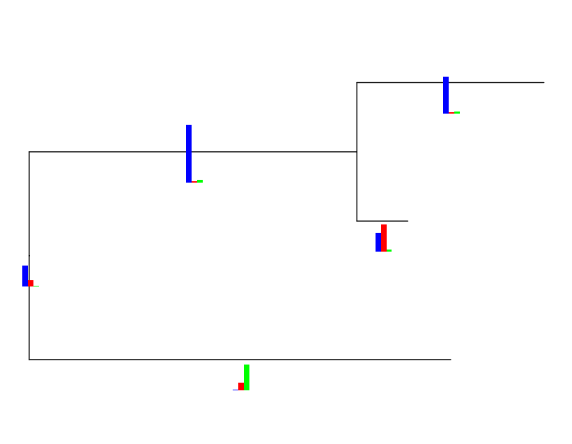
As you will see, in the barplots along the branches, the highest bar is always of the same height, no matter if the value is e.g 57, 33 or 90 (blue). Or, in green, the bars will be of different height even if they are the same value (i.e. 20 in this example), depending on the other values.
library(ggtree)
library(phytools)
library(ape)
library(ggimage)
library(reshape2)
library(dplyr)
library(ggstance)
library(ggtreeExtra)
#create random tree with 3 species t1, t2, t3
tr <- rtree(3)
tr2 <- ggtree(tr)
tr2
p <- ggtree(tr)+ geom_tiplab()
p
#create data frame for barplot of percentage occurrence of random traits - first column must match tree tip label
specs <- matrix(c("t1",43,1,"t1",57,2,"t2",60,1,"t2",40,2,"t3",10,1,"t3",90,2),ncol=3,byrow=TRUE)
colnames(specs) <- c("species","value","cat")
rownames(specs) <- c("Spec1","Spec2","Spec3")
specs <- as.data.frame(specs)
specs
#column 2 "value' needs to be converted to numeric
specs$value <- as.numeric(as.character(specs$value))
specs1 <- as.data.frame(specs)
p3 <- facet_plot(p, panel = 'Stacked Barplot', data = specs1,
geom = geom_barh,
mapping = aes(x = value, fill = as.factor(cat)),size=1,stat='identity')
p3
#create dataframe with data for 5 nodes to be plotted along each branch - values are absolute and do not add to 100
trait <- matrix(c(30,43,4,1,57,2,3,2,1,12,40,3,33,10,1,4,90,2,4,5),ncol=4,byrow=TRUE)
colnames(trait) <- c("x1","x2","x3",'node')
rownames(trait) <- c("1","2","3","4", "5")
trait <- as.data.frame(trait)
trait
bars <- nodebar(trait, cols=1:3, position='dodge',color=c('blue','red','green'))
bartree <- inset(tr2, bars, x='branch',width=.06, height=0.3,hjust=0)
bartree
p4 <- facet_plot(bartree, panel = 'Stacked Barplot', data = specs1,
geom = geom_barh,
mapping = aes(x = value, fill = as.factor(cat)),size=1,stat='identity')
p4
p5 <- p4+geom_tiplab()
p5
# tried to adjust the window grids
library(grid)
library(gtable)
gt = ggplot_gtable(ggplot_build(p5))
gtable_show_layout(gt)
#look at layout in table
gt
gt$widths[7] = 0.4*gt$widths[7]
gt$layout$l[grep('panel-2', gt$layout$name)]
grid.draw(gt)
#the stacked barplot is still to high but anyway
As you will see, in the barplots along the branches, the highest bar is always of the same height, no matter if the value is e.g 57, 33 or 90 (blue). Or, in green, the bars will be of different height even if they are the same value (i.e. 20 in this example), depending on the other values.
Is there a possibility to plot those absolute values
using the same scale? Maybe with a bubble plot where I can define
different symbols for each trait and the size of the symbol is
correlated with the absolute number? In my case, I want to plot a ration
of genes under positive selection onto each branch.
Thank you for your help.
Sebastian

Yu, Guangchuang
Nov 12, 2021, 2:02:43 AM11/12/21
to Sebastian Kirchhof, ggtree
```
bars <- nodebar(trait, cols=1:3, position='dodge',color=c('blue','red','green'))
bars <- lapply(bars, function(x) x + ylim(0, 100)) ## force in same scale
bartree <- inset(tr2, bars, x='branch',width=.06, height=0.3,hjust=0)
bartree
```
It is easy to force the bars in the same scale
--
1. G Yu*. Using ggtree to visualize data on tree-like structures. Current Protocols in Bioinformatics. 2020, 69:e96. https://doi.org/10.1002/cpbi.96
2. LG Wang, TTY Lam, S Xu, Z Dai, L Zhou, T Feng, P Guo, CW Dunn, BR Jones, T Bradley, H Zhu, Y Guan, Y Jiang, G Yu*. treeio: an R package for phylogenetic tree input and output with richly annotated and associated data. Molecular Biology and Evolution. 2020, 37(2):599-603. http://dx.doi.org/10.1093/molbev/msz240
3. G Yu*, TTY Lam, H Zhu, Y Guan*. Two methods for mapping and visualizing associated data on phylogeny using ggtree. Molecular Biology and Evolution, 2018, 35(2):3041-3043. https://doi.org/10.1093/molbev/msy194
4. G Yu, DK Smith, H Zhu, Y Guan, TTY Lam*. ggtree: an R package for visualization and annotation of phylogenetic trees with their covariates and other associated data, Methods in Ecology and Evolution, 2017, 8(1):28-36. https://doi.org/10.1111/2041-210X.12628
5. Book: https://yulab-smu.top/treedata-book/
---
You received this message because you are subscribed to the Google Groups "ggtree" group.
To unsubscribe from this group and stop receiving emails from it, send an email to bioc-ggtree...@googlegroups.com.
To view this discussion on the web visit https://groups.google.com/d/msgid/bioc-ggtree/f00980cb-ac50-4188-824c-7218b7d516e5n%40googlegroups.com.
--~--~---------~--~----~------------~-------~--~----~
Guangchuang Yu PhD
Professor, Director
Department of Bioinformatics
School of Basic Medical Sciences
School of Basic Medical Sciences
Southern Medical University
Guangzhou, China
-~----------~----~----~----~------~----~------~--~---
Reply all
Reply to author
Forward
0 new messages