Should we change the main button layout to be more like Anki Desktop?

169 views
Skip to first unread message

Tim

unread,
Mar 20, 2014, 6:16:14 AM3/20/14
to anki-a...@googlegroups.com

VERY rough sketch, but I was thinking something like this...?


Xiao Sun

unread,
Mar 20, 2014, 10:33:56 AM3/20/14
to anki-a...@googlegroups.com
where is the "unbury" button? 

Tim

unread,
Mar 20, 2014, 10:59:38 AM3/20/14
to anki-a...@googlegroups.com
Sorry I have no idea what you're talking about... can you please post a screenshot of the button you're talking about on Anki Desktop?

Xiao Sun

unread,
Mar 20, 2014, 5:47:40 PM3/20/14
to anki-a...@googlegroups.com

Xiao Sun

unread,
Mar 20, 2014, 5:50:35 PM3/20/14
to anki-a...@googlegroups.com
Seem like Ankidroid does not have "unbury" function, I can't find it in the current version.

Tim

unread,
Mar 20, 2014, 7:45:30 PM3/20/14
to anki-a...@googlegroups.com
Ah thanks! Anki Desktop only shows the unbury button when there are cards to unbury so I didn't notice...
AnkiDroid currently only shows the unbury button at the "congratulations" screen when all cards have been reviewed, I've added a new issue:

Xiao Sun

unread,
Mar 20, 2014, 8:52:33 PM3/20/14
to anki-a...@googlegroups.com
Thanks. 

Yes, I think we should move all the buttons to the deck page like the way you proposed (just add unbury and undo buttons), and then we can get rid of the "congratulations" page, that page is pointless.

Tim

unread,
Mar 20, 2014, 9:14:39 PM3/20/14
to anki-a...@googlegroups.com
My question was more to do with moving some of the buttons to the top...

Xiao Sun

unread,
Mar 20, 2014, 10:45:40 PM3/20/14
to anki-a...@googlegroups.com
two birds one stone

Tim

unread,
Mar 20, 2014, 11:17:42 PM3/20/14
to anki-a...@googlegroups.com
Well the "custom study" button is going to be in 2.1... I've just added the unbury button, but it may or may not be included in 2.1 depending on other project members' opinions.
I will consider additionally moving the buttons to the top like in the picture above for 2.2, if users and other developers like this idea.

Alexander Grüneberg

unread,
Mar 21, 2014, 12:23:31 AM3/21/14
to anki-a...@googlegroups.com
I think we should make better use of UI conventions Android users are already familiar with. We could use up-navigation of the action bar instead of displaying a home button (see https://developer.android.com/design/patterns/navigation.html), or maybe even a navigation drawer that lists decks instead of having a deck picker seeing that you put the sync button into the study options (see https://developer.android.com/design/patterns/navigation-drawer.html). I'm not yet sure how backward-compatible all that stuff is, though.

Tim

unread,
Mar 21, 2014, 1:29:32 AM3/21/14
to anki-a...@googlegroups.com
I love the idea of using a navigation drawer, but I'm not sure how much I like the idea of putting the decks in it...

Personally I think it makes more sense to put all of the available views into the navigation drawer - e.g. when at the deck picker maybe at least :
Home / Stats / Sync / Help

Probably add card and browser (with icon-> magnifying glass) could be put directly in the action bar since they are nice to have available from a single tap (btw this would look a lot like the gmail app which is cool).
Some or all of the other options in the menu could also be put into the navigation drawer.
When the profiles feature is eventually implemented, we could have a little drop down arrow like they have in the Play Store for changing accounts.

RE: Backwards compatibility: How about just keeping all the buttons moved to the navigation drawer in their original layout and only disabling them if API < 14?

Eginhard

unread,
Mar 21, 2014, 7:59:35 AM3/21/14
to anki-a...@googlegroups.com
I agree that adhering closer to Android design guidelines would be a good move. It might not look like on Desktop then, but users will be familiar with such a UI from other Android apps and it will make better use of the capabilities of mobile devices. Probably some mockups and navigation flow diagrams would need to be done first to agree on how the new navigation will look like.

Eginhard

Nicolas Raoul

unread,
Mar 21, 2014, 8:16:44 AM3/21/14
to anki-android
If we are hesitating between several options, how about asking for feedback at http://ux.stackexchange.com ?

By the way, I was thinking to have these guys review AnkiDroid, but it seems that their show is dead now:
The App Clinic https://www.youtube.com/playlist?list=PLB7B9B23D864A55C3
I used to watch this show a lot, they were reviewing apps in regard to then-current Android guidelines.
Do anyone know other options for getting AnkiDroid reviewed by people who know the current Android guidelines well?

Cheers!
Nicolas Raoul


--
You received this message because you are subscribed to the Google Groups "AnkiDroid" group.
To unsubscribe from this group and stop receiving emails from it, send an email to anki-android...@googlegroups.com.
To post to this group, send email to anki-a...@googlegroups.com.
To view this discussion on the web visit https://groups.google.com/d/msgid/anki-android/4535d228-332a-4e8e-a01b-87bd9db6e142%40googlegroups.com.

For more options, visit https://groups.google.com/d/optout.

Tim

unread,
Mar 23, 2014, 12:24:23 AM3/23/14
to anki-a...@googlegroups.com
Does anyone want to volunteer to implement a new navigation drawer layout, if we can agree on more or less what it should look like?


On Friday, March 21, 2014 1:23:31 PM UTC+9, Alexander Grüneberg wrote:

Alexander Grüneberg

unread,
Mar 23, 2014, 1:15:24 AM3/23/14
to anki-a...@googlegroups.com
Sure, I'd love to give it a shot.

-ag

Tim

unread,
Mar 24, 2014, 5:04:56 AM3/24/14
to anki-a...@googlegroups.com
I guess the first things we need to decide are:

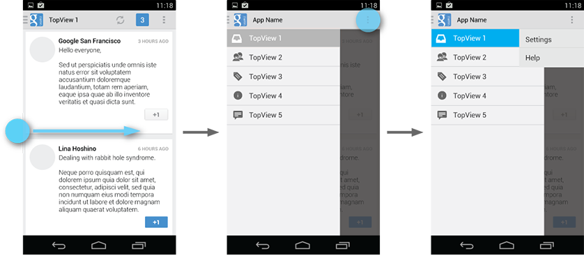
1) Will the navigation drawer replace or augment the current menu button?

I often get irritated at apps with both navigation drawer and menu because I forget which function is in which. However, we have a lot of items in the menu so if we only had the ND, to prevent it looking too clogged, we may have to put some things in as sub items.

2) Which features need to be available from single tap?

I think just add note, and browse cards meet this criteria. But currently stats, sync, and help also are.


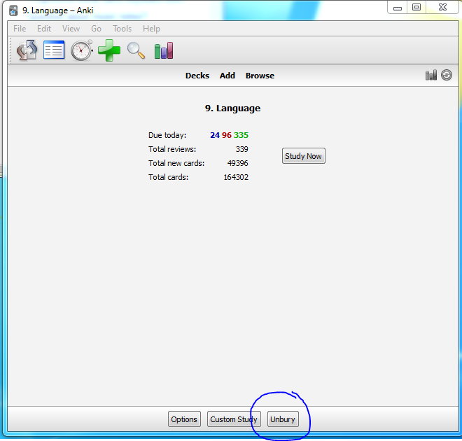
3) Do we make "get shared" / "create deck" / "import cards" have physical buttons like in desktop version, or put them in the ND / menu?

Tim

unread,
Mar 24, 2014, 5:11:15 AM3/24/14
to anki-a...@googlegroups.com
Sorry I should have written:

0) Do we keep the deck list or put them in the drawer?

I vote to keep the deck list how it is, as some people have hundreds of decks.

Message has been deleted

Tim

unread,
Mar 31, 2014, 10:15:41 AM3/31/14
to anki-a...@googlegroups.com
After reading the official guidelines carefully, I think maybe we should not use a navigation drawer in AnkiDroid. According to the official recommendations, these are the only scenarios where it's suggested to use one:

More than 3 top-level views 
It's not clear exactly what our top level views are, but the (Decks / Add / Browse)  division that Damien has made make sense as the top views, so I think we have to answer NO. Personally I don't really like the idea of thinking of the decks as top level views, I think users are used to having the deck picker as the top level view.
 
Cross-navigation from lower levels
No, we don't really have enough lower levels for this to apply IMO

Deep navigation branches

No

When these conditions are not fulfilled, it seems to be recommended to use action bar(s), with either tabs or spinners for changing between the main views. As in (2) below, I think a tabbed view with (Decks / Add / Browse) would be very helpful for navigation and would have the advantage of being nice and consistent with the desktop, while following current Android design practices.

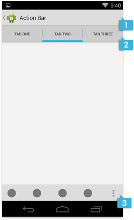
We could then possibly have a bottom action bar for the buttons at the bottom like (Get Shared / Create Deck / Import File) in Deck Picker, and (Options / Custom Study / Unbury) in StudyOptionsFragment. 

Sync and stats could then go at the front of the action bar in Deck Picker, all the rest into the action bar overflow menu, as they write in the guidelines.

Alexander, and others, what do you guys think?


Alexander Grüneberg

unread,
Mar 31, 2014, 10:54:41 AM3/31/14
to anki-a...@googlegroups.com
I think we should explore both options. I see the navigation drawer as a place to present common actions for all activities. We could put in Deck picker, Card browser, Add note, Stats, Preferences, Help, Feedback, and About. I like the tabbed approach, too, but I fear we need multiple menus to put in all our options: where would card browser specific options go for example?

So far I have only experimented with the possibility of adding action bars in the first place. I found out that it's quite easy. Please see the results here: https://github.com/ankidroid/Anki-Android/pull/240

On March 31, 2014 9:15:41 AM CDT, Tim <perceptu...@gmail.com> wrote:
>After reading the official guidelines carefully, I think maybe we
>should *not
>*use a navigation drawer in AnkiDroid. According to the official
>recommendations<http://developer.android.com/design/patterns/navigation-drawer.html>,
>
>these are the only scenarios where it's suggested to use one:
>
>More than 3 top-level views
>
>It's not clear exactly what our top level views are, but the (Decks /
>Add /
>Browse) division that Damien has made make sense as the top views, so
>I
>think we have to answer NO. Personally I don't really like the idea of
>thinking of the decks as top level views, I think users are used to
>having
>the deck picker as the top level view.
>
>
>> Cross-navigation from lower levels
>
>No, we don't really have enough lower levels for this to apply IMO
>
>Deep navigation branches
>
>No
>
>When these conditions are not fulfilled, it seems to be recommended to
>use
>action bar(s), with either tabs or spinners for changing between the
>main
>views. As in (2) below, I think a tabbed view with (Decks / Add /
>Browse)
>would be very helpful for navigation and would have the advantage of
>being
>nice and consistent with the desktop, while following current Android
>design practices.
>
><http://developer.android.com/design/media/action_bar_pattern_considerations.png>
>
>We could then possibly have a bottom action bar for the buttons at the
>bottom like (Get Shared / Create Deck / Import File) in Deck Picker,
>and
>(Options / Custom Study / Unbury) in StudyOptionsFragment.
>
>Sync and stats could then go at the front of the action bar in Deck
>Picker,
>all the rest into the action bar overflow menu, as they write in the
>guidelines
><http://developer.android.com/design/patterns/actionbar.html>.

Tim

unread,
Mar 31, 2014, 11:19:49 AM3/31/14
to anki-a...@googlegroups.com, alexander....@googlemail.com
We could put in Deck picker, Card browser, Add note, Stats, Preferences, Help, Feedback, and About.

Yeah I was thinking the same thing at first about putting settings/help in the Navigation Drawer, but then I saw that this is not recommended design practice:
Settings is given low prominence in the UI because it's not frequently needed. Even if there's room in the action bar, never make Settings an action button. Always keep it in the action overflow and label it "Settings". Place it below all other items except "Help".

I agree that stats could also be put into a navigation drawer with the main 3, which would take us up to the 4, but in that case I think I like it better the Action Bar and the main 3 as tabs, because it's more consistent with Desktop.

I like the tabbed approach, too, but I fear we need multiple menus to put in all our options: where would card browser specific options go for example? 
Well in v2.1 we have (Add Note / Change display order / Filter Marked / Filter Suspended / Filter by Tag) all in a context menu. Add would not be necessary as we have a tab for it, the others could go into the overflow menu of the action bar, so that the search bar was the only item in the action bar. 

On Monday, March 31, 2014 11:54:41 PM UTC+9, Alexander Grüneberg wrote:
I think we should explore both options. I see the navigation drawer as a place to present common actions for all activities. We could put in Deck picker, Card browser, Add note, Stats, Preferences, Help, Feedback, and About. I like the tabbed approach, too, but I fear we need multiple menus to put in all our options: where would card browser specific options go for example?

So far I have only experimented with the possibility of adding action bars in the first place. I found out that it's quite easy. Please see the results here: https://github.com/ankidroid/Anki-Android/pull/240

Tim

unread,
Mar 31, 2014, 11:25:59 AM3/31/14
to anki-a...@googlegroups.com, alexander....@googlemail.com
They also mention you should put settings and help in the overflow menu in the navigation drawer design guidelines (it's a bit ironic that they don't follow this in Google Play app though!):

Tim

unread,
Apr 3, 2014, 11:19:15 AM4/3/14
to anki-a...@googlegroups.com, alexander....@googlemail.com
I might be starting to come back around to the idea of the navigation drawer... One important usage case is to switch back and forth between the reviewer and the browser during the review process. I don't think we'd want to show the tabs in the reviewer itself, so a navigation drawer might be the best bet after all. An alternative would be to add search to the action bar, but on normal/small smartphone screens it would be pushed into the overflow menu.

Tim

unread,
Apr 9, 2014, 1:11:36 AM4/9/14
to anki-a...@googlegroups.com, alexander....@googlemail.com
Alexander, do you have any vision for this at the moment?

chajadan

unread,
May 9, 2014, 12:45:57 AM5/9/14
to anki-a...@googlegroups.com
I'm only posting to try to start getting this thread to my inbox -- I already should but I don't. Maybe when I switched from digest to individual messages it choked.
Reply all
Reply to author
Forward
0 new messages