Crime vs. Weather
2 views
Skip to first unread message

Eric van Zanten
May 8, 2013, 9:21:06 AM5/8/13
to OpenGov...@googlegroups.com
Hi there:
First time poster, long-time follower. I've recently put together a bit of a data visualization that I'd love to get some feedback on from this group.
So, first, the link: http://crime.static-eric.com/
In a nutshell, I set out to answer the question of whether or not the crime rate in Chicago does, in fact, climb as the temperature climbs. Short answer: yes. More nuanced answer: mostly. There were a few categories that were counter to the trend (which you can drill down into using the little nav thing on the left side over there) but, overall the conventional wisdom pans out.
I'd love to hear what any of you guys have to say and please feel free to share it around off this list (I'll be hitting my twitter followers in a minute). There are also a couple other more or less half baked ideas that you can take a look at over there: a "browse crimes by date" map interface and a "rogues gallery" of sorts that displays info about the 25 most wanted individuals in the city.
Yeah, so, let me know what you think.
Eric

Daniel X. O'Neil
May 8, 2013, 9:25:48 AM5/8/13
to OpenGov...@googlegroups.com
Simple answer to a common question. Thanks for this!
Also: seems like the cure for crime is to turn up heat to 100.
Eric--
You received this message because you are subscribed to the Google Groups "Open Government Chicago-land" group.
To unsubscribe from this group and stop receiving emails from it, send an email to OpenGovChicag...@googlegroups.com.
To post to this group, send email to OpenGov...@googlegroups.com.
Visit this group at http://groups.google.com/group/OpenGovChicago?hl=en.
For more options, visit https://groups.google.com/groups/opt_out.

Paul Baker
May 8, 2013, 10:01:39 AM5/8/13
to opengovchicago
There is research to show that, in general, crime increases with temperature, up to a point. When it gets near 100 degrees it tends to go down.
Of course you can't prove causality--that higher temperatures cause more crime any more than you can say that higher crime rates cause the temperature to rise.
The Trib apps group has some good information about crime, http://crime.chicagotribune.com/chicago/, and a group of us opengovers created http://crimeinchicago.org which examines many aspects of crime and allows comparison by ward. During the course of that project we talked with crime experts who made us appreciate that many factors, political, public safety personnel levels and deployment policies, demographics, community characteristics, etc, factor into whether crime rates are portrayed as going up or down.
Paul
On Wed, May 8, 2013 at 8:21 AM, Eric van Zanten <eric.va...@gmail.com> wrote:
Eric--
You received this message because you are subscribed to the Google Groups "Open Government Chicago-land" group.
To unsubscribe from this group and stop receiving emails from it, send an email to OpenGovChicag...@googlegroups.com.
To post to this group, send email to OpenGov...@googlegroups.com.
Visit this group at http://groups.google.com/group/OpenGovChicago?hl=en.
For more options, visit https://groups.google.com/groups/opt_out.
11 East Adams St
Suite 900
Chicago, Illinois 60603-6306
312 469-5444
pa...@webitects.com
@PaulBaker
- - - - - - - -
A writer who waits for ideal conditions under which to work will die without putting a word on paper.
—E.B. White
Eric van Zanten
May 8, 2013, 10:21:06 AM5/8/13
to OpenGov...@googlegroups.com
Paul:
It would be great to get some of the knowledge about the various factors that go into figuring out crime rates. Any generalizations that can be made there? Any data or resources available?
Since I now have this data set kind massaged into something that can be queried, etc, I'd love to run some other analyses against it to see what I can see. Weather/Temperature just seemed like a no-brainer to get things going. It would be interesting to actually attempt to test out some of the theories that go into determining the crime prevention policies used by our city as well as others.
Eric

Tom Kompare
May 8, 2013, 10:28:08 AM5/8/13
to OpenGov...@googlegroups.com
Very nice work. Glad to see this done.
Some further study into testing weather/crime conventional wisdom off the top of my head...
I wonder if there is a better correlation using each day's mean temperature rather than the day's high temp since both temperature and crime occur around the clock.
Overnight temperature may better correlate with certain types of crime. Just read the Chicago Tribune's everyday panic headline ("OMG!!! 13 People Shot Overnight! Everybody Duck and Cover!!!") So maybe a low temps comparison would be good too.
I also wonder if certain crimes deviate from the daily "criminal average" as the daily mean temperature deviates from the climactic mean for the day. Something like "Today, we had 50 more robberies than today's historical average, and the mean temp was 13 degrees above normal."
Another coorelation might be found with rain versus crime. Conventional wisdom says rain keeps certain types of crime at bay.
I know hourly conditions data for every official weather station exist. Crime data is logged by reporting time. I wonder if Eric's fine work, or any of the above I suggest above could be refined down to the hour. This would be a much bigger project.
Cheers.
--
Tom Kompare
t...@kompare.us
http://about.me/tomkompare
Eric van Zanten
May 8, 2013, 10:34:48 AM5/8/13
to OpenGov...@googlegroups.com
Great stuff. I'd already thought of a couple of those (particularly the "time of day" angle) but yeah, I agree, this could be a much larger undertaking.
As I mentioned underneath the charts over on the site, I've got all this stuff in a MongoDB instance so if there's anyone out there that is interested, I can create a dump and make it available for others to peruse, etc.
Eric

Randy Baxley
May 8, 2013, 10:51:16 AM5/8/13
to opengovchicago
I am sure I will spell Mariahnna wrong but anyway I was impressed by her openess in questioning the veracity of victims and eye witness / 911 callers accounts of crime. I think somehow a proper predictive model will need some psychological basis akin to those proposed in Asimov's science fiction. A burgular I was able to talk with said his favorite time to work was during the middle of the day in the rain. This was before DNA so not sure how that might change things though I tend to think DNA is not generally used in property crime solutions. I could be wrong.
Eric--

Forest Gregg
May 8, 2013, 1:08:43 PM5/8/13
to OpenGov...@googlegroups.com
Really interesting take.
It looks like you have a good bit of noise at the temperature extremes, which should be expected as these are thankfully pretty rare days.
An alternative approach that you might want to try:It looks like you have a good bit of noise at the temperature extremes, which should be expected as these are thankfully pretty rare days.
- For every day, find the maximum temperature and the number of days. These are your data points
- Fit
a simple curve, like num_crimes = intercept + beta_1 * max_temp +
beta_2 * max_temp_squared + beta_3 * max_temp_cubed (you could keep
going, but cubed will probably be great) (R is great for this, but you
can do it in excel too.
- Plot the estimated curve
- Plot a sample of the data points so we can see how well your estimated curve fits the data
Eric--
You received this message because you are subscribed to the Google Groups "Open Government Chicago-land" group.
To unsubscribe from this group and stop receiving emails from it, send an email to OpenGovChicag...@googlegroups.com.
To post to this group, send email to OpenGov...@googlegroups.com.
Visit this group at http://groups.google.com/group/OpenGovChicago?hl=en.
For more options, visit https://groups.google.com/groups/opt_out.
Eric van Zanten
May 8, 2013, 3:52:27 PM5/8/13
to OpenGov...@googlegroups.com
Forest:
Thanks for the insight. As a relative novice to this kind of analysis, this is precisely the kind of feedback I was looking for.
Eric
Forest Gregg
May 9, 2013, 9:45:49 AM5/9/13
to OpenGov...@googlegroups.com
If you post the data (the per day counts, date, and temp) somewhere, I can show you how to do something simple in R. It will give others a chance to play with this data as well.
-ForestEric--
You received this message because you are subscribed to the Google Groups "Open Government Chicago-land" group.
To unsubscribe from this group and stop receiving emails from it, send an email to OpenGovChicag...@googlegroups.com.
To post to this group, send email to OpenGov...@googlegroups.com.
Visit this group at http://groups.google.com/group/OpenGovChicago?hl=en.
For more options, visit https://groups.google.com/groups/opt_out.
Eric van Zanten
May 9, 2013, 10:19:50 AM5/9/13
to OpenGov...@googlegroups.com
Sorry if this ends up being largely duplicate info. I posted this but it seemed to have vanished just after so I wanted to make sure it went through.
Anyways, the basic thrust of the seemingly lost message was that all that data is already available online. I designed it to work entirely client side so the D3 crime vs weather thing up front is actually being generated by a bunch of flat JSON files that are organized by "Primary Type". So, if you load:
You'll get all the crunched info for crimes that were categorized as "Interfere with Public Officer". As of right now, this doesn't include the total number of days that were reported at a given temperature but it's trivial to stuff that in there. Give me until this afternoon.
Another way of getting more of a firehose view for a given day is to load something like this:
which will give you all the crime reports for October 24, 2002 along with the high and low temperatures in Celsius and Fahrenheit. The info about each crime reported on that day is included in a GeoJSON packet which makes it really simple to load it into a client side mapping tool like Leaflet.
Anyways, give me a few minutes to put the day count into the files for the various categories and we should be set.
Thanks for all the help with this so far. The support has been amazing.
Eric
Eric van Zanten
May 10, 2013, 10:09:57 AM5/10/13
to OpenGov...@googlegroups.com
Forest:
I am in the process currently of dumping everything out by year in CSV format. Once it's done you'll be able to get to it like this:
I'll try to do a full dump, too. Oh, and I setup the header row the way you suggested so it should, hopefully, work the way you need it to.
Thanks again for the help.
Eric
Eric van Zanten
May 10, 2013, 11:16:49 AM5/10/13
to OpenGov...@googlegroups.com
OK, all the years are dumped out and I made a full dump (everything from 1/1/2001 to 5/3/2013) that can be fetched at:
Eric
Forest Gregg
May 14, 2013, 3:09:00 PM5/14/13
to OpenGov...@googlegroups.com
Here's how you might deal with the noise: https://gist.github.com/fgregg/5578318
Plotting all the data is really useful. In this data, there is
something unusual going on. Instead of one big cloud of points,
there's seems to be two clouds. This kind of makes sense if we
remember that the total reported crimes have been going down year over
year during this period. It could be that the apparent decline in
temperatures is just a fluke that's due to the past few years being
both hotter years and lower crime years overall. A more sophisticated
analysis might take year-over-year decline into account.
Best,
Forest
Eric van Zanten
May 14, 2013, 7:18:08 PM5/14/13
to OpenGov...@googlegroups.com
Man, that's fantastic. I've actually been thinking about doing a year by year comparison so maybe factoring in the decline in reported crimes and the increase in temperatures can be part of it.
Eric
Eric van Zanten
May 14, 2013, 9:15:17 PM5/14/13
to OpenGov...@googlegroups.com
Forest:
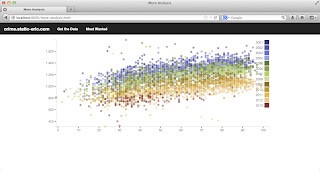
Looks like your intuition was correct. I colored the dots by year and the year by year groupings come out pretty well. This is just a quickie that I put together this evening. Hoping to clean it up a bit and stick it on the site soon. If there are any D3 wizards out there, I'd love the help. I'd like to get this thing to be filterable by year (so, check off a year or group of years to only display those ones, etc). Eric
Eric van Zanten
May 14, 2013, 9:18:28 PM5/14/13
to OpenGov...@googlegroups.com


Rebecca Ackerman
May 15, 2013, 2:04:56 PM5/15/13
to OpenGov...@googlegroups.com
Tuning back in now that there are pretty pictures.... What are the axes? And what does each dot represent? It's not clear in the image what I'm looking at.
On Tue, May 14, 2013 at 6:18 PM, Eric van Zanten <eric.va...@gmail.com> wrote:
Just realized that image was a TIFF. Here's a JPEG in case that works better.
--
Eric van Zanten
May 15, 2013, 3:18:44 PM5/15/13
to OpenGov...@googlegroups.com
If you go back a bit in the conversation, Forest suggested that there might be a bit of noise in that crime vs. weather data that could be filtered by plotting all the data in a slightly different way (he actually wrote a snippet in R that does a pretty awesome job of proving his thesis. It's over here: https://gist.github.com/fgregg/5578318). If you take a look at that, you'll kinda get the idea of what's going on. If you take all the days since 2001 and plot them where the x axis is the high temperature for the day and the y axis is the total number of crimes that were reported on that day, you'll see a lot less of a dramatic increase in the number of crimes reported at more comfortable temperatures and then decrease when the temperatures get too hot.
The theory here is that this is because there has been a general downward trend in the number of crimes reported in the city over that period (2001-present) and the graphic that I posted last night demonstrates that pretty nicely by showing the older dates in blueish, the dates in between in greenish and the newer dates in reddish. I hope to be able to clean this up and stick it up next to the other visualizations that I did last week (over here http://crime.static-eric.com) in the near future.
Hopefully that helps give you a bit of context. Again, that was just a quickie that I put together last night that basically supports Forest's hypothesis by coloring the dots by year.
Eric
Rebecca Ackerman
May 15, 2013, 3:31:25 PM5/15/13
to OpenGov...@googlegroups.com
My point was more that your graph doesn't show anything until you label your axes :-).
--
Reply all
Reply to author
Forward
0 new messages