Small responsive YouTube embeds in chrome?

Matt Meade
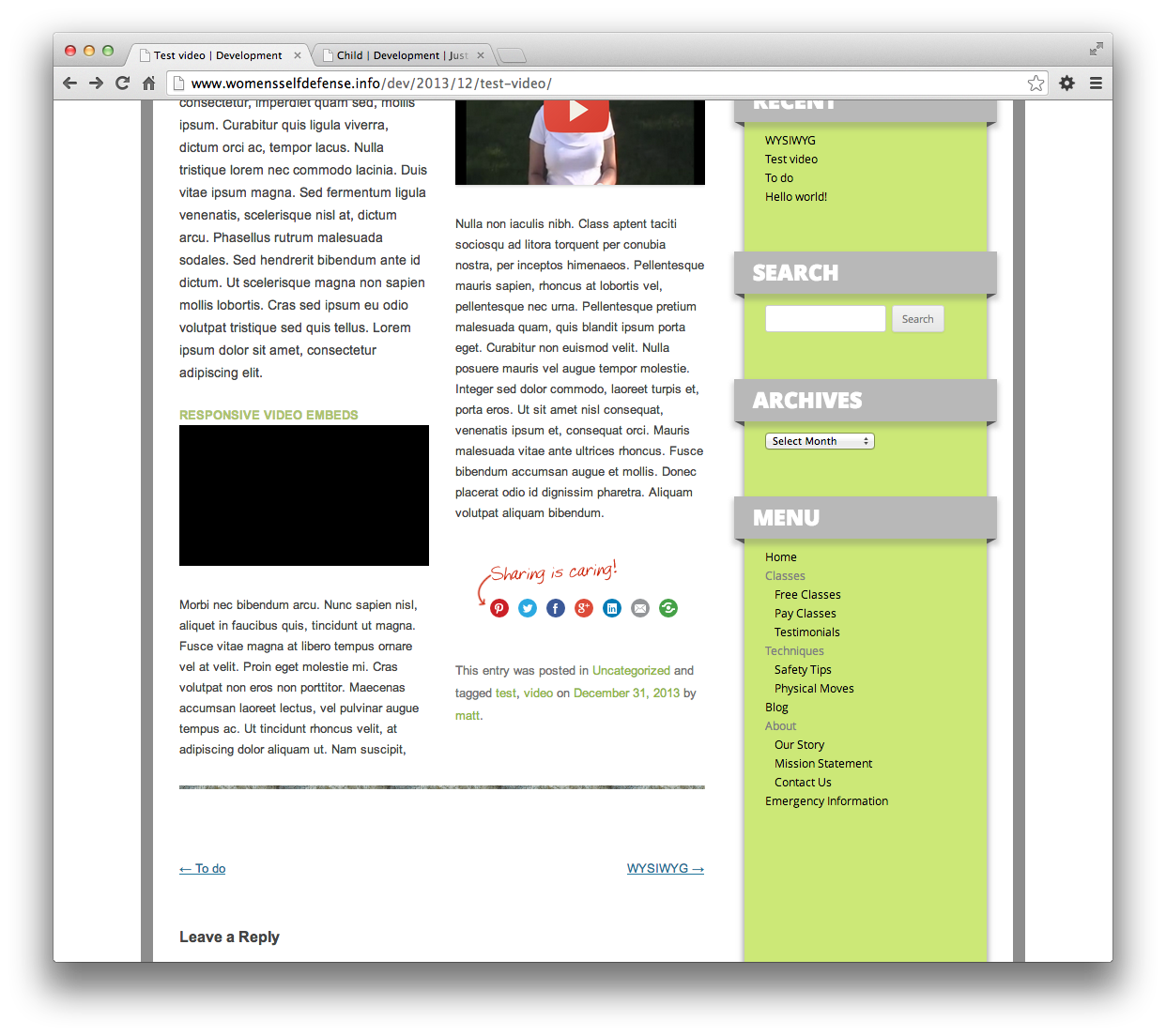
I run a wp install where the main content is in two responsive css columns, so it can get more narrow than your standard YouTube embed.
I have tried default WordPress embed, and two widgets (fluid video embeds, and responsive video embeds).
In all cases, when the width gets small enough, chrome browser only displays a black box instead of the video. Other browsers still show the video, but not chrome.
I have tested this from my work pc and my home pc but I suppose it's possible that they show up fine for some people, reports?
Does anyone have a solution that does what I am looking for? (Meaning not just "make your columns wider!" or "link to the video instead of embedding!")
I would like video embedded and showing up even in chrome at these sizes of possible.
Example: http://www.womensselfdefense.info/dev/2013/12/test-video/

Topher
check other machines and see if it's you?

Brian Richards
Brian Richards
--
You received this message because you are subscribed to the Google Groups "WordPress Grand Rapids (WPGR)" group.
To unsubscribe from this group and stop receiving emails from it, send an email to wpgr+uns...@googlegroups.com.
For more options, visit https://groups.google.com/groups/opt_out.

Chad Warner

Matt Meade
Matt Meade

Luke Rumley
On Fri, Jan 3, 2014 at 10:05 AM, Chad Warner <ch...@optimwise.com> wrote:
Matt Meade
Unfortunately it's the default desktop size that sucks. It actually shows wider on mobile because it's one column instead of two :-(
Resizing the desktop smaller to make it change to single-column is what makes it work, not what breaks it :-(
I know that's slightly backwards to show wider content on smaller screens but I am trying to just trust the graphic artists original two column layout for full desktop size instead of saying "sorry about your layout but I can't code it" :-(
Matt Meade
Seems to display fine on the blog page showing multiple posts.
Topher
On 01/10/2014 11:54 AM, Matt Meade wrote:
Haven't had a chance to try the suggestions here yet but I noticed something weird about this.
Seems to display fine on the blog page showing multiple posts.http://www.womensselfdefense.info/dev/classes/child/
Still broken on the single post view.
gah, wtf WordPress!
On Fri, Jan 3, 2014 at 11:28 AM, Matt Meade <ring...@gmail.com> wrote:
Unfortunately it's the default desktop size that sucks. It actually shows wider on mobile because it's one column instead of two :-(
Resizing the desktop smaller to make it change to single-column is what makes it work, not what breaks it :-(
I know that's slightly backwards to show wider content on smaller screens but I am trying to just trust the graphic artists original two column layout for full desktop size instead of saying "sorry about your layout but I can't code it" :-(
On Jan 3, 2014 11:17 AM, "Luke Rumley" <lu...@rumleydesign.com> wrote:
Keeping in mind that most people won't be resizing their desktop browsers, I tried it in Chrome on my iPhone and it worked fine on first load. FWIW.
On Fri, Jan 3, 2014 at 10:05 AM, Chad Warner <ch...@optimwise.com> wrote:
If you find a solution, please let us know what worked!I see the black box upon initial page load (Chrome on Win 7 x64). When I resize the browser and get the content into a single column, the video shows. If Brian's code doesn't work, you could also try the FitVids for WordPress plugin. I'd be surprised if it worked better than Fluid Video Embeds or Responsive Video Embeds, but it's worth trying.
On Fri, Jan 3, 2014 at 9:50 AM, Brian Richards <br...@rzen.net> wrote:
When I initially loaded the page I saw the video as just a black box, but the moment I changed the browser width enough to hit a CSS breakpoint I saw the properly embedded and responsive video.
If you're unsatisfied with the solutions you've tried so far, take this code for a spin:�https://gist.github.com/brichards/8239011
The first block would go into your theme's functions.php file (or a plugin, if you wanted to create one), while the second block would go into your theme's style.css (or, again, a stylesheet loaded by a plugin).
This is something I wrote for myself so that every video I embed via oembed would be automatically responsive for http://WPSessions.com � you can see it in work on the homepage, in fact. Any video you're manually embedding (pasting the full iframe embed code, rather than just the video's URL) you'll need to manually wrap in <div class="video-wrapper"></div>.
Hope this helps!
Grace and Peace,
Brian Richards
On Fri, Jan 3, 2014 at 9:34 AM, Topher <top...@codeventure.net> wrote:
On 01/03/2014 09:32 AM, Matt Meade wrote:
>
> I run a wp install where the main content is in two responsive css
> columns, so it can get more narrow than your standard YouTube embed.
>
> I have tried default WordPress embed, and two widgets (fluid video
> embeds, and responsive video embeds).
>
> In all cases, when the width gets small enough, chrome browser only
> displays a black box instead of the video. Other browsers still show
> the video, but not chrome.
>
> I have tested this from my work pc and my home pc but I suppose it's
> possible that they show up fine for some people, reports?
>
> Does anyone have a solution that does what I am looking for? (Meaning
> not just "make your columns wider!" or "link to the video instead of
> embedding!")
>
> I would like video embedded and showing up even in chrome at these
> sizes of possible.
>
> Example: http://www.womensselfdefense.info/dev/2013/12/test-video/
>
I never get the bad behaviour you describe in Chrome. �Are you able to
check other machines and see if it's you?
--
You received this message because you are subscribed to the Google Groups "WordPress Grand Rapids (WPGR)" group.
To unsubscribe from this group and stop receiving emails from it, send an email to wpgr+uns...@googlegroups.com.
For more options, visit https://groups.google.com/groups/opt_out.
--
You received this message because you are subscribed to the Google Groups "WordPress Grand Rapids (WPGR)" group.
To unsubscribe from this group and stop receiving emails from it, send an email to wpgr+uns...@googlegroups.com.
For more options, visit https://groups.google.com/groups/opt_out.
--
You received this message because you are subscribed to the Google Groups "WordPress Grand Rapids (WPGR)" group.
To unsubscribe from this group and stop receiving emails from it, send an email to wpgr+uns...@googlegroups.com.
For more options, visit https://groups.google.com/groups/opt_out.
--
You received this message because you are subscribed to the Google Groups "WordPress Grand Rapids (WPGR)" group.
To unsubscribe from this group and stop receiving emails from it, send an email to wpgr+uns...@googlegroups.com.
For more options, visit https://groups.google.com/groups/opt_out.

Steve Colthorp
Both work fine for me in Chrome.
On 01/10/2014 11:54 AM, Matt Meade wrote:
Haven't had a chance to try the suggestions here yet but I noticed something weird about this.
Seems to display fine on the blog page showing multiple posts.http://www.womensselfdefense.info/dev/classes/child/
Still broken on the single post view.
gah, wtf WordPress!
On Fri, Jan 3, 2014 at 11:28 AM, Matt Meade <ring...@gmail.com> wrote:
Unfortunately it's the default desktop size that sucks. It actually shows wider on mobile because it's one column instead of two :-(
Resizing the desktop smaller to make it change to single-column is what makes it work, not what breaks it :-(
I know that's slightly backwards to show wider content on smaller screens but I am trying to just trust the graphic artists original two column layout for full desktop size instead of saying "sorry about your layout but I can't code it" :-(
On Jan 3, 2014 11:17 AM, "Luke Rumley" <lu...@rumleydesign.com> wrote:
Keeping in mind that most people won't be resizing their desktop browsers, I tried it in Chrome on my iPhone and it worked fine on first load. FWIW.
On Fri, Jan 3, 2014 at 10:05 AM, Chad Warner <ch...@optimwise.com> wrote:
If you find a solution, please let us know what worked!I see the black box upon initial page load (Chrome on Win 7 x64). When I resize the browser and get the content into a single column, the video shows. If Brian's code doesn't work, you could also try the FitVids for WordPress plugin. I'd be surprised if it worked better than Fluid Video Embeds or Responsive Video Embeds, but it's worth trying.
On Fri, Jan 3, 2014 at 9:50 AM, Brian Richards <br...@rzen.net> wrote:
When I initially loaded the page I saw the video as just a black box, but the moment I changed the browser width enough to hit a CSS breakpoint I saw the properly embedded and responsive video.
If you're unsatisfied with the solutions you've tried so far, take this code for a spin: https://gist.github.com/brichards/8239011
The first block would go into your theme's functions.php file (or a plugin, if you wanted to create one), while the second block would go into your theme's style.css (or, again, a stylesheet loaded by a plugin).
This is something I wrote for myself so that every video I embed via oembed would be automatically responsive for http://WPSessions.com – you can see it in work on the homepage, in fact. Any video you're manually embedding (pasting the full iframe embed code, rather than just the video's URL) you'll need to manually wrap in <div class="video-wrapper"></div>.
Hope this helps!
Grace and Peace,
Brian Richards
On Fri, Jan 3, 2014 at 9:34 AM, Topher <top...@codeventure.net> wrote:
On 01/03/2014 09:32 AM, Matt Meade wrote:
>
> I run a wp install where the main content is in two responsive css
> columns, so it can get more narrow than your standard YouTube embed.
>
> I have tried default WordPress embed, and two widgets (fluid video
> embeds, and responsive video embeds).
>
> In all cases, when the width gets small enough, chrome browser only
> displays a black box instead of the video. Other browsers still show
> the video, but not chrome.
>
> I have tested this from my work pc and my home pc but I suppose it's
> possible that they show up fine for some people, reports?
>
> Does anyone have a solution that does what I am looking for? (Meaning
> not just "make your columns wider!" or "link to the video instead of
> embedding!")
>
> I would like video embedded and showing up even in chrome at these
> sizes of possible.
>
> Example: http://www.womensselfdefense.info/dev/2013/12/test-video/
>
I never get the bad behaviour you describe in Chrome. Are you able to