[WnCC] [Important]


Ranveer Aggarwal
--
--
The website for the club is http://wncc-iitb.org/
To post to this group, send email to wncc...@googlegroups.com
---
You received this message because you are subscribed to the Google Groups "Web and Coding Club IIT Bombay" group.
To unsubscribe from this group and stop receiving emails from it, send an email to wncc_iitb+...@googlegroups.com.
For more options, visit https://groups.google.com/d/optout.

Rohan Kumar
--
--
The website for the club is http://wncc-iitb.org/
To post to this group, send email to wncc...@googlegroups.com
---
You received this message because you are subscribed to the Google Groups "Web and Coding Club IIT Bombay" group.
To unsubscribe from this group and stop receiving emails from it, send an email to wncc_iitb+...@googlegroups.com.
For more options, visit https://groups.google.com/d/optout.

Siddharth Bulia
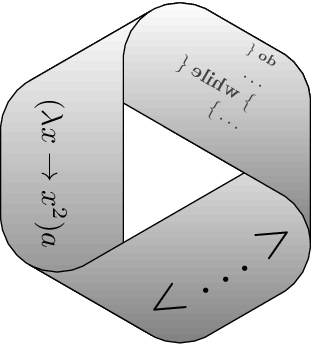
I am not getting the need of gears in wncc logo. We can go a bit more minimal.

Rohit Gogoi
I would suggest play around the letters of wncc. Google expressive typography to get the feel of what im talking about

Sumith 1896

Dilawar Singh
Kumar Ayush
PFA four updated options. You are requested to put forward your updated opinion :P
Siddharth Bulia
Maybe you can rearrange the location of wncc.
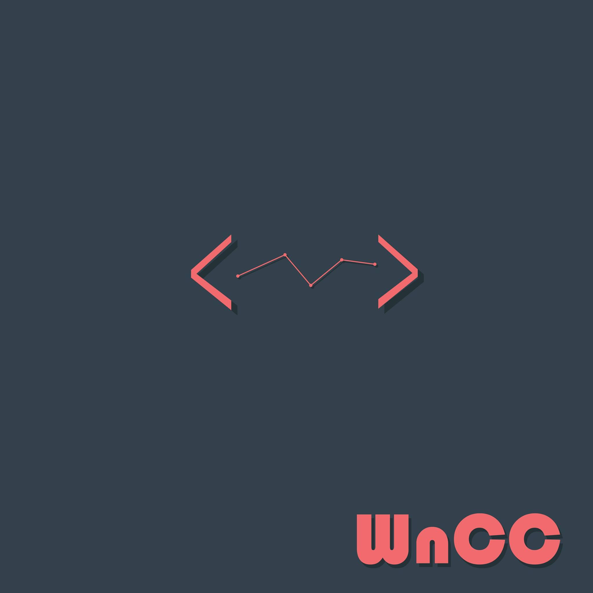
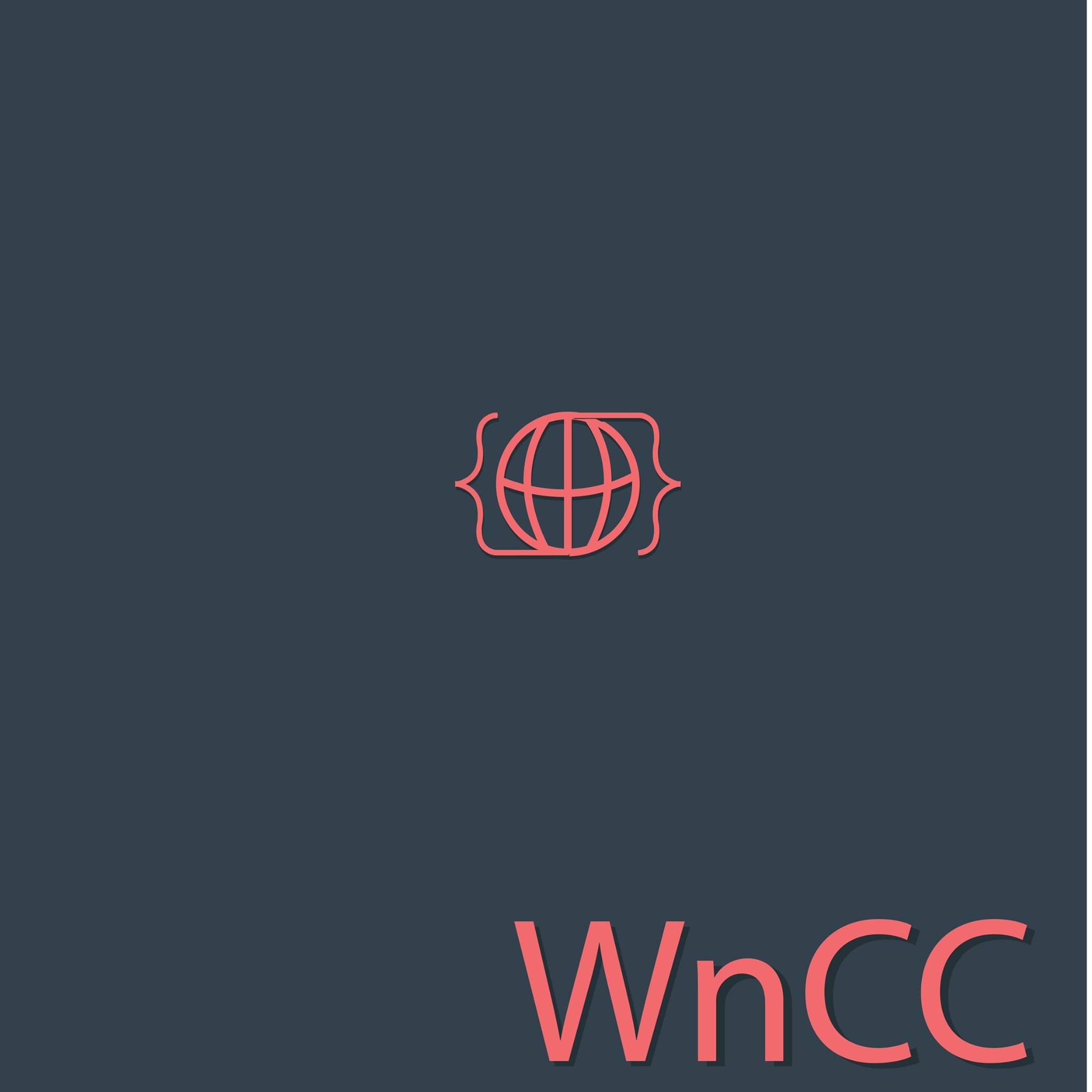
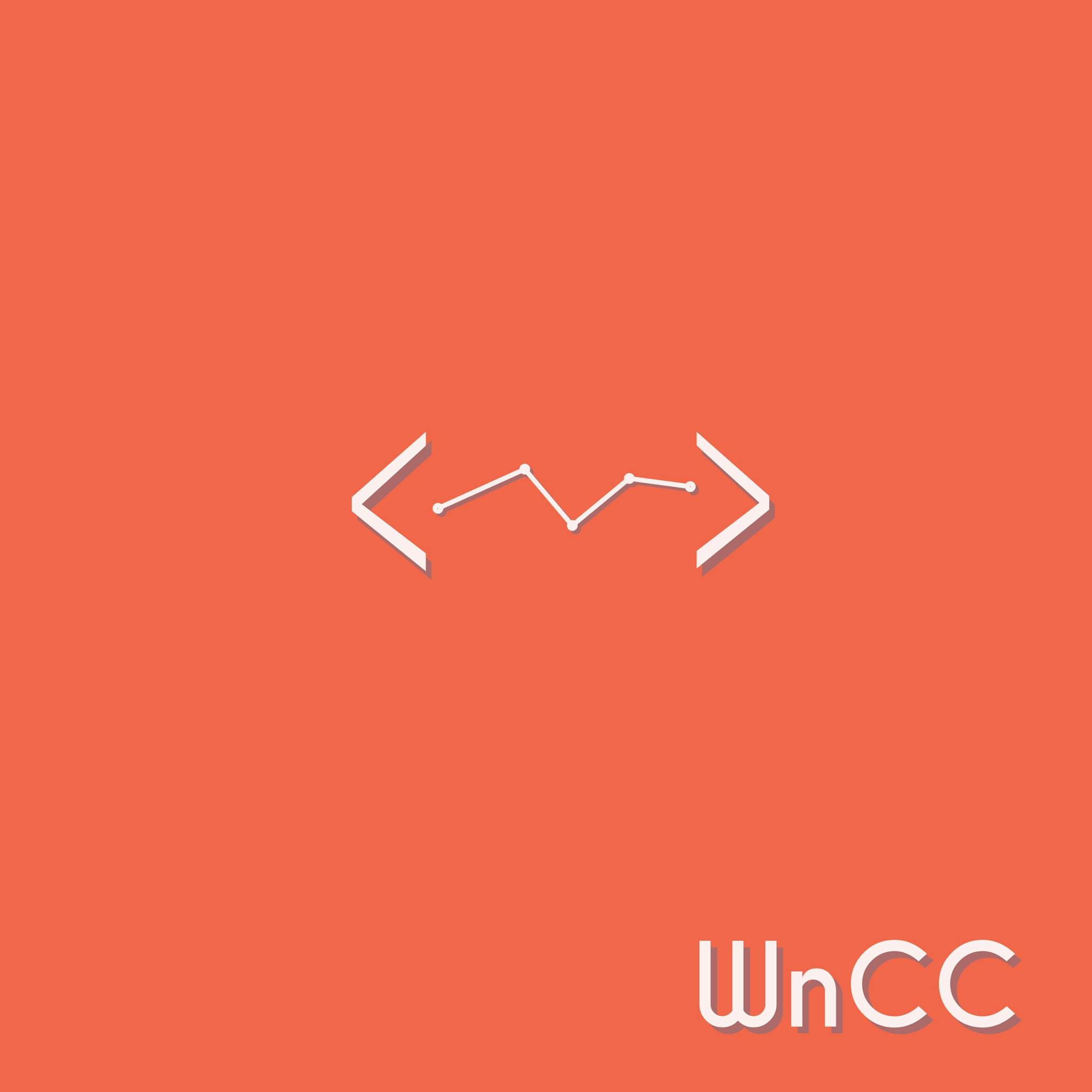
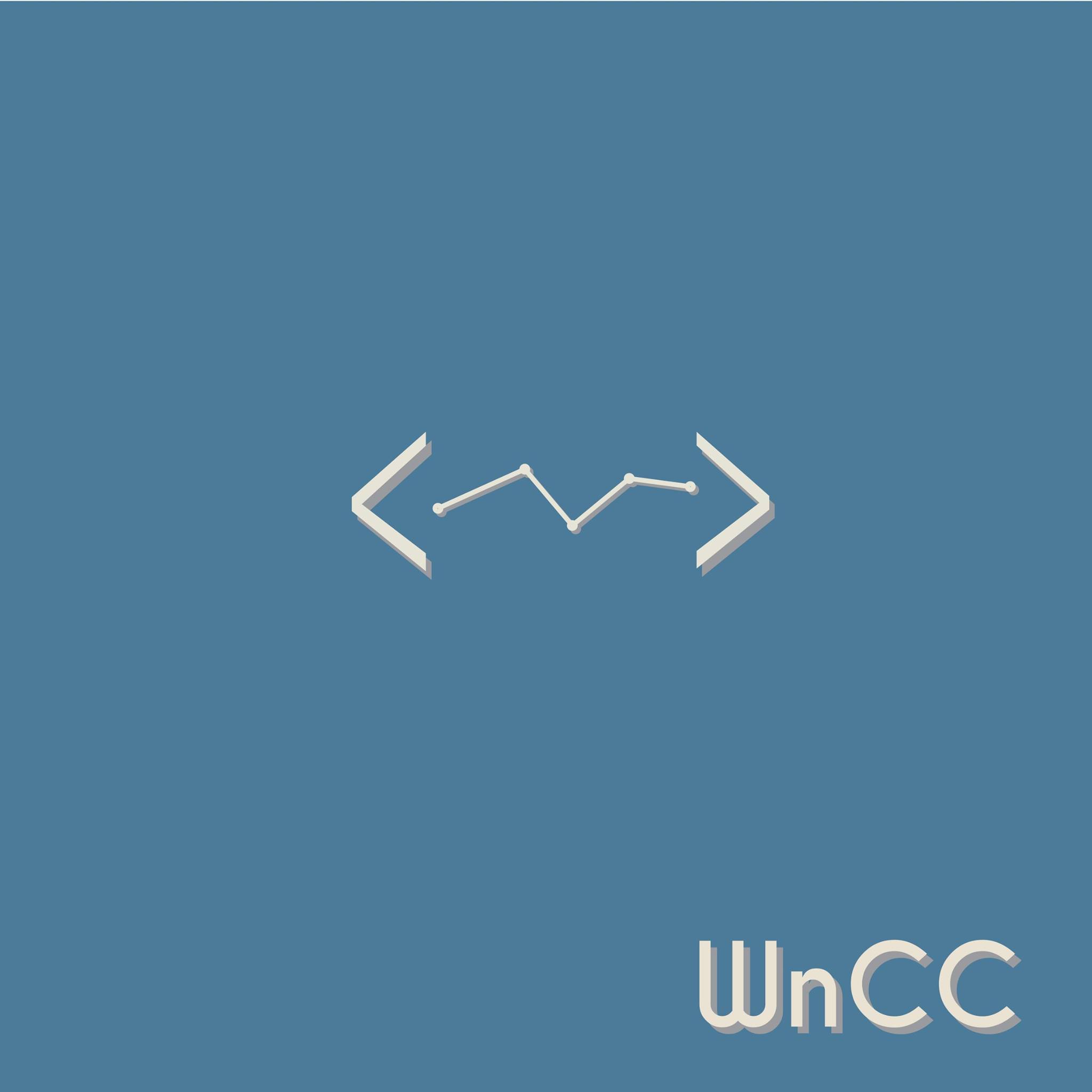
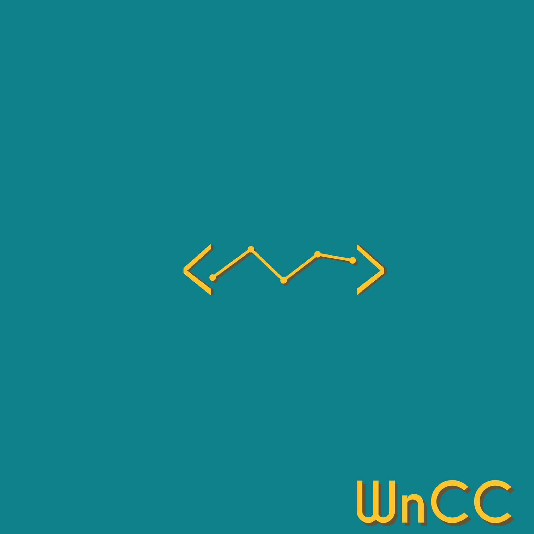
I prefer < > brackets over {}.
And btw, what is the meaning of that theta or phi ??


Akash Trehan
How are these symbols related to WnCC? First one looks cool though.
You received this message because you are subscribed to a topic in the Google Groups "Web and Coding Club IIT Bombay" group.
To unsubscribe from this topic, visit https://groups.google.com/d/topic/wncc_iitb/OxHiXbLEdJ8/unsubscribe.
To unsubscribe from this group and all its topics, send an email to wncc_iitb+...@googlegroups.com.
For more options, visit https://groups.google.com/d/optout.
Kumar Ayush
The brackets represent coding. and the phi represents the Web in a minimal way I guess.

Manish Goregaokar

Akash Trehan

Kalpesh Krishna
Kalpesh Krishna
Akash Trehan
+1 for 1st,2nd and last one. Others look a bit dull to me.
--
--
The website for the club is http://wncc-iitb.org/
To post to this group, send email to wncc...@googlegroups.com
---
You received this message because you are subscribed to a topic in the Google Groups "Web and Coding Club IIT Bombay" group.
To unsubscribe from this topic, visit https://groups.google.com/d/topic/wncc_iitb/OxHiXbLEdJ8/unsubscribe.
To unsubscribe from this group and all its topics, send an email to wncc_iitb+...@googlegroups.com.
For more options, visit https://groups.google.com/d/optout.
Siddharth Bulia
1 2 & last. Same as akash
You received this message because you are subscribed to the Google Groups "Web and Coding Club IIT Bombay" group.
To unsubscribe from this group and stop receiving emails from it, send an email to wncc_iitb+...@googlegroups.com.

Chinmay Rajhans Official
Sry for replying little late.
Generally, logos are small when printed, so in a box or circle given to you, try to utilize max. space as you can.
2ndly, create 2 versions, one with only initials, other with name written in full.
You received this message because you are subscribed to the Google Groups "Web and Coding Club IIT Bombay" group.
To unsubscribe from this group and stop receiving emails from it, send an email to wncc_iitb+...@googlegroups.com.
Dilawar Singh

Mayank Singhal
--
--
The website for the club is http://wncc-iitb.org/
To post to this group, send email to wncc...@googlegroups.com
---
You received this message because you are subscribed to the Google Groups "Web and Coding Club IIT Bombay" group.
To unsubscribe from this group and stop receiving emails from it, send an email to wncc_iitb+unsubscribe@googlegroups.com.
Sumith 1896
--
Akash Trehan
Kumar Ayush
None. We will have a meeting after endsems where we'll vote
--
--
The website for the club is http://wncc-iitb.org/
To post to this group, send email to wncc...@googlegroups.com
---
You received this message because you are subscribed to the Google Groups "Web and Coding Club IIT Bombay" group.
To unsubscribe from this group and stop receiving emails from it, send an email to wncc_iitb+...@googlegroups.com.
Rohit Gogoi
By color scheme I meant the color of the logo, not the color of the background, choose a color combination which serves both of these points : a)good aesthetics
b)versatile, i.e stands out and can be used in any kind of background.
Manish Goregaokar
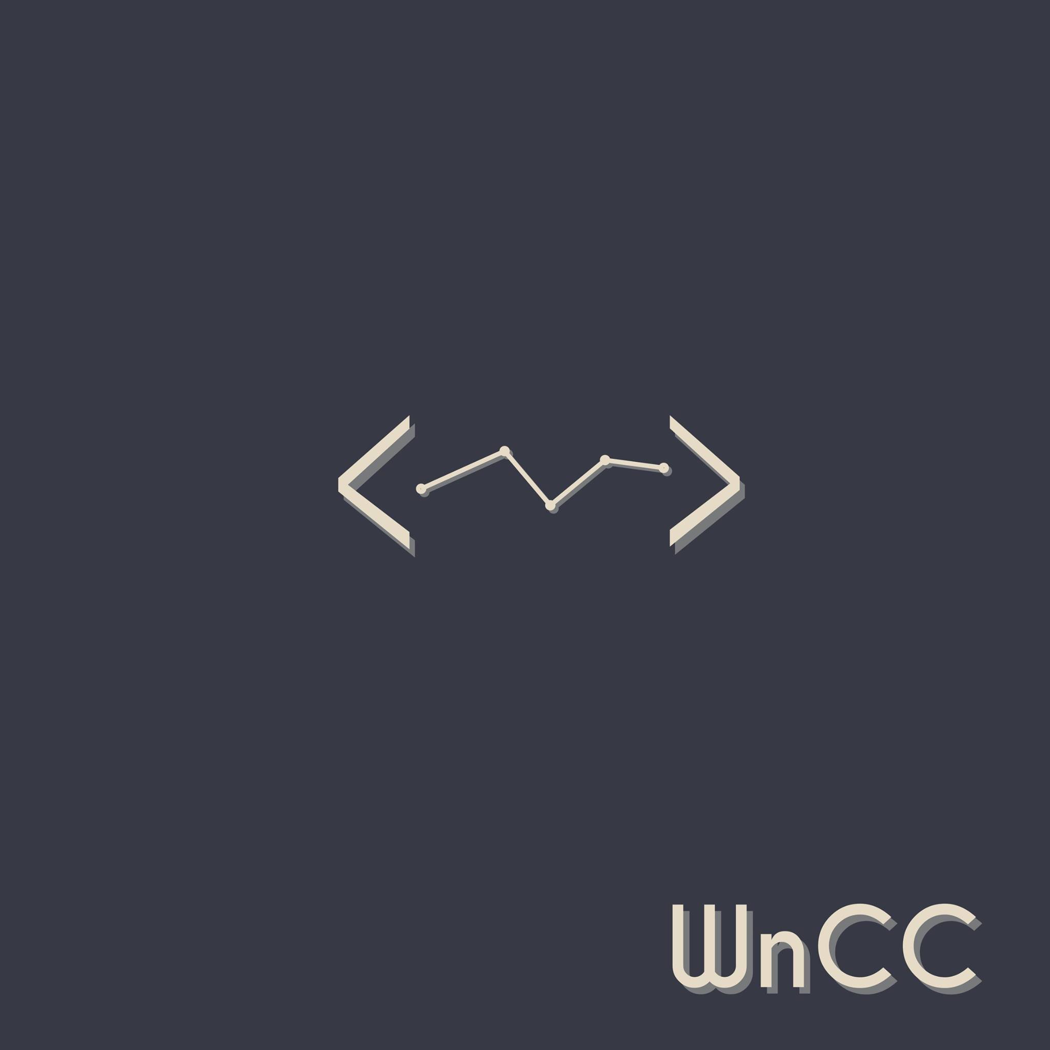
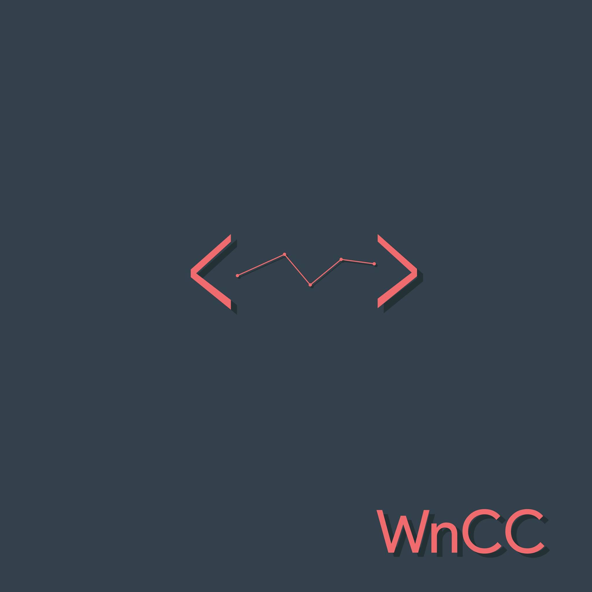
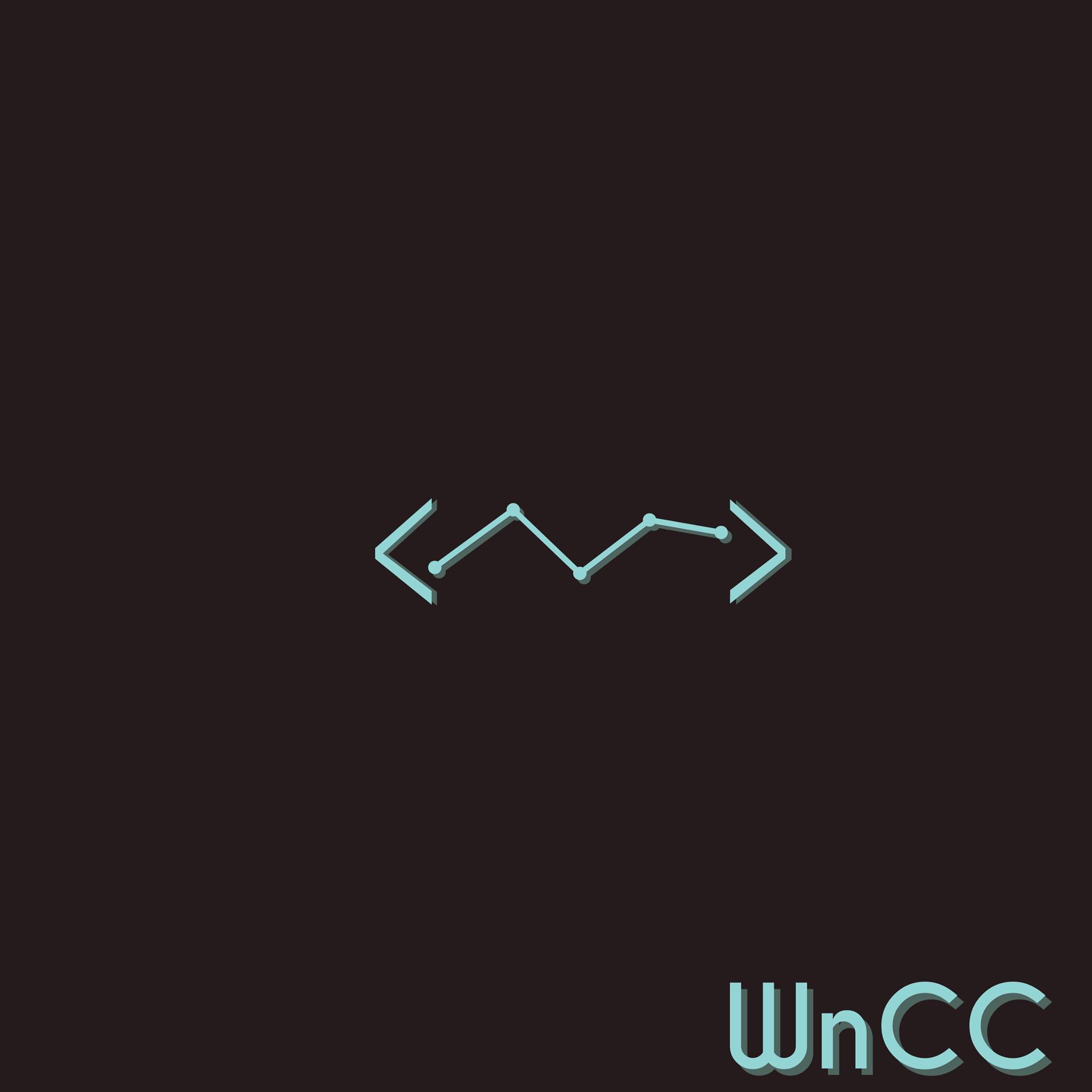
Three more color schemes
Kumar Ayush
I agree with Manish. Why not just keep all?

Videsh Suman
Besides, I don't find the font cool enough.
Here are a few fonts which seem nicer. Suggestions are welcome.

Videsh Suman
Mayank Singhal
To unsubscribe from this group and stop receiving emails from it, send an email to wncc_iitb+unsubscribe@googlegroups.com.