$100 COMPETITION! - Make a poster for TW

Mat
Win $100 contributed, in your name, to the guidebook Inside TiddlyWiki - the Missing Manual by expert TW developer and expert TW educator Eric Shulman.
...by designing a A4/letter sized poster that attracts people to TiddlyWiki
It should be ready for simple print out, with a common printer, to put up on university billboards, in corporate lunch rooms, taped on the lab door, public outdoor billboards, community houses, etc. This is a rare opportunity to contribute to our community without being a programmer! Or a spender for that matter ;-)
The competition will run December out and the winner will be announced shortly thereafter and the prize will be transferred to the Inside TiddlyWiki project. The grand jury is... well, let's just say it's as small as it gets and highly subjective ;-)
Critera
- The purpose of the poster is to get the maximum number of new people to try out TW.
Beautiful graphics, ugly sketches, 3-D tiddlers or 3-year toddlers - use whatever it takes to get people to try TW. Ok, no profanity, false claims, etc. The jury evaluates only perceived effectiveness at attracting people to TW.
- www.tiddlywiki.com/poster - this url must be mentioned. They will be met by the poster there with a link to tiddlywiki.com
- SVG format ideally, but if not available in your software then use jpeg, tiff or png (unless some expert here objects). The idea is anyone can print it on a common color printer but SVG is particularly good for embedding on the website.
- Size - 210mm × 279mm (8.26" × 11") to work both for European (A4) and North American (letter size) paper BUT you should probably include some margin in this because printers often add this. Pure text typically has 25mm/1" margin.
Portrait or landscape does not matter.
Yes, of course you can send in multiple different candidates! Maybe add a black/white version? Not necessary to win, but good for TW. There is only one winner but all contributions will be available for use in (only) TiddlyWiki contexts.
Tips
A good framework for designing an effective poster is the well known AIDA formula;
- get the Attention ("catch the eye"),
- create Interest ("hm, wiki what?"),
- create Desire ("...oh, I could use that for ... !")
- stimulate Action ("I'm must go to tw.com now!")
It is my absolute belief that the most valuable contribution the majority of us here can do is to get more members to our community. This is the prerequisite for everything else, including more development.
...so get a pen and paper or switch over to that graphics software you've got - now! ;-)

Duarte Farrajota Ramos
Duarte Farrajota Ramos

The text is generic, may be adjusted to whatever you want later, its was designed in Inkscape so the original is a full vector artwork available in SVG:

Birthe C
Lovely fish, beautifully coloured. We could pick colours from that for many a TiddlyWiki palette.
Birthe

Tobias Beer
Ok, so here is my entry, what do you guys think?

Stephen Kimmel
It's very nice. I can see us using that on the HelloThere page.
Mat
As jury (er, I mean, as part of the grand jury, of course) I will intentionally refrain from expressing what I think of it right now other than to say that you're clearly displaying graphical skill. As mentioned previously, this is not a criteria per se for the purpose described so I hope nobody gets scared off.
As an encouragement to everybody - this actually is the only contibution coming in thus far! You can't let Duarte win this without any competition, can you? Consider that you're doing it for the improvement of TW and that you win the $100 perks in the Inside Tiddlywiki: the Missing Manual:
- Participate in online review and feedback
- PLUS listed as a "Sponsor of Inside TiddlyWiki" online and in the final publication
- PLUS credit for one hour of private consulting to evaluate/debug one of your original TiddlyWiki documents.
This last bullet alone - one hour of private consultation from a Silicon Valley programming expert specialized in TiddlyWiki - is worth many times the $100.
Have you dismissed some things as "so difficult I don't even know where to start so I'll just leave it...but it would be fantastic if... " - well, Eric can help you!
Imagine talking with Eric right now - what would you bring up?
<:-)
Tobias Beer

Duarte Farrajota Ramos
Haha didn't know about the babel fish from The Hitchhiker's Guide to the Galaxy, so that must be where the name of the old yahoo translation website came from.
I did forget to mention the ideia behind it all, this was actually inspired by an idea that ran quite some time ago back when you were searching for an official icon for TiddlyWiki. I always thought the word tiddler came from tiddly as small or compact and simple, but apparently as Stephen mentioned it is also a fish species whose scientific name, according to Wikipedia, is Three-Spined Stickleback.
Doing a Google search I found a few nice images which I use as reference reference, and the colors are actually more or less accurate according to the last image found in this website, with some artistic liberties in the mix of course.
So it should be pretty straightforward now, the fish obviously came from the "tiddler" species, and those lines, that "go in" all tangled and "come out" straight and lined up represent how tiddlywiki is great for organizing and displaying your information in a neat and customizable fashion. The triangulated "low poly" style seems to be pretty much "the thing" currently throughout the internet, did my best to capture that feeling.
Duarte Farrajota Ramos
I hope it's the later, I was a TiddlyWiki classic user quite a few years ago, I am strongly considering coming back to TW5 given it's power and new features, but being a mere user with very limited coding skills the lack of documentation is still an issue for me.
Having that book as a TiddlyWiki I can refer to any time will be a great bonus
Duarte Farrajota Ramos
As stated earlier, the text is just a placeholder, something more "official" sounding should probably be written by the developers or the knowledgeable people here

Jon
those lines, that "go in" all tangled and "come out" straight and lined up represent how tiddlywiki is great for organizing and displaying your information in a neat and customizable fashion.
I think it's stunning but funnily enough I read the lines the other way round - that the straight lines were what went in, and what came out was something more organic, representing the various interactions of individual tiddlers producing a variety of possible stories.
Jon.
Mat
As stated earlier, the text is just a placeholder, something more "official" sounding should probably be written by the developers or the knowledgeable people here
While "the developers or the knowledgeable people here" can correct possible factual errors you may write, I should point out that those people probably not representative of the people who will see your poster up on walls over the world (should it win). In other words; I strongly urge you to actually phrase the words so that it will be the poster that you think would attract the maximum number of people to try out TW. Factual errors are disregarded and can be corrected later, but your disclaimer is almost saying "I've created half of a poster" which is not fair to yourself because you did clearly put thought into the text.
Now that said, your point does raise an important aspect: This competition and the poster is of course for the benefit of the TW community (us!) so it should be clear that all contributions belong to the community and can be manipulated by anyone for the promotion of TW. Allowing for the text to be easily changed for local demographics (languages, tech vs non-tech people, age...) is very good. Still, to actually phrase the words is part of the poster and part of the challenge.
@Jeremy
BTW, if Jeremy is positive, maybe tw.com could host more than a single poster for easy access and download (maybe at .../posters). But there is still only one winning poster in the competition, of course.
Thank you for your contribution Duarte!
<:-)

David Gifford
Don't consider this a contest entry, just a suggestion for the poster text. Were I a graphic designer I would put bundles of light gray tiddler icons to the left and right of the text, linked to each other blue lines to show that the tiddlers are connected like a network. Instead I offer this accompanying text for your consideration. Could go with the pooping fish design or some other design. Blessings.
Duarte Farrajota Ramos
I was however actually more concerned about any technical inaccuracies I could inadvertently write, but that sounds like a good idea, keeping an editable format around for the community to be able to adapt the poster to any particular event/language/target audience that may be arise. Or perhaps alternatively contemplate some blank space specifically for that purpose in the very design of the wining poster, so that whoever prints it can add any local information.
If need arises I can help translate any texts to Portuguese, my native language
Most welcome, my pleasure to participate.
Duarte Farrajota Ramos

The "connecting words" is actually a great idea, made a new poster based on the concept more abstract design if you are more into that sort of thing.
Think wikiwords, tags and links that connect tiddlers together in a complex global network mesh, hope you like it.
On a side note, also updated the original poster to match the correct required dimensions, realized I had specified the wrong paper size.
Duarte Farrajota Ramos

Eric Shulman
On Thursday, December 11, 2014 6:41:37 PM UTC-8, Duarte Farrajota Ramos wrote:
Hahahah "the pooping fish design" made me laugh, nice nickname!
The "connecting words" is actually a great idea, made a new poster based on the concept more abstract design if you are more into that sort of thing.
Think wikiwords, tags and links that connect tiddlers together in a complex global network mesh, hope you like it.
Birthe C
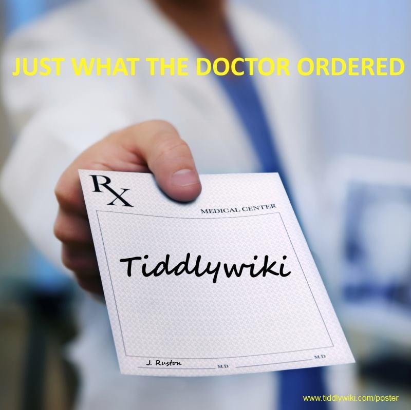
The prescription is my favourit. I seem to have problems finding the right daily dose though.
Birthe
Tobias Beer
The prescription is my favourit. I seem to have problems finding the right daily dose though.
Duarte Farrajota Ramos

Once again, all proposals are full vector artworks, drawn in Inkscape, and available as SVG files for native inclusion in tiddlywiki.
This one had an auxiliary 3D model in Blender to get the diamond shape just right.

Andreas Hahn
> Once again, all proposals are full vector artworks, drawn in Inkscape,
> and available as SVG files for native inclusion in tiddlywiki.
> This one had an auxiliary 3D model in Blender to get the diamond shape
> just right.
expressing the concept of TiddlyWiki through geometric shapes. I however
also think that any text included in such
a poster should be easily readable and particularly the bottom text
might be a bit too much grey on grey ?
/Andreas
Duarte Farrajota Ramos
Also, if these are to be print-ready, those backgrounds might be a little environment unfriendly and cost ineffective, and color ink might not always be available so maybe a monochrome version might be in order.
Duarte Farrajota Ramos

Stephen Kimmel
One of the dictums they teach every beginning writer is to "Show not Tell." Obviously showing what TiddlyWiki can do on a poster is a lot harder than just telling is going to be a challenge but I think the graphic should make the attempt.
By the way, Duarte, my favorite of the posters suggested so far, is your fish.

Felix Küppers
Felix
Duarte Farrajota Ramos
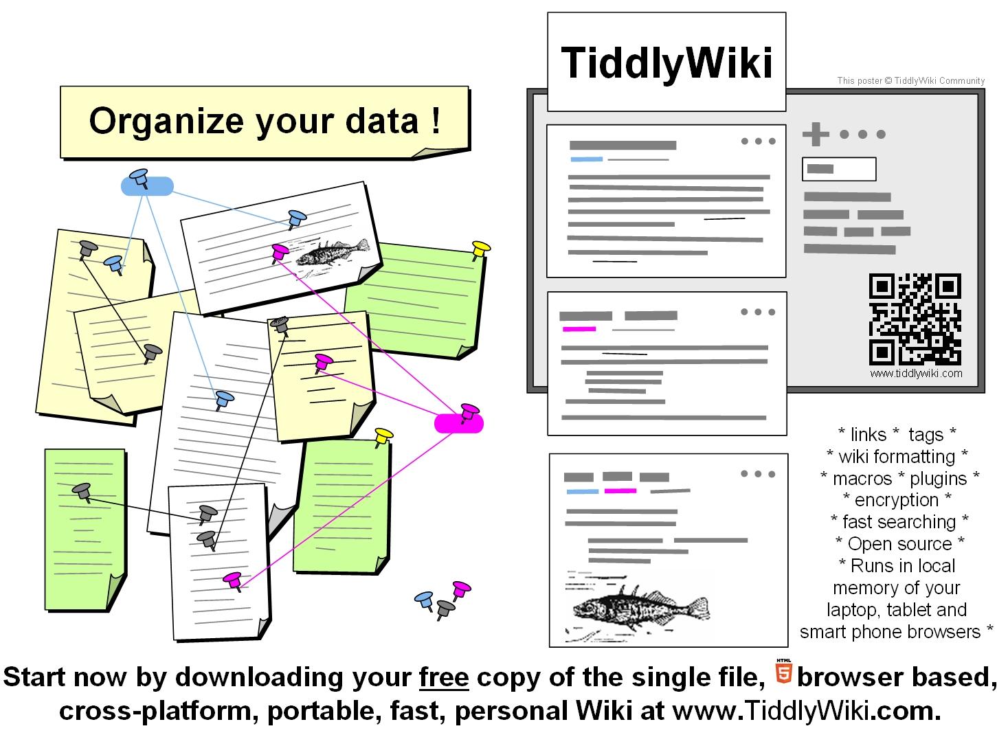
- The fish represents the tiddler
- The "crystal" and nodes represent how the several linking elements (links, tags, wikiwords,etc.) constitute the backbone of a tiddlywiki
- And the diamond resulted fromEric Shulman's suggestion and I quote "implication being that the facets are tiddlers, and bringing them together in an organized way makes a very valuable result" - and solid if I may add
Although has you said conveying through images the abstract concepts of a "wiki" and "information" is very hard, and not always universal (like the fish, in Portuguese for example a tiddler means absolutely nothing).
Still we can start aiming here on the opposite direction and perhaps instead try to associate a strong (even if somewhat random) image with tiddywiki brand

Duarte Farrajota Ramos
On Monday, 15 December 2014 06:25:47 UTC, wimm wrote:
This is my attemptWiM
Felix Küppers
this is really a cool picture!
Under which license did you publish it? Would you mind granting me the rights to use it as it I want to use it for my tw-taskgraph plugin :)
Your graphical elements really look like the nodes in taskgraph.
See the demo here: http://wkpr.de/hosting/tmp/tw5/taskgraph/
Felix
Matias Goldman
Under which license did you publish it? Would you mind granting me the rights to use it as it I want to use it for my tw-taskgraph plugin :)
Felix, while it of course is nice that you ask WiM, I stated in an earlier message that:
This competition and the poster is of course for the benefit of the TW community (us!) so it should be clear that all contributions belong to the community and can be manipulated by anyone for the promotion of TW.
<:-)
Mat
second attempt added some text (required according to the rules ;-)WiM
Sorry if I've been unclear: text is not at all required. The contributions are judged according to how well they are perceived to accomplish the goal i.e to attract people to try out TW. It could be a poster showing... well just anything, at least hypothetically.
The point I made on Dec. 11 regarding text was that a poster with a mere "dedicated space" for text is not good because it is not something anyone can actually use. It is not a finished poster for anyone to simply print out. But if your poster is supposed to look a certain way, with or without text (or images, or whatever) then, hey, go ahead!
I'm sorry if I was unclear but I'm happy you brought this up! Don't hesitate to tell me if there's anything unclear.
Again, WiM, thank you for your contribution!!!
<:-)
Mat
One more thing; please note that it is not necessary to post your poster here in the google group. You can also email to me at: boardsmm at gmail dot com as I stated in the introductory announcement.
Notice that the competition is for the good of TW - we want the best poster -(s?) possible for TW - so, just like with TW and open source, it is fully allowed to take ideas from others and improve on them. This means it is also a "risk" putting up your contributions on the boards.
<:-)
Felix Küppers
Felix, while it of course is nice that you ask WiM, I stated in an earlier message that:This competition and the poster is of course for the benefit of the TW community (us!) so it should be clear that all contributions belong to the community and can be manipulated by anyone for the promotion of TW.I would include promoting your tw-taskgraph in promoting TW.
Nice! Thanks for this clarification Mat! The I will use it for my purposes. :)
Felix
wimm
Felix Küppers
Felix,your welcomeWiM
Thanks WiM!
Duarte Farrajota Ramos
If you are ok with it I would later like to post it on the Inkscape users community page on Google+
Mat
Is it ok if we post the posters elsewhere?
If you are ok with it I would later like to post it on the Inkscape users community page on Google+
I think it's fair to say that all contributions in this competition are intended to be spread as absolutely much as possible - on the presumption that they are used for the promotion of TiddlyWiki or the TiddlyWiki community. If anyone objects, raise your voice now or yee shall forver be silent.
However, I'm thinking we should add a small "Copyright © TiddlyWiki community" on the poster for a (microscopic) protection against some other part blatantly using our posters for other purposes. That local stickleback dealer, to name one fishy guy.
<:-)

Alex Hough
--
You received this message because you are subscribed to the Google Groups "TiddlyWiki" group.
To unsubscribe from this group and stop receiving emails from it, send an email to tiddlywiki+...@googlegroups.com.
To post to this group, send email to tiddl...@googlegroups.com.
Visit this group at http://groups.google.com/group/tiddlywiki.
For more options, visit https://groups.google.com/d/optout.
Alex Hough
Birthe C
When I saw your former links I couldn't help thinking, "but where are the tiddlers?" I did not have to worry for long ;-). Nice to see tiddlers holding several sticklebacks. And the big black one running over the screen, so funny.
Biggest tiddler caught
Birthe
Mat
Ya gotta love it! Scrolling down, I got a bit scared of the Teenage Mutant Ninja Tiddlers tho. Tiddlers are supposed to be small chunks, but those is clearly something with too much content. Sections or divs or something.
If we have a $100 video competition, that one is in the lead so far.
Speaking of the competition: Do keep the contributions coming, here or to above stated email. And do suggest ideas too.
<:-)
Felix Küppers
Maybe that's also worth a thought at some point If we think of developing a corporate design.
-Felix
Mat
Felix wrote:
Just a question: Does Tiddlywiki have a logo like other projects have:
There has been detabe on this before. I think that as of TW5, Motovun Jack is probably as close as it gets.
<:-)
wimm
WiM - great that you're continuing the creative process! Interesting idea with the QR code! Do people actually use those? I assume it is instead of manually typing the url, right?
Felix wrote:Just a question: Does Tiddlywiki have a logo like other projects have:
There has been detabe on this before. I think that as of TW5, Motovun Jack is probably as close as it gets.

Jeremy Ruston
--
You received this message because you are subscribed to the Google Groups "TiddlyWiki" group.
To unsubscribe from this group and stop receiving emails from it, send an email to tiddlywiki+...@googlegroups.com.
To post to this group, send email to tiddl...@googlegroups.com.
Visit this group at http://groups.google.com/group/tiddlywiki.
For more options, visit https://groups.google.com/d/optout.
Duarte Farrajota Ramos
Now that is one curious story, thanks for sharing! This should definitely be officially featured in tiddlywiki.com as label for the image. :)
Felix Küppers
The rationale for a kitten being the mascot is that a well-fed kitten is full of tiddlers...
Nice allegory.
The other reason is that I encountered Jack during a brief holiday in Croatia just as I was leaving BT and deciding to work on TiddlyWiki5. I've uploaded a bunch of the other photos here:
Truly amazing pictures in all your albums.
-Felix
Jeremy Ruston
-Felix
Felix Küppers
Thank you - although I think it's the camera that does all the work really :)
Hehe, must be a camera then that has a great sense for mood, and for situations full of ambiance :)
Mat
Thank you - although I think it's the camera that does all the work really :)
But of course, haha! I can only agree w Felix - those are some terrific pictures!!
<:-)
Alex Hough
--
Jeremy Ruston
Some kind of logo made from WikiText! ! !< * ]]~~~~~~~ >< ]]#

On 23 December 2014 at 15:03, Mat <matia...@gmail.com> wrote:Thank you - although I think it's the camera that does all the work really :)
But of course, haha! I can only agree w Felix - those are some terrific pictures!!
<:-)
--
You received this message because you are subscribed to the Google Groups "TiddlyWiki" group.
To unsubscribe from this group and stop receiving emails from it, send an email to tiddlywiki+...@googlegroups.com.
To post to this group, send email to tiddl...@googlegroups.com.
Visit this group at http://groups.google.com/group/tiddlywiki.
For more options, visit https://groups.google.com/d/optout.
Mat
December has ended - so who is the winner in the poster competition?
...well, a thing has come up that makes me extend the contribution period a few days:
Eric is temporarily increasing the perks for the contributions to the Inside TiddlyWiki: The Missing Manual project!
He is giving a special super duper perk week and generiously gave persmission for the poster competition to ride on this! This means the winner - maybe YOU - will make it to the $500 "PARTNER" PERK level and win:
* access to the "Inside TiddlyWiki" discussion group, where you can review early drafts of book content
* listed in the book credits as a "Partner of Inside TiddlyWiki"
* an autographed, "first edition" PRINTED COPY OF THE FINAL PUBLISHED BOOK
* 4 hours credit toward private TiddlyWiki consulting services
Alex Hough
Alex Hough

Handoko Suwono
I have seen a few of them, they are good. Isn't it possible for us to vote for one which has the most likes to win or as part of the weighted average on winning? If that so you should make them paraded for awhile before deciding the best.
Handoko -
On Friday, December 5, 2014 7:56:00 AM UTC+7, Mat wrote:
Fellow tiddlywikians,
Win $100 contributed, in your name, to the guidebook Inside TiddlyWiki - the Missing Manual by expert TW developer and expert TW educator Eric Shulman.
...by designing a A4/letter sized poster that attracts people to TiddlyWiki
It should be ready for simple print out, with a common printer, to put up on university billboards, in corporate lunch rooms, taped on the lab door, public outdoor billboards, community houses, etc. This is a rare opportunity to contribute to our community without being a programmer! Or a spender for that matter ;-)
The competition will run December out and the winner will be announced shortly thereafter and the prize will be transferred to the Inside TiddlyWiki project. The grand jury is... well, let's just say it's as small as it gets and highly subjective ;-)
Critera
- The purpose of the poster is to get the maximum number of new people to try out TW.
Beautiful graphics, ugly sketches, 3-D tiddlers or 3-year toddlers - use whatever it takes to get people to try TW. Ok, no profanity, false claims, etc. The jury evaluates only perceived effectiveness at attracting people to TW.
- www.tiddlywiki.com/poster - this url must be mentioned. They will be met by the poster there with a link to tiddlywiki.com
- SVG format ideally, but if not available in your software then use jpeg, tiff or png (unless some expert here objects). The idea is anyone can print it on a common color printer but SVG is particularly good for embedding on the website.
- Size - 210mm × 279mm (8.26" × 11") to work both for European (A4) and North American (letter size) paper BUT you should probably include some margin in this because printers often add this. Pure text typically has 25mm/1" margin.
Portrait or landscape does not matter.
Yes, of course you can send in multiple different candidates! Maybe add a black/white version? Not necessary to win, but good for TW. There is only one winner but all contributions will be available for use in (only) TiddlyWiki contexts.
Tips
A good framework for designing an effective poster is the well known AIDA formula;
- get the Attention ("catch the eye"),
- create Interest ("hm, wiki what?"),
- create Desire ("...oh, I could use that for ... !")
- stimulate Action ("I'm must go to tw.com now!")
It is my absolute belief that the most valuable contribution the majority of us here can do is to get more members to our community. This is the prerequisite for everything else, including more development.
...so get a pen and paper or switch over to that graphics software you've got - now! ;-)

Mat
Dear all!
I am proud to say the jury has reached a decision. And the WINNER is...
Oh,
just first, I should mention that the decision process turned out
trickier than expected. In fact, I pulled in assistance from two friends
who work in marketing AND even my fiancee (M.D.) whom I bombarded
with a zillion questions such as "Which ones catch your eye the most?",
"If this appeared on your work place, what would the others think when
reading this?", "Which posters would work better on a board in a
stressed and messy environment - and which ones for a calmer place?",
"What would non-tech people think?", etc. There was particular talk
about what creates a "desire" to go to the webpage.
Well, there was quite a heated debate but in the end there was a next to unanimous decision. Can you guess? Well the WINNER is:
Oh, just first, we should have a rundown of all the contributions for everyones enjoyment and for reference.
Here
are the final versions of the variants people included. In reviewing
them we looked at earlier versions also (for instance WiMs many touch ups) but there was an agreement the latest was the best anyway so this
did not affect things. So, here I only include the final versions of the
contributed variants:
In ARBITRARY, i.e no particular, order:
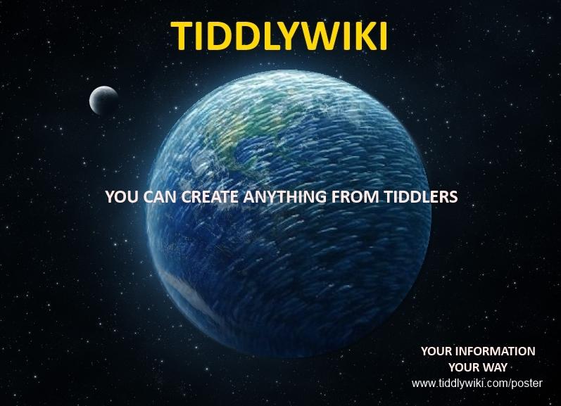
WiMs TW Concept (remade into jpg for display here):

Stephens Ordination:

World of Stephen:

Duartes Fish:

Duartes Diamond:

We also got encouraging input from several people that has affected some of the contributions.
So... are you ready?
My warmest contratulations goes to the fisherman - non other than Duarte!
While I explicitly did state that beautiful graphics were not important - per se - it is undeniable that his fish catches the eye. A good catch to say the least. And you go "hm, what's this". As particularly my fiancee pointed out, it also creates a first impression of TW namely that it is something polished and slick. Now, both my marketing friends and I have some opinions that there probably should be some more "call to action" but on the whole we were all very impressed.
I also want to bring up WiMs contribution. Bri-li-ant! In fact, it is so good that I have made a version myself which I will put up shortly. (Oooh, I wish there was a contest ;-)
Of course also my warmest thank you to Stephen! I really liked both the doctors order (funny!) and the globe (impressive!) I doubt people would understand it was about some kind of personal wiki, but cool nonetheless! And I don't think I must mention which one my M.D fiancee liked the most ;-)
GREAT CONTRIBUTIONS FOR THE CONTE... no, wait.. FOR OUR COMMUNITY, GUYS!
So what happens now? Well, the prize money has already been transferred as a contribution to Erics Inside TiddlyWiki project (even if via paypal) and he will, if not already, be informed about Duartes win. BTW, I urge everyone to take this remaining last day to jump on his SUPER PERK UPGRADE. I just did myself the other day. Imagine your friends or colleagues seeing your poster, starting to use TW... only to find out you are also part of the book!!! And this/these books, Inside TiddlyWiki, will be around for a looong time, for sure!
Let me also tell you that Jeremy has promised that ALL posters can become available via tw.com meaning that anyone wanting to do a quick printout can choose whichever is most suitable at that time! However, there are some file format aspects. In a private conversation, Jeremy wrote:
"Basically, in order to print at decent quality at A3 size we'd need the JPEG to be around 3,500 by 5,000 pixels. SVG is just the most web-friendly resolution independent format (decent quality still requires that any embedded bitmaps be of a sufficiently high resolution)."
Now, the poster competition was about A4 (figuring this is what will result in the maximum numbers of posters actually put up). But, particularly for the winning poster, would anyone be willing to help make it perfect according to Jeremys description? (Yes, we're all looking at you @Duarte ;-)
Ok, thank you guys. It was a great contest and we did it for us!
<:-)
Duarte Farrajota Ramos
I am of course available to make any final adjustments to my poster required to match you standards and requirements. There is always a somewhat implicit need for some post-contest fine-tuning, even from my part, as I would myself like to make a few small additions and touch ups for the final version. So let me know what Jeremy, Mat, Eric or anyone else requires.
A few questions of my own that stand out the most are:
- Is the poster size really 210mm × 279mm ? I know we are accounting for American standard paper sizes, but an ISO A4 paper is 210 x 297mm. Just want to make sure it is not a typo.
- The Tiddler fish entry is a full vector SVG drawing (no raster graphics whatsoever) so there should be no print quality issues at any size, it can also be export as raster graphics of any required dimensions, but:
- Shouldn't the "default" poster download file be a PDF file? It is easy to print directly, well supported (opens everywhere, most current browsers have built-in PDF viewer), and since it is vector based too, provides a great balance between file size and quality, and can also easily be imported back into Inkscape for further editing without any major loss of information.
Most common users are probably not tech savvy enough to deal with SVG files, and will most likely print as is, no editing involved, so SVG might be overkill. Images are either low quality or may become quite large in terms of file size with high enough resolution. JPG is probably a bad file format for this kind of "illustration" type of image (causes compression artifacts), PNG is also widely supported and would probably provide better secondary file format (with the downside of increased file size). - Anyway for display purposes inside TiddlyWiki SVG would still be the best bet, so from my part I will gladly provide the final version in all three file formats (PDF for printing, SVG for display inside tiddlywiki, and PNG (or JPG if you prefer) for display/printing elsewhere.
Anyway let me know what you think, and what needs to be done. If you wish to continue in a more private fashion you can reach me at my GMail duarte.framos
Thanks again
Duarte Farrajota Ramos
BTW, I urge everyone to take this remaining last day to jump on his SUPER PERK UPGRADE. I just did myself the other day.
<:-)
Also would like to let you know I just made an additional contribution to the noble cause. Hope it helps :)

HansWobbe
Congratulations!
I think these should be posted at Flickr. If you'd like, I'd be happy to do so for you and set up some appropriate Tags and perhaps even a TW Photographers & Images Group.
Regards,
Hans
Mat
I am of course available to make any final adjustments to my poster required to match you standards and requirements. There is always a somewhat implicit need for some post-contest fine-tuning, even from my part, as I would myself like to make a few small additions and touch ups for the final version. So let me know what Jeremy, Mat, Eric or anyone else requires.
Truly a worthy winner!!!
Ok, the main thing pointed out was a clearer "call to action", i.e in our case something that makes the viewer actually go to the computer and type in the url. (Hm... will it work well on the phone?)
Here are some examples of "calls to action in ads" but I think it's enough with something simple that stands out (red? "handwritten"? encricled?) and just plants a sentence in their like "You MUST type in tiddlywiki.com/poster in your browser NOW". (Yes it's corny but it's not meant to be pretty/clever/subtle/... it's ment to make them click.).
A few questions of my own that stand out the most are:
- Is the poster size really 210mm × 279mm ? I know we are accounting for American standard paper sizes, but an ISO A4 paper is 210 x 297mm. Just want to make sure it is not a typo.
Yes, 210x279 is to make it fit both on European A4 and on US letter size. I reason it's better with a few mm of white margin than someone not being able to print it or have it cut. With your fish maybe it doesn't matter if the lenght is cut a bit - any @Americans here who can tell). Ideally a slightly too small image should be centered on their printout but with so few mm I think it wouldn't matter much if it wasn't. If you have a better idea - rock'n roll.
@Jeremy
As for your format questions, I will let Mr.R reply. Personally I think pdf sounds like a terrific idea! And I'm VERY happy to hear you're willing to provide multiple versions. One little thing I think would be particularly valuable would be a monochrome version(s).
Jeremy, is there anything you need help with when it comes to putting up the posters? I think the best, from an accessibility point, would be a gallery showing all posters available and perhaps stating "creator", "file format" and a print button. If you give some specs, maybe someone could help set up such a gallery?
<:-)
Duarte Farrajota Ramos
That sounds like a terrific ideia, but perhaps wait for the final approved version before publishing?
Anyway I am not in charge here, Jeremy and Mat will advise on the best course of action, but from my part you have my blessings.
Duarte Farrajota Ramos
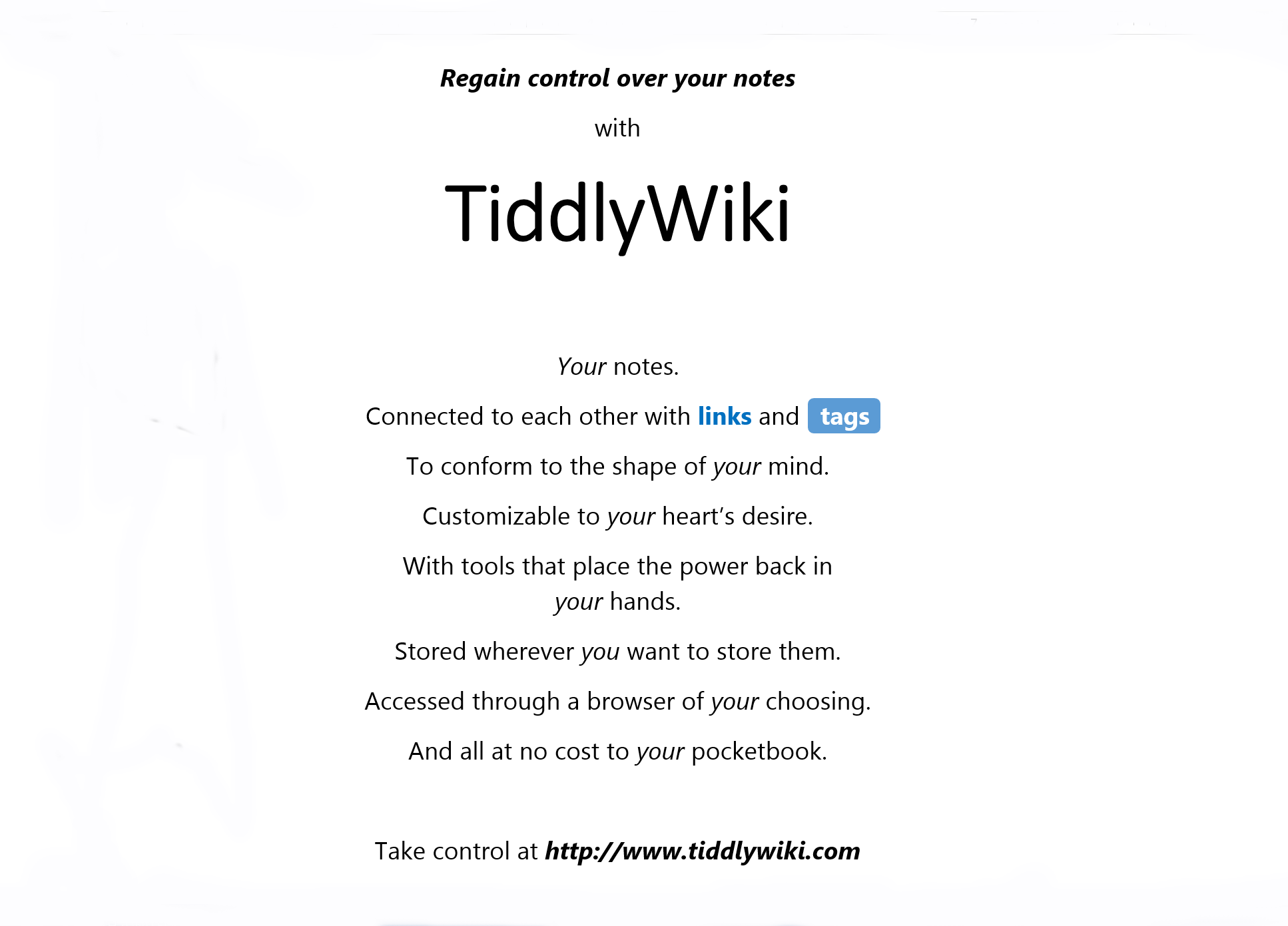
OK, so I remastered the poster to fix a few small issues with the previous version and to make some additions I meant to add, like the small call line to emphasize the topics and reworking the text a bit. Did some further thinking, organized my ideas and refined the wording to better match what I initially meant to say, and also added your "call to action" right on top.
This is not at all a closed final version, its open to debate so please let me know what you think, and what should be reverted back to original, some topical points:
- Again I understand you want a more down-to-earth "common user" approach to the phrasing but I still urge you (community dwellers, knowledgeable people and developers) to please review my text, mainly to see if I committed no technical inaccuracies, and no grammatical/syntax errors. Please do correct me as English is not my native language.
- Is the catch phrase or call to action to your liking, or did you have something else in mind? Suggestions are gladly accepted, I am not very good with words ;)
- I tried changing the link to
www.tiddlywiki.com. Isn't the poster supposed to promote tiddlywiki
itself to new users? I think it makes a lot more sense to point directly
to the real thing, instead of pointing to a poster again, which might
confuse new users who seem to be the main target audience. Other users
will probably find their way to the poster easily.
- Removed the fish shadow mostly for practical reasons: makes more room for additional text, and unclutters the poster of redundant visual elements. It can easily be added back in if you think its essential.
- I kept "personal signature" watermark throughout the previews, I assume it should be removed for the final version, right?

Here is a PNG version with 5580 x 4200 pixels, I think it is more than enough to print even bigger then an ISO A3 (I can make it larger if desired), and at about 1.4mb filesize seems like an acceptable download for today's standards. Equivalent PDF clocks at about 206Kb (apparently the blurry shadows have to be rasterized, since PDF doesn't support all SVG filters but I don't think quality will be an issue). Equivalent SVG file will probably be under 146Kb after optimization.
Awaiting further instructions
Tobias Beer
Duarte Farrajota Ramos

Felix Küppers
great idea with the list circles below the fish.
-Felix
Jeremy Ruston
Jeremy Ruston
Mat
Here is my suggestion, and below the reasoning:

- (@ also Tobias) while I like the "scatterbrains... remedy", I'm afraid this is too abstract here and requires too much figuring out. We must not forget that even the fish itself appears TOTALLY irrelevant to someone not in the know. (Here are some examples of brilliance for exactly this. Ironically the very first example is from our main competitor, if there ever was one: Evernote!)
- The (stakkato) sentence captures the problem, the (resulting) solution and ends with an immediate call to action.
- The "free*" is a strong selling point for almost anyone who bothers with open source, at least in my experience.
- The asterisk and the "explanation" at bottom is "supposedly discrete" while it is obviously not - actually it is obviously intended to be seen, and the "yes, free" adds a bit of humour. The "check it out" is another call to action and in some sense the end of the poster.
- I actually wouldn't mind a bit more jumbled lines, I mean spreading out in a somewhat wider angle. My mind is a lot more scattered than that ;-)
- @Jeremy - "www.tiddlywiki.com" vs ".../poster", Jeremy suggested the ".../poster", I assume as a way to measure the effect of it all. Frankly, if I saw this url, I would still just go to tw.com particularly since I have to type it in manually. Jeremy - what do you say, can we skip "/poster"?
- For phrasing the factual content, I say go with Jeremys suggestions.
- Please do remove the watermark but if not visible then do add e.g "tiddlywiki.com"
- Like Felix, I love the circles. I have no idea why, but I love them. Maybe it binds the sentences visually, subtly messaging they're connected into a story... somehow breaking the feeling of a list... I don't know.
<:-)
Birthe C
The word free* is important, the red color do call for attention, but not only in a good way. If it could be changed a little to better match the colours in the fish. Duarte is the artist let it be up to him.
Birthe
Mat
changed a little to better match the colours in the fish. Duarte is the artist let it be up to him.
Good idea. I would stand out more than enough also with a niceer matching colour. I'm sure señor Picasso will handle it ;-)
<:-)
Duarte Farrajota Ramos
@Jeremy
Thank you, I am very glad that you like it. Your publishing method seems adequate, I intend to provide you three final files once the design gets the approving green light from you:
- An optimized SVG file (will reduce file size and improve compatibility) for display purposes embedded inside tiddlywiki, and any further community editing
- A raster PNG version in as many sizes as you see fit (let me know what you require)
- A ready to print PDF (All data will remain vector based, except for the fish drop shadow which is an SVG filter and cannot be natively exported to PDF)
I can specify any resolution you desire, but "blurry shadows" don't require very high definition, at 300DPI is more than enough, I notice no visible pixelation.
@Jeremy, Mat, and Birthe C
I went with Jeremy's proposal for the text topics, thanks for the suggestions these look genuinely better.
As for the call to action I made two variants, one following Mat's suggestion (yes free is indeed an import message) and another inspired by it.
Mine uses the "Tag pill" to connect the asterisk much like wikiwords and tags connect a hole wiki together, and a call to action that is a bit more "poetic" so to say, but still alludes to the collecting and note taking nature of tiddlywiki, plus a vague sea->fish reference.
Final version may very well end up being a mashup of all the available options so let me know what you like and what you don't.


Mat
One tiny idea I just thought of would be to see if the word tiddlywiki would be clearer if we made "www" and "com" a little fainter. All URL's give a complex impression and maybe this would make it easier on the eye. Just an idea.
...Duarte, again, it really is fantastic!!!
<:-)
Tobias Beer
I like...
*yes, free. check it out
Duarte Farrajota Ramos
That's an excellent idea Mat, really like it and I think it works very well, check it out here:

I have to agree with Tobias on the *yes, free. check it out though. I I don't think it's a deal breaker, but hear some more opinions, it is after all a community poster
Mat
That's an excellent idea Mat, really like it and I think it works very well, check it out here:
I have to agree with Tobias on the *yes, free. check it out though. I I don't think it's a deal breaker, but hear some more opinions, it is after all a community poster
Ok, let us look at what this means. I'm all positive for some other way as long as it takes the following in consideration:
A call to action must be noticed and be a lasting message. For this to work, something has to echo in their head as they leave the poster. My marketing friends stress this and I'm in 100% agreement with them.
So, let's look at if we cut out "yes free, check it out". The essence of the call to action remaining is then in the top line word "Now". This, however, has a dual meaning here, both implying "Do it now" but also "Your messy thoughts will be organized now". It's ok, but not great as a way to have the unassuming poster viewer actally go do something. However, the "check it out" is much more powerful because it is in imperative and it really ends the poster with a definite call to action. It is 100% clear what the viewer should do now. It takes it from being just another (very) pretty poster into a poster that plants an echo in their head to actually check tw out.
I'm all for alternatives... but they have to get more people to check TW out ;-)
Thoughts?
<:-)
Jeremy Ruston
Yes, it did really work well. Now let's just hope Jeremy feels it's ok with us having removed ".../poster"
I have to agree with Tobias on the *yes, free. check it out though. I I don't think it's a deal breaker, but hear some more opinions, it is after all a community poster
Ok, let us look at what this means. I'm all positive for some other way as long as it takes the following in consideration:
A call to action must be noticed and be a lasting message. For this to work, something has to echo in their head as they leave the poster. My marketing friends stress this and I'm in 100% agreement with them.
So, let's look at if we cut out "yes free, check it out". The essence of the call to action remaining is then in the top line word "Now". This, however, has a dual meaning here, both implying "Do it now" but also "Your messy thoughts will be organized now". It's ok, but not great as a way to have the unassuming poster viewer actally go do something. However, the "check it out" is much more powerful because it is in imperative and it really ends the poster with a definite call to action. It is 100% clear what the viewer should do now. It takes it from being just another (very) pretty poster into a poster that plants an echo in their head to actually check tw out.
I'm all for alternatives... but they have to get more people to check TW out ;-)
Thoughts?
<:-)
Tobias Beer
A call to action must be noticed and be a lasting message. For this to work, something has to echo in their head as they leave the poster. My marketing friends stress this and I'm in 100% agreement with them.
Also, it slightly hints at how TiddlyWiki might just be very apt to cope with the genius that is you,
- an realisation of your problem with a pinch of subliminal flattery — Scattered Brains?
- a call to action, hinting at the solution — Organize.
- and another call to action — Now.
- and a big incentive, rounding it all up — Free!
- immediately followed by the X that marks the spot with the treasure — www.tiddlywiki.com
Jeremy Ruston
Duarte Farrajota Ramos
Mat
Ok, a few quite interesting things have come up!
I wanted to take this to a teacher of mine to get his input - which I did today! He has decades of experience in marketing, copywriting, campaigns and advertising in all kinds of media and he teaches at the leading marketing school in Sweden (Berghs) on these and related subjects. I'm taking his course on "Communication Design" (at my university, not the marketing school) which is about (verbally) presenting so to effectively get messages across. He is 60+ and has a non tech background. I had previously mentioned TW but only in general terms (it's a wiki etc) and he doesn't really know about it or tried it, which I think was good for testing the poster on him. I told him about the competition and the purpose - and then showed him Duartes poster.
Well, first of all - again congratulations to Duarte. He was very impressed with the artwork and he thought it was brilliant in concept.
He also said it was unlike almost all other advertisement he had seen for technical products, and that this was a very good aspect.
He also had quite a few valuable and even critical pointers:
Perhaps to the relief of some, he did not like my "Free*" and "*yes free, check it out" bits. (Hrmpf!) He pointed out that a web address in itself is a call to action and he means the interest creation in itself pushes this.
Regarding the headline he said we should make this the prominent part, not the URL. He strongly suggests putting the headline above the fish and the URL under it, because the headline is what tells the story. And the headline and the URL should switch each others font size. BTW, Jeremy suggested (unless the technical disturbance in the communication made me misunderstand him) he suggests we skip the "www" and also the faint grey. He points out "www" is redundant and that the grey makes it look like we want to say something with the colors. Ok, possibly. Well, if we cut out the www, then the grey looses much of it's point anyway. I say we try it and see what it looks like, i.e simply "tiddlywiki.com" in one color.
Wording for the headline: He (my teacher) said:
Messy thoughts. Organized.
Ok.... hard to argue with that. That really does say it all. He also pointed out that "scattered brains" and similar is not good if it is to be used outside of Enligsh speaking countries. I think he's right. I kind of liked the "Now." but I agree it is even more direct without it. (Again I'm reminded of the Evernote line: "Remember everything." That also really says it all.)
Now for the absolute major crtitizism, and a classic beginners mistake: We have too much text. (I guess Herr "More is less" get's happy now ;-) And, somewhat to my embarassment, I only there noticed the font is actually also much too small! I had until then zoomed in every time I looked, but the poster is - well - it is as big as it is, A4. We MUST reduce the text and only take out the critical parts.
It is the typical beginners mistake to list all the technical benefits but this is not the right stage for this. As he pointed out, just about every other IT system is supposedly "versatile" and "knowledge base" etc and trying to list every benefit we can think of is like a desperate car salesman and instead signals insecurity as if you're nervous the customer won't like it. He says we should basically have more or less only the "free and open source" and "own you data". Now he's not an IT guy so he may not know exactly what our target market considers important but I can't argue with his general premise here. Listing a lot there will not convince anyone any more than listing a few things there. And if the "too much" makes the text difficult to read, well then we loose it all. Regardless, I would at least want to have something like "personal wiki" included. So I suggest:
a personal wiki ○ single html file in your browser
free and open source ○ no costs, you own your data
any platform, any time ○ desktop, mobile, tablet, offline or in the cloud
(He would probably say this is too much also. Can we make it even fewer words?)
Regarding the image (which he really liked!) he suggested that what comes out probably should only be one line, not many. I think that we here think of many tiddlers coming out but I think his point was to have "maximum order", i.e one thing. Ok, makes sense. (I fear it might look heavy if it's one thick black line though. Maybe paler? But should be same color as what comes in IMO.)
He also pointed out that the supposed "messy" lines aren't very messy because they are symmetrical! I agree with the "not very messy" but hadn't considered that it was they symmetry causing it. I think he is right. He suggested having one of the downpointing lines diverge much more so the viewer gets annoyed at something. Ok, worth a try IMO.
@Duarte... you up for it? :-)
<:-)
Mat
<:-)
Duarte Farrajota Ramos
Sure am, I was actually gonna post here when I read you message.
It's good
to have the input of an actual professional, although I have some basic
notions I have no formal education in advertizing or marketing, I am
simply an architect who happens to really like graphic design as a
hobby.
So here's what I came up with, I think it lost a little in
terms of overall balance of the composition, but the more minimal
approach improves the readability and message. Made the text larger and I
tried my best to fit the URL bellow the fish but just could find a
position it would sit nicely so I left it above. If you oppose it
strongly I will gladly move it back down, let me know what you think:

Mat
I agree with the overall balance issue there.
How about this (but, yes, it needs formatting too ;-)
>= <:)))))>{ ---
tiddlywiki.com
a personal wiki in html ⌽ open source and free
It this is not the absolute core of it then I don't know what is. Maaaaybe even cut "in html" because "open source" tops it anyway. This is extremely clear and IMO captures the absolute essentials of TW to make someone want more.
And funnily, having just made the above I'm thinking that an ascii version might just actually make some sense after all! If your poster becomes a bit of a trademark for TW (but I do hope people make more posters eventually) then a simple ascii, like AlexHough's hilarious stuff, might just make sense in some contexts, like signatures on discussion boards etc. Just a thought, but I'm tired and it makes my thoughts even messier than usual... I must go to tiddlywiki.com to get organi... no I should really slee... zzzzzzzzzzzzzzzz
<:-)
Duarte Farrajota Ramos
Haha thanks, yeah you know how deadlines are, I work mostly for archviz with 3D models and such and they always want them for yesterday so I went through
some pretty intensive sprints :)
That ascii version really looks neat and
compact, I could see it become some sort of official logo, light and
simple enough to include in TW.
So here it is, looks much more
harmonious now, thanks for the suggestion. I didn't strip as much
information though, I think there's still room for it without over
advertizing; too little info and it will become a riddle to new users
and we risk capturing no one's attention.
If you think it's still too much we can go with your even more minimal approach

Mat
Beginning to think maybe correspondence woudl be smoother via email,
but after each draft I find myself going "ok, just a few tiny things and
then we should be done!" - which has been going on now for quite a few
drafts ;-)
Anyway, here are just a few tiny things and then we should be done:
I
took the liberty of doing some editing myself, among other things to
make it even more balanced. This included move the
fish vertically a bit and making tw.com a bit more subtle (nobody can miss it though). I think it looks good, what do you say? I suggest putting my version as a transparent layer on top of yours to see all the detail changes.

I'm really happy we got some input from my teacher. It really improves it. The bit about putting the headline alone on top is great and, funnily, by putting the url under the fish it almost like when you have an image with a descriptive text under it, i.e "here you see a tiddlywiki fish" sort of.
Now... what I would really prefer is actually this one crucial bit to make sure they can't miss what might very well be the tipping point to make them actually try it out. See pic below. The line is intended to look as if a friend of theirs just wanted to make sure they didn't miss it and so simply picked up a pen:

I can only speak for myself, but I would be happy if it looks like this last variant.
<:-)
Duarte Farrajota Ramos
I think we are getting somewhere!
Not much of a fan of the "handwritten"
visual here, I don't really like the tick but I think can live with it :)
Recreated it um full vector fashion to keep the SVG as true to itself as
possible, also made an alternate version to see if anyone prefers a cleaner
look.
Would love to hear Jeremy and everyone else opinion before we can call anything final.

