New Slideshow Image Size

497 views
Skip to first unread message

Matt Selby

unread,
Jul 29, 2015, 11:51:29 AM7/29/15
to sporcle-u...@googlegroups.com
Small tweak to slideshow quizzes we released: We've updated the aspect ratio of these quizzes to match movies/tv shows. 

The maximum size for slideshows is now 640x360, and it should make it easier to use pictures without too much image editing.

Let me know if you see anything odd.

MasterKGlas

unread,
Jul 29, 2015, 1:44:16 PM7/29/15
to Sporcle University, mse...@sporcle.com
Is there no way to make this not affect the thousands upon thousands of slideshow quizzes released pre-update.  
I made 90% of my slideshow slides with image editing to make them fit the ratios exactly. 
I would have to literally start from scratch to fix each quiz (finding an original image, resizing it, cutting it to right ratio, editing whatever blur/sharpness, paint or cloning needed) It's a ton of work.  
I honestly think this update does more harm then good.

MasterKGlas

unread,
Jul 29, 2015, 1:50:28 PM7/29/15
to Sporcle University, mse...@sporcle.com, maste...@gmail.com
For clarification, I mean that players who made their images to be 640x396 allowing for a 42 gap at the top and bottom now have tiny little squares because of this update.
Message has been deleted

sporc...@gmail.com

unread,
Jul 29, 2015, 2:22:20 PM7/29/15
to Sporcle University, mse...@sporcle.com
How will this affect quizzes that are already out? It may just be in my mind, but I think it has distorted the images in my already made quizzes. They are appearing significantly smaller and fuzzy to me. Also, how does that affect images that are square. In the past, the acceptable dimensions were 396x396. Are they now 360x360?

Matt Selby

unread,
Jul 29, 2015, 2:35:46 PM7/29/15
to sporcle-u...@googlegroups.com
-MasterKGlas: This should only slightly effect the look of any existing slideshow quizzes. Depending on how you set them up, you might only see the width slightly effected.

-Tim: Existing images have been resized uniformly, but not compressed in any way so if your image was a square 396x396, it would now be 360x360.


Bazmerelda

unread,
Jul 29, 2015, 3:23:21 PM7/29/15
to Sporcle University, mse...@sporcle.com
Surely it is easier for players to just crop their images to a 16:9 aspect ratio if that is what best suits the needs of the quiz. It seems like a bit of a backwards step to actually reduce the overall canvas size in a World of increasing screen sizes and display resolutions.

Are you implying that you only want to see slideshow quizzes of TV and movie screenshots? There are countless creative ways to use slideshow quizzes and a squarer aspect ratio opens up a lot more options for presentation than 16:9. Besides, it's not like movie aspect ratios are even standardised, so we are only really talking about very modern productions. What about slideshows of art? What if you want to provide supplementary information above or below an element which is already widescreen?

All this change has done is reduce the visual information available on thousands of pre-existing slideshow quizzes by scaling down precisely cropped images, and reduced quizmaking potential. Can anyone point out the upsides?

I don't normally like to be so negative about new features and generally try to keep criticism constructive, but I love slideshows and feel strongly about them. This change strikes me as the solution to a problem nobody ever had.

Hell, I don't even like the modern trend for ultra wide PC monitors. I miss all that vertical real estate. We don't only use our PCs for the interminable consumption of film and TV. But that's another gripe altogether so here endeth my old man rant.

Bazmerelda

unread,
Jul 29, 2015, 3:34:25 PM7/29/15
to Sporcle University, d.a.b...@gmail.com
In my experience, if you wanted to simplify the process of plugging existing images directly into a quiz, the photographic aspect ratio (3:2) would have been are more useful option. This could have been achieved with no negative effects on older quizzes by extending the canvas to 720x480 px rather than squishing it to 640x360, while also maintaining a more useable square space. Win-win, no?

Sheldon

unread,
Jul 29, 2015, 4:01:20 PM7/29/15
to Sporcle University, d.a.b...@gmail.com
I'm a little confused. I've checked out a bunch of my slideshow quizzes and they all seem to be displaying correctly, just not fitting perfectly horizontally. But what was the previous size? I don't remember.

I have to agree with everyone else though that this felt unnecessary. For me, it hasn't affected the game play, but I like to use the full canvas. I could re-edit them all (just because it would annoy me having those white bars on the sides) but that would mean relocating hundreds of source images (which I used to save but now don't) and then trying to reupload them to the site I use which is fantastic for ease of use and speed of generating slideshow links, but also means that it is really difficult trying to figure out how to delete an image and re-use its link without the original showing up.

Personally, I have more of a problem with the map feature. I remember when the new page design rolled out that people found that the font size in the creator was smaller than what appeared on the actual quiz, but this was fixed soon after. Now, it appears to be the same again with the added bonus of the locations of the answers only being approximate.

I can get by with the slideshow change because it's not a major, but it is getting increasingly harder to use the map tools to create a decent map quiz.

MasterKGlas

unread,
Jul 29, 2015, 4:14:25 PM7/29/15
to Sporcle University, d.a.b...@gmail.com, the-...@windowslive.com
I keep hearing this is a "small/slight" change however...the old dimensions were 640x480.  The new dimensions are 640x360; this means each 640x480 was resized while keeping their ratios intact to keep quality. They now fit within the new 640x360 by being resized at 480x360 (that's why there are white bars on each left and right) Moreover though, if you sized your quiz at 640x438 to leave room for the answer column or 640x396 to have a hint column and answer space.  Then, it is resized to 480x328.5 or 480x297.  So, it makes all the work done to make the quizzes look perfect in the first place mute and it makes it tinier the more exact you were with having answer columns or hints.  

The maps issue is annoying but this should be fixed quickly since it affects 100% of all slideshows. 

Bazmerelda

unread,
Jul 29, 2015, 4:28:47 PM7/29/15
to Sporcle University, the-...@windowslive.com
I'm a little confused. I've checked out a bunch of my slideshow quizzes and they all seem to be displaying correctly, just not fitting perfectly horizontally. But what was the previous size? I don't remember.

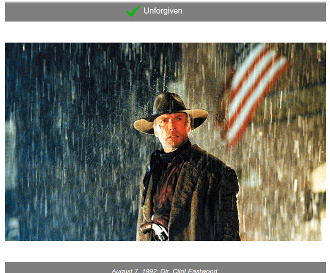
@Sheldon: It very much depends on how you have set a particular quiz up. Here is an example where the changes have produced quite a jarring effect.

In this quiz I used a full 640x480 px canvas with a 640x42 px white margin at the top. This fully maximised the available canvas without obscuring the answer bar with any clutter beneath it. A neat but relatively convoluted solution. Now that 640x480 image has been scaled to 480x360 px and you will notice (in addition to the wasted vertical columns) there is now a gaping chasm between the image and the answer bar, making me look frankly amateurish.

MasterKGlas

unread,
Jul 29, 2015, 4:39:07 PM7/29/15
to Sporcle University, d.a.b...@gmail.com, the-...@windowslive.com, maste...@gmail.com
More simply:

Old slide setups could be 3 ways: 
640x480 (Full Window taken up)
640x438 (42 left blank at top for the answer bar to not distort the image)
640x396 (42 for answer bar and 42 for a hint bar)

Now they have been converted to the new ratio of 640x360 in the following ways.

OLD NEW
640x480 480x360
640x438 480x328.5
640x396 480x297

That means a loss of:
160 pixels horizontally and 120 vertically for a full sized ratio.
160 pixels horizontally and 109.5 vertically for an answer column sized ratio.
160 pixels horizontally and 99 vertically for an answer column and hint sized ratio.

That is a lot of loss image space when you think of area lost.  So this is not a slight adjustment.

MasterKGlas

unread,
Jul 29, 2015, 5:20:09 PM7/29/15
to Sporcle University, d.a.b...@gmail.com, the-...@windowslive.com, maste...@gmail.com

I completely agree that many of my past quizzes look very amateurish now.  

Here is an example of each type of slide setup:


1. Originally Full Window (640x480)


2. Originally Answer Bar Setup (640x438)


3. Originally Answer & Hint Bars Setup (640x396)


Each of these quizzes used to fit the screen perfectly and looked seamless.  
I do not even have the ability to edit these anymore, many of my slides are heavily edited.

Matt Selby

unread,
Jul 29, 2015, 5:21:15 PM7/29/15
to sporcle-u...@googlegroups.com
First of all, I want to say I really appreciate that you guys are being constructive with your feedback. The examples and specific reasoning have been really informative. 

If you have other quizzes that you feel are being negatively effected, send me the examples I still believe a wider aspect ration will make it easier for more people to make better looking quizzes, but there may be a happy medium here as well.

--
You received this message because you are subscribed to the Google Groups "Sporcle University" group.
To unsubscribe from this group and stop receiving emails from it, send an email to sporcle-univers...@googlegroups.com.
To post to this group, send email to sporcle-u...@googlegroups.com.
To view this discussion on the web visit https://groups.google.com/d/msgid/sporcle-university/557cbbef-1a2c-4c92-b554-df6bcc265d80%40googlegroups.com.

For more options, visit https://groups.google.com/d/optout.

david6k

unread,
Jul 29, 2015, 5:38:45 PM7/29/15
to Sporcle University, the-...@windowslive.com, d.a.b...@gmail.com
Additionally, some of the slides Bazmerelda points to below contained text which provided clues to the correct answer but is now hard/impossible to read (see #17). This is even more noticeably the case with word cloud quizzes, for example: http://www.sporcle.com/games/david6k/bible-books-by-word-cloud. I certainly did not intend to make a quiz where all of the smallest words in the images are too blurry to read.

David

MasterKGlas

unread,
Jul 29, 2015, 6:01:32 PM7/29/15
to Sporcle University, mse...@sporcle.com
If you wanted to make a wide-shot slide in the old setup you could have; 640x360 fits in the old 640x480 setup but now that it is changed, the old formats will not work within the new constrains.  The update only creates problems instead of solving this wider ratio dilemma that I didn't even realize was an issue to begin with...

david6k

unread,
Jul 29, 2015, 6:21:48 PM7/29/15
to Sporcle University, the-...@windowslive.com, d.a.b...@gmail.com, dekir...@gmail.com
Here's a great published quiz of Hejman's for which several of the slides are now nearly readable: http://www.sporcle.com/games/Hejman/yall_play_nice_now

David

david6k

unread,
Jul 29, 2015, 6:22:19 PM7/29/15
to Sporcle University, the-...@windowslive.com, d.a.b...@gmail.com, dekir...@gmail.com
Hah, *unreadable*

katesutton

unread,
Jul 29, 2015, 9:46:33 PM7/29/15
to Sporcle University, mse...@sporcle.com
I see where this is coming from, because I've noticed quite a few slideshows recently with weird aspect ratios, made by quiz creators who I assume don't have a lot of technical skills to crop them properly. However, I agree this is detrimental to quiz making for those of us who do know what we're doing with image size. I'm currently working on a non-movie slideshow where I'm using all of the 480px height, and if I have to make it smaller, I might as well scrap the whole thing.

Maybe a fix might be to make it a choice? Like in classic quizzes, you can change your column width. How difficult would it be to add a couple different aspect ratios of slideshow windows to the options or style tab (i.e. movie image quiz size or non-movie image quiz size)?

-katesutton

Kazaxat

unread,
Jul 29, 2015, 10:38:06 PM7/29/15
to Sporcle University, mse...@sporcle.com, icantt...@live.com
While my own quizzes have not been too badly affected beyond a bit of shrinkage, I agree that this appears to be a backwards change. 

Further limiting the size for convenience makes no sense to me. Quiz authors could already make slideshows at a 640x360 ratio if they so desired, how does this change make it easier to do so? I can only assume that linking to larger images forcibly resizes to the set max limits, thereby making this new limit better for scaling? If so that would only seem to encourage hastily made and poorly put together quizzes, as resizing and rehosting are 2 aspects that may require a small bit of effort, but go a long way to making a better quiz, and someone who can't even bother to do that will likely not be making a great quiz anyway.

If the change must be instituted, would it not be possible to leave the old quizzes unchanged? Make 2 forms, one at the old size and one in the new, and simply make the former a 'sunset' and no longer selectable option while setting any new quizzes made henceforth to the latter. That would allow already made quizzes to exist peacefully without forcing their authors to painstakingly mend them, while also ensuring you achieve your goal of 'making it easier' to use pictures without editing. 

Also, out of curiosity I went archive.org to see if I could find the old versions of some of the quizzes linked here, and the changes are certainly quite dramatic in some cases. The linked Hejman quiz for instance, went from this, to this, which seems a bit ridiculous.

Sheldon

unread,
Jul 29, 2015, 11:15:01 PM7/29/15
to Sporcle University, mse...@sporcle.com, icantt...@live.com, kaz...@gmail.com
To add to my previous comment (and others), the majority of my slideshow quizzes are movie themed. However, I have very rarely needed that extra width to fit an image in. In fact, when I've gone to crop screenshots from movies, there is a lot of wasted space in a movie frame (in terms of width) in the context of a quiz. The slides in a slideshow aren't supposed to be frames from a movie, they are, at their core, a clue for the player to guess the movie. Most of the time, the subject is an actor or multiple actors and when you take away height, the actor will have to be smaller in the picture so it can fit, meanwhile there is all this extra width not a whole lot to fill it.

I love katesutton's idea of providing a choice. This would solve the issue completely, assuming it is possible to implement, of course.

I do see the theory behind this change, but I think it was a change that needed to be made in the slideshow's early stages, rather than now, after thousands of slideshow quizzes being made based on the original dimensions. It would be like changing the .com of web addresses to .cam. Billions of websites would suddenly have to change to suit.

One last thing, how permanent is this change going to be? Since it has messed up a lot of current quizzes, owners of those quizzes will be wanting to fix them as soon as possible, but if it's changing back, or changing slightly as a compromise, that'll mean even more work for those affected, so it might be good to let them know.

sporc...@gmail.com

unread,
Jul 29, 2015, 11:38:55 PM7/29/15
to Sporcle University, mse...@sporcle.com, icantt...@live.com, kaz...@gmail.com, the-...@windowslive.com
Yeah, I'd love knowing whether it is permanent. One of my quizzes was clearly distorted, and I hated the way it made it look. I spent the afternoon finding new images (where I could) to change them to the new formatting (640x360). I haven't decided whether or not to slowly update others, but if this is just temporary, it'd be great to know in advance. 

Michael

unread,
Jul 30, 2015, 4:14:28 AM7/30/15
to sporcle-u...@googlegroups.com
I've tried to work this out on my own, but am not understanding the previous posts in this thread...

For my slideshows such as these:
http://www.sporcle.com/games/beforever/animal-slideshow-1
http://www.sporcle.com/games/beforever/25-pop-artists-slideshow

If I want them to be as big as possible again, what dimensions are they now at and what do I have to make them instead?


--
You received this message because you are subscribed to the Google Groups "Sporcle University" group.
To unsubscribe from this group and stop receiving emails from it, send an email to sporcle-univers...@googlegroups.com.
To post to this group, send email to sporcle-u...@googlegroups.com.

RockGolf

unread,
Jul 30, 2015, 7:40:25 AM7/30/15
to Sporcle University, mse...@sporcle.com
Oh dear, this reduces any landscape images to just large postage stamps. My quiz on pixelated movie posters now look sooo small.

http://www.sporcle.com/games/rockgolf/hint-squint

JoeBeta

unread,
Jul 30, 2015, 8:53:37 AM7/30/15
to Sporcle University, mse...@sporcle.com
If it were possible to keep all of the already launched slideshow quizzes at their original sizes and to institute new slideshow sizes for all future quizzes, I think that most quizmasters would be happy with that. I recently did a quiz search of all quizzes tagged "slideshow" - http://www.sporcle.com/games/tags/slideshow . I believe that there were 30 pages. That's around 3000 quizzes with the tag. There are probably more untagged quizzes. It takes a lot of time for a quizmaster to get images to an optimal size and level of clarity. I've checked some of my own quizzes. They look okay. They aren't distorted, but they are smaller with extra white space that I certainly would have used more efficiently.

MasterKGlas

unread,
Jul 30, 2015, 9:47:09 AM7/30/15
to Sporcle University, mse...@sporcle.com, jb...@aol.com
I'm not saying the old quizzes being reformatted isn't a huge issue and I do not know if everyone should go through the work of converting each quiz yet; however, people do seem to want to know how this update has changed quiz-making.

The change is that now the window is set to 640x360 (That is what you will edit every single image to)

The answer bar now is automatically above the image and; therefore, there is no need to leave a 42 pixel space when you edit.  Also if you put a hint in for any slide then the image is automatically resized to fit a hint bar without you having to add the 42 pixel bottom blank to you picture in an editor.

So, the update makes it so all a quiz maker must do is resize an image to 640x360, everything else is automated.

I foresee problems with people only wanting hints on certain slides but the automation feature resizing each slide because they used one hint.  Also, there is still the gigantic issue of the old formatted quizzes floating around.

babymonkee

unread,
Jul 30, 2015, 1:31:14 PM7/30/15
to Sporcle University, mse...@sporcle.com

I am really sad. The quiz that I am most proud of is linked below. I spent a long time finding large beautifully clear images so that I could make this quiz with the biggest images possible. There is nothing clever about the quiz, but I thought the images were so good that it made for a quiz that I was very proud of. With the new maximum image size it now just looks like a very ordinary slideshow quiz. For me I couldn't  care  less about time spent sizing or cropping images. For me its time well spent. I am a huge fan of the Slideshow format. For those of us that lack the imagination to think up lots of very clever, ground breaking quiz idea's, the slideshow is a great way to make cool quizzes. For me limiting the image size makes the format much less special.   


Hejman

unread,
Jul 30, 2015, 1:55:54 PM7/30/15
to Sporcle University
I agree with the earlier concerns about how this affects the thousands of slideshows already out there. I've made a lot and have never had a problem finding and appropriately sizing images. Nor had I ever heard a complaint from anyone about the default size. I'd love to hear more about the impetus for this because right now it strikes me as a solution in search of a problem (that then created lots of new problems).

Bazmerelda

unread,
Jul 30, 2015, 3:54:00 PM7/30/15
to Sporcle University, scylla.micha...@gmail.com

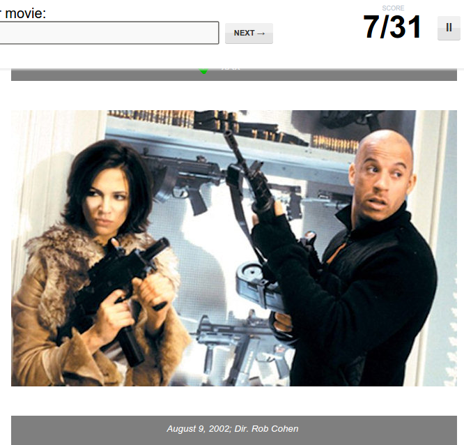
@beforever: I've only looked at your first link but it seems you had originally used a size of 640x480 px. To fit the new dimensions fully, you need to remove 120 pixels of height from each image while leaving the width in tact. Here is my attempt at image 1 from your first quiz:


That is with a bar of 640x40 pixels removed from the top and another bar of 640x80 pixels removed from the bottom to keep the whole turtle in frame. Test the url from that image in your quiz to see if it uses the whole canvas with no issues.

Bazmerelda

unread,
Jul 30, 2015, 4:18:42 PM7/30/15
to Sporcle University, scylla.micha...@gmail.com, d.a.b...@gmail.com

Which is fine for images with lots of free space at the top and/or bottom to crop out, but in close ups you start to lose the framing and things won't look as artfully composed as the originals:


Matt Selby

unread,
Jul 30, 2015, 4:39:38 PM7/30/15
to sporcle-u...@googlegroups.com
Hey all,

First of all, just let me say: We screwed up.

The primary goal here was to make creating slideshow quizzes easier. Using a more common image size, and eliminating the issue of overlapping hint/answer text.

But the point that’s been made here on Sporcle U, emphasizes that there is no ‘standard’ image size for slideshow. There are people who do use a 16:9 image, but many use square or tall images for different purposes, and no one wants a smaller image area.

So, the max image size has now been restored to 640x480, and the change will now be that answer/hint bars will lie outside of the image area and not overlap the image at all.

Again, I just want to say I really appreciate the civil tone, and constructive feedback here. 

Let me know if you have other questions/feedback.

On Thu, Jul 30, 2015 at 1:18 PM, Bazmerelda <d.a.b...@gmail.com> wrote:

Which is fine for images with lots of free space at the top and/or bottom to crop out, but in close ups you start to lose the framing and things won't look as artfully composed as the originals:


--
You received this message because you are subscribed to the Google Groups "Sporcle University" group.
To unsubscribe from this group and stop receiving emails from it, send an email to sporcle-univers...@googlegroups.com.
To post to this group, send email to sporcle-u...@googlegroups.com.

sporc...@gmail.com

unread,
Jul 30, 2015, 5:07:11 PM7/30/15
to Sporcle University, mse...@sporcle.com
I don't mean to be pester, especially after you just explained it. 

However, I'm confused. I thought the original max image size was 640x396. That is what was listed on the creation guides about a month ago. 

Is the max now 640x480 or is it back to 640x396? 

Again, sorry for the repetition. 

david6k

unread,
Jul 30, 2015, 5:37:42 PM7/30/15
to Sporcle University, mse...@sporcle.com
Kudos to you guys for reconsidering so quickly. I see that you had edited the "How to Make an Awesome Slideshow Quiz" posting to reflect the new size. Don't forget to change it back :-)

David

smac17

unread,
Jul 30, 2015, 5:41:51 PM7/30/15
to Sporcle University, mse...@sporcle.com
Looking at a few of the slideshows above that were initially being complained about, they're now looking great :)


On Thursday, 30 July 2015 21:39:38 UTC+1, mselby wrote:
Hey all,

First of all, just let me say: We screwed up.

The primary goal here was to make creating slideshow quizzes easier. Using a more common image size, and eliminating the issue of overlapping hint/answer text.

But the point that’s been made here on Sporcle U, emphasizes that there is no ‘standard’ image size for slideshow. There are people who do use a 16:9 image, but many use square or tall images for different purposes, and no one wants a smaller image area.

So, the max image size has now been restored to 640x480, and the change will now be that answer/hint bars will lie outside of the image area and not overlap the image at all.

Again, I just want to say I really appreciate the civil tone, and constructive feedback here. 

Let me know if you have other questions/feedback.
On Thu, Jul 30, 2015 at 1:18 PM, Bazmerelda <d.a.b...@gmail.com> wrote:

Which is fine for images with lots of free space at the top and/or bottom to crop out, but in close ups you start to lose the framing and things won't look as artfully composed as the originals:


--
You received this message because you are subscribed to the Google Groups "Sporcle University" group.
To unsubscribe from this group and stop receiving emails from it, send an email to sporcle-university+unsub...@googlegroups.com.

To post to this group, send email to sporcle-u...@googlegroups.com.

John O'Brien

unread,
Jul 30, 2015, 5:58:03 PM7/30/15
to Sporcle University, mse...@sporcle.com, sporc...@gmail.com
The max was always 640x480 (until this week's changes).  Many people were cropping to 640x396 so that the gray answer and extra text bars wouldn't overlap the image at all (and that's what the creation guide instructed you to do).  But you could put in a 640x480 image previously if you didn't mind that overlap.  Now, after the most recent change, the max size is back to 640x480 again but there will no longer be overlap of the gray bars, the full image will display.  So there's no reason to crop to a height of 396px anymore unless you want to letterbox your image with whitespace.

Thanks,
John

Sheldon

unread,
Jul 30, 2015, 11:34:37 PM7/30/15
to Sporcle University, jo...@sporcle.com
OK, so I just read MasterKGlas's comment which said that the answer part appeared above the image automatically. Was this the original purpose of the first change? Because that is actually a great idea to fix that. The side effects obviously messed up the images for many slideshows, but I didn't realise that was the issue it was trying to solve.

Of course, now that has been solved as well as providing an even bigger area for images which to me is just fantastic!

You folks at Sporcle HQ are the best!

geshmonkey

unread,
Jul 30, 2015, 11:44:20 PM7/30/15
to Sporcle University
A couple of my slideshows are looking a little bit shrunken right now, especially ones with hints included on the slides themselves that now have large white spaces at the top, but this is apparently a more convenient size for future slideshows, so I guess that's a good thing?

RockGolf

unread,
Jul 31, 2015, 7:43:12 AM7/31/15
to Sporcle University, mse...@sporcle.com
Haven't seen this yet, Matt, but thanks for changing your minds back.

Hejman

unread,
Jul 31, 2015, 9:35:13 AM7/31/15
to Sporcle University
Ditto to what rockgolf just said. Sometimes you try something new and then get info you didn't have before that makes you rethink it. Kudos to Sporcle for being willing to do that. As I said in a different feed yesterday- the fact that HQ is always trying to make the user experience better is part of why I love this site so much. Thanks Matt, John and anyone else at HQ who played a part in this.

John O'Brien

unread,
Jul 31, 2015, 4:49:21 PM7/31/15
to Sporcle University, mattros...@googlemail.com
None of your quizzes should look any differently (in terms of size or aspect ratio) than before we started making changes this week.  The max image size was 640x480 previously and still is, the only change at this point is the gray bars don't overlap anymore so you can see the full image.  Can you provide a link to a quiz where you think it doesn't look right anymore?

Thanks,
John

geshmonkey

unread,
Jul 31, 2015, 7:11:44 PM7/31/15
to Sporcle University
i spent quite a bit of time building and working around for this (albeit in test form, and adjustable without damage to ratings/results) but the result is disappointing. The aspect ratio is no different, but they were constructed for 480x396, with top border accounted for, and now just look sorta funny, and the images are just way smaller than they could be with an annoyingly large white space, and so it looks (for lack of a better word) 'unprofessional'. I feel as though some already-produced slideshows may also suffer from this:
http://www.sporcle.com/games/test/bcb11a8fe67


(This one is a less good demonstration of the same point)
www.sporcle.com/games/geshmonkey/cflags_europe

Message has been deleted

Aprilli

unread,
Aug 1, 2015, 5:18:43 AM8/1/15
to Sporcle University
I don't understand why there has to be that white space between image and the grey bar. Is there a reason for that? Now the 2 grey bars can't both fit in to my computer screen at the same time. Images attached 
slideshow.png
slideshow2.png

Aprilli

unread,
Aug 1, 2015, 5:26:45 AM8/1/15
to Sporcle University
And if I want to see the slides numbers, I can't see the answer at all. This is what I see after answering right. I'm starting not to like this changes. 
slideshow3.png

william2

unread,
Aug 1, 2015, 1:50:35 PM8/1/15
to Sporcle University
Aprilli, I am having the same problem.

Sheldon

unread,
Aug 1, 2015, 4:09:40 PM8/1/15
to Sporcle University

I think this problem is just down to screen resolution. Here's what I see with 1920x1080:

I even changed it to the lowest HD resolution (1366x768) and I can still see everything from just above the timer to about 1cm past the "friends scores" part.

Unfortunately, I would have thought most people have at least a 1366x768 screen resolution these days which means it is probably not worth Sporcle (or any website) reverting to suit the lower resolutions.

I could be wrong though, this may be down to some other issue.

Also, Aprilli, those white bars you are seeing are the spaces where the grey boxes would have been previously. Now, they have been moved outside of the slide area so they will never appear over the slide. This was never a problem for users like us who created our slides to avoid this happening, but it will make a huge improvement on other slideshows that didn't account for this. You could edit all of those slides to fill the white space, but that ratio is more suited to TV/movies so I'd say leave as is.
Reply all
Reply to author
Forward
0 new messages