CMS page actions and states - rethink

284 views
Skip to first unread message

Paul Clarke

unread,
Oct 28, 2014, 11:07:36 PM10/28/14
to silverst...@googlegroups.com

Hi everyone,


We are keen to start finding out what barriers there are for the everyday user of the CMS and I'd like your help. I understand this could open a can of worms, but I'd like to start with:

  • Page actions (including text on buttons)
  • Page status (including current status messages)

Some questions:

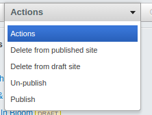
  • Is it clear to a user the current status of a page? (New, draft only, published, published but edited on draft, deleted, hidden... feel free to add any others if you can think of more)
  • Is the draft/live workflow clear to a first time user?
  • Do the current buttons/links just 'make sense' to users or is there confusion about what clicking on them actually does?
  • Are there any actions which are performed regularly that aren't catered for?

In the next week or so, we are planning on running some user interviews and asking for feedback to try and answer these questions. We will post the findings here once completed.

This will hopefully allow us to identify pain points and in the long term improve the UX for everyone. We are planning on looking at Advanced Workflow separately but will consider it.


Some background and past conversations:

http://silverstripe.uservoice.com/forums/251266-new-features/suggestions/6425908-rework-the-unpublish-delete-cms-controls-to-be

https://github.com/silverstripe/silverstripe-cms/issues/631

https://groups.google.com/forum/#!topic/silverstripe-dev/ikLXPSwqdck

https://groups.google.com/forum/#!topic/silverstripe-dev/p3b6IhIK7NA

https://groups.google.com/forum/#!topic/silverstripe-dev/bjRhobDbEkA

https://groups.google.com/forum/#!topic/silverstripe-dev/_utN4jO8woM


If you have any suggestions based on your clients or own experiences please post them here.


Thanks,

Paul, Mike A, and Jared

g4b0

unread,
Oct 29, 2014, 6:02:29 AM10/29/14
to silverst...@googlegroups.com
In my experience with some quite big SiteTree (~1000 entry) it's useful to have a color scheme for the Icons, in order to know if a page is a draft, a draft with an older version published or a live page.

I wrote a small module to achieve it: http://addons.silverstripe.org/add-ons/zirak/sitetree-icon

My module has some issue, but so far they have not given me any major problems:
  • It overwrite the original icons (e.g. home page)
  • It's not compatible with custom workflow module
  • Icons are hardcoded into the module

Maybe this behaviour should be included into the core in a cleaner way?

g4b0

unread,
Oct 29, 2014, 6:35:29 AM10/29/14
to silverst...@googlegroups.com

UndefinedOffset

unread,
Oct 29, 2014, 11:44:03 AM10/29/14
to silverst...@googlegroups.com

Fred

unread,
Oct 29, 2014, 2:16:02 PM10/29/14
to silverst...@googlegroups.com
The worst UI deficiency is that the Save/Save&Publish buttons don't change state the moment that a field is changed. Instead, they stay in their initial state until a changed field loses focus. The state of the Save buttons should track the state of the fields. When a user edits the content field, they don't see a way to save, because the buttons resolutely state that the content is saved. This is inexcusably confusing.

Michael van Schaik

unread,
Oct 29, 2014, 4:12:41 PM10/29/14
to silverst...@googlegroups.com
Same goes for the URLSegment update action, this button only becomes visible on unfocus of the Page Title field, should be onchange I think.

And if the Menu Title & Page Title are the same, the Menu Title gets automagically updated whenever I edit the Page Title - nice on initial creation of the page. But after the page has been saved and I want to edit the page title to be different (often longer) than the menu title, I have to manually change back the menu title to the original value afterwards.

Another small issue that I've discussed with Phillipe(?) earlier as well (SS3 beta), is that the meaning of some of the icons is a bit off:
- The icon on the 'save draft' button says 'create a new document/page' - should be the floppy-icon from the publish action, since that says 'save' - the publish action could then get something like a globe with an arrow (https://cdn0.iconfinder.com/data/icons/duesseldorf/32/publish.png?)
- The icon on the Uploadfield's 'delete' action (not unllink), says 'the image will still exist but you cannot access it from this direction' - should just be a trashbin icon in my opinion

Cheers,
Michael

--
You received this message because you are subscribed to the Google Groups "SilverStripe Core Development" group.
To unsubscribe from this group and stop receiving emails from it, send an email to silverstripe-d...@googlegroups.com.
To post to this group, send email to silverst...@googlegroups.com.
Visit this group at http://groups.google.com/group/silverstripe-dev.
For more options, visit https://groups.google.com/d/optout.

Hamish Friedlander

unread,
Oct 29, 2014, 4:27:13 PM10/29/14
to silverst...@googlegroups.com
On 30 October 2014 09:12, Michael van Schaik <m...@restruct.nl> wrote:
Same goes for the URLSegment update action, this button only becomes visible on unfocus of the Page Title field, should be onchange I think.

It probably is onchange already - onchange events only fire on textfields when they loose focus.

I'd be happy to see patches to fix this nicely (and the save / save & publish button state), but it's very hard to get this to work reliably, especially cross-browser and all the way down to IE8. TinyMCE is a particular problem point (you can't bind to events like onkeyup or oninput because it's in an iframe).

The issue I see clients struggle with most is the one I raised in the UserVoice feature. Currently we have "unpublish" and "delete from draft", but (a) it's not obvious what will actually happen when people click these, and (b) the things these buttons do aren't actually what content editors want to be able to do.

My feeling is they should be replaced with "Undo most recent publication", "Discard changes since last publication", "Remove page completely from site" and "Remove all public versions of this page" (maybe not those actual labels, they're too long, but those actions)

Hamish Friedlander


Uncle Cheese

unread,
Oct 29, 2014, 7:01:07 PM10/29/14
to silverst...@googlegroups.com
I agree with Fred -- updating those buttons only on blur of a text field is really confusing, especially when you click on the button, and blurring the text field, change the state of the button, and then complete the click. It's very awkward.

TinyMCE, even version 3, is well-equipped to handle keyup events. I think this would be an easy fix.


I love Hamish's suggestions for new button text. I agree they can be tightened up a bit, but there's definitely a need to clarify those actions to the user. They're horribly cryptic and ambiguous right now.

Hamish Friedlander

unread,
Oct 29, 2014, 7:33:14 PM10/29/14
to silverst...@googlegroups.com
 
TinyMCE, even version 3, is well-equipped to handle keyup events. I think this would be an easy fix.

Awesome, I look forward to merging your patch :). More seriously, although I haven't looked at it myself, there have been a lot of commits attempting to fix this issue, and a lot of commits reverting those commits to fix regressions. That implies that this is one of those situations where something is much harder than it first appears.

I'm not saying the way it currently works is fine, or that we shouldn't look at improving it, but there's a reason it's the way it is at the moment, and it's not just lack of care. For instance: I'd put effort into upgrading TinyMCE to 4 before I put much more effort trying to fix the current integration.

Hamish Friedlander.

Uncle Cheese

unread,
Oct 29, 2014, 7:58:33 PM10/29/14
to silverst...@googlegroups.com
I'd love to write a PR, but it looks like all that behaviour is handled by a thirdparty jQuery plugin. Who knows where the author of that old thing is now!

;-)

Jonathon Menz

unread,
Oct 29, 2014, 10:31:59 PM10/29/14
to silverst...@googlegroups.com
Here's a proof of concept for one of the other solutions on that thread (coloured dot overlays): https://github.com/jonom/silverstripe-cmstreestatusicons

Uncle Cheese

unread,
Oct 29, 2014, 11:05:37 PM10/29/14
to silverst...@googlegroups.com
FWIW, here's a PR, Hamish. Thanks for calling my bluff. :-)

Paul Clarke

unread,
Oct 30, 2014, 12:23:36 AM10/30/14
to silverst...@googlegroups.com
Another link if its not here already for the colour of sitetree items: https://github.com/silverstripe/silverstripe-framework/pull/2794#issuecomment-56772300

lu...@lerni.ch

unread,
Oct 30, 2014, 11:19:56 AM10/30/14
to silverst...@googlegroups.com
I think the stage/live concept works pretty well as long as you work with "Split mode" to preview (large screens). If you work with staged & live content but do not use "Split mode" (smaller screens like laptops) many users tend to use a browser-tab for preview instead of the built-in preview function. In this case you end up manipulating the URL in the preview-tab like /?stage=Stage or /?stage=Live. If you toggle Stage vs. Live in the backend the Link in URL-Segment always points to Stage (this is where I click to open the preview tab). A Stage- and Live-link in "Edit mode" at the lower right corner (where the toggle in "Split mode" is) could improve things.

I'm most likely not the only one using a tab to preview since it feels more "natural" to switch browser-tabs and people are used to do that, it needs just one click, there are keyboard short-cuts and you do not have to collapse & uncollapse the panels on the left hand side to have a wider preview.

I see two options to improve the preview with small screens. Make the preview better accessible (one click) or improve the stage/live workflow with browser-tabs.

Am 29.10.14 04:07, schrieb Paul Clarke:
--

Shaun de Greeff

unread,
Oct 30, 2014, 11:30:01 AM10/30/14
to silverst...@googlegroups.com

+1..... I use it the same and most of my clients as well. I still like the way 2.4 did it where you could view the current state eg draft or published.

Jonathon Menz

unread,
Oct 30, 2014, 4:58:37 PM10/30/14
to silverst...@googlegroups.com
The staged/published workflow has been one of the very few pain points of upgrading to SS3 for me. That and the loss of DOM... Especially ImageDOM ;)

I think the split window preview feature is fantastic, but personally I (and some of my clients) also prefer to work in separate tabs, and for this workflow I think a Draft/Published flag in the front-end is essential. I would love to see SilverStripeNavigator revamped and it's use encouraged to help solve this. (But in the meantime... check out BetterNavigator)

These are the major problems for me:
  • Users can't tell at a glance that a page has unpublished changes
  • Users don't know which version they're viewing in the front-end
  • Users don't understand what ?stage=Stage means
Which leads to phone calls like this:
  • Client: Everyone else in the company is seeing the old version of my page. When I visit the site I can see the updates fine.
    • Me: You're probably still logged in to the CMS and are viewing the draft version of the site. You need to publish your changes.
  • Client: I sent an email campaign to 45,000 people with a link to my website, but when people click it they're being asked to log in!
    • Me: Does the URL have a question mark and 'stage=Stage' at the end? Oh dear...
I think the buttons could be improved a bit too. Currently if a page is modified there is a grey button that says "Saved" and a green button that says "Save and Publish". The Save part in the green button is confusing as it implies there are in fact unsaved changes. Perhaps in this scenario it would be better to have a grey "Saved" button and a green "Publish changes" button. For new pages that aren't live yet, this could be tweaked to say "Publish page" or "Make page live".

Beyond small tweaks I think something that would help would be to display a status message above or near the buttons i.e. "This page has unpublished changes" or "This page has not yet been made live". It might add a little clutter but could alleviate a lot of confusion. Basically breaking that 'status label' information out of the site tree and showing it right in the page (in addition to site tree markings).

Paul Clarke

unread,
Nov 9, 2014, 6:04:56 PM11/9/14
to silverst...@googlegroups.com
I agree that the text on the buttons is misleading and like your suggestions of "Publish changes" and "Publish page", originally I was thinking it should be just "Publish" but that might not be meaningful enough.

Jonathon Menz

unread,
Nov 10, 2014, 6:22:30 PM11/10/14
to silverst...@googlegroups.com
Here are a few other usability quirks/bugs I've noticed today to add to this list. They're small issues but when I demo the CMS to new users for the first time and we come across them they can have a big impact on their initial impression and confidence in the CMS.
  • Site tree: clicking page icon highlights link but doesn't load page (medium impact)
  • Site tree multi-selection editing: after changing multiple pages (e.g. publishing), the status labels aren't updated until the page is manually refreshed or you navigate away and come back - so it can look like the change wasn't successful (high impact)
  • Site tree multi-selection editing: clicking just outside of a checkbox triggers the underlying link and loads the page, so if you're selecting lots of pages you'll often get halfway through then accidentally leave the site tree (low impact). (Having a label underneath the checkbox should fix this.)
  • Insert Media > From the CMS > Find in Folder: Dropdown arrows appear on folders that don't have more folders under them (low impact)
I'd personally choose to see little things like this fixed up first rather than new features. Snow Leopard style ;)

Nicolaas Thiemen Francken - Sunny Side Up

unread,
Nov 11, 2014, 4:04:25 AM11/11/14
to silverstripe-dev
I fully support the sentiment of Jonathon's email.  I think that the final polish on the CMS makes all the difference and that devs (me included), at times, forget that the raison d'être for a CMS is to edit content. 

In terms of the multi-selection editing ... I have always found this confusing.... Here are some minor points that could make it better - AFAIK ... 

Inline images 1

Can "delete from draft site", not simply be "Delete" - which is the same as delete from draft site (if it exists there) and from live site (if it exists there). 

What is the difference between "Delete from published site" and "Un-publish"

It seems more logical to have the following order:

Publish
Un-publish
Delete (unpublish and remove from draft)
-------------------
maybe more specific options here - if needed. 

What is a real pain is that you have to select 100 pages and unpublish them and having to select the same 100 pages again to delete them from the draft site. 


--

Jonathon Menz

unread,
Nov 14, 2014, 10:03:32 PM11/14/14
to silverst...@googlegroups.com
Here's another little one, not a bug but an enhancement. When you're choosing files in the CMS (whether in HTMLEditorField or UploadField) the form always starts you off in the Uploads folder. I think it would be so much better if you were returned to whichever folder you were last browsing (in any context). This would be a big improvement for repetitive tasks like adding photos to a gallery.

Paul Clarke

unread,
Nov 16, 2014, 9:26:42 PM11/16/14
to silverst...@googlegroups.com
Hey guys, here is the usability report that we did regarding this topic.

This report is based only on the user testing we did and not on all the feedback we have received from the developer community but feedback from the community was used to form questions for testing. We didn't have time to go into more detail about all the topics discussed in this thread but hopefully it helps us in making some decisions for the community.
We will make this is available via a blog post (or similar) in the next days but you are welcome to dig into it now.

We are now working to provide some suggestions to improve some of the points raised in this report. Hopefully we can contribute to Jonathon's submission on pages states (https://github.com/silverstripe/silverstripe-framework/pull/2794#issuecomment-56904575) and make it fit in with other areas of the CMS.

Report: http://www.silverstripe.org/assets/2014/Reports/Usability-report-on-SilverStripe-CMS-Main-actions-and-page-states.pdf

Thanks for your input so far.

Cheers, Paul, Mike A and Jared

Jonathon Menz

unread,
Nov 16, 2014, 11:12:48 PM11/16/14
to silverst...@googlegroups.com
Good read and very nicely presented!

Jonathon Menz

unread,
Nov 18, 2014, 6:17:58 PM11/18/14
to silverst...@googlegroups.com
A little more feedback on action labelling, on UploadField "Remove" might be better as "Clear selection". "Remove" is still a bit ambiguous and analogous to Delete I think.


On Monday, 17 November 2014 12:56:42 UTC+10:30, Paul Clarke wrote:

James Cocker

unread,
Nov 25, 2014, 2:52:17 PM11/25/14
to silverst...@googlegroups.com
The report definitely highlights the main issues my clients come across too. Just to highlight a couple:

Reordering Pages by Drag & Drop
It's mentioned in the report that drag & drop only works sometimes. The bug report for this is here: https://github.com/silverstripe/silverstripe-cms/issues/744 It's been an issue for some time, and its just not acceptable for dragging & dropping to require a "knack" for it to work properly.

SilverStripe Userhelp
I gave up with the official CMS help guide a while ago, and created my own SilverStripe Help Guide for my clients. I override the CMS help link to point to my own guide at silverstripehelp.net which I created to provide simple step by step instructions for the most common CMS tasks. It also allows me to create guide pages for custom site specific features and has dramatically cut down on the amount of CMS support I've had to provide. While the official guide is much more in depth, I've found it lacks the simple step by step directions, and has too much text, which makes it hard for users to quickly find out how to perform a basic task. I'm happy for anything in my guide to be used to improve the official guide.

Will Rossiter

unread,
Nov 26, 2014, 2:18:42 AM11/26/14
to SilverStripe Development
I gave up with the official CMS help guide a while ago, and created my own SilverStripe Help Guide for my clients

The SilverStripe User Help guide is open source (https://github.com/silverstripe/userhelp.silverstripe.org) along with all the other documentation. Any contributions to make it better and give the community a comprehensive resource are welcome :)

Nicolaas Thiemen Francken - Sunny Side Up

unread,
Nov 26, 2014, 4:45:48 AM11/26/14
to silverstripe-dev
James, your help site looks great.  Beautifully simple.  I would definitely use it for some clients.  For such a large and diverse community as the Silverstripe one I reckon it is great to have several places for content editor help - all with their own strengths. 

Nicolaas

On 26 November 2014 at 20:18, Will Rossiter <will.r...@gmail.com> wrote:
I gave up with the official CMS help guide a while ago, and created my own SilverStripe Help Guide for my clients

The SilverStripe User Help guide is open source (https://github.com/silverstripe/userhelp.silverstripe.org) along with all the other documentation. Any contributions to make it better and give the community a comprehensive resource are welcome :)

On 26/11/2014, at 8:52 am, James Cocker <j...@purplespider.co.uk> wrote:

I gave up with the official CMS help guide a while ago, and created my own SilverStripe Help Guide for my clients

--
You received this message because you are subscribed to the Google Groups "SilverStripe Core Development" group.
To unsubscribe from this group and stop receiving emails from it, send an email to silverstripe-d...@googlegroups.com.
To post to this group, send email to silverst...@googlegroups.com.
Visit this group at http://groups.google.com/group/silverstripe-dev.
For more options, visit https://groups.google.com/d/optout.


--
Nicolaas Thiemen Francken
  www.sunnysideup.co.nz
  phone: +64221697577

Message has been deleted

Cam Findlay

unread,
Dec 2, 2014, 4:51:38 PM12/2/14
to silverst...@googlegroups.com
Hey James, 

Great CMS editor help site! I would be keen to work out a way in which we can combine efforts and content.

Given that the current UserHelp documentation uses the same setup as our developer docs site which has recently been totally overhauled and in beta currently, we could perhaps look to update the userhelp docs in the same fashion and incorporate some of your content perhaps? Might be a good community project for the start of next your (or over the holidays if you're keen?).

Checkout the beta dev docs at http://beta.doc.silverstripe.org - all the content is simply structured markdown.


I'm in favour of the wider community pulling together in a common direction on knowledge assets like the docs and CMS help.

Great videos too :)

James Cocker

unread,
Dec 4, 2014, 10:46:59 AM12/4/14
to silverst...@googlegroups.com
Hey Cam,

Sure, I'd certainly be happy to look at overhauling the CMS UserHelp in the New Year! I've been using the beta dev docs all this week, and do like the new structure and style.

James

Cam Findlay

unread,
Dec 4, 2014, 3:22:30 PM12/4/14
to silverst...@googlegroups.com
Sounds good, WillR and I still need to do a few fixes on the search and documentation index features of the docviewer module (feel free to contribute if you want to get your hands dirty with some code).

I don't think it would be too hard to rework the userhelp docs, if you go and look at how we have done the restructure in the dev docs there is no reason why you couldn't fork the markdown and get the content side under way.

Here's the dev docs content (note the prefixes to set the structures and the new meta tags in docs): https://github.com/wilr/sapphire/tree/docsrewrite/docs/en

Cam Findlay

unread,
Mar 1, 2015, 4:37:30 PM3/1/15
to silverst...@googlegroups.com
Hey James and anyone else interested in the userhelp site.

We had our UX people internally do a card sort of the UserHelp site and James' silverstripehelp.net site to see if there was some meaningful way to bring all that information together.

I'll post the results shortly, meanwhile if anyone is keen to help get the userhelp site into a better shape please let me know. I think we could use quite a lot of the work that was down on the developer docs site to update userhelp.

For reference the open sourced repos for this site are at: https://github.com/silverstripe/userhelp.silverstripe.org for the site and https://github.com/silverstripe/silverstripe-userhelp-content for the content.


On Friday, 5 December 2014 04:46:59 UTC+13, James Cocker wrote:

James Cocker

unread,
Mar 1, 2015, 5:15:45 PM3/1/15
to silverst...@googlegroups.com
Hi Cam,

Yep, still happy to help out with this. I'd been planning to make a start on the IA of the user guide myself but hadn't managed to get round to it as yet. So it will certainly be useful to see the details of the card sort.

Thanks
James 

Purple Spider Web Design

--
You received this message because you are subscribed to a topic in the Google Groups "SilverStripe Core Development" group.
To unsubscribe from this topic, visit https://groups.google.com/d/topic/silverstripe-dev/JGtcs9sF1Aw/unsubscribe.
To unsubscribe from this group and all its topics, send an email to silverstripe-d...@googlegroups.com.
Reply all
Reply to author
Forward
0 new messages