Scale particular section of the graph

raval ishit
Hi,
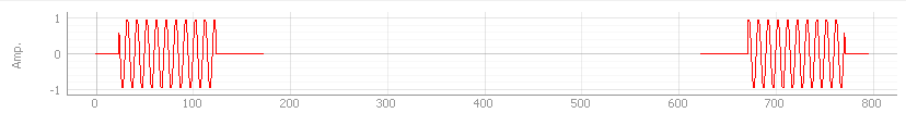
I have a question regrading to data plot. I implemented graph same as below (Sample graph 1), in which I plotted 2 sine way and delay. I want to squeeze the graph now by ignoring delay and represent as dotted line same as second graph (Sample graph 2) or I want to change scale of particular section of the graph. Is it possible with pyqtgraph? If yes, can you suggest me how to doing this?

Sample Graph 1

Sample Graph 2

Luke Campagnola
import pyqtgraph as pgpg.mkQApp()w = pg.GraphicsLayoutWidget()w.show()v1 = w.addPlot()v2 = w.addPlot()v2.hideAxis('left')v2.setYLink(v1)offset = 450def updateRange():xrange1 = v1.vb.viewRange()[0]xscale = (xrange1[1] - xrange1[0]) / v1.vb.rect().width()xrange2 = xscale * v2.vb.rect().width()v2.setXRange(offset, offset+xrange2, padding=0)v1.sigXRangeChanged.connect(updateRange)d = pg.np.random.normal(size=600)d[100:500] = 0v1.plot(d)v2.plot(d)v1.setXRange(0, 200)
--
You received this message because you are subscribed to the Google Groups "pyqtgraph" group.
To unsubscribe from this group and stop receiving emails from it, send an email to pyqtgraph+unsubscribe@googlegroups.com.
To view this discussion on the web visit https://groups.google.com/d/msgid/pyqtgraph/68a0303b-8e30-470a-a1b2-7ff445709c36%40googlegroups.com.
For more options, visit https://groups.google.com/d/optout.
raval ishit
Thanks Luke,
I thought the same way. But, it doesn't seem right, the reason is if user drag one of the view box, then range of individual x axis will change. Also, what if I have n number of waveform.
So, I come up with idea for instance, instead of giving just data of y-axis here I also provide x-axis data as well. In additional, I reduce the sample for delay, e.g if I have 500 points for delay, instead of using all I usage just 150 points where I give value of 25 points from start, 25 points from end and 100 points for NaN value (for showing gap on graph). However, it doesn’t create any effect on pyqtgraph, and plot it in same scale. After that I exported the .csv file and plot it in excel, and guess what I got exact same plot which I expected. Here, I attached my .csv file and snippets of pyqtgraph and excel output graph.
Now, please suggest me how can I get plot which just show data points from my array and ignore remaining points? Also, can you tell me how can I set interval between x - axis points?
Sample of PYQTGRAPH

Sample of Excel Plot 1

Sample of Excel Plot 2
To unsubscribe from this group and stop receiving emails from it, send an email to pyqtgraph+...@googlegroups.com.