bar plot with rolling mean - issue with x-axis labelling
29 views
Skip to first unread message

questions anon
Jan 11, 2016, 6:23:59 PM1/11/16
to pyd...@googlegroups.com
I am trying to combine a stacked bar plot with a rolling mean.
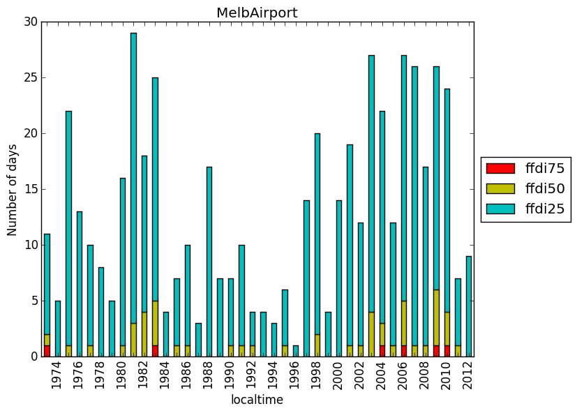
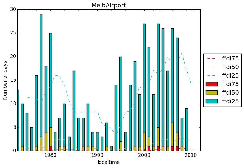
I have resolved issues in the past with the bar plot and x-axis labelling (thanks to this forum) but I seem to be having issues with my axis labelling again now that I am adding a rolling mean.
I have attached two plots - one is just the stacked bar plot with the correct x-axis labelling and the other is when I include the rolling mean. It is like the rolling mean takes over the x-axis labelling?
Any feedback will be greatly appreciated.
result=pd.concat([df75, df50, df25],axis=1)
myplot=result.plot(kind='bar', stacked=True, color=['r','y','c'])
myplot.set_xticklabels([dt.strftime('%Y') for dt in result.index.to_pydatetime()])
plt.setp(myplot.get_xticklabels()[0::2], visible=False)
pd.rolling_mean(result, window=5).plot(ax=myplot,style='--', color=['r','y','c'])

Michael
Jan 16, 2016, 7:49:44 AM1/16/16
to PyData
maybe you need to call .set_xticklabels() again, after rolling_mean()
or maybe you could plot first the rolling_mean(), then the bars
just some ideas, i don't know if they will work
questions anon
Jan 18, 2016, 10:54:55 PM1/18/16
to pyd...@googlegroups.com
thanks - I have tried lots of different rearranging but it still doesn't seem to work!
--
You received this message because you are subscribed to the Google Groups "PyData" group.
To unsubscribe from this group and stop receiving emails from it, send an email to pydata+un...@googlegroups.com.
For more options, visit https://groups.google.com/d/optout.
Reply all
Reply to author
Forward
0 new messages