Why does plotting a line graph with NaN-values mess up xticks?
8 views
Skip to first unread message

saschagra...@gmail.com
Jun 12, 2018, 10:14:46 AM6/12/18
to PyData
I have a `_df` with this pseudo setup:
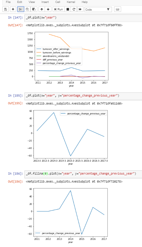
`year´ contains ints and the value columns contain floats or nans.
year    value_column_with_nans    value_column_without_nans
2011    NaN                       0.5
2012    NaN                       0.6
2013    0.38                      0.4
...
2017    0.29                      0.6
`year´ contains ints and the value columns contain floats or nans.
When I plot `value_column_with_nans` using `year` as `x` the values in `year` are represented as floats, the x-axis breaks (i.e. starts on 2013.0 instead of 2011) and is separated by .5-intervals for some (to me weird) reason. Handling the `NaNs` will solve the issue: `df.fillna(0).plot(x="year", y="value_column_with_nans")`. Compare each of the x-axis in the attached photo to see how it works.
My question is: why does this happen, and should it happen?
Reply all
Reply to author
Forward
0 new messages