Announcing Pentaho 7.0 (available mid-November)
46 views
Skip to first unread message

Pedro Alves
Oct 17, 2016, 9:43:15 AM10/17/16
to pentaho-...@googlegroups.com
Announcing Pentaho 7.0 (available mid-November)
I’ll go straight to it – This is the most spectacular release ever!
This
previous sentence would even be more meaningful if I hadn’t been deeply
involved on this release, and by “deeply involved” I actually mean that
sometimes I was able to sneak in to the development rooms and a few
times speak to a few of the devs before the heads of engineering kicked
me out of the room… but still, the janitor sometimes pat me in the back
when he saw me crying in a corner and said that someone must listen to
me, so I’m taking his word for it….
Anyway, here’s the announcement and mid-november will be available for download!
The Year of the Product
The beginning of the year, our CEO, Quentin Gallivan, gave us a challenge: “Make this the year of the product!”.
In CEO-language, this basically means I’m gonna be fired if we don’t
make good progress in a journey to improve usability and ease of use!
That’s motivation in my book!
So here’s the main announcement of Pentaho 7.0, that will be made available to download mid-November. These are the main release highlights
Figure 1: 7.0 Release Highlights
I’m going through this in a somewhat random order.
The beginning of the year, our CEO, Quentin Gallivan, gave us a challenge: “Make this the year of the product!”.
In CEO-language, this basically means I’m gonna be fired if we don’t
make good progress in a journey to improve usability and ease of use!
That’s motivation in my book!
So here’s the main announcement of Pentaho 7.0, that will be made available to download mid-November. These are the main release highlights

Figure 1: 7.0 Release Highlights
I’m going through this in a somewhat random order.
Admin Simplification
The Pentaho Server
This
has been a long term goal internally, and we’ve been testing it in CE
since 6.1. The BA Server / DI Server distinction is no more (actually, I
don’t make it a secret that I think it shouldn’t ever have been
created, but that’s just my sweet person talking…).
We
now have one single artifact: The Pentaho Server, with full combined
BA/DI capabilities. It’s important to notice that this doesn’t change
the deployment topology strategy – there will be a lot of times,
specially on larger organizations, where it will make sense to have
multiple servers, some dedicated to the more interactive, BA style operations and others optimized to the heavy duty data integration work.
A simplified architecture
It’s
a fact that our product is architecturally complex; Not because we want
– it’s a consequence of us being the only vendor with a platform that
works all the way through the data pipeline, from the data integration
to the business analytics side.
Figure 2: The data pipeline
We’re
still faithful to the original founders’ vision: Offer a unified
platform throughout all these stages, and we’ve been tremendously
successful at that. But we believe it’s possible to combine this vision
with an improved – and much simplified – user experience. And it’s why
we’re doing this.
Some of you that have been around long enough that you can recognize this image:
Figure 3: Oh my god, my eyes!!!
We’re moving to a much simpler (conceptual) approach:
Figure 4: Pentaho Architecture
This
means that going forward, we want to focus our platform on two main
cornerstones: PDI and the Pentaho Server. And we’re working on making
the two interact as seamlessly as possible.
Please
note that this doesn’t mean we’re not counting on other areas
(Mondrian, PRD, CTools, I’m looking at you), on the contrary. They’ll
keep being a fundamental part of our platform, but they will take a more
of a backstage role making all the wheels turning instead of a taking a
front seat.
It’s
a fact that our product is architecturally complex; Not because we want
– it’s a consequence of us being the only vendor with a platform that
works all the way through the data pipeline, from the data integration
to the business analytics side.

Figure 2: The data pipeline
We’re
still faithful to the original founders’ vision: Offer a unified
platform throughout all these stages, and we’ve been tremendously
successful at that. But we believe it’s possible to combine this vision
with an improved – and much simplified – user experience. And it’s why
we’re doing this.
Some of you that have been around long enough that you can recognize this image:
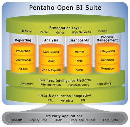
Figure 3: Oh my god, my eyes!!!
We’re moving to a much simpler (conceptual) approach:

Figure 4: Pentaho Architecture
This
means that going forward, we want to focus our platform on two main
cornerstones: PDI and the Pentaho Server. And we’re working on making
the two interact as seamlessly as possible.
Please
note that this doesn’t mean we’re not counting on other areas
(Mondrian, PRD, CTools, I’m looking at you), on the contrary. They’ll
keep being a fundamental part of our platform, but they will take a more
of a backstage role making all the wheels turning instead of a taking a
front seat.
Connecting PDI to the Pentaho Server
One
of the first materializations of this concept was the work done on
connecting from the PDI (spoon) to the Pentaho Server. It’s now a much
more streamlined experience:
Figure 5: Pentaho Repository Connection
Once defined, we’ll be able to get a new login experience:
Figure 6: Logging in to the Pentaho Server
Once done, there will be the indication of where we’re connected to, plus a few simpler ways to handle those connections:
Figure 7: Identifying the current connection
And
remember when I mentioned the simplified architecture? Now both the
Data Integration user and the Business user have access to the same
view:
Figure 8: Different views over the same ecosystem
A lot of optimizations were done here to allow a smoother experience:
- Repository performance optimizations (and we still want to improve the browsing / open / save experience)
- Versioning is turned on by default
- That somewhat annoying commit message every time we save is now also turned off by default
- Every connection dialog now connects to port 8080 and to the pentaho/ webapp instead of the 9080 and pentaho-di that has now been somewhat discontinued (even though for migration purposes we still hand out this artifact)
One
of the first materializations of this concept was the work done on
connecting from the PDI (spoon) to the Pentaho Server. It’s now a much
more streamlined experience:

Figure 5: Pentaho Repository Connection
Once defined, we’ll be able to get a new login experience:

Figure 6: Logging in to the Pentaho Server
Once done, there will be the indication of where we’re connected to, plus a few simpler ways to handle those connections:

Figure 7: Identifying the current connection
And
remember when I mentioned the simplified architecture? Now both the
Data Integration user and the Business user have access to the same
view:

Figure 8: Different views over the same ecosystem
A lot of optimizations were done here to allow a smoother experience:
- Repository performance optimizations (and we still want to improve the browsing / open / save experience)
- Versioning is turned on by default
- That somewhat annoying commit message every time we save is now also turned off by default
- Every connection dialog now connects to port 8080 and to the pentaho/ webapp instead of the 9080 and pentaho-di that has now been somewhat discontinued (even though for migration purposes we still hand out this artifact)
Migration
It’s
fundamental to note that existing installations with the BA / DI
configuration won’t turn into some kind of legacy scenario; This
configuration is still supported and, much on the contrary, it still is the recommended topology. This is about capabilities, not about installation.
In 7.0, for migration purposes, we’ll still have the baserver / diserver artifacts for upgrades only.
Analytics Anywhere
A completely new approach
Ok,
so this is absolutely huge! You’re certainly familiar with the classic
data pipeline that describes most of the market positioning / product
placement:
Figure 9: Data pipeline
In
this scenario we identify three different funnels: Engineering, Data
Preparation and Analytics. But we started thinking about this and got to
the somewhat obvious conclusion that this doesn’t actually make a lot
of sense. The truth is that the need for Analytics happens anywhere in the data pipeline.
By
being one of the few products that work on all this 3 areas, we’re in a
unique position to completely break this model and deliver analytics
anywhere in the data pipeline:
Figure 10: Analytics Anywhere in the data pipeline
And
7.0 is the first step in a journey that aims to break these boundaries
while working towards a consolidated UX experience; And the first
materialization is bringing analytics to PDI…
Ok,
so this is absolutely huge! You’re certainly familiar with the classic
data pipeline that describes most of the market positioning / product
placement:

Figure 9: Data pipeline
In
this scenario we identify three different funnels: Engineering, Data
Preparation and Analytics. But we started thinking about this and got to
the somewhat obvious conclusion that this doesn’t actually make a lot
of sense. The truth is that the need for Analytics happens anywhere in the data pipeline.
By
being one of the few products that work on all this 3 areas, we’re in a
unique position to completely break this model and deliver analytics
anywhere in the data pipeline:

Figure 10: Analytics Anywhere in the data pipeline
And
7.0 is the first step in a journey that aims to break these boundaries
while working towards a consolidated UX experience; And the first
materialization is bringing analytics to PDI…
An EE feature
This
is huge. Really huge! And let me say from the beginning that this
feature is EE only. Why? Because according to our CE/EE framework this
falls there: it’s not an engine level functionality, and while it
doesn’t prevent any work from being done, it drastically accelerates the
time to results.
And
just a word on this – even though I’m the Community guy, and one of the
biggest advocates of the advantages of having a great CE release, I’m
also a huge proponent that a good, well thought balance has to exist
between the CE and EE versions. This balance is never easy to get to –
we know we can’t be 100% open source and we know we’ll absolutely lose
this battle if we’re completely closed source. The sweet spot is
somewhere in the middle.
Entry point
Starting from 7.0, we’ll be able to see a new flyover when in PDI with 2 buttons in there:
- Run and inspect data
- Inspect data
Figure 11: Analytics entry point
The
difference between both are subtle but will grow in importance over
time; The first option always runs the transformation and get the set of
data to inspect, while the second option gets data from cache if it’s
available. If not, acts as the first one.
Starting from 7.0, we’ll be able to see a new flyover when in PDI with 2 buttons in there:
- Run and inspect data
- Inspect data
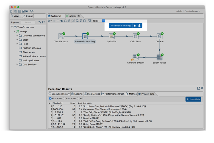
Figure 11: Analytics entry point
The
difference between both are subtle but will grow in importance over
time; The first option always runs the transformation and get the set of
data to inspect, while the second option gets data from cache if it’s
available. If not, acts as the first one.
A new Data Inspection experience
If we click any of those options, we should land in a completely new Data Inspection experience:
Figure 12: A new Data Inspection experience
The
first thing you’ll see here is obviously the most immediate kind of
information you’ll expect to see: A table that shows the data that’s
flowing on the transformation stream. However, there’s a lot more that
you can do from this point on, and even without moving away from this
initial visualization you can select which columns to see and sort the
available data.
It’s
important to note that this may not be (and most likely won’t be) the
entire data set. This is about data inspection and spot-checking; What
this does is looking at the stream of data that passes in PDI and uses a
limited amount of data. This limit is still to be determined, but
should be in the range of thousands of rows. This (configurable) number
will go up in time, never compromising in usability and speed of
analysis.
If we click any of those options, we should land in a completely new Data Inspection experience:

Figure 12: A new Data Inspection experience
The
first thing you’ll see here is obviously the most immediate kind of
information you’ll expect to see: A table that shows the data that’s
flowing on the transformation stream. However, there’s a lot more that
you can do from this point on, and even without moving away from this
initial visualization you can select which columns to see and sort the
available data.
It’s
important to note that this may not be (and most likely won’t be) the
entire data set. This is about data inspection and spot-checking; What
this does is looking at the stream of data that passes in PDI and uses a
limited amount of data. This limit is still to be determined, but
should be in the range of thousands of rows. This (configurable) number
will go up in time, never compromising in usability and speed of
analysis.
Other ways to visualize the data
So
we can see a table. Not exactly exciting so far, even though it’s much
more legible and useful that the good-ol’ preview window. But this is
just one of the possible ways to look at the data:
Figure 13: Visualization selector
So as you see we can have several ways to look at the data:
- Table
- Pivot
- Bar and stacked bar charts
- Column and stacked column charts
- Line and area charts
- Pie and doughnut chart
- Scatter and bubble charts
One
thing you’ll notice is that you’re not restricted to work with a single
visualization; It’s possible to create different tabs so you can do
other kind of analysis:
Figure 14: Working with different visualizations simultaneously
Here’s an example of getting this information with a different visualization:
Figure 15: Stacked bar chart
So
we can see a table. Not exactly exciting so far, even though it’s much
more legible and useful that the good-ol’ preview window. But this is
just one of the possible ways to look at the data:

Figure 13: Visualization selector
So as you see we can have several ways to look at the data:
- Table
- Pivot
- Bar and stacked bar charts
- Column and stacked column charts
- Line and area charts
- Pie and doughnut chart
- Scatter and bubble charts
One
thing you’ll notice is that you’re not restricted to work with a single
visualization; It’s possible to create different tabs so you can do
other kind of analysis:
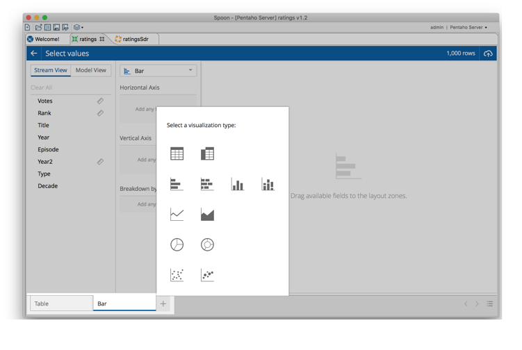
Figure 14: Working with different visualizations simultaneously
Here’s an example of getting this information with a different visualization:

Figure 15: Stacked bar chart
Chart tweaks and improvements
The
previous screenshot showed a bar chart. And you have no idea how much
work was put on these visualizations… You’re surely thinking “it’s a stupid bar chart. I’ve seen hundreds just like this one”.
Well, let me tell you – you’re wrong. This is not just a bar chart –
this is an astonishing bar chart with a lot of attention given to
details.
Let me go through some areas where the team did a great work:
A new color palette
Figure 16: A completely useless chart just to prove a point
From
the start we had a goal: This experience had to be pleasant to the
user. It had to be pretty, and a great color balance is absolutely
fundamental. However, it’s really not an easy task to get a generic
color palette to the visualizations that even with a lot of categories
is pleasant to the eyes.
But
I think that objective has been achieved. If you look at the previous
utterly stupid pie chart with tons of categories, you’ll have to agree
that even with lots and lots of colors the overall color balance is
still very easy on the eyes – a great balance between beauty and
legibility
Screen real estate optimization
How
many times did you see a chart with so many bars that they seemed
thinner than a pixel? Or a single bar that caused a dashboard to look
like your garage door?
Well, not here…
Figure 17: Not that many bars on screen
We
always try to leverage as much screen real estate as we possibly can,
but trying to prevent edge cases; on the case of the bar charts, bars
have a maximum width so they don’t become stupidly large.
But
the opposite is also true: We defined a minimum width for the visual
elements on screen, and if that minimum is reached, instead of
sacrificing legibility by allowing bars to shrink to a tiny value, we
simply stop at a given size and let the chart overflow on its
categorical axis.
Figure 18: Much more bars, but still readable!
This
screenshot shows exactly that. More decades than what fits on screen
will result on the appearance of that scroll bar you see on the right.
How
many times did you see a chart with so many bars that they seemed
thinner than a pixel? Or a single bar that caused a dashboard to look
like your garage door?
Well, not here…
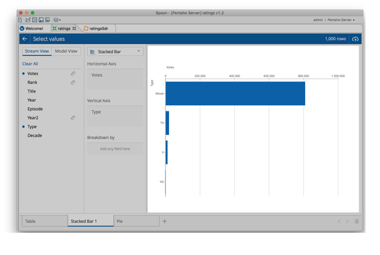
Figure 17: Not that many bars on screen
We
always try to leverage as much screen real estate as we possibly can,
but trying to prevent edge cases; on the case of the bar charts, bars
have a maximum width so they don’t become stupidly large.
But
the opposite is also true: We defined a minimum width for the visual
elements on screen, and if that minimum is reached, instead of
sacrificing legibility by allowing bars to shrink to a tiny value, we
simply stop at a given size and let the chart overflow on its
categorical axis.

Figure 18: Much more bars, but still readable!
This
screenshot shows exactly that. More decades than what fits on screen
will result on the appearance of that scroll bar you see on the right.
Axis label legibility
A
bit related with the previous item is how we treat the axis labels. We
try to show them the “best” way possible… If we see the axis label fit
on screen, we put then on their natural position, horizontally:
Figure 19: Horizontally placed axis labels
But
if we see there’s not enough room and they would overlap, we
automatically slant them; If still they don’t fit on screen, we don’t
let them overflow part a certain point (I don’t recall the exact rule
but it’s something like never going over 20% of the chart height/width).
And on those cases there a tooltip will allow to see the full label.
Figure 20: Lots of wide labeled categories
This is obviously very hard to guarantee it works on every condition, but so far I think it’s a huge improvement
A
bit related with the previous item is how we treat the axis labels. We
try to show them the “best” way possible… If we see the axis label fit
on screen, we put then on their natural position, horizontally:

Figure 19: Horizontally placed axis labels
But
if we see there’s not enough room and they would overlap, we
automatically slant them; If still they don’t fit on screen, we don’t
let them overflow part a certain point (I don’t recall the exact rule
but it’s something like never going over 20% of the chart height/width).
And on those cases there a tooltip will allow to see the full label.

Figure 20: Lots of wide labeled categories
This is obviously very hard to guarantee it works on every condition, but so far I think it’s a huge improvement
Chart legends
This
is one of those that it’s so obvious that we ask ourselves why didn’t
we do it from the start… So, legends are good. They provide information…
So yeah, we have them, like shown on this stacked chart of votes by
type (I’m parsing an IMDB ratings file I grabbed from the internet):
Figure 21: Cool and useful looking legends, I salute you
However, suppose that instead of breaking down by decade, I want to do a breakdown by year. That’s a lot of legends, right?
Figure 22: Hum, formerly cool and useful looking legends, where did you go??
No,
they’re gone. The rationale here is simple: If you have a lot of series
the legends become completely useless, and even risk stealing away
precious screen real estate – how many times did we see legends taking
more space than the chart itself?
So
we applied an extremely advanced algorithm here. Heavy math, guys, we
used a predictive univariate model that based on font being monospaced
or not, size of strings, number of elements, width of the chart, number
of lines the legend would use and…. Nah, I’m kidding, we didn’t bother-
we just hide the damn legend if it has more than 20 elements. Simple and
effective! :p
This
is one of those that it’s so obvious that we ask ourselves why didn’t
we do it from the start… So, legends are good. They provide information…
So yeah, we have them, like shown on this stacked chart of votes by
type (I’m parsing an IMDB ratings file I grabbed from the internet):

Figure 21: Cool and useful looking legends, I salute you
However, suppose that instead of breaking down by decade, I want to do a breakdown by year. That’s a lot of legends, right?

Figure 22: Hum, formerly cool and useful looking legends, where did you go??
No,
they’re gone. The rationale here is simple: If you have a lot of series
the legends become completely useless, and even risk stealing away
precious screen real estate – how many times did we see legends taking
more space than the chart itself?
So
we applied an extremely advanced algorithm here. Heavy math, guys, we
used a predictive univariate model that based on font being monospaced
or not, size of strings, number of elements, width of the chart, number
of lines the legend would use and…. Nah, I’m kidding, we didn’t bother-
we just hide the damn legend if it has more than 20 elements. Simple and
effective! :p
Tooltips
You probably noticed it by now, but simply put, they look great and give you the information you need ☺
Figure 23: A great looking tooltip
You probably noticed it by now, but simply put, they look great and give you the information you need ☺

Figure 23: A great looking tooltip
And a few other minor but very important things…
There
were other minor (?) interventions that really work well with all these
other items I mentioned previously: a correct choice of font family,
size and color; A balanced chart configuration for gridlines; The
placement and orientation of the axis titles and more. Everything
working together to provide a combined result that I personally think is
not short than amazing and for which I’m extremely proud of the team.
We
decided for this go round not to give the user the possibility to
customize chart properties, and it was a conscious decision. We believe
that in a lot of places there’s an incorrect mix of data related
properties with visual properties – sometimes this shouldn’t even be
done by the same person. In this context it’s all about the data, so we
opted to work a lot on a great set of defaults that make reading the
data as easy as possible and on a later stage (dashboards, I’m thinking
of you) we’ll work on allowing to set visual specific properties. I
think it was the right decision.
The underlying technology
Even though we’re not making that public for now, we developed a new version of what we internally call the VizAPI,
and that’s what’s currently providing the visualizations to this
interface (by the way, we internally code name this interface DET,
don’t ask me why…). And this is obviously pluggable, so when we get the
chance to make the documentation available, anyone will be able to
provide extra visualizations that will be available to use alongside the
othere.
And
the visualization implementation itself? I’m sure you won’t be
surprised to know it’s the Ctools’ CCC charting engine, and we also want
to make all the described behavior the default behavior of CCC, which
would obviously benefit all the Ctools users out there.
We
didn’t get time to do it, but very soon we’re going to apply this new
VizAPI to Analyzer as well, so the visualizations and it’s behaviors
will be coherent between this new analysis interface and Analyzer.
Stream vs Model: Modelling at the source
You probably noticed that I always used Votes in
the previous screenshots, and there’s a reason for it: While votes are a
cumulative concept, doesn’t make any sense at all to show a sum of
ranks. But until this point, we have no information that allow us to
know what’s the business meaning of these fields; All we know is if
they’re strings, numbers, binaries, dates, etc… In order to get insights
from fields like rank, we need to get more semantics out of the fields mean from a business perspective.
And
how do we get this information? Classically, this information is
appended in a separate stage of the process. We are used to calling it
the modelling stage,
and it’s an operation usually done after the data integration stage is
complete. On our stack, we do this by writing Mondrian schemas (if we
want to use OLAP) or Pentaho Metadata models for interactive reporting.
But
this is incredibly stupid! From the point we get a field called rank,
we already know it should be treated as an average. As soon as we see a
date field, most likely it will feed a date dimension. If we get
country, state, city fields, they will mostly likely be attributes of a
territory dimension. Makes no sense at all to wait till the end of this
data preparation stage and resort to a different tool to append an
information we have from the start.
In
this new way of analyzing data as part of the data integration process,
we started with the following assumption: There are two different
lenses that we can apply to look at a data set:
- Stream view:
This is the bi-dimensional representation of the physical data that
we’re working with; A view over the fields and their primary types
- Model view:
The semantic meaning of those fields; Dimensions, attributes, measures,
basically the real business meaning of the stream underneath
On the example I’ve been using, these are the two views:
Figure 24: Stream view and Model view
Like
mentioned before, these are two views over the same domain; If we’re
interested in looking at the physical stream, the one on the left will
be used. If we’re looking from a business perspective, it’s the model
view that has the added information. Our current thinking is that only
the model view will be available for the end users (once we get this
data exploration experience there).
You probably noticed that I always used Votes in
the previous screenshots, and there’s a reason for it: While votes are a
cumulative concept, doesn’t make any sense at all to show a sum of
ranks. But until this point, we have no information that allow us to
know what’s the business meaning of these fields; All we know is if
they’re strings, numbers, binaries, dates, etc… In order to get insights
from fields like rank, we need to get more semantics out of the fields mean from a business perspective.
And
how do we get this information? Classically, this information is
appended in a separate stage of the process. We are used to calling it
the modelling stage,
and it’s an operation usually done after the data integration stage is
complete. On our stack, we do this by writing Mondrian schemas (if we
want to use OLAP) or Pentaho Metadata models for interactive reporting.
But
this is incredibly stupid! From the point we get a field called rank,
we already know it should be treated as an average. As soon as we see a
date field, most likely it will feed a date dimension. If we get
country, state, city fields, they will mostly likely be attributes of a
territory dimension. Makes no sense at all to wait till the end of this
data preparation stage and resort to a different tool to append an
information we have from the start.
In
this new way of analyzing data as part of the data integration process,
we started with the following assumption: There are two different
lenses that we can apply to look at a data set:
- Stream view: This is the bi-dimensional representation of the physical data that we’re working with; A view over the fields and their primary types
- Model view: The semantic meaning of those fields; Dimensions, attributes, measures, basically the real business meaning of the stream underneath
On the example I’ve been using, these are the two views:
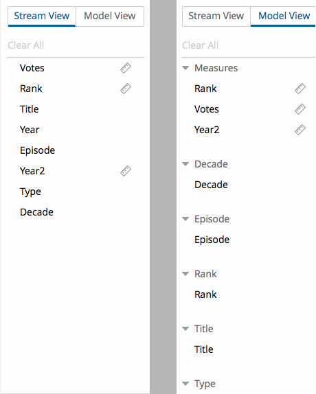
Figure 24: Stream view and Model view
Like
mentioned before, these are two views over the same domain; If we’re
interested in looking at the physical stream, the one on the left will
be used. If we’re looking from a business perspective, it’s the model
view that has the added information. Our current thinking is that only
the model view will be available for the end users (once we get this
data exploration experience there).
Annotating the stream
The
first time you switch to the model view (and you’ll notice that some
visualizations only make sense for a specific view, which is the case of
the table and the pivot view for stream and model respectively) you’ll
probably notice that some of the information is not as you want it: Rank
is defined as a cumulative measure, decade and years are not on the
same dimension, just to name two specific examples.
How to correct this information? Through the special Annotate Stream step.
This is where you’ll add the extra business information that we’ll use
to render the correct model view. Here’s an example:
Figure 25: Annotating the stream
The
concepts should be familiar, as they are based on the dimensional
modeling concepts that have been around for 30+ years. Why? Because most
of those concepts are not technical, on the contrary – IMO the biggest
advantage of the core data warehouse concepts is the way raw data is
turned into business meaningful terminology. The technologies to turn
one in the other may evolve, but the main concepts are exactly the same:
Measures, dimensions, attributes, properties, etc.
So
by adding this information, we’ll be able to get the correct model from
this step on and see the correct model information and expected output
from our visualizations:
Figure 26: A visualization using the correct model information
As
I’m sure you realized by now, underneath we’re generating a Mondrian
model. To be more accurate, we’re generating what we call a DSW model,
which contains more than the Mondrian schema. It’s important for us not
to lock this down to a specific technology or implementation to allow
for future optimizations.
The
first time you switch to the model view (and you’ll notice that some
visualizations only make sense for a specific view, which is the case of
the table and the pivot view for stream and model respectively) you’ll
probably notice that some of the information is not as you want it: Rank
is defined as a cumulative measure, decade and years are not on the
same dimension, just to name two specific examples.
How to correct this information? Through the special Annotate Stream step.
This is where you’ll add the extra business information that we’ll use
to render the correct model view. Here’s an example:
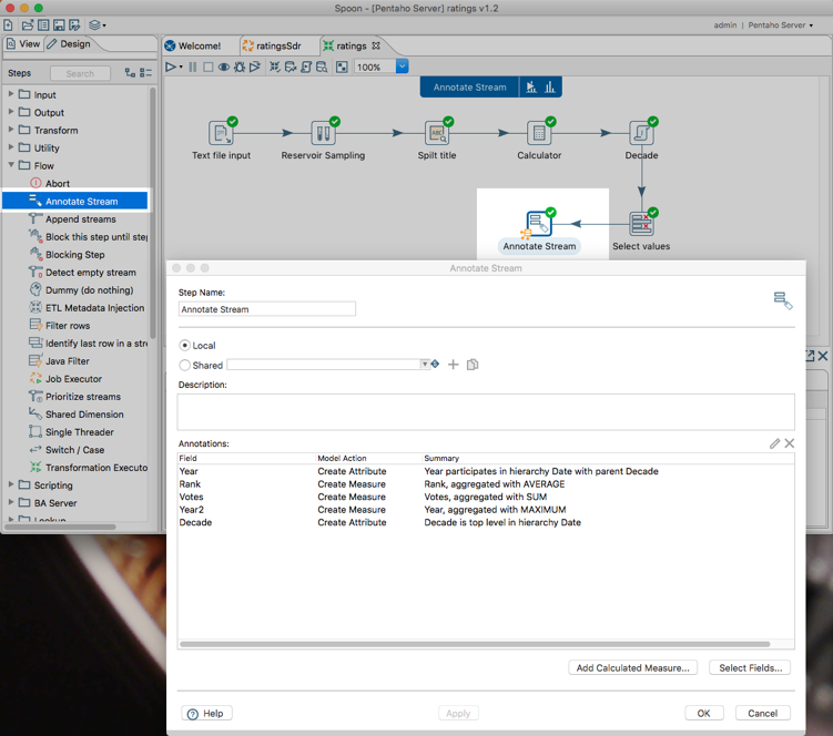
Figure 25: Annotating the stream
The
concepts should be familiar, as they are based on the dimensional
modeling concepts that have been around for 30+ years. Why? Because most
of those concepts are not technical, on the contrary – IMO the biggest
advantage of the core data warehouse concepts is the way raw data is
turned into business meaningful terminology. The technologies to turn
one in the other may evolve, but the main concepts are exactly the same:
Measures, dimensions, attributes, properties, etc.
So
by adding this information, we’ll be able to get the correct model from
this step on and see the correct model information and expected output
from our visualizations:

Figure 26: A visualization using the correct model information
As
I’m sure you realized by now, underneath we’re generating a Mondrian
model. To be more accurate, we’re generating what we call a DSW model,
which contains more than the Mondrian schema. It’s important for us not
to lock this down to a specific technology or implementation to allow
for future optimizations.
The pivot view
One special visualization is the pivot view, for OLAP- style analysis
Figure 27: The pivot view
The result? An experience you may be very familiar about:
Figure 28: Exploring the data in a pivot table format
One of the key items in Pentaho is embed-ability, and we have a lot of OEM customers. Here we have a classic case of “eat your own dog food”,
as we’re leveraging a highly stylized analyzer visualization and taking
advantage of its capabilities to be embedded in an external
application. On this case, we are the external application, but it was a
great validation that we actually are capable of doing what we say we
do ;)
You’ll
notice that we disabled all the options that are available out of the
box in analyzer, like filters, drilldowns, tops, ranks, etc… In future
versions we’ll progressively add these fundamental operations to this
exploration experience, but we’ll have to do it in a way where we can do
them in all visualizations, not only in the pivot view, and we simply
didn’t have time to do everything we wanted.
One special visualization is the pivot view, for OLAP- style analysis

Figure 27: The pivot view
The result? An experience you may be very familiar about:

Figure 28: Exploring the data in a pivot table format
One of the key items in Pentaho is embed-ability, and we have a lot of OEM customers. Here we have a classic case of “eat your own dog food”,
as we’re leveraging a highly stylized analyzer visualization and taking
advantage of its capabilities to be embedded in an external
application. On this case, we are the external application, but it was a
great validation that we actually are capable of doing what we say we
do ;)
You’ll
notice that we disabled all the options that are available out of the
box in analyzer, like filters, drilldowns, tops, ranks, etc… In future
versions we’ll progressively add these fundamental operations to this
exploration experience, but we’ll have to do it in a way where we can do
them in all visualizations, not only in the pivot view, and we simply
didn’t have time to do everything we wanted.
The number of rows
Figure 29: Data set size of the inspection
I’ve been talking about data inspection. I mentioned this before but want to reinforce so people don’t have the wrong expectations over this. We are not exploring
the full dataset, at least for all the cases. PDI can process tons of
data, and would be physically impossible to have something that could
generically analyzer any non-optimized dataset size, at least in a fast
and practical manner.
This
is about data inspection and spot-checking; What this does is looking
at the stream of data that passes in PDI and uses a limited amount of
data. This limit, shown here as 1000 rows but will be larger, is still
to be determined, but should be in the range of thousands of rows. This
(configurable) number will go up in time, never compromising in
usability and speed of analysis.
AgileBI, Instaview… Deja-vu?
Some of the older Pentaho users may be asking the following question:
But… isn’t this very similar to Agile BI and / or Instaview?
My
best answer to that is: While they are indeed similar in concept, the
different approach to the implementation makes this extremely useful
while the others were, in my (very critical) opinion, completely
useless.
What
the others did wrong is that they forced the user to go out of the way
to use them; AgileBI, for instance, only worked on specific steps, where
data was materialized in a table. Then it would take a huge amount of
time to prepare the infrastructure, you’d always have to provide
modelling information, and eventually you’d be greeted with an analyzer
frame running inside a pentaho instance running inside an application
server embedded inside spoon…. You’d only be able to do slice and dice
operations and when you’re done, you lose everything, there’s nowhere to
go.
Instaview
(discontinued and actually removed from the product a while back) had a
slightly different approach – while it worked at any step, it always
ran the full transformation and moved the data to an embedded MonetDB
database and only after that we’d go into analyzer, that once again was
running inside a thing that was running inside a thing, that was running
inside a thing… jeez, it always felt to me like the architectural
version of a Turducken (can you tell that I really, really, really hated those plugins?).
This new approach was built on what we learned from the others:
- It doesn’t force you to exit your usual work flow, on the contrary, complements it;
- We
tried to make it extremely fast – there’s just a small overhead over
the time it takes to actually run the transformation to get the data to
be inspected;
- It’s completely unmaterialized, no persistency involved;
- Leverages data services, so takes advantage of push-down optimizations when needed
- Gives you several ways to look at the data while you build your transformations, so it’s not restricted to a pivot table only
- Blends the concept of stream and model on a unified view of the dataset
- A single click publishes a datasource in the Pentaho Server
Some of the older Pentaho users may be asking the following question:
But… isn’t this very similar to Agile BI and / or Instaview?
My
best answer to that is: While they are indeed similar in concept, the
different approach to the implementation makes this extremely useful
while the others were, in my (very critical) opinion, completely
useless.
What
the others did wrong is that they forced the user to go out of the way
to use them; AgileBI, for instance, only worked on specific steps, where
data was materialized in a table. Then it would take a huge amount of
time to prepare the infrastructure, you’d always have to provide
modelling information, and eventually you’d be greeted with an analyzer
frame running inside a pentaho instance running inside an application
server embedded inside spoon…. You’d only be able to do slice and dice
operations and when you’re done, you lose everything, there’s nowhere to
go.
Instaview
(discontinued and actually removed from the product a while back) had a
slightly different approach – while it worked at any step, it always
ran the full transformation and moved the data to an embedded MonetDB
database and only after that we’d go into analyzer, that once again was
running inside a thing that was running inside a thing, that was running
inside a thing… jeez, it always felt to me like the architectural
version of a Turducken (can you tell that I really, really, really hated those plugins?).
This new approach was built on what we learned from the others:
- It doesn’t force you to exit your usual work flow, on the contrary, complements it;
- We tried to make it extremely fast – there’s just a small overhead over the time it takes to actually run the transformation to get the data to be inspected;
- It’s completely unmaterialized, no persistency involved;
- Leverages data services, so takes advantage of push-down optimizations when needed
- Gives you several ways to look at the data while you build your transformations, so it’s not restricted to a pivot table only
- Blends the concept of stream and model on a unified view of the dataset
- A single click publishes a datasource in the Pentaho Server
Looking into the future
I
really believe that this will have a huge impact for PDI users; On its
own it’s a fantastic tool that we’ll be improving over time and will be a
real differentiation in the market. But we want more than that.
We’re
on a journey to build one single interface for users to engage with
information, regardless of where they are. We want to move away from a
tool based approach to a data-centric approach, which will drastically
improve the overall user experience.
Share Analytics in PDI
This
one is it’s in own section because it’s one of the most useful
features; When we’re connected to a Pentaho Server, we can immediately
publish the dataset to have that available to the users on the Pentaho
Server.
Figure 30: Publish datasource
This
feature requires a connection to a server because on most cases it will
immediately it will create an unmaterialized connection on the Pentaho
Server through data services, which means the transformation will be
executed on demand on the server. Special care has to be taken to make
sure all the resources are available and working correctly on that
server. For performance reasons, cache will be enabled by default.
Figure 31: Publish datasource dialog
From
this point on you’ll be able to name the datasource and it will be
created on the Pentaho Server you chose; One important feature, actually
inherited from the SDR blueprint (SDR stands for Streamlined Data Refinery) is that the system is smart enough to create a direct JDBC connection to a database if we’re publishing from a table output step or equivalent.
As
soon as we publish the dataset from within PDI all limits will be
removed; The business users will be able to analyze all the data from
within the User Console, completely unmaterialized. This requires that
some care is needed related to data set size; Data services work
extremely well for datasets up to a few million rows, but over that we
may need to do some optimizations.
If
more performance is needed, the integration developer can, at any time,
materialize the data in a database and if he publishes again that
unmaterialized connection will be immediately replaced by a
“materialized” connection to the database.
This
is a key message and strategic direction of the platform: keep things
simple, go complex as needed; If the system behaves well with an
unmaterialized model, we’ll leave it that way. If not, we’ll explore
other solutions, knowing that there’s always a price involved in that
(database maintenance, data lifecycle management, etc).
And
what’s the final result? An exploration in Analyzer that mimics exactly
what we saw on PDI (since, on my case, I had a small dataset)
Figure 32: The published result
This
one is it’s in own section because it’s one of the most useful
features; When we’re connected to a Pentaho Server, we can immediately
publish the dataset to have that available to the users on the Pentaho
Server.

Figure 30: Publish datasource
This
feature requires a connection to a server because on most cases it will
immediately it will create an unmaterialized connection on the Pentaho
Server through data services, which means the transformation will be
executed on demand on the server. Special care has to be taken to make
sure all the resources are available and working correctly on that
server. For performance reasons, cache will be enabled by default.

Figure 31: Publish datasource dialog
From
this point on you’ll be able to name the datasource and it will be
created on the Pentaho Server you chose; One important feature, actually
inherited from the SDR blueprint (SDR stands for Streamlined Data Refinery) is that the system is smart enough to create a direct JDBC connection to a database if we’re publishing from a table output step or equivalent.
As
soon as we publish the dataset from within PDI all limits will be
removed; The business users will be able to analyze all the data from
within the User Console, completely unmaterialized. This requires that
some care is needed related to data set size; Data services work
extremely well for datasets up to a few million rows, but over that we
may need to do some optimizations.
If
more performance is needed, the integration developer can, at any time,
materialize the data in a database and if he publishes again that
unmaterialized connection will be immediately replaced by a
“materialized” connection to the database.
This
is a key message and strategic direction of the platform: keep things
simple, go complex as needed; If the system behaves well with an
unmaterialized model, we’ll leave it that way. If not, we’ll explore
other solutions, knowing that there’s always a price involved in that
(database maintenance, data lifecycle management, etc).
And
what’s the final result? An exploration in Analyzer that mimics exactly
what we saw on PDI (since, on my case, I had a small dataset)

Figure 32: The published result
Reporting Enhancements
And
now, for something completely different. This release is not only made
of new and shiny stuff. As in all releases tons of issues are addressed,
and this time we also revamped the reporting bits to add an extremely
important feature: Progress report and partial renderings.
From 7.0 on, if you run a report (PRD or PIR based),
you’ll see this cool looking progress indicator. And even better, if
you see it’s taking a lot of time to render cause it’s destroying half
of the Amazon forest, you have the option to send it to background
execution and it will be saved where you want it to.
Figure 33: Progress indicator! I know it's 2016, but better late than ever!
There’s
a second insanely useful improvement is that we’ll start giving you the
pages as soon as they’re available without the need for you to wait for
everything
Figure 34: Handing out stuff as soon as it's ready
And
now, for something completely different. This release is not only made
of new and shiny stuff. As in all releases tons of issues are addressed,
and this time we also revamped the reporting bits to add an extremely
important feature: Progress report and partial renderings.
From 7.0 on, if you run a report (PRD or PIR based),
you’ll see this cool looking progress indicator. And even better, if
you see it’s taking a lot of time to render cause it’s destroying half
of the Amazon forest, you have the option to send it to background
execution and it will be saved where you want it to.
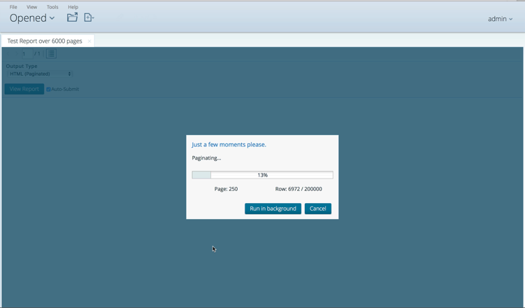
Figure 33: Progress indicator! I know it's 2016, but better late than ever!
There’s
a second insanely useful improvement is that we’ll start giving you the
pages as soon as they’re available without the need for you to wait for
everything
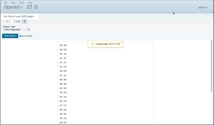
Figure 34: Handing out stuff as soon as it's ready
Spark
In 7.0 we increased our support to Spark in 2 main areas: Added orchestration abilities and support to SQL on Spark
In 7.0 we increased our support to Spark in 2 main areas: Added orchestration abilities and support to SQL on Spark
Expanded Spark Orchestration
Figure 35: Spark orchestration improvementsd /
Allows
IT/developers to visually coordinate and schedule Spark applications
that leverage libraries for streaming, machine learning, structured data
query, and other purposes; also supports applications written in
Python.
This
is important cause it allows to visually coordinate and schedule Spark
applications to run in broader pipelines. Having this visual environment
makes it easier to manage the wide variety of programming languages and
different application types.
In
here we expanded the existing Spark submit step capabilities, allowing
to submit existing applications that use libraries including Spark
Streaming, SparkMLlib, SparkML, and Spark SQL.
This is supported for Cloudera and Hortonworks.
SQL on Spark
Figure 36: SQL on Spark capabilities added to PDI
PDI
is now enabled to connect to data with SQL on Spark, making it easier
for data analysts to query structured Spark data and integrate it with
other data for preparation and analytics. This is done through an HQL query in the relevant PDI steps.
We’re
leveraging the different Hadoop implementations; Cloudera uses the Hive
on Spark JDBC while Hortonworks uses the Spark SQL JDBC driver.
From this point on… business as usual!
Metadata Injection
Figure 37: Metadata injection concept
You don’t know what Metadata injection is?
You should. It’s absolutely useful when you have disparate datasources /
rules and want to dynamically change them at runtime, avoiding having
to build and maintain a huge amount of transformations and jobs. Define a
template, pass metadata at runtime, and you’ll be good! Not the easiest
thing to do, but that’s the price you get for this insanely powerful
approach.
We did tons of improvements to this story in 6.1, and we kept adding support to it by enabling more than 30 new steps to this list
Figure 38: Added steps enabled with Metadata Injection in 7.0

Figure 37: Metadata injection concept
You don’t know what Metadata injection is?
You should. It’s absolutely useful when you have disparate datasources /
rules and want to dynamically change them at runtime, avoiding having
to build and maintain a huge amount of transformations and jobs. Define a
template, pass metadata at runtime, and you’ll be good! Not the easiest
thing to do, but that’s the price you get for this insanely powerful
approach.
We did tons of improvements to this story in 6.1, and we kept adding support to it by enabling more than 30 new steps to this list

Figure 38: Added steps enabled with Metadata Injection in 7.0
Hadoop Security
Figure 39: Added support for Hadoop user impersonation
What a huge and amazing effort the team did here.
We
are extending our Kerberos integration to effectively cover
impersonation from multiple PDI users (whereas before it was focused on
authentication from a single user). Updated PDI Kerberos enhancements
will allow multiple authenticated PDI users to access Kerberos-enabled
Cloudera Hadoop clusters as multiple Hadoop users, promoting more secure
big data integration. This also enables the Hadoop cluster to perform
user level tracking and resource management. This granular level of
auditing of user activity is essential in enterprise-grade PDI
implementations with Hadoop.
While
Kerberos is focused on authenticating or providing a secure ‘log in’ to
the cluster, Cloudera Sentry is a framework for user/role authorization
to specific resources and data within Hadoop to help enforce business
security policies. In other words, users only have access to the data
they have been provisioned to access by IT. 7.0 enables the integration
of PDI with Cloudera Sentry in order to enforce enterprise data
authorization rules. Sentry enables unified user and role based access
controls to data, including specific Hive or HBase tables and other data
in HDFS, down to the column level of granularity
If
you made it to the end of this long and thorough blog on 7.0…..I’m
impressed. That probably means that you want some more information? If
yes, check out these links:
- Pentaho 7.0 webpage on Pentaho.com with additional information and resources
- Register for the 7.0 webinar on November 9, 2016 where you get to see a live demo of all of this!
As
a final comment, I reiterate what I said in the beginning – I consider
this the most spectacular release this product has ever seen – the only
release better than this one will be the next one ☺
-pedro

Figure 39: Added support for Hadoop user impersonation
What a huge and amazing effort the team did here.
We
are extending our Kerberos integration to effectively cover
impersonation from multiple PDI users (whereas before it was focused on
authentication from a single user). Updated PDI Kerberos enhancements
will allow multiple authenticated PDI users to access Kerberos-enabled
Cloudera Hadoop clusters as multiple Hadoop users, promoting more secure
big data integration. This also enables the Hadoop cluster to perform
user level tracking and resource management. This granular level of
auditing of user activity is essential in enterprise-grade PDI
implementations with Hadoop.
While
Kerberos is focused on authenticating or providing a secure ‘log in’ to
the cluster, Cloudera Sentry is a framework for user/role authorization
to specific resources and data within Hadoop to help enforce business
security policies. In other words, users only have access to the data
they have been provisioned to access by IT. 7.0 enables the integration
of PDI with Cloudera Sentry in order to enforce enterprise data
authorization rules. Sentry enables unified user and role based access
controls to data, including specific Hive or HBase tables and other data
in HDFS, down to the column level of granularity
- Pentaho 7.0 webpage on Pentaho.com with additional information and resources
- Register for the 7.0 webinar on November 9, 2016 where you get to see a live demo of all of this!
As
a final comment, I reiterate what I said in the beginning – I consider
this the most spectacular release this product has ever seen – the only
release better than this one will be the next one ☺
-pedro
Reply all
Reply to author
Forward
0 new messages