Getting MYSQL data into a chart.
10,697 views
Skip to first unread message

Garry Hayne
Feb 24, 2017, 5:44:15 AM2/24/17
to Node-RED
Hi,
I've got my MYSQL database up and running, inserting data is no problem but I am having problems charting data from the database.
Are there any guides to doing this. I have searched high and low without any real results.
Garry

Colin Law
Feb 24, 2017, 6:49:09 AM2/24/17
to node...@googlegroups.com
Start with a simple chart that you just feed some fixed data into
(using inject nodes or similar). Once that is working then attempt to
format the data out of the db so that it consists of a sequence of
messages with topic and payload values and feed that into the chart
instead. Ask again when you get stuck.
Colin
> --
> http://nodered.org
>
> Join us on Slack to continue the conversation: http://nodered.org/slack
> ---
> You received this message because you are subscribed to the Google Groups
> "Node-RED" group.
> To unsubscribe from this group and stop receiving emails from it, send an
> email to node-red+u...@googlegroups.com.
> To post to this group, send email to node...@googlegroups.com.
> Visit this group at https://groups.google.com/group/node-red.
> To view this discussion on the web, visit
> https://groups.google.com/d/msgid/node-red/4b03662a-c31f-4044-8138-3335a5578248%40googlegroups.com.
> For more options, visit https://groups.google.com/d/optout.
(using inject nodes or similar). Once that is working then attempt to
format the data out of the db so that it consists of a sequence of
messages with topic and payload values and feed that into the chart
instead. Ask again when you get stuck.
Colin
> http://nodered.org
>
> Join us on Slack to continue the conversation: http://nodered.org/slack
> ---
> You received this message because you are subscribed to the Google Groups
> "Node-RED" group.
> To unsubscribe from this group and stop receiving emails from it, send an
> email to node-red+u...@googlegroups.com.
> To post to this group, send email to node...@googlegroups.com.
> Visit this group at https://groups.google.com/group/node-red.
> To view this discussion on the web, visit
> https://groups.google.com/d/msgid/node-red/4b03662a-c31f-4044-8138-3335a5578248%40googlegroups.com.
> For more options, visit https://groups.google.com/d/optout.
Garry Hayne
Feb 24, 2017, 4:07:37 PM2/24/17
to Node-RED
On Friday, 24 February 2017 11:49:09 UTC, Colin Law wrote:
Start with a simple chart that you just feed some fixed data into
(using inject nodes or similar). Once that is working then attempt to
format the data out of the db so that it consists of a sequence of
messages with topic and payload values and feed that into the chart
instead. Ask again when you get stuck.
Colin
I am stuck Colin, exactly the process of formatting the output of the DB to present to the Chart node
Garry
Colin Law
Feb 24, 2017, 5:05:15 PM2/24/17
to node...@googlegroups.com
Show us an example of the data you are getting from the db.
Colin
Colin
> --
> http://nodered.org
>
> Join us on Slack to continue the conversation: http://nodered.org/slack
> ---
> You received this message because you are subscribed to the Google Groups
> "Node-RED" group.
> To unsubscribe from this group and stop receiving emails from it, send an
> email to node-red+u...@googlegroups.com.
> To post to this group, send email to node...@googlegroups.com.
> Visit this group at https://groups.google.com/group/node-red.
> To view this discussion on the web, visit
> https://groups.google.com/d/msgid/node-red/b20bf16f-9ad5-48d9-ba35-1facc3fd8d93%40googlegroups.com.
> http://nodered.org
>
> Join us on Slack to continue the conversation: http://nodered.org/slack
> ---
> You received this message because you are subscribed to the Google Groups
> "Node-RED" group.
> To unsubscribe from this group and stop receiving emails from it, send an
> email to node-red+u...@googlegroups.com.
> To post to this group, send email to node...@googlegroups.com.
> Visit this group at https://groups.google.com/group/node-red.
> To view this discussion on the web, visit
Colin Law
Feb 25, 2017, 9:20:54 AM2/25/17
to node...@googlegroups.com
I meant what it looks like once you get it into node-red.
Colin
Colin
> --
> http://nodered.org
>
> Join us on Slack to continue the conversation: http://nodered.org/slack
> ---
> You received this message because you are subscribed to the Google Groups
> "Node-RED" group.
> To unsubscribe from this group and stop receiving emails from it, send an
> email to node-red+u...@googlegroups.com.
> To post to this group, send email to node...@googlegroups.com.
> Visit this group at https://groups.google.com/group/node-red.
> To view this discussion on the web, visit
> https://groups.google.com/d/msgid/node-red/f73a2427-0ef2-4977-b63c-2111f479666a%40googlegroups.com.
> http://nodered.org
>
> Join us on Slack to continue the conversation: http://nodered.org/slack
> ---
> You received this message because you are subscribed to the Google Groups
> "Node-RED" group.
> To unsubscribe from this group and stop receiving emails from it, send an
> email to node-red+u...@googlegroups.com.
> To post to this group, send email to node...@googlegroups.com.
> Visit this group at https://groups.google.com/group/node-red.
> To view this discussion on the web, visit

mark hubrich
Feb 26, 2017, 9:55:45 PM2/26/17
to Node-RED
Is the database on the same pc as node-red? It took me a while to figure it out but I got it now.

The function creates my query and makes it a topic.

I then use a contrib-json to pull one key out of the data...

Then I can direct the key, values to gauges and stuff. I don't know about the charts yet as I'm very new at this and there's probably a better way to do what I'm doing but it's working for me at the moment :)
Good Luck!!
Mark
Garry Hayne
Mar 1, 2017, 8:12:23 AM3/1/17
to Node-RED
On Saturday, February 25, 2017 at 2:20:54 PM UTC, Colin Law wrote:
I meant what it looks like once you get it into node-red.
Colin
Sorry for the delay Colin, the screenshot shows what the data looks like in node-red.
Regards, Garry
Colin Law
Mar 1, 2017, 8:43:47 AM3/1/17
to node...@googlegroups.com
The info on the node says "msg.payload can contain an array of values
to bind to the topic." Are you expecting the array you are providing
to be bound to the query?
Colin
to bind to the topic." Are you expecting the array you are providing
to be bound to the query?
Colin
> --
> http://nodered.org
>
> Join us on Slack to continue the conversation: http://nodered.org/slack
> ---
> You received this message because you are subscribed to the Google Groups
> "Node-RED" group.
> To unsubscribe from this group and stop receiving emails from it, send an
> email to node-red+u...@googlegroups.com.
> To post to this group, send email to node...@googlegroups.com.
> Visit this group at https://groups.google.com/group/node-red.
> To view this discussion on the web, visit
> https://groups.google.com/d/msgid/node-red/e38a1f21-de43-442a-9ac5-80684acc95bf%40googlegroups.com.
> http://nodered.org
>
> Join us on Slack to continue the conversation: http://nodered.org/slack
> ---
> You received this message because you are subscribed to the Google Groups
> "Node-RED" group.
> To unsubscribe from this group and stop receiving emails from it, send an
> email to node-red+u...@googlegroups.com.
> To post to this group, send email to node...@googlegroups.com.
> Visit this group at https://groups.google.com/group/node-red.
> To view this discussion on the web, visit
Garry Hayne
Mar 1, 2017, 8:52:09 AM3/1/17
to node...@googlegroups.com
Hi Colin,
I just need to use the Timesamp and Value as inputs for a line chart.
Garry
On 1 March 2017 at 13:43, Colin Law <cla...@gmail.com> wrote:
The info on the node says "msg.payload can contain an array of values
to bind to the topic." Are you expecting the array you are providing
to be bound to the query?
Colin
On 1 March 2017 at 13:12, Garry Hayne <garry...@gmail.com> wrote:
>
>
> On Saturday, February 25, 2017 at 2:20:54 PM UTC, Colin Law wrote:
>>
>> I meant what it looks like once you get it into node-red.
>>
>> Colin
>>
>>
> Sorry for the delay Colin, the screenshot shows what the data looks like in
> node-red.
>
> Regards, Garry
>
> --
> http://nodered.org
>
> Join us on Slack to continue the conversation: http://nodered.org/slack
> ---
> You received this message because you are subscribed to the Google Groups
> "Node-RED" group.
> To unsubscribe from this group and stop receiving emails from it, send an
> email to node-red+unsubscribe@googlegroups.com.
> To post to this group, send email to node...@googlegroups.com.
> Visit this group at https://groups.google.com/group/node-red.
> To view this discussion on the web, visit
> https://groups.google.com/d/msgid/node-red/e38a1f21-de43-442a-9ac5-80684acc95bf%40googlegroups.com.
>
> For more options, visit https://groups.google.com/d/optout.
--
http://nodered.org
Join us on Slack to continue the conversation: http://nodered.org/slack
---
You received this message because you are subscribed to a topic in the Google Groups "Node-RED" group.
To unsubscribe from this topic, visit https://groups.google.com/d/topic/node-red/MbOPcXNJRzI/unsubscribe.
To unsubscribe from this group and all its topics, send an email to node-red+unsubscribe@googlegroups.com.
To post to this group, send an email to node...@googlegroups.com.
Visit this group at https://groups.google.com/group/node-red.
To view this discussion on the web, visit https://groups.google.com/d/msgid/node-red/CAL%3D0gLuMg3wFV0vJ-xP3O2cBRatCRMbzJUCcMZAxznCDedLGRA%40mail.gmail.com.
Colin Law
Mar 1, 2017, 9:39:09 AM3/1/17
to node...@googlegroups.com
Sorry, I had got confused about what you were showing us, I thought
the screenshot was the query you were running, but I see now that it
is the result of the query.
I realise that I am not sure how to do that. Usually with a line chart
you just supply values in real time and it adds the timestamp for
itself.
Can someone else please advise what format the data has to be provided
to the chart to draw the line with pre-determined timestamps?
Colin
>> > email to node-red+u...@googlegroups.com.
the screenshot was the query you were running, but I see now that it
is the result of the query.
I realise that I am not sure how to do that. Usually with a line chart
you just supply values in real time and it adds the timestamp for
itself.
Can someone else please advise what format the data has to be provided
to the chart to draw the line with pre-determined timestamps?
Colin
>> > To post to this group, send email to node...@googlegroups.com.
>> > Visit this group at https://groups.google.com/group/node-red.
>> > To view this discussion on the web, visit
>> >
>> > https://groups.google.com/d/msgid/node-red/e38a1f21-de43-442a-9ac5-80684acc95bf%40googlegroups.com.
>> >
>> > For more options, visit https://groups.google.com/d/optout.
>>
>> --
>> http://nodered.org
>>
>> Join us on Slack to continue the conversation: http://nodered.org/slack
>> ---
>> You received this message because you are subscribed to a topic in the
>> Google Groups "Node-RED" group.
>> To unsubscribe from this topic, visit
>> https://groups.google.com/d/topic/node-red/MbOPcXNJRzI/unsubscribe.
>> To unsubscribe from this group and all its topics, send an email to
>> node-red+u...@googlegroups.com.
>> > Visit this group at https://groups.google.com/group/node-red.
>> > To view this discussion on the web, visit
>> >
>> > https://groups.google.com/d/msgid/node-red/e38a1f21-de43-442a-9ac5-80684acc95bf%40googlegroups.com.
>> >
>> > For more options, visit https://groups.google.com/d/optout.
>>
>> --
>> http://nodered.org
>>
>> Join us on Slack to continue the conversation: http://nodered.org/slack
>> ---
>> You received this message because you are subscribed to a topic in the
>> Google Groups "Node-RED" group.
>> To unsubscribe from this topic, visit
>> https://groups.google.com/d/topic/node-red/MbOPcXNJRzI/unsubscribe.
>> To unsubscribe from this group and all its topics, send an email to
>> To post to this group, send an email to node...@googlegroups.com.
>> Visit this group at https://groups.google.com/group/node-red.
>> To view this discussion on the web, visit
>> https://groups.google.com/d/msgid/node-red/CAL%3D0gLuMg3wFV0vJ-xP3O2cBRatCRMbzJUCcMZAxznCDedLGRA%40mail.gmail.com.
>> For more options, visit https://groups.google.com/d/optout.
>
>
>> Visit this group at https://groups.google.com/group/node-red.
>> To view this discussion on the web, visit
>> https://groups.google.com/d/msgid/node-red/CAL%3D0gLuMg3wFV0vJ-xP3O2cBRatCRMbzJUCcMZAxznCDedLGRA%40mail.gmail.com.
>> For more options, visit https://groups.google.com/d/optout.
>
>
> --
> http://nodered.org
>
> Join us on Slack to continue the conversation: http://nodered.org/slack
> ---
> You received this message because you are subscribed to the Google Groups
> "Node-RED" group.
> To unsubscribe from this group and stop receiving emails from it, send an
> email to node-red+u...@googlegroups.com.
> http://nodered.org
>
> Join us on Slack to continue the conversation: http://nodered.org/slack
> ---
> You received this message because you are subscribed to the Google Groups
> "Node-RED" group.
> To unsubscribe from this group and stop receiving emails from it, send an
> To post to this group, send email to node...@googlegroups.com.
> Visit this group at https://groups.google.com/group/node-red.
> To view this discussion on the web, visit
> https://groups.google.com/d/msgid/node-red/CAAxsrjecMPtO3Mv0UssfPNYCUQiMn%3Dz2SaZy2DJ37S3cj2HQmA%40mail.gmail.com.
> Visit this group at https://groups.google.com/group/node-red.
> To view this discussion on the web, visit

Dave C-J
Mar 1, 2017, 10:37:58 AM3/1/17
to node...@googlegroups.com
If you send a few points in real time and attach a debug to the first output of the chart node you will see the current state of the chart object... (which will be an array) - you can copy this format and inject the whole array back into the input to plot your own points from historical data.
Garry Hayne
Mar 1, 2017, 11:01:20 AM3/1/17
to node...@googlegroups.com
Yes Dave, I had seen that too, now if I could just work out how to get my data into the same format. My Javascript skills are improving, but a few pointers how to do it would be appreciated if anyone can help. I would have thought that this would be of interest to a lot of people.
Garry
On 1 March 2017 at 15:37, Dave C-J <dce...@gmail.com> wrote:
If you send a few points in real time and attach a debug to the first output of the chart node you will see the current state of the chart object... (which will be an array) - you can copy this format and inject the whole array back into the input to plot your own points from historical data.
--
http://nodered.org
Join us on Slack to continue the conversation: http://nodered.org/slack
---
You received this message because you are subscribed to a topic in the Google Groups "Node-RED" group.
To unsubscribe from this topic, visit https://groups.google.com/d/topic/node-red/MbOPcXNJRzI/unsubscribe.
To unsubscribe from this group and all its topics, send an email to node-red+unsubscribe@googlegroups.com.
To post to this group, send email to node...@googlegroups.com.
Visit this group at https://groups.google.com/group/node-red.
To view this discussion on the web, visit https://groups.google.com/d/msgid/node-red/CACXWFwKSMfv-dTeHEKK-aQtjQ%3DNmaN33OipPMy55Y2HGio3HwQ%40mail.gmail.com.
mark hubrich
Mar 1, 2017, 11:09:55 AM3/1/17
to Node-RED
I am one of those many people :) I believe the same issue you're having. My data in the sql already has a timestamp.
Mark
On Wednesday, March 1, 2017 at 10:01:20 AM UTC-6, Garry Hayne wrote:
Yes Dave, I had seen that too, now if I could just work out how to get my data into the same format. My Javascript skills are improving, but a few pointers how to do it would be appreciated if anyone can help. I would have thought that this would be of interest to a lot of people.Garry
On 1 March 2017 at 15:37, Dave C-J <dce...@gmail.com> wrote:
If you send a few points in real time and attach a debug to the first output of the chart node you will see the current state of the chart object... (which will be an array) - you can copy this format and inject the whole array back into the input to plot your own points from historical data.
--
http://nodered.org
Join us on Slack to continue the conversation: http://nodered.org/slack
---
You received this message because you are subscribed to a topic in the Google Groups "Node-RED" group.
To unsubscribe from this topic, visit https://groups.google.com/d/topic/node-red/MbOPcXNJRzI/unsubscribe.
To unsubscribe from this group and all its topics, send an email to node-red+u...@googlegroups.com.

steve rickus
Mar 1, 2017, 4:06:04 PM3/1/17
to Node-RED
I've wrestled this dragon (jello?) before -- might as well document it here so others can make some use of it...
Each "row" of the query results has the timestamp and a bunch of values, matching the query columns from the database. There are at least 4 ways I have used to munge this query results array into the chart data structure. The most straight-forward solution is a function node with this custom code:
The final msg.payload structure should look like this:
Other possible techniques are using split/change/join nodes to pull out each column, build the datapoints, and reassemble them into an array. This should be doable without having to write any code, since the data values themselves are already in the right format. However, if, for instance, your "time" column values from the query are ISO datetime values, you may need a Date function or "moment" node to coerce it to javascript millis timestamp.
The ui_chart takes an array of data, with each element representing a "series" or line on the graph. Each series is an object with a key (a unique title) and values (an array of data points). Each data point is itself an array of 2 numbers [timestamp, value]. (Dave -- is the { x: timestamp, y: value } point object also still supported?)
Note: if you want to show only one series in each chart, I believe you still need to set msg.payload to be an array of one object. Or maybe not.
So the goal is to take your output query results and format it into this data structure before feeding it into the chart. For this example, I'll start with a subset of the data that Mark previously published (just two rows of data, to keep it small).
[ { "time" : "1487079026609", "lat" : "42.3791", "lon" : "-88.0964", "bearing" : "92", "volts" : "13.0", "throttle" : "41.1765", "maf" : "63.55", "coolant" : "92", "rpm" : "1908", "mph" : "74", "vac" : "-3.2420187" }, { "time" : "1488234810064", "lat" : "42.3488", "lon" : "-87.8816", "bearing" : "0", "volts" : "13.3", "throttle" : "18.8235", "maf" : "6.5", "coolant:" "91", "rpm" : "969.25", "mph" : "50", "vac" : "-9.333603" }]// name of the time column values:var tcol = "time";// list of columns to be charted:var cols = [ "rpm", "mph", "coolant" ];
// iterate over each column of the query resultsvar data = cols.map(function(col) { // iterate over each row of the query results var vals = msg.payload.map(function(row) { // return a data point for each col return [ +row[tcol], +row[col] ]; });
// return data object for each line on the chart return { key: col, values: vals };});
// now put the new chart data in the payloadmsg.payload = data;return msg;The final msg.payload structure should look like this:
[
  {    "key": "rpm",    "values": [      [        1487079026609,        1908      ],      [        1488234810064,        969.25      ]    ]  },  {    "key": "mph",    "values": [      [        1487079026609,        74      ],      [        1488234810064,        50      ]    ]  },  {    "key": "coolant",    "values": [      [        1487079026609,        92      ],      [        1488234810064,        91      ]    ]  }]
By far, the shortest (and most succinct) way is to use JSONata expressions in the change node. This magic expression will build the same array of objects of arrays suitable for putting into the output msg.payload:
[
  { "key": "rpm", "values": msg.payload.[time, rpm] },
  { "key": "mph", "values": msg.payload.[time, mph] },
  { "key": "coolant", "values": msg.payload.[time, coolant] }
 ]
Other possible techniques are using split/change/join nodes to pull out each column, build the datapoints, and reassemble them into an array. This should be doable without having to write any code, since the data values themselves are already in the right format. However, if, for instance, your "time" column values from the query are ISO datetime values, you may need a Date function or "moment" node to coerce it to javascript millis timestamp.
Maybe this is another topic that needs to be slated for the cookbook!
--
Steve
P.S. This discussion raises many other questions in my mind:
* Each time the chart node receives this "pre-digested" dataset (as opposed to a stream of numbers over time), the entire dataset is replaced and the chart is redrawn. There used to be way to pass an "empty" dataset, to just clear the chart -- but I don't know what that msg looks like. And can you mix the two methods? That is, how to send historical data to the chart when it is first drawn, then start adding data in real time?
* The underlying chart library has many other built-in options that node-red does not really need to use, so they are not exposed in node editor panel. For instance, the X-axis does not have to be a timestamp, and does not have to be contiguous. Although I have not tried it, I think you can choose a different column from your database to be used for the X-axis. Could be useful for showing values of temperature/pressure against the lap number, perhaps?
* If the underlying chart library supports other graphs types (e.g. scatterplot), is there a way we can include that in the msg itself? I suggest that, because it's not reasonable to expect all the chart types/options to be exposed in the chart editor. I'm willing to add some code to look for something like a msg.options object, and use that to override the node-red default chart settings, if the authors would be interested.
Garry Hayne
Mar 1, 2017, 5:20:48 PM3/1/17
to node...@googlegroups.com
Great stuff Steve, I'll have a look tomorrow.
Regards, Garry
--
http://nodered.org
Join us on Slack to continue the conversation: http://nodered.org/slack
---
You received this message because you are subscribed to a topic in the Google Groups "Node-RED" group.
To unsubscribe from this topic, visit https://groups.google.com/d/topic/node-red/MbOPcXNJRzI/unsubscribe.
To unsubscribe from this group and all its topics, send an email to node-red+unsubscribe@googlegroups.com.
To post to this group, send email to node...@googlegroups.com.
Visit this group at https://groups.google.com/group/node-red.
To view this discussion on the web, visit https://groups.google.com/d/msgid/node-red/3b7111b0-0f1f-45e9-8f12-0552dc040993%40googlegroups.com.
Garry Hayne
Mar 2, 2017, 7:14:34 AM3/2/17
to Node-RED
Hi Steve,
I can't get it to work at all on my data :(
Garry
Garry Hayne
Mar 2, 2017, 8:20:41 AM3/2/17
to Node-RED
On Thursday, March 2, 2017 at 12:14:34 PM UTC, Garry Hayne wrote:
Hi Steve,I can't get it to work at all on my data :(Garry
On Wednesday, March 1, 2017 at 9:06:04 PM UTC, steve rickus wrote:I've wrestled this dragon (jello?) before -- might as well document it here so others can make some use of it...
Correction: I entered it as an expression in the change node and it worked!
Regards, Garry
steve rickus
Mar 2, 2017, 8:55:41 AM3/2/17
to Node-RED
Nice! And I learned a few other things along the way. To clear the chart, just pass an empty array, either from an inject, function, or change node.
At first I thought maybe the chart would not handle the dates you were passing in, but I tried it and it works fine. The docs on the chart library imply that most valid date formats (that are parseable) can be passed in as the x-axis value.
The more I use the JSONata expressions, the more I love them. Once you can wrap your mind around the XPath-like syntax, it's so powerful yet beautifully simple. But then like node-red, that is the case with all great software!
--
Steve
Message has been deleted

Jéan Roux
Mar 30, 2017, 5:08:55 PM3/30/17
to Node-RED
Hi Steve, thank you !
So, I tried the Change node, with option Set, in the JSONata code box, and added this code, to prep the data as per your description for the graph:
But this returns an empty object?
Never used JSONata, I need some help please. I have a MySQL query that retuns [object, object, ...] of which each object has:
Day: "2017-01-24T23:58:00.000Z"MaxTmp: 24.6So, I tried the Change node, with option Set, in the JSONata code box, and added this code, to prep the data as per your description for the graph:
[
  {"Day":Day , "MaxTmp" : MaxTemp}
]
But this returns an empty object?
Jéan Roux
Mar 30, 2017, 5:22:14 PM3/30/17
to Node-RED
Now tried below, not working still:
[ {"Key": "MaxTemp", "Values":[ msg.payload.Day, msg.payload.MaxTmp]}]Jéan Roux
Mar 30, 2017, 5:26:54 PM3/30/17
to Node-RED
Now tried below, chart still not showing, (but the array / objects are built)
[ {"Key": "MaxTemp", "Values":[ msg.payload.[Day, MaxTmp]]}]steve rickus
Mar 31, 2017, 12:27:33 PM3/31/17
to Node-RED
Jéan,
I find the easiest way to debug the jsonata expressions is to use the online JSONata exerciser -- just paste your json structure into the left window, and as you type the expression in the upper right, the results are shown below. But there is one thing that you have to be aware of: in node-red, the root of the data structure is 'msg.payload', while in the exerciser you use '$$'. Oh, and the json structure has to be valid json (not javascript formatted) -- all field names and values must be double-quoted. So instead of { key: 'val' } you must use { "key": "val" }
If you want to paste your actual json data here, I can try to debug it. Just from looking at what you have tried, I suspect you have too many square brackets in your expression, and are generating an array of arrays of values. Try this instead:
[ {"Key": "MaxTemp", "Values": msg.payload.[Day, MaxTmp]}]--
Steve
steve rickus
Mar 31, 2017, 2:58:09 PM3/31/17
to Node-RED
So I created a small dataset matching your sample above in the exerciser, just so I could test some expressions. Here is nice pattern to use for generating chart input msg objects from a query result (a single timestamp with multiple readings):
The first section defines a list of field names/titles that should be pulled out of the data into their own lines on the chart. You can add or remove them as necessary, or even pass them in the msg (e.g. msg.series) if you want the user to select which series to show.
[ { "field": "MinTmp", "title": "Min. Temp" }, { "field": "MaxTmp", "title": "Max. Temp" }].( $xaxis := "Day"; $yaxis := $.field; $title := $.title; [ { "Key": $title, "Values": $$.[ $lookup($, $xaxis), $lookup($, $yaxis) ] } ])The first section defines a list of field names/titles that should be pulled out of the data into their own lines on the chart. You can add or remove them as necessary, or even pass them in the msg (e.g. msg.series) if you want the user to select which series to show.
Here is what the output looks like:

Just remember, when you copy this expression into the change node, replace the '$$' with 'msg.payload' and it should work for you!
On Friday, March 31, 2017 at 12:27:33 PM UTC-4, steve rickus wrote:
Jéan,I find the easiest way to debug the jsonata expressions is to use the online JSONata exerciser -- just paste your json structure into the left window, and as you type the expression in the upper right, the results are shown below...
Message has been deleted
Jéan Roux
Mar 31, 2017, 4:43:26 PM3/31/17
to Node-RED
Thank you Steve for going through the trouble...
The output of my MySQL node, only has Day and MaxTmp, I only show the 1st 2, in msg.payload.
array[63][0 … 9]0: objectDay: "2017-01-24T23:58:00.000Z"MaxTmp: 24.61: objectDay: "2017-01-25T23:58:00.000Z"MaxTmp: 30.03Thank you for the suggestion to use try.jsonata.org, I have tried to hack your suggested expression to handle only one field, MaxTmp, (and did replace $$ with msg.payload, but no success yet.) Here is what I used:
[ { "field": "MaxTmp", "title": "Max. Temp" }].( $xaxis := "Day"; $yaxis := $.field; $title := $.title; [
{ "Key": $title, "Values": msg.payload.[ $lookup($, $xaxis), $lookup($, $yaxis) ] } ])Also tried your previous version, also does not produce a graph yet.
[ {"Key": "MaxTemp", "Values": msg.payload.[Day, MaxTmp]}]Any ideas?
Jéan Roux
Mar 31, 2017, 5:02:20 PM3/31/17
to Node-RED
SOLVED IT !!!!!!
key, not Key, and values, not Values ....
[ {"key": "MaxTemp", "values": msg.payload.[Day, MaxTmp]}]key, not Key, and values, not Values ....
Jéan Roux
Apr 11, 2017, 2:45:50 PM4/11/17
to Node-RED
Steve, hoping for another pointer.
I now have line graphs working perfectly after reading data from a MySQL db, thanks to your help ! But if I use ui_chart - with the same input - (MySQL -> change node with jsonata data format to below structure -> ui_graph), but change line "Line Chart" to "Bar Chart", it does not work?
Any ideas on solving this?
steve rickus
Apr 11, 2017, 5:58:36 PM4/11/17
to Node-RED
Yes, the dataset that the bar chart expects uses a different format for the series and data objects:
For your example data (above), the input to the chart should have a structure something like this:
In the ui_chart code, if the incoming payload is an array, it is parsed into the data structure that the chart library needs. For the line chart, there is extra logic to handle the "sparse time-series" data format that we got working previously. Similar logic is NOT available for the bar/pie charts, which is why just changing the type did not work for you.
- series is an array of strings to use for each bar (or group of bars) -- if each element is an array or strings, they are rendered as separate lines in the label
- data is an array of arrays of number values, each with length equal to the # of series names -- if the outer array has more than one array, then the bars are grouped together
[ { "key": "MaxTemp", "values": { "series": [ "2017-01-24", "2017-01-25" ], "data": [ [ 24.6, 30.03 ] ] } }]In the ui_chart code, if the incoming payload is an array, it is parsed into the data structure that the chart library needs. For the line chart, there is extra logic to handle the "sparse time-series" data format that we got working previously. Similar logic is NOT available for the bar/pie charts, which is why just changing the type did not work for you.
Not sure how doable it is, but similar logic could be added to allow the same dataset to work for all chart types. But while you are holding your breath (or not!) you should be able to modify the jsonata expression to generate this data format. If not, send me your input msg.payload as a JSON string and I can take look at it.
--
Steve
Dave C-J
Apr 11, 2017, 7:43:47 PM4/11/17
to node...@googlegroups.com
Just pushed a fix, so the input format now accepts the same as the output provides for bar and pie charts.
steve rickus
Apr 11, 2017, 9:03:13 PM4/11/17
to Node-RED
Well -- I guess that answers the "how doable it it?" question...
Thanks again, Dave!
Jéan Roux
Apr 11, 2017, 11:40:12 PM4/11/17
to Node-RED
Thank tou kindly Steve ! Cannot wait to try it tonight.
How on earth did you sus this out??? 😀
How on earth did you sus this out??? 😀
steve rickus
Apr 12, 2017, 1:09:59 AM4/12/17
to Node-RED
So I started with the ChartJS docs for Bar Chart data structures, and reverse engineered the ui_chart.js code to see how it maps the fields.
But hey, now that Dave has fixed it, no need to consult the source code!
Jéan Roux
Apr 17, 2017, 9:08:34 AM4/17/17
to Node-RED
Steve, some assistance please.
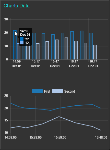
My graph now looks like this (almost there !), thus it uses one date as the x-axis, although the correct data does live in the msg.payload.
I also tried this:
Any ideas?

I only have one series, will try 2 later. Reading your json, The jsonata function restructures MySQL query as follows:
[ {"key": "Day Litres", "values": { "series": msg.payload.[Day] , "data": [msg.payload.[DayLtrs]] } }][ {"key": "Day Litres", "values": { "series": msg.payload.[Day] , "data": msg.payload.[DayLtrs] } }]Any ideas?
Jéan Roux
Apr 17, 2017, 9:10:47 AM4/17/17
to Node-RED
The output from MySQL delivers this:
'2017/04/17','3.9''2017/04/15','30.5''2017/04/14','176.6'
steve rickus
Apr 17, 2017, 11:29:20 AM4/17/17
to Node-RED
My first guess is that the descending dates are confusing the chart rendering logic. I would try ordering your query results to be ascending dates, and see if it displays properly. If it does work, then you may need to change your x-axis to be categories (which just happen to show date strings) instead of actual date objects.
There is also an axis option in the chartjs library to reverse the display of the axis -- I just don't know how that option would get set in the dashboard.
Jéan Roux
Apr 17, 2017, 6:07:49 PM4/17/17
to Node-RED
Steve, is it possible to show the incoming SQL, and the jsonata for the graph you are showing below?
And here is the jsonata for it:
I tried to use your 2 statements below, in every conceivable way I can think of, to answer to your statements. The best I can get is if I do not have the "Series-1" - but then the graph shows in different colours for every bar, thus it translates every day as a series.
Here is my current payload (made readable via the json node, thus "" are added by it)
"[{"key":"Day Litres","values":{"series":["Series-1","Series-1","Series-1","Series-1","Series-1"],"data":[["2016/11/30",188.6],["2016/12/01",296.3],["2016/12/02",104.8],["2016/12/03",321.9],["2016/12/04",287.6]]}}]"
And here is the jsonata for it:
[ {"key": "Day Litres", "values": { "series": msg.payload.series , "data": [msg.payload.[Day,DayLtrs ]] } }]This iteration delivers this graph:

steve rickus
Apr 17, 2017, 10:02:26 PM4/17/17
to Node-RED
Well, I'm not actually using any SQL or JSONata expressions to generate the input data -- it's just some test data hard-coded into my test flow.
I think the problem is that you have a mismatch between the length of the series array and the number of elements in each data array. If there are 5 days in your data set, the series array should be a list of those 5 days. The example data you are showing only has 1 set of y-axis values for each of those days, so your data needs to be an array of one array of 5 values:
[ { "key": "Day Litres", "values": { "series": [ "2016/11/30", "2016/12/01", "2016/12/02", "2016/12/03", "2016/12/04" ], "data": [ [ 188.6, 296.3, 104.8, 321.9, 287.6 ] ] } }][ { "key": "Day Litres", "values": { "series": msg.payload.Day, "data": [ msg.payload.DayLtrs ] } }]--
Steve
On Monday, April 17, 2017 at 6:07:49 PM UTC-4, Jéan Roux wrote:
Steve, is it possible to show the incoming SQL, and the jsonata for the graph you are showing below?I tried to use your 2 statements below, in every conceivable way I can think of, to answer to your statements. The best I can get is if I do not have the "Series-1" - but then the graph shows in different colours for every bar, thus it translates every day as a series.Here is my current payload (made readable via the json node, thus "" are added by it)
And here is the jsonata for it:
Jéan Roux
Apr 18, 2017, 3:59:04 AM4/18/17
to Node-RED
Thank you Steve, the jsonata below delivers the graph below. So at least it spreads it per the correct x-axis. But, it has clearly picked each date as a series, if you do 40 days it is a smarty box. This is not what I want, I want to add a send series to it still, for instance comparing water use for the last 4 weeks, but for the days of the week.
Any further ideas perhaps ?

[ { "key": "Day Litres", "values": { "series": msg.payload.Day, "data": [ msg.payload.DayLtrs ] } }]On Tuesday, April 18, 2017 at 4:02:26 AM UTC+2, steve rickus wrote:

Zenofmud
Apr 18, 2017, 8:08:09 AM4/18/17
to node...@googlegroups.com
If I understand you you want to see the total water usage for each Monday for the last 40 days and the total water usage for Tuesday for the last 40 days etc. The bottom of the chart will show ‘Monday’, ’Tuesday”, etc
Is that correct?
If so you need to request the data from MySQL in that format - here is a thread I found using a google search: http://stackoverflow.com/questions/5092706/how-to-count-and-group-items-by-day-of-the-week
You received this message because you are subscribed to the Google Groups "Node-RED" group.
To unsubscribe from this group and stop receiving emails from it, send an email to node-red+u...@googlegroups.com.
To post to this group, send email to node...@googlegroups.com.
Visit this group at https://groups.google.com/group/node-red.
To view this discussion on the web, visit https://groups.google.com/d/msgid/node-red/7592f5d0-68e8-4e23-81f9-ccb4b775397c%40googlegroups.com.
Jéan Roux
Apr 18, 2017, 9:01:44 AM4/18/17
to node...@googlegroups.com
Hi Zeno, you are correct. But my problem is not the way to extract it from SQL, that I know how to do, if you look at the graph, prepped by jsonata, from an sql call, we have one series of data in this example. But, the series is also the dates, thus every date is drawn in a different colour. I am only presenting one series of data, thus it should present that as one colour.
Yes, the way you have explained it is correct, I would like to for instance, present more than one series, like days of week, I have other use cases, like show the last 4 months of water use per week, but the 4 months as 4 series. Again, I know how to extract the SQL for that.
But, the issue is the dashboard chart, how do present more than one series on the chart - if I cannot even get one series to display as a series ?
On 18 April 2017 at 14:08, Zenofmud <zeno...@zenofmud.org> wrote:
If I understand you you want to see the total water usage for each Monday for the last 40 days and the total water usage for Tuesday for the last 40 days etc. The bottom of the chart will show ‘Monday’, ’Tuesday”, etcIs that correct?If so you need to request the data from MySQL in that format - here is a thread I found using a google search: http://stackoverflow.com/questions/5092706/how-to-count-and-group-items-by-day-of-the-week
On Apr 18, 2017, at 3:59 AM, Jéan Roux <je...@familyroux.com> wrote:
Thank you Steve, the jsonata below delivers the graph below. So at least it spreads it per the correct x-axis. But, it has clearly picked each date as a series, if you do 40 days it is a smarty box. This is not what I want, I want to add a send series to it still, for instance comparing water use for the last 4 weeks, but for the days of the week.Any further ideas perhaps ?
On Tuesday, April 18, 2017 at 4:02:26 AM UTC+2, steve rickus wrote:--
http://nodered.org
Join us on Slack to continue the conversation: http://nodered.org/slack
---
You received this message because you are subscribed to the Google Groups "Node-RED" group.
To unsubscribe from this group and stop receiving emails from it, send an email to node-red+unsubscribe@googlegroups.com.
To post to this group, send email to node...@googlegroups.com.
Visit this group at https://groups.google.com/group/node-red.
To view this discussion on the web, visit https://groups.google.com/d/msgid/node-red/7592f5d0-68e8-4e23-81f9-ccb4b775397c%40googlegroups.com.
For more options, visit https://groups.google.com/d/optout.
--
http://nodered.org
Join us on Slack to continue the conversation: http://nodered.org/slack
---
You received this message because you are subscribed to a topic in the Google Groups "Node-RED" group.
To unsubscribe from this topic, visit https://groups.google.com/d/topic/node-red/MbOPcXNJRzI/unsubscribe.
To unsubscribe from this group and all its topics, send an email to node-red+unsubscribe@googlegroups.com.
To post to this group, send email to node...@googlegroups.com.
Visit this group at https://groups.google.com/group/node-red.
To view this discussion on the web, visit https://groups.google.com/d/msgid/node-red/8E390C86-E97D-4821-BB63-14C090861ECA%40zenofmud.org.
Zenofmud
Apr 18, 2017, 9:30:55 AM4/18/17
to node...@googlegroups.com
So in the example graph, instead of showing a blue, purple, organs, dark green and light green bar - you want them all blue
And you want to put a second set of data on the same graph using a second color for all the new set of data.
…right?
To unsubscribe from this group and stop receiving emails from it, send an email to node-red+u...@googlegroups.com.
To post to this group, send email to node...@googlegroups.com.
Visit this group at https://groups.google.com/group/node-red.
To view this discussion on the web, visit https://groups.google.com/d/msgid/node-red/CAL09UJN2D3HRRSBxv%2BCw_uc7f9gzRYRx7zikB-aumSpAyHp57A%40mail.gmail.com.
Jéan Roux
Apr 18, 2017, 9:57:07 AM4/18/17
to node...@googlegroups.com
That is it!
How do I change my jsonata to do that?
To unsubscribe from this group and stop receiving emails from it, send an email to node-red+u...@googlegroups.com.
To post to this group, send email to node...@googlegroups.com.
Visit this group at https://groups.google.com/group/node-red.
To view this discussion on the web, visit https://groups.google.com/d/msgid/node-red/7592f5d0-68e8-4e23-81f9-ccb4b775397c%40googlegroups.com.
For more options, visit https://groups.google.com/d/optout.
--
http://nodered.org
Join us on Slack to continue the conversation: http://nodered.org/slack
---
You received this message because you are subscribed to a topic in the Google Groups "Node-RED" group.
To unsubscribe from this topic, visit https://groups.google.com/d/topic/node-red/MbOPcXNJRzI/unsubscribe.
To unsubscribe from this group and all its topics, send an email to node-red+u...@googlegroups.com.
To post to this group, send email to node...@googlegroups.com.
Visit this group at https://groups.google.com/group/node-red.
To view this discussion on the web, visit https://groups.google.com/d/msgid/node-red/8E390C86-E97D-4821-BB63-14C090861ECA%40zenofmud.org.
--
http://nodered.org
Join us on Slack to continue the conversation: http://nodered.org/slack
---
You received this message because you are subscribed to the Google Groups "Node-RED" group.
To unsubscribe from this group and stop receiving emails from it, send an email to node-red+u...@googlegroups.com.
To post to this group, send email to node...@googlegroups.com.
Visit this group at https://groups.google.com/group/node-red.
To view this discussion on the web, visit https://groups.google.com/d/msgid/node-red/CAL09UJN2D3HRRSBxv%2BCw_uc7f9gzRYRx7zikB-aumSpAyHp57A%40mail.gmail.com.
--
http://nodered.org
Join us on Slack to continue the conversation: http://nodered.org/slack
---
You received this message because you are subscribed to a topic in the Google Groups "Node-RED" group.
To unsubscribe from this topic, visit https://groups.google.com/d/topic/node-red/MbOPcXNJRzI/unsubscribe.
To unsubscribe from this group and all its topics, send an email to node-red+u...@googlegroups.com.
To post to this group, send email to node...@googlegroups.com.
Visit this group at https://groups.google.com/group/node-red.
To view this discussion on the web, visit https://groups.google.com/d/msgid/node-red/F90B5933-760A-4BAC-833E-44C2723A8E23%40zenofmud.org.
Zenofmud
Apr 18, 2017, 11:31:47 AM4/18/17
to node...@googlegroups.com
That I don’t know, but at least there is now a clear definition of what you want to do so maybe one of the brains can help out. I’ll play a bit too, but I have to leave for a couple hours now.
To view this discussion on the web, visit https://groups.google.com/d/msgid/node-red/CAL09UJO%2BT1A%2BrLGhHSfzXk%3Drx3yhGAZMyfagMeR3WK55sopEnQ%40mail.gmail.com.
Message has been deleted
steve rickus
Apr 18, 2017, 12:44:39 PM4/18/17
to Node-RED
Jéan,
I sent you a direct message on slack, but I guess you are not active there --
please use the new "Share Link" button on try.jsonata.org showing the raw sql results and the jsonata expression that you are using.
We might as well use that new feature, instead of guessing what your actual data looks like...
Jéan Roux
Apr 19, 2017, 4:31:38 PM4/19/17
to Node-RED
For those watching this topic, Steve assisted me on slack to get to a point where the dates are not the series as well. This is what the jsonata in the switch node looks like.
[ { "key": "Day Litres", "values": { "series": msg.payload.Day, "data": [ [msg.payload.DayLtrs] ] }} ]Steve is now assisting to add a 2nd series...
Thank you Steve !
Zenofmud
Apr 19, 2017, 6:44:10 PM4/19/17
to node...@googlegroups.com
I’d love to see the final flow - from the mysql read thru the graphing - so I could add it to the examples I’m compiling,
--
http://nodered.org
Join us on Slack to continue the conversation: http://nodered.org/slack
---
You received this message because you are subscribed to the Google Groups "Node-RED" group.
To unsubscribe from this group and stop receiving emails from it, send an email to node-red+u...@googlegroups.com.
To post to this group, send email to node...@googlegroups.com.
Visit this group at https://groups.google.com/group/node-red.
To view this discussion on the web, visit https://groups.google.com/d/msgid/node-red/1109567c-2d74-478c-88ae-ec7f74106e43%40googlegroups.com.
Jéan Roux
Apr 20, 2017, 3:33:44 PM4/20/17
to Node-RED
After all the help I got, that is the least I can do.... 8-)
If you have 2 series, we do not yet have the series names display bottom of the graph as labels. Steve made a change to the graph ui, have submitted to Dave for review / inclusion. Hold thumbs it goes in. But if you want to see how 2 put two series on, Steve showed me how, I will add here.

------------------------
[{"id":"b8deb01d.d5f1f8","type":"inject","z":"d34d2b26.930f58","name":"refresh","topic":"","payload":"","payloadType":"str","repeat":"","crontab":"28 01 * * *","once":false,"x":109.21629333496094,"y":1208.1546277999878,"wires":[["9267d82c.fa4e9"]]},{"id":"9267d82c.fa4e9","type":"function","z":"d34d2b26.930f58","name":"The SQL","func":"\nvar A = \"SELECT * FROM (\tselect 'Series-1' AS series, DATE_FORMAT(tmstamp,'%Y/%m/%d') AS Day, \tcast(FORMAT(SUM(val),2) as decimal(6,1)) AS DayLtrs from SysTaskVal where idTask = 4 and idSystem = 62 group by DATE(tmstamp) order by Day DESC LIMIT 15 ) sub ORDER BY Day ASC ;\";\nmsg.topic = A ;\nreturn msg;\n","outputs":1,"noerr":0,"x":280.06945037841797,"y":1207.9562149047852,"wires":[["ab1d9b1.1ff30e8"]]},{"id":"ab1d9b1.1ff30e8","type":"mysql","z":"d34d2b26.930f58","mydb":"7eb7066e.cf7fb8","name":"","x":422.76384353637695,"y":1206.5950870513916,"wires":[["829da0d0.1e10e"]]},{"id":"829da0d0.1e10e","type":"function","z":"d34d2b26.930f58","name":"topic","func":"msg.topic = 'sql query';\nreturn msg;","outputs":1,"noerr":0,"x":561.5773887634277,"y":1207.6387481689453,"wires":[["b3937158.13875"]]},{"id":"b3937158.13875","type":"change","z":"d34d2b26.930f58","name":"format","rules":[{"t":"set","p":"payload","pt":"msg","to":"[ {\t \"key\": \"Day Litres\", \t \"values\": {\t \"series\": msg.payload.Day, \t \"data\": [ [msg.payload.DayLtrs] ]\t }\t} ]","tot":"jsonata"}],"action":"","property":"","from":"","to":"","reg":false,"x":694.9107322692871,"y":1207.3213481903076,"wires":[["e3169c7.5d733e","247cf3a9.afff0c","530bf3ef.5dbe9c"]]},{"id":"392d4e22.374212","type":"function","z":"d34d2b26.930f58","name":"","func":"msg.payload = [] ;\nreturn msg;","outputs":1,"noerr":0,"x":694.9107780456543,"y":1169.821310043335,"wires":[["e3169c7.5d733e"]]},{"id":"e3169c7.5d733e","type":"ui_chart","z":"d34d2b26.930f58","name":"Daily Muni Litres","group":"ab5df193.be793","order":6,"width":0,"height":0,"label":"Daily Muni Litres (40d)","chartType":"bar","legend":"false","xformat":"D/M","interpolate":"linear","nodata":"refresh to extract data from table ...","ymin":"","ymax":"","removeOlder":"4","removeOlderPoints":"","removeOlderUnit":"604800","cutout":0,"colors":["#1F77B4","#AEC7E8","#FF7F0E","#2CA02C","#98DF8A","#D62728","#FF9896","#9467BD","#C5B0D5"],"x":862.9960517883301,"y":1206.3490715026855,"wires":[[],[]]},{"id":"c54156bc.1797a8","type":"inject","z":"d34d2b26.930f58","name":"","topic":"Clean Grph","payload":"1","payloadType":"str","repeat":"","crontab":"","once":false,"x":540.6052017211914,"y":1169.6824178695679,"wires":[["392d4e22.374212"]]},{"id":"3bf32e68.364632","type":"link in","z":"d34d2b26.930f58","name":"Refresh","links":["1e8b6539.e1749b"],"x":134.44444274902344,"y":1170,"wires":[["9267d82c.fa4e9"]]},{"id":"22fd8a14.dbe14e","type":"debug","z":"d34d2b26.930f58","name":"test2","active":false,"console":"false","complete":"payload","x":825.6250114440918,"y":1313.750020980835,"wires":[]},{"id":"530bf3ef.5dbe9c","type":"json","z":"d34d2b26.930f58","name":"","x":696.8750114440918,"y":1315.0000200271606,"wires":[["22fd8a14.dbe14e"]]},{"id":"247cf3a9.afff0c","type":"debug","z":"d34d2b26.930f58","name":"","active":false,"console":"false","complete":"false","x":841.875,"y":1271.25,"wires":[]},{"id":"7eb7066e.cf7fb8","type":"MySQLdatabase","z":"","host":"localhost","port":"3306","db":"iotplay","tz":"+2"},{"id":"ab5df193.be793","type":"ui_group","z":"d34d2b26.930f58","name":"Daily Total","tab":"c94cc2d9.20716","order":1,"disp":true,"width":"6"},{"id":"c94cc2d9.20716","type":"ui_tab","z":"d34d2b26.930f58","name":"Water","icon":"dashboard","order":2}]
------------------------
steve rickus
Apr 20, 2017, 4:49:38 PM4/20/17
to Node-RED
I'm glad to be able to help, but it's a bit premature to say there is a fix in the works...
The good news is that the ChartJS library will support multiple series, and can group the bars, stack them, or even a combination. However, those options are not exposed in the node editor, and there is no logic in the convert methods to handle those extra options.
Currently, in streaming mode, each incoming msg to ui_chart (in Bar mode) is mapped like this: msg.topic is treated as the category (x-axis), and the msg.payload number is the height of the bar (y-axis). If there is already a bar with the same category (topic), it is redrawn with the value (payload) as the new height. The order of the bars left-to-right are as-received.
What we really need is a way to specify the Series name for a group of bars -- that name shows up in the tooltip next to the values, and all bars in the same series uses the same color. I can think of several ways to pass that information, but thought I would throw it open for discussion, since any solution is likely to break the previous behavior. IMO, the topic should be used to group the bars (mapped to series name) so multiple readings from a single sensor would all be the same color.
If the payload is a simple number, it only makes sense for that to be the bar height -- but where to put it on the x-axis? I could see binning the msgs into time slots as specified by the user (1 min, 5 min, 1 hour, 8 hrs, 1 day, etc). Eventually, an auto scale feature could aggregate the bars into larger time groups as the scale gets longer. This may already be built in to the chart library.
Alternately, the payload will have to be an object with fields like { label: "Monday", value: 12.34 } -- keeping up with these mappings as the library options expand could be a bit of a chore. The most flexible implementation would allow the user to configure a JSON object of all the chart options, but that is hard to show in the node editor, in a generic way.
I can keep looking at some of these options, but any feedback or opinions would be helpful.
Dave C-J
Apr 20, 2017, 5:24:41 PM4/20/17
to node...@googlegroups.com
Steve, et al,
more than happy to consider fixes/extensions to the current behaviour... just a few few thoughts... Ideally all the widgets should always "just work" when supplied a simple payload (ie number or string). Having to supply objects would start to make it more down to the user to have to maintain that object and update and resend it for every update.
As you point out at the moment it uses the topic to set the individual X-axis labels... As a lot of people are already familiar with MQTT... maybe we could consider splitting the topic using / as per MQTT and using the first level as the label/bin and second as the column within that ? eg {topic:"Monday/1", payload:12} . That would keep the payload "simple" and allow easy updates to individual columns.
(No idea how to implement yet - just thinking out loud).
steve rickus
Apr 20, 2017, 6:45:21 PM4/20/17
to Node-RED
Good thinking -- makes sense with the hierarchical nature of topics, but I guess we could only handle two parts to the topic. Off the cuff, I'd say we split the topic on '/' and use everything up to the last '/' as the series name. The part after the last '/' would be the label on the column? I guess no matter which way you choose, someone will need it the other way...
I also think we need an option to use the topic as the series name, and the current time as the x-axis. But that could wait until later, since our current use case does not require that ;*)

Csongor Varga
Apr 21, 2017, 11:46:35 AM4/21/17
to Node-RED
Hi Guys,
Just want to say that I managed to build a dynamic report which supports multiple data series to be displayed in a chart. You can select the data series on the UI, and the time base and the charts gets generated dynamically. There are also buttons on the UI to change the time base, move forward and back in time. I think it is quite neat. I am planning to make a video of it explaining how it works. That can also be adapted for your scenario.
Regards,
Csongor
Jéan Roux
Apr 24, 2017, 2:32:58 PM4/24/17
to node...@googlegroups.com
When can we see it? Cannot wait to see how you did it !
--
http://nodered.org
Join us on Slack to continue the conversation: http://nodered.org/slack
---
You received this message because you are subscribed to a topic in the Google Groups "Node-RED" group.
To unsubscribe from this topic, visit https://groups.google.com/d/topic/node-red/MbOPcXNJRzI/unsubscribe.
To unsubscribe from this group and all its topics, send an email to node-red+unsubscribe@googlegroups.com.
To post to this group, send email to node...@googlegroups.com.
Visit this group at https://groups.google.com/group/node-red.
To view this discussion on the web, visit https://groups.google.com/d/msgid/node-red/5c5d40ec-505f-4140-9589-fec4fd412b1f%40googlegroups.com.
Csongor Varga
Apr 25, 2017, 3:36:56 AM4/25/17
to Node-RED
I have all the recordings, I just need to finish editing and uploading it. Maybe tonight or Wednesday night. Expect a long one video.
On Monday, April 24, 2017 at 8:32:58 PM UTC+2, Jéan Roux wrote:
When can we see it? Cannot wait to see how you did it !
On 21 April 2017 at 17:46, Csongor Varga <csongo...@gmail.com> wrote:
Hi Guys,Just want to say that I managed to build a dynamic report which supports multiple data series to be displayed in a chart. You can select the data series on the UI, and the time base and the charts gets generated dynamically. There are also buttons on the UI to change the time base, move forward and back in time. I think it is quite neat. I am planning to make a video of it explaining how it works. That can also be adapted for your scenario.Regards,Csongor
--
http://nodered.org
Join us on Slack to continue the conversation: http://nodered.org/slack
---
You received this message because you are subscribed to a topic in the Google Groups "Node-RED" group.
To unsubscribe from this topic, visit https://groups.google.com/d/topic/node-red/MbOPcXNJRzI/unsubscribe.
To unsubscribe from this group and all its topics, send an email to node-red+u...@googlegroups.com.
To post to this group, send email to node...@googlegroups.com.
Visit this group at https://groups.google.com/group/node-red.
Csongor Varga
Apr 25, 2017, 11:42:02 AM4/25/17
to Node-RED
Video is up on Youtube: https://youtu.be/nkKf26oKzhQ
It is even longer than my usual episodes, so grab some snacks and drinks before it starts.

Andreas Fuchs
May 1, 2017, 2:32:59 PM5/1/17
to Node-RED
Hi
Thanks for sharing all this, i have a pretty similar use case where i would like to display the total solar power generated for the last 7 days in a bar chart (all seven bars the same color if possible)
From your example i tryed this in a function node because i don't like the readability of the switch node and was not shure how your input data exactly looks like:
var chart =[
{ "key": "Last 7 Days",
"values": { "series": [1,2,3,4,5,6,7],
"data": [25,30,16,20,23,40,10]
}
} ];
msg.payload=chart;
return msg;
the output of the function node goes into the bar chart node.
sadly this does not work and in the log i see: TypeError: data[0].values.data[i].map is not a function
any hint how to create the chart data so it works?
Andreas Fuchs
May 1, 2017, 3:01:24 PM5/1/17
to Node-RED
Here a pen how i would like to have it look like: http://codepen.io/anon/pen/xddeaZ
And here another version of the object i feed into bar chart:
var chart =[
{ "key": "Last7Days",
"values": [{ "series": "kWh",
And here another version of the object i feed into bar chart:
var chart =[
{ "key": "Last7Days",
"values": [{ "series": "kWh",
"data": [25,30,16,20,23,40,10]
}]
} ];
msg.payload=chart;
return msg;
This version does not end in an error, but still not displaying a graph
Csongor Varga
May 1, 2017, 4:20:21 PM5/1/17
to Node-RED
Well, the data should be like this:
var chart =[
{ "key": "Last 7 Days",
{ "key": "Last 7 Days",
"values": [
[1,25],
[2,30],
[3,16],
[4,20],
[5,23],
[6,40],
[7,10]
]
} ];
msg.payload=chart;
return msg;
So the values attribute is an n dimensional array where each item in the array represents a data point. The data point itself is again a 2 dimensional array with the first value being the X axis data and Y is the second axis data. In all the data I am using, I am storing the X axis value (time) in a milisecond type date format. So I am not sure how your values of 1, 2, 3, 4, 5, 6 and 7 will be represented. But that should get your bar charts shown.
Regards,
Csongor
Dave C-J
May 8, 2017, 4:49:16 AM5/8/17
to node...@googlegroups.com
Working on some improvements... - https://github.com/node-red/node-red-dashboard/issues/224
Csongor Varga
May 8, 2017, 6:36:47 AM5/8/17
to Node-RED
Thanks, looking forward to that.

David Caparrós
Jul 16, 2017, 12:46:01 PM7/16/17
to Node-RED
Hello Guys
Did you get it working?
I'm trying to follow the guides from CSongor related to work with time series version 1 and 2 as shown on
I'm getting different arrays with the data as was suposed to be expected however the chart is not showing more than one variable whatever I do.
This is the data that reach the chart:


Does someone has some clue why is not working for me?,
O course I have some differences with the example as my tables are slightly different, I can past my flow if required and the info from the SQL table however seems the chart is not managing booth arrays at once.
Thanks in advance
David Caparrós
Jul 16, 2017, 1:05:34 PM7/16/17
to Node-RED
I think my problem is that I receive booth messages but with no different topics and this makes the chart to show only the last one data received, any help on how to create a function that provide different topic to each message?
David Caparrós
Jul 16, 2017, 1:21:21 PM7/16/17
to Node-RED
I need to value of "Sala" to be the msg.topic of each message from fuction:
var msg2 = [];
// this is the logic when there are multiple data sets are received
for (var i=0; i<msg.payload.length; i++) {
var output = [];
for (var j=0; j<msg.payload[i].length; j++) {
output.push([msg.payload[i][j].epoch, msg.payload[i][j].Payload]);
}
msg2.push({ Sala: msg.payload[i][0].Sala+"/"+msg.payload[i][0].Device, values : output});
//msg2.push({ key: "test", values : output});
}
msg.payload=msg2;
//msg.payload = [ { key: "Power", values : output} ];
return msg;
mark hubrich
Jul 16, 2017, 1:27:13 PM7/16/17
to node...@googlegroups.com
I haven't messed with this for a while but I noticed in my case it was easier to copy the query node and branch off another query. You can see in the topic the query for that branch and just use a function node to change the topic to a simple one. Downstream you can pick out from all the query topics.
Advise from a steel fabricator LoL 🙄
On Jul 16, 2017 12:05 PM, "David Caparrós" <davi...@gmail.com> wrote:
I think my problem is that I receive booth messages but with no different topics and this makes the chart to show only the last one data received, any help on how to create a function that provide different topic to each message?
--
http://nodered.org
Join us on Slack to continue the conversation: http://nodered.org/slack
---
You received this message because you are subscribed to a topic in the Google Groups "Node-RED" group.
To unsubscribe from this topic, visit https://groups.google.com/d/topic/node-red/MbOPcXNJRzI/unsubscribe.
To unsubscribe from this group and all its topics, send an email to node-red+unsubscribe@googlegroups.com.
To post to this group, send email to node...@googlegroups.com.
Visit this group at https://groups.google.com/group/node-red.
To view this discussion on the web, visit https://groups.google.com/d/msgid/node-red/d9a771c2-899c-4202-8d57-b98cdf5a164e%40googlegroups.com.
David Caparrós
Jul 16, 2017, 1:39:41 PM7/16/17
to Node-RED
I just realized the issue is not not having different topics as looking into I see the topic is already different for booth messages:
object
topic: "SELECT * FROM sensores WHERE Sala='Baño' AND Device='Luminosidad' AND epoch >= 1500140238860 AND epoch <= 1500226638860"
_msgid: "c850e88f.bfc8d8"
payload: array[1]
16/7/2017 19:37:17node: ddfa7d1.6da3d8SELECT * FROM sensores WHERE Sala='Salon' AND Device='Luminosidad' AND epoch >= 1500140238860 AND epoch <= 1500226638860 : msg : Object
objecttopic: "SELECT * FROM sensores WHERE Sala='Salon' AND Device='Luminosidad' AND epoch >= 1500140238860 AND epoch <= 1500226638860"
_msgid: "c850e88f.bfc8d8"
payload: array[1]
Bad news this means I have no clue why the chart only displays the latest message received instead of drawing booths.
Regards
Bad news this means I have no clue why the chart only displays the latest message received instead of drawing booths.
Regards
Csongor Varga
Jul 16, 2017, 4:13:53 PM7/16/17
to Node-RED
Hi David,
I think your issue is here:
msg2.push({ Sala: msg.payload[i][0].Sala+"/"+msg.payload[i][0].Device, values : output});
this line should be:
msg2.push({ key: msg.payload[i][0].Sala+"/"+msg.payload[i][0].Device, values : output});
You accidentally renamed the property name in output structure as well. I think this should resolve your problem.
Regards,
Csongor
David Caparrós
Jul 16, 2017, 5:28:17 PM7/16/17
to Node-RED
Thanks for your answer Csongor,
I tried to made this change in booth versions but is giving me exactly the same result:
SELECT * FROM sensores WHERE Sala='Baño' AND Device='Luminosidad' AND epoch >= 1500153523039 AND epoch <= 1500239923039 : msg : Object
objecttopic: "SELECT * FROM sensores WHERE Sala='Baño' AND Device='Luminosidad' AND epoch >= 1500153523039 AND epoch <= 1500239923039"
_msgid: "d1f9e1dd.543af"
payload: array[1]
16/7/2017 23:18:56node: ddfa7d1.6da3d8SELECT * FROM sensores WHERE Sala='Salon' AND Device='Luminosidad' AND epoch >= 1500153523039 AND epoch <= 1500239923039 : msg : Object
objecttopic: "SELECT * FROM sensores WHERE Sala='Salon' AND Device='Luminosidad' AND epoch >= 1500153523039 AND epoch <= 1500239923039"
_msgid: "d1f9e1dd.543af"
payload: array[1]
This is what I get on debug going to the chart, I can see how chart very quick shows on graph and move quick to the latest variable received instead of plot booth lines.
Initially I thought that was due to topic issues but fond that topics are already different so this can not be the problem.
Mention that I have same effect on booth versions copied from your flows, do you still have this implemented? What you have on a debug going to the chart when doing a request with 2 variables? Do you have also latest dashboard version?
Thanks in advasnce
David Caparrós
Jul 16, 2017, 5:32:54 PM7/16/17
to Node-RED
Something should not good as chart should expect in order to print booth lines on same graph but I have no clue what.


steve rickus
Jul 17, 2017, 9:11:31 AM7/17/17
to Node-RED
David,
The ui_chart node is designed to plot individual points as they arrive in real time -- but whenever it receives an array of points, it replaces the entire data set with the incoming array. This is why the last set of data received replaces the first set, and you only see one line graph.
However, if the array has 2 data sets in it, you will see 2 line graphs -- which is what you are trying to do. So you will need to combine the two msg arrays into a single payload, in order to see them on the same graph. Without actually testing your data, i believe your combined msg.payload should be an array of two objects, each with a "key" (the name of the sensor) and "values" (an array of data points) -- something like this:
[
  { "key": "Sensor-1",
    "values": [
      [1480622344619,22], [1480622945578,20.5], [1480623444808,20], [1480624644810,19.5], [1480625244812,19]
    ]
  },
  {
    "key": "Sensor-2",
    "values": [
      [1480622344619,12], [1480622945578,12.5], [1480623444808,12], [1480624644810,13.5], [1480625244812,15]
    ]
  }
]
However, if you combine your two example data sets into one msg.payload array, there will be almost 20,000 data points in your graph -- this will not work! The practical limit to the number of points you will be able to show is measured in 100's, not thousands...
In order to show meaningful trends, you will probably need to aggregate all that data into chunks of 5 minutes or so, which will still give you 288 points per line graph per day.
There are other javascript graphing packages available that can handle that many points, and even have dynamic data grouping, panning, and zooming. If you need that capability, you will have to create your own html page using the ui_template nodes, using <script> tags to include those third-party libraries in the page <head>. There are some examples on the google groups forum, or you can search the web for packages like highcharts, dygraphs, plotly, etc.
--
Steve
David Caparrós
Jul 17, 2017, 10:34:34 AM7/17/17
to Node-RED
Thanks a lot Steve
Now it's then clear why both lines are not shown.
For the moment I'm just making some test, is clear there is too much data and I will have to limit the number of captures as I did already with some sensor, like 1 each 5 minutes or so.
Another interesting aproach is to make some flow that make the average of the value received ever specific time (5 to 15 min for instance) and send the average as payload to the SQL and resets once this time is passed.
For now making my own htm using ui_template is totally out of my capabilities (I hope will learn some day but sure will take time.....).
If there were less points to show on each array, 200 each for instance, how I can do to combine those two arrays on a single one?
Thanks in advance
David Caparrós
Jul 18, 2017, 4:34:29 AM7/18/17
to Node-RED
Any idea on how to combine those 2 arranys on asingle on on a way that chart recognize it?
Thanks in advance
Csongor Varga
Jul 18, 2017, 9:06:15 AM7/18/17
to Node-RED
In my code, when you select multiple points (using the checkboxes), it sends out multiple SQL statements and after the database node, a join node links them all together. You just set the node to create an Array on the output.

Mike Arney
Oct 2, 2017, 2:40:48 PM10/2/17
to Node-RED
Can anyone help me a little further?
I have learned how to create my chart based on a SQL query, thanks to this entire thread. The only issue that I am having is that my SQL [Timestamp] value is in my table as: 2017-10-02 12:47:59.000... When I look at the debug, I am getting: 1506953921000...
My chart is 4 hours behind. How can I fix this.

Thanks,
Mike
Colin Law
Oct 2, 2017, 3:26:11 PM10/2/17
to node...@googlegroups.com
On 2 October 2017 at 19:40, Mike Arney <mikespc...@gmail.com> wrote:
Can anyone help me a little further?I have learned how to create my chart based on a SQL query, thanks to this entire thread. The only issue that I am having is that my SQL [Timestamp] value is in my table as: 2017-10-02 12:47:59.000... When I look at the debug, I am getting: 1506953921000...My chart is 4 hours behind. How can I fix this.
You have said that the value in the table is 017-10-02 12:47:59.000...
Is that exactly what you see, complete with dots? What timestamp do you expect to see in the table?
The long value you see is probably a millisecond timestamp since time 0 (I forget when that is) so may very well be right. In fact it is likely that the data in the table is actually that long integer and whatever you are using to view it is helpfully changing it into readable form for you.
So the question is why is the chart wrong? Would I be right in thinking that your local timezone is UTC+4 (or -4)? If so then the problem is that you are showing or saving it in the wrong zone.
It is good practice to save data in a database as UTC, so first check that you are doing this. Then you have to convert it to local time when you add it to the chart.
Colin
Thanks,Mike
On Tuesday, July 18, 2017 at 9:06:15 AM UTC-4, Csongor Varga wrote:In my code, when you select multiple points (using the checkboxes), it sends out multiple SQL statements and after the database node, a join node links them all together. You just set the node to create an Array on the output.
On Tuesday, July 18, 2017 at 10:34:29 AM UTC+2, David Caparrós wrote:Any idea on how to combine those 2 arranys on asingle on on a way that chart recognize it?Thanks in advance
--
http://nodered.org
Join us on Slack to continue the conversation: http://nodered.org/slack
---
You received this message because you are subscribed to the Google Groups "Node-RED" group.
To unsubscribe from this group and stop receiving emails from it, send an email to node-red+unsubscribe@googlegroups.com.
To post to this group, send email to node...@googlegroups.com.
Visit this group at https://groups.google.com/group/node-red.
To view this discussion on the web, visit https://groups.google.com/d/msgid/node-red/18ef05a7-fbdc-48a2-8314-5200087d83f8%40googlegroups.com.
steve rickus
Oct 2, 2017, 3:33:34 PM10/2/17
to Node-RED
Sounds like a timezone offset that is not being accounted for -- are you on EDT now? Dealing with dates in SQL is always tricky, and there are several places where mistakes can pop up. First you will need to check the database schema, and see what datatype is being used to save the date/time info (it should be either datetime or timestamp, depending on the database). Then I would check the actual data being saved and make sure it is stored in UTC (not your local timezone).
If you can include your query statement, and some query results data, I'm sure someone can help you get it into the correct format in your graphs. Typically, if you have incorrect data coming from your query and you can't change that, you would just need to apply a timezone conversion to the query results, using node-red-contrib-moment.
BTW, in the debug output sidebar, when the data type is recognized as a timestamp, you can click on the text to toggle between the internal numeric and local string formats.
--
Steve
Mike Arney
Oct 10, 2017, 2:48:15 PM10/10/17
to Node-RED
No dots at the end of the timestamp. Just my frustration. I guess that I am UTC-5 or Eastern time. How do I convert the 1506953921000 timestamp to UTC-5?
Thanks,
Mike
On Monday, October 2, 2017 at 3:26:11 PM UTC-4, Colin Law wrote:
On 2 October 2017 at 19:40, Mike Arney <mikespc...@gmail.com> wrote:Can anyone help me a little further?I have learned how to create my chart based on a SQL query, thanks to this entire thread. The only issue that I am having is that my SQL [Timestamp] value is in my table as: 2017-10-02 12:47:59.000... When I look at the debug, I am getting: 1506953921000...My chart is 4 hours behind. How can I fix this.You have said that the value in the table is 017-10-02 12:47:59.000...Is that exactly what you see, complete with dots? What timestamp do you expect to see in the table?The long value you see is probably a millisecond timestamp since time 0 (I forget when that is) so may very well be right. In fact it is likely that the data in the table is actually that long integer and whatever you are using to view it is helpfully changing it into readable form for you.So the question is why is the chart wrong? Would I be right in thinking that your local timezone is UTC+4 (or -4)? If so then the problem is that you are showing or saving it in the wrong zone.It is good practice to save data in a database as UTC, so first check that you are doing this. Then you have to convert it to local time when you add it to the chart.Colin
Thanks,Mike
On Tuesday, July 18, 2017 at 9:06:15 AM UTC-4, Csongor Varga wrote:In my code, when you select multiple points (using the checkboxes), it sends out multiple SQL statements and after the database node, a join node links them all together. You just set the node to create an Array on the output.
On Tuesday, July 18, 2017 at 10:34:29 AM UTC+2, David Caparrós wrote:Any idea on how to combine those 2 arranys on asingle on on a way that chart recognize it?Thanks in advance
--
http://nodered.org
Join us on Slack to continue the conversation: http://nodered.org/slack
---
You received this message because you are subscribed to the Google Groups "Node-RED" group.
To unsubscribe from this group and stop receiving emails from it, send an email to node-red+u...@googlegroups.com.
To post to this group, send email to node...@googlegroups.com.
Visit this group at https://groups.google.com/group/node-red.
Mike Arney
Oct 10, 2017, 2:52:47 PM10/10/17
to Node-RED
The Timestamp datatype is datetime. I am EDT and it records in the database correctly. It just doesn't show up correctly on the chart. I did toggle the payload message to get the 1506953921000 number. I was hoping that I could figure out how to convert that on my chart.
Thanks,
Mike
Mike Arney
Oct 11, 2017, 12:19:17 PM10/11/17
to Node-RED
How would I have a gauge show this data? I am gathering the average of a value. I need a 0 to 1 gauge. Currently nothing shows.
msg.payload : array[1]
array[1]0: object
AvgTime: 0.288135
Thanks,
Mike
steve rickus
Oct 11, 2017, 12:27:30 PM10/11/17
to Node-RED
Mike,
When I inject your numbers, my chart shows my local time correctly (I'm also in the same timezone as you).
I suspect you have the wrong timezone set either in your browser machine, or the system running node-red.
Also, are you using the new data format introduced in dashboard v2.5.0? There were some improvements made to the axis labels that may help you.
That 13-digit number is the javascript internal format for a datetime value -- the ui_chart will automatically convert that to a javascript Date object, and the settings on the chart allows you to pick which label format to use when displaying them on the x-axis (or you can let the automatic setting decide based on how long a time range is shown on the chart)
--
Steve

Nick O'Leary
Oct 11, 2017, 12:30:10 PM10/11/17
to Node-RED Mailing List
Mike,
the gauge node expects msg.payload to be a number. So you'll need to use a Change node to move msg.payload[0].AvgTime to msg.payload, before passing it to the gauge node. Also, make sure you've set the min/max range of the gauge node to 0 and 1
Nick
--
http://nodered.org
Join us on Slack to continue the conversation: http://nodered.org/slack
---
You received this message because you are subscribed to the Google Groups "Node-RED" group.
To unsubscribe from this group and stop receiving emails from it, send an email to node-red+unsubscribe@googlegroups.com.
To post to this group, send email to node...@googlegroups.com.
Visit this group at https://groups.google.com/group/node-red.
To view this discussion on the web, visit https://groups.google.com/d/msgid/node-red/44561913-4b02-48ba-bbcf-2d71de62a7f3%40googlegroups.com.
steve rickus
Oct 11, 2017, 12:30:34 PM10/11/17
to Node-RED
You would need to send just the number as the msg.payload value to the gauge node.
You can use a change node to "Set: msg.payload to: msg.payload[0].AvgTime" effectively replacing the payload with just that value...
Mike Arney
Oct 11, 2017, 2:59:42 PM10/11/17
to Node-RED
Perfect! It works great! Thank you all
On Wednesday, October 11, 2017 at 12:30:10 PM UTC-4, Nick O'Leary wrote:
Mike,the gauge node expects msg.payload to be a number. So you'll need to use a Change node to move msg.payload[0].AvgTime to msg.payload, before passing it to the gauge node. Also, make sure you've set the min/max range of the gauge node to 0 and 1Nick
On 11 October 2017 at 17:19, Mike Arney <mikespc...@gmail.com> wrote:
How would I have a gauge show this data? I am gathering the average of a value. I need a 0 to 1 gauge. Currently nothing shows.msg.payload : array[1]array[1]0: objectAvgTime: 0.288135Thanks,Mike
On Monday, May 8, 2017 at 4:49:16 AM UTC-4, Dave C-J wrote:Working on some improvements... - https://github.com/node-red/node-red-dashboard/issues/224
--
http://nodered.org
Join us on Slack to continue the conversation: http://nodered.org/slack
---
You received this message because you are subscribed to the Google Groups "Node-RED" group.
To unsubscribe from this group and stop receiving emails from it, send an email to node-red+u...@googlegroups.com.
Mike Arney
Oct 12, 2017, 9:15:06 AM10/12/17
to Node-RED
Here is what is contained in my function node:
pld = "SELECT Payload, Timestamp "
pld = pld + "FROM [Dev].[dbo].[MQTTData] "
pld = pld + "ORDER BY Timestamp " ;
msg.payload = pld
return msg;
Here are the results:
msg.payload : array[57]
array[57][0 … 9]
[10 … 19]
[20 … 29]
[30 … 39]
[40 … 49]
[50 … 56]
50: object
51: object
52: object
53: object
54: object
55: object
56: object
Payload: 1
Timestamp: "2017-10-12T09:12:46.556Z"
Here is the Chart:

Notice the Timestamp in the query results above the chart.
Thanks,
Mike
On Monday, October 2, 2017 at 3:33:34 PM UTC-4, steve rickus wrote:
On Monday, October 2, 2017 at 3:33:34 PM UTC-4, steve rickus wrote:
Mike Arney
Nov 6, 2017, 8:48:01 AM11/6/17
to Node-RED
Guys,
I can get this chart to work for one series:
[{"id":"9f18ee56.48063","type":"inject","z":"b56e7b1b.f75038","name":"","topic":"","payload":"","payloadType":"date","repeat":"60","crontab":"","once":false,"x":98,"y":162,"wires":[["5ccbe647.3ddeb8"]]},{"id":"5ccbe647.3ddeb8","type":"function","z":"b56e7b1b.f75038","name":"SQL Function","func":"pld = \"SELECT Topic, Payload, Timestamp \"\npld = pld + \"FROM [Dev].[dbo].[MQTTData] \"\npld = pld + \"WHERE Topic = 'STG/H/CycleStart' and Timestamp > DATEADD(hour, -12, sysutcdatetime()) \"\npld = pld + \"ORDER BY Timestamp \" ;\n\nmsg.payload = pld\nreturn msg;\n\n\n\n\n","outputs":1,"noerr":0,"x":388,"y":162,"wires":[["2bb56f06.f2921"]]},{"id":"2bb56f06.f2921","type":"delay","z":"b56e7b1b.f75038","name":"","pauseType":"delay","timeout":"3.5","timeoutUnits":"seconds","rate":"1","nbRateUnits":"1","rateUnits":"second","randomFirst":"1","randomLast":"5","randomUnits":"seconds","drop":false,"x":578,"y":162,"wires":[["740f4c53.808c74"]]},{"id":"740f4c53.808c74","type":"MSSQL","z":"b56e7b1b.f75038","mssqlCN":"4f854204.cc081c","name":"MSSQL","query":"","outField":"payload","x":728,"y":162,"wires":[["f84beaf2.8e5ef8","2ed8e1f.746e21e","6fe404f9.50142c"]]},{"id":"2ed8e1f.746e21e","type":"function","z":"b56e7b1b.f75038","name":"Chart Setup","func":"// name of the time column values:\nvar tcol = \"Timestamp\";\n// list of columns to be charted:\nvar cols = [ \"Payload\" ];\n\n// iterate over each column of the query results\nvar data = cols.map(function(col) {\n // iterate over each row of the query results\n var vals = msg.payload.map(function(row) {\n // return a data point for each col\n return [ +row[tcol], +row[col] ];\n });\n\n // return data object for each line on the chart\n return { key: col, values: vals };\n});\n\n// now put the new chart data in the payload\nmsg.payload = data;\nreturn msg;\n","outputs":1,"noerr":0,"x":919,"y":120,"wires":[["245f9e64.d06a02"]]},{"id":"245f9e64.d06a02","type":"ui_chart","z":"b56e7b1b.f75038","name":"","group":"e1648312.beec","order":3,"width":"6","height":"6","label":"On / Off Time","chartType":"line","legend":"false","xformat":"HH:mm","interpolate":"step","nodata":"","dot":false,"ymin":"0","ymax":"1.5","removeOlder":"24","removeOlderPoints":"100","removeOlderUnit":"3600","cutout":0,"colors":["#1f77b4","#aec7e8","#ff7f0e","#2ca02c","#98df8a","#d62728","#ff9896","#9467bd","#c5b0d5"],"useOldStyle":false,"x":1139,"y":120,"wires":[[],[]]},{"id":"4f854204.cc081c","type":"MSSQL-CN","z":"","name":"Dev","server":"10.0.0.120","encyption":true,"database":"Dev"},{"id":"e1648312.beec","type":"ui_group","z":"","name":"STG H Machine","tab":"e3504922.217b08","order":4,"disp":true,"width":"6"},{"id":"e3504922.217b08","type":"ui_tab","z":"","name":"All Shaft Grind","icon":"dashboard","order":1}]
Now, I need a second series. The first Series would need to be:
WHERE Topic = 'STG/H/CycleStart'
the second Series needs to be:
WHERE Topic = 'STG/H/Flashing'
I was able to get the data that I want with this SQL statement:
Select Topic, Payload, Timestamp
from MQTTData
where Topic = 'STG/H/CycleStart' and Timestamp > DATEADD(hour, -12, sysutcdatetime())
or Topic = 'STG/H/Flashing' and Timestamp > DATEADD(hour, -12, sysutcdatetime())
order by Timestamp desc
Here is example data:
Topic Payload Timestamp
STG/H/Flashing 0 2017-11-06 13:15:54.750
STG/H/CycleStart 0 2017-11-06 13:15:46.753
STG/H/Flashing 1 2017-11-06 13:15:45.913
STG/H/Flashing 0 2017-11-06 13:15:40.007
STG/H/CycleStart 1 2017-11-06 13:15:37.923
STG/H/Flashing 1 2017-11-06 13:15:36.090
STG/H/Flashing 0 2017-11-06 13:15:34.157
STG/H/Flashing 1 2017-11-06 13:15:32.180
STG/H/Flashing 0 2017-11-06 13:15:31.690
STG/H/Flashing 1 2017-11-06 13:15:20.910
STG/H/Flashing 0 2017-11-06 13:15:02.777
Reply all
Reply to author
Forward
0 new messages