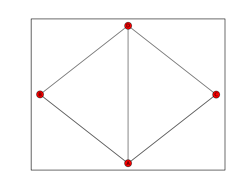
XGraph plot dot showing multiple edges

Ian York
import networkx as nx
import pylab as plot
K=nx.XGraph(name="Konigsberg", multiedges=True, selfloops=False)
K.add_edges_from([("A","B","Honey Bridge"),
("A","B","Blacksmith's Bridge"),
("A","C","Green Bridge"),
("A","C","Connecting Bridge"),
("A","D","Merchant's Bridge"),
("C","D","High Bridge"),
("B","D","Wooden Bridge")])
nx.draw(K)
plot.show()

Aric Hagberg
> Being new to networkx, I was just working through the examples. Strangly,
> the Konigsberg Bridge graph is not displaying the multiple edges nor the
> edge labels in matplotlib - any thoughts on what might be happening?
> Ultimately, I'd like to provide a variety of interactions with the graph and
> as such would like to keep it in matplotlib, but multiedges, edge labels,
> node images, etc are all needed as well. Thanks in advance for any info!
As you have discovered the drawing provided within NetworkX doesn't
automatically provide edge labels or parallel edges. But matplotlib
(which is doing the drawing) is very powerful and flexible and it
is probably possible to produce a drawing like you want.
For example edge labels can be added using matplotlib "text" objects
like this:
import networkx as nx
import pylab as plot
K=nx.XGraph(name="Konigsberg", multiedges=True, selfloops=False)
K.add_edges_from([("A","B","Honey Bridge"),
("A","B","Blacksmith's Bridge"),
("A","C","Green Bridge"),
("A","C","Connecting Bridge"),
("A","D","Merchant's Bridge"),
("C","D","High Bridge"),
("B","D","Wooden Bridge")])
pos=nx.spring_layout(K)
nx.draw_nx(K,pos)
xa,ya=pos['A']
xb,yb=pos['B']
plot.text((xa+xb)/2,(ya+yb)/2,"Blacksmith's Bridge")
plot.show()
With a little work you can get the label rotated and exactly how you
want it positioned. You can also set the node positions directly in the
"pos" dictionary above.
As for parallel edges - you could add some code to draw to edges
side-by-side or else use splines to make them curve. The scipy
package has spline routines in scipy.signal. The code that does the
drawing in NetworkX is
https://networkx.lanl.gov/svn/networkx/trunk/networkx/drawing/nx_pylab.py
if you want to look at how it is currently being done.
Aric