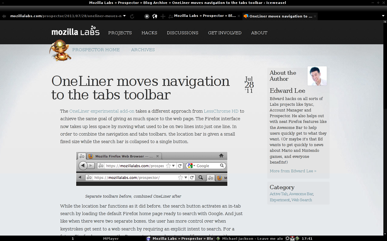
OneLiner moves navigation to the tabs toolbar

Edward Lee
instead of dynamically hiding/showing the navigation.
https://mozillalabs.com/prospector/2011/07/28/oneliner-moves-navigation-to-the-tabs-toolbar
Ed

Shane Caraveo

Geobert
On this take, I wish I can have the address bar on right side of tabs.
The search button behavior is definitively wrong in my opinion: maybe something like Mozilla F1 would be better so we can still change the search engine.

Siddhartha Dugar
- Increase urlbar default size (should ideally be like IE9)
- Hide identity box label
- Reduce minimum tab width
- The function of the search button is not clear, why don't you search whatever is in the urlbar
- There is some extra padding which causes height of tabs to increase
Edward Lee
> looks nice, but I can't get it working on beta channel.
controls? Did you see any errors in the error console?
Ed
Edward Lee
> I wish I can have the address bar on right side of tabs.
urlbar stop/reload?
> The search button behavior is definitively wrong in my opinion
Anything in particular that you don't like? Right now functionality is
definitely less than the original searchbar as you can only search
with Google.
Ed
Geobert
I find it too "heavy", we lost autosuggest.
when I first see it, I thought that we'll get a balloon style popup like the identity info or Mozilla F1.

apotropaico
By now the thing i don't like in the search behavior is that it loads the search page in the current tab, I would prefer that if the tab is not empty it opens a new one with the search page in.
The thing i miss is the extensions buttons that are in the address bar and disappear without it
Edward Lee
<dugar.si...@gmail.com> wrote:
> Increase urlbar default size (should ideally be like IE9)
> Hide identity box label
Would it always be hidden or only when you click in the box? (There's
an issue with text shifting as you click when dynamically hiding).
> Reduce minimum tab width
That could be done.. perhaps scaled so that the same number of tabs
are visible when overflowing before combining and after? For my screen
that's 11 tabs before and currently 7 after.
> The function of the search button is not clear, why don't you search
> whatever is in the urlbar
It should do that already or at least transfer the value from the
urlbar to searchbar when you hit the icon.
> There is some extra padding which causes height of tabs to increase
What OS/platform are you on?
Ed
Edward Lee
> By now the thing i don't like in the search behavior is that it loads the
> search page in the current tab, I would prefer that if the tab is not empty
> it opens a new one with the search page in.
tabs. E.g., AwesomeBar HD would always open a tab each time a category
was selected.
https://github.com/mozilla/prospector/issues/591
Ed
Siddhartha Dugar
<dugar.si...@gmail.com> wrote:
> Increase urlbar default size (should ideally be like IE9)
What does IE9 do? Does it dynamically shrink it as you open more tabs?
> Hide identity box label
Would it always be hidden or only when you click in the box? (There's
an issue with text shifting as you click when dynamically hiding).
> Reduce minimum tab width
That could be done.. perhaps scaled so that the same number of tabs
are visible when overflowing before combining and after? For my screen
that's 11 tabs before and currently 7 after.
> The function of the search button is not clear, why don't you search
> whatever is in the urlbar
It should do that already or at least transfer the value from the
urlbar to searchbar when you hit the icon.
> There is some extra padding which causes height of tabs to increase
What OS/platform are you on?
Ed
--
Siddhartha Dugar

Sriram R
Is it possible to bring in the back button into the URL bar just like the refresh-stop button?
However, I guess, this will break the Larry UI (am I right?) that shows the identity of the site in FF 7 and above.

sieciobywatel
- it does funny things when enabled with LessChrome active. Page starts around top window edge instant of content area, so top of page is not visible. Tested on both latest Ubuntu and W7.
- Aero background for Back and Search buttons are not the best choice. Looks weird and illegible in my case (I have deep blue color set in Aero):
- separating address bar from tab goes against latest changes; I agree that adress bar and its doorhangers should be more visually connected to page, not to chrome. Maybe a good idea would be to merge tab/page title with address bar (do we really need to see both at the same time) and add spiffy animations where switching tab moves it on the beggining of bar and adds controls (site identification, refresh etc). Of course we'd have to find out how does it change other scenarios, like closing tab, dragging it... But it may be worth exploring in my opinion. Now in the same bar page exists in two places - tab and address bar. It is not very clear.
- search experience is now only your default engine. Ctrl-K just open start page in my case, giving me no choice to use other engine. On the other hand using selected text/clipboard is something I was waiting for. What worries me a bit, that it exposes my clipboard a bit to willingly to page context. Especially for clipboard data it can be dangerous, as I may forget that I have something sensitive there.
- fullscreen improvements are just awesome.

Roger Taylor
I missed the search box but using Omnibar and reducing the search engines to just a favicon solves that problem. I generally don't use more than 5 or 6 tabs at any one time plus a couple of app tabs the set up is fine for me.
Rohugh

Judah Richardson
Geobert
apotropaico
for example if the balloon object is find useful there could be a button with a balloon for the search, one for F1, one for the extensions buttons and so on
or
it could be a shrinking bar so if you mouse-over the address input it expand itself and the rest of objects shrink, if you mouse-over the tabs that part expand itself, if you mouse over the extensions button it expand to show all the buttons, the search button will show the search input which will behave just like the normal one, and so on. in this way the part of the bar you are using is expanded and full operative, the rest is "minified".

Kith

B. Polidoro
http://www.pandia.com/sw-2005/24-netscape.html
Brian Polidoro
Kith
- separating address bar from tab goes against latest changes; I agree that adress bar and its doorhangers should be more visually connected to page, not to chrome. Maybe a good idea would be to merge tab/page title with address bar (do we really need to see both at the same time) and add spiffy animations where switching tab moves it on the beggining of bar and adds controls (site identification, refresh etc). Of course we'd have to find out how does it change other scenarios, like closing tab, dragging it... But it may be worth exploring in my opinion. Now in the same bar page exists in two places - tab and address bar. It is not very clear.
You've brought up an interesting point, and one that needs to be discussed with much more earnest. What does the Address bar do, and can it do it better?
As things stand, the Address bar does two things: it Displays the current URL, and it allows you to navigate. It might be far better to separate the two modes. Display of page information could, for example, be inserted at the top of the page itself so that it scrolls off the screen as we read. We are unlikely to be paying attention to both the page information and the content at the same time, and the insert could contain far more than just the URL and still be unobtrusive.
Navigation (along with all Awesome Bar functionality) could be given to a single input box that also provided search options. This box wouldn't need to be visible all the time (thus reclaiming the space previously occupied by the Address and Search bars). Instead, it could be the default active item on the Firefox menu. Since navigation has little to do with the page you're presently looking at, the new mental modal is preserved.
As for the back/forward buttons, they can appear when you mouse over the active tab, within the tab's borders. Likewise with the Home button.
So a tab / Page Title \ could become / < > H |e Title \ or similar when you point at it. Then the navigation toolbar wouldn't need to appear at all!
ICE-M
some things with it:
1. if i bookmark something, an entire bar appears above the add-on (see attach)
2. make all the buttons movable, especially in the front on the address bar.
- i need new tab there because i want to stay focused on the address bar, not to move my eyes all over the screen.
- reload/stop should be movable there as well.
- search should be movable to customize or deletable. because it's function it's useless for some that use the address bar to search.
3. identity box is awful. it's like a traffic light and adds unnecessary width to the bar. maybe include an option to disable it. (i did)
4. sometimes the back/forward arrows are partially covered by the identity box or the address bar in my case.
5. make the add-on, if possible, to use the system icons and not mozilla's ones. (i speak of identity box and the go/reload/stop)
thanks and keep on the great work. i use debian unstable with the latest aurora build of iceweasel if it helps.

Ksec
Since i have Tree Tabs and use Tabs Bar on Left Side,
Notes: Tree Tabs doesn't work with one liner.........
Delirium tremens
addressbar saying Mozilla Corporation (US), I couldn't see where to
type, so make an enter next destination icon that clears the address
bar, maybe?
When I open many tabs, when a tab appears under an other tab for the
first time, there is unused space, so make the tab on the bottom be
under the back button instead of under an other tab, maybe?
On Jul 28, 11:01 am, Edward Lee <edi...@mozilla.com> wrote:
> Check out a different take on LessChrome HD. Combine the toolbars
> instead of dynamically hiding/showing the navigation.
>
>
> Ed
Kith

Paul Morris
One thing I've noticed: sometimes the site identity box in the URL field is wide enough to be annoying and crowd out the URL space if the title of the site is too long.
Also not sure if showing and hiding the forward and back arrows is worth it.
Edward Lee
> cutting the tab bar in half throws the problem of Tab Proliferation
True. Abhinav stumbled upon an interesting finding when experimenting
with in-tab previews of links. The previews took up most but not all
of the tab content area, and it allowed previewing arbitrarily deep,
and this let the user easily see the navigation history. Potentially
something like this could replace tabs where instead of opening a
"full tab", these related previews within a tab encapsulate an idea or
task.
> Simply reducing the minimum tab width is a temporary solution at best
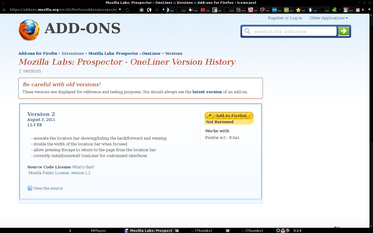
True, but for now, v2 will reduce the minimum tab width from 100px to 40px.
https://addons.mozilla.org/en-US/firefox/addon/prospector-oneLiner/versions/
Ed
Edward Lee
> Also not sure if showing and hiding the forward and back arrows is worth it.
button? v2 also adds in some animation, but that probably also needs
its own set of tweaking.
https://addons.mozilla.org/en-US/firefox/addon/prospector-oneLiner/versions/
Ed
Edward Lee
> if i bookmark something, an entire bar appears above the add-on
the navigation bar to appear even if the urlbar isn't in the
navigation bar. v2 should prevent that. Thanks for the screenshots.
https://addons.mozilla.org/en-US/firefox/addon/prospector-oneLiner/versions/
> make all the buttons movable, especially in the front on the address bar.
> - i need new tab there because i want to stay focused on the address bar,
> - reload/stop should be movable there as well.
The right-edge of the address bar should be fixed no-matter if the
back/forward buttons are showing or not. v2 resizes the address bar
when it gets focus though.
> sometimes the back/forward arrows are partially covered by the identity
That's by design to give the address bar more space when you can't
even click back and/or forward.
Ed
ICE-M
- in full screen the minimize, maximize and close button are no longer displayed.
- the resizing address bar in a bad idea because it moves all over the place and obstructs other tabs. the perfect arrangement was the first version, it was large enough to type the urls and see suggestions or history of web sites in it. this one is huge and defeats the purpose of the add-on, even dough is resizable. please if you could show me a way to disable this behaviour i would be very grateful.
- the new tabs width is not a good idea. why? because the tab should have a minimum width big enough so we can read what is in the opened tab or the tabs that were next to it. again the first version of the add-on was right on. also for this i would like a way to disable the changes.
- if i open say 20 tabs instead of seeing the tabs in a normal way and navigate trough them i see a lot of buttons and suspension points and i can't read or navigate the tab in a normal way. this i guess is related to the above one.
the way i see this addon is:
- is made for someone that uses the browser at a moderate usage of tabs (max: 20 and 3 to 5 in focus) if we wanted an entire enciclopedia of tabs opened we wouldn't needed to cram the tab bar in to the navigation bar.
- the ratio between the navigation bar and tab bar should be 40:60. because in the tab bar there are also buttons from other add-ons, bookmark menu, history or menu.
- the address bar shouldn't be resizable because it becoming annoying after a wile and again defeats the purpose of the add-on if we wanted a huge address bar we wouldn't need one liner.
- the disappearing back/forward buttons are awesome and adds a novelty to firefox. chrome is huge on minimalism maybe it's the time not to copy them and do our own thing.
i added 2 screenshots one with the full screen and other with 20 tabs open same effect on 10 tabs opened.
thanks again for your work, i hope this add-on will come at a perfect usable state.
Paul Morris
Would you prefer just hiding of the forward button and not the back button?
Yeah, I think that would be better. It feels particularly odd to me (like something may have gone wrong) when there are no arrows there at all.
Installed version 2 and I love the resizing URL bar! It expands when you're using it, and contracts when you're not. A big advantage is- it lets you see the whole URL for longer URLs, which wasn't possible with v1.
The wider minimum tab width in version one was much better for me. Now I only see the favicons and none of the text for my tabs, much harder to know which tab is which.
Thanks for your work, it's coming along really well!
ICE-M
because i hate coding and i'm pretty bad at it still trying to figure out how to disable the resizable url bar. i managed to disable it but i remains at a very big size not at the small one. hope i'll figure it out.
ICE-M

Erlan Sergaziev
Please provide a setting to disable this feature.
Rohugh
Looking even better. :)
Delirium tremens
> 130KViewDownload
>
> full-screen.png
> 257KViewDownload
Since there's more space in the focused awesomebar, let's use it! :-)
I click the search button in the focused awesomebar, fx scrolls down a
drop down list of ubiquity commands until:
"<search category label>
my computer ([v]bookmarks, [v]tags, [v]history, [v]tabs)
the web ([v]google, []bing, []yahoo)
<twitter category label>
tweet <message>
shorten <url>"
In the awesomebar, instead of searching bookmarks, tags, history and
tabs by default, since ubiquity includes searching bookmarks, tags,
history and tabs in its commands, use ubiquity by default.
Kith
Delirium tremens
I regret having said what I said. I'll send you a private message from
Bugzilla.
Delirium tremens
Missing a combination of other and private contact category is a bug
and missing other in all contact categories is a bug too.
Product Feedback contains suggestions, so put the words that the
Product Feedback category contains under Product Feedback as
description with etc by the end or people will think Product Feedback
isn't suggestions and select other.
I posted in that same message the message that I wanted to send to
Mozilla Labs only.

elliot73
Delirium tremens
> I like OneLiner, but with OneLiner activated I cannot edit the searchengine
> settings since that pulldown menu is gone, can I?
omg! omg! omg! FlashGot and Greasemonkey introduced to me the concept
of a SplitIcon!!!
You mouseover the SplitIcon in the navigation bar's tool bar and:
1. it shows a vertical line between the icon and the drop down arrow
2. it shows a line surrounding the icon and the drop down arrow
3. it doesn't show a drop down menu like a splititem, it shows a
tooltip
4. windows, ubuntu, mac os x and even fedora now are into big icons
and it's big, because it has a down arrow
To see it, visit http://imgur.com/OMlWo
I really wish the search button was a spliticon.
the fx user clicks search and searches with the mozilla's sponsor
that's not enough power, so the user sees a down arrow
that's many alternatives, that's many doubts, so the user sees a
tooltip on mouse over
the search button tooltip is search
the user is happy, clicks the down arrow and sees:
- <google favicon> google
- <bing favicon> bing
- <yahoo favicon> yahoo
- add search engine
he selects <google favicon> google
at the same time:
the search button becomes <google favicon>
the <google favicon> tooltip becomes google
finally, the autist user admires the beauty of seeing "<google
favicon>" google become half alone icon and half alone tooltip
Delirium tremens
one liner uses the app button and my add-on makes living with app
button much better. It's at https://addons.mozilla.org/en-US/firefox/addon/addon-tools-in-app-button/
It had a competitor that I didn't know, but my add-on is better. The
competitor is at https://addons.mozilla.org/en-US/firefox/search/?q=New+Old+Menu&cat=all
There is a powerful add-on which has similar functionality, but it's
manual, laborious and time-consuming. It's at
https://addons.mozilla.org/en-US/firefox/addon/personal-menu/
Delirium tremens
Kith
Ultimately, I feel that moving the existing controls around is also the wrong answer because it doesn't really solve any problems, only hides them behind clever arrangements of UI. My solution would be to move the information presently displayed in the address bar to the content area (so it would scroll away like any other page element), and tuck the rest of the address bar - the command line part - into the Firefox menu. Making the Awesome Bar Command Line into a Ubiquity Command Line makes sense in that context, and the space taken up by the address bar is reclaimed.
Honestly, I understand that this is a Big Change and that people would probably bristle at it (at least at first). I would just write an extension myself, but it's been over a decade since I wrote any code and I've never hacked on a browser before, so I'll just have to be patient.
But that's just my opinion. ;)

Tony Stark
New Feature : expand location bar when mouse hover on it and hide a
part of tab bar...and otherwise, expand tab bar when mouse hover on it
and hide a part of location bar...
How do you think ? Could you make this new feature ?
On Jul 28, 7:01 am, Edward Lee <edi...@mozilla.com> wrote:
> Check out a different take on LessChrome HD. Combine the toolbars
> instead of dynamically hiding/showing the navigation.
>
> https://mozillalabs.com/prospector/2011/07/28/oneliner-moves-navigati...
>
> Ed
Delirium tremens
> I have a new idea ^^
> New Feature : expand location bar when mouse hover on it and hide a
> part of tab bar...and otherwise, expand tab bar when mouse hover on it
> and hide a part of location bar...
> How do you think ? Could you make this new feature ?
titlte bar or to the top bar of the OS?
the awesomebar or tab bar will expand or collapse and distract me,
giving me the blink feeling
Tony Stark
OneLiner and my new idea...new feature appear when hover in tab/
location bar. When the mouse out...it turns to normal mode ^^
Thanks for your reply, Delirium tremens. I think "auto hide" feature
cause a lot of problems... We should make a shortcut for it
like...pressing alt button and menu bar appear or increase the delay
time... ^^
How do you think about my solutions ? :D
Paul Morris
Solution: the expanding URL bar should never be allowed to push the currently active tab off screen and out of sight, but should cover up other inactive tabs instead.
Thanks again for all the good work on this!
-Paul
Geobert
Delirium tremens
Firefox 7 without One Liner 2,
what if One Liner 3 had mini tabs with almost instantaneous tooltips
instead of right side tab bar expansion?
Details at https://addons.mozilla.org/en-US/firefox/addon/mini-tab/reviews/user:4708156
