MDE-Web-App UI overhauled, server now also handles http in JSON

30 views
Skip to first unread message

Alex Yang

unread,
Jul 17, 2012, 4:45:26 AM7/17/12
to math-descri...@googlegroups.com


Hi Gerardo and Terry,

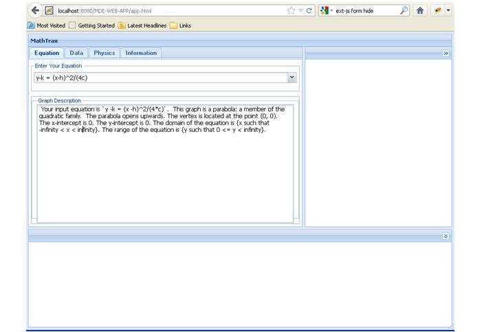
I've been actively working on prototyping the UI of the MDE web application for the past 2 weeks after we talked. The goal is to create an accessible "single-page" purely client-side JavaScript app that mimics current Java Swing MathTrax UI. I set an initial reached milestone:

"Used ext-js to build an initial Web based MDE application, with client and server exchange http request/response done in JSON. Takes user input and generates graph descriptions."

The code has already been pushed to github and the result is in the screenshots.

Alex

Gerardo Capiel

unread,
Jul 17, 2012, 12:52:25 PM7/17/12
to math-descri...@googlegroups.com
Wow, Alex.  This is fantastic! Good choice of a framework to use for the UI.  Terry is currently fixing some bugs she found and integrating back in Rom's SVG code at https://github.com/benetech/mde.  To make deployment simpler for people that either want to experiment with the app or for us to deploy, can you see if you can deploy the web app using Cloud Foundry: http://cloudfoundry.com.  There's a good tutorial on Cloud Foundry at: http://contributingcode.cloudfoundry.com/info.  You can deploy the app using either a micro instance or directly on cloudfoundry.com.  Let me know if you need help, because I have some people at Cloud Foundry who would be willing to help.

I have posted this task and a few others at:

Thanks,

Gerardo

Alex Yang

unread,
Jul 18, 2012, 6:47:04 PM7/18/12
to math-descri...@googlegroups.com
Yeah, I'll start working on that in tandem with continuing to work on the web service.

Shajey Rumi

unread,
Jul 20, 2012, 8:05:02 PM7/20/12
to math-descri...@googlegroups.com
Hi Alex, 
Great job. 
In parallel we were working on the web interface of MDE. Here you can find an interactive HTML mockup. 
It would be great if you can take advantage of these mockups in your integration of MDE into web.

The underlying interface is identify to MathTrax, we have just skinned it differently. Also we have moved some UI around based on some user feedback.
Have a look and let me know your thoughts:

Shajey

Shajey Rumi

Senior Product Manager, Literacy Program

The Benetech Initiative

480 S. California Avenue, Suite 201

Palo Alto, CA 94306

Office: +1 650-352-0328

Mobile: +1 650-427-0851


--
You received this message because you are subscribed to the Google Groups "Math Description Engine" group.
To view this discussion on the web visit https://groups.google.com/d/msg/math-description-engine/-/SbxTogct0WQJ.

To post to this group, send email to math-descri...@googlegroups.com.
To unsubscribe from this group, send email to math-description-...@googlegroups.com.
For more options, visit this group at http://groups.google.com/group/math-description-engine?hl=en.

Gerardo Capiel

unread,
Jul 20, 2012, 10:27:53 PM7/20/12
to math-descri...@googlegroups.com

Shajey - Thanks for putting this together.  I have a few questions/comments:

1) Can you give some examples in the pulldown?  Type it doesn't make sense, since it's a pulldown. I know that typing typically moves the selection based on the letter in most web interfaces, but most web interfaces don't say type it.

2) I image that depending on the pulldown, you might see different coefficients/parameters like you do in the advanced screen.  For example, if you select a circle (x^2 + y^2 = c), it would give you the ability to enter different values for c.  The difference between the current version of MathTrax and your mock would be that the pulldown might have the label: Circle: x^2 + y^2 = c as opposed to just the equation.

2) "Advance" should be "Advanced".

3) "Graph It" is not necessary, since selecting the item in the pulldown automatically performs the action in the current version of MathTrax.  If we don't want that behavior, then we should call it "Go" or something like that since it both graphs and describes.

4) Can you give an explanation of the two icons on the bottom left of the graph?


On Tuesday, July 17, 2012 1:45:26 AM UTC-7, Alex Yang wrote:

Alex Yang

unread,
Jul 25, 2012, 2:37:52 AM7/25/12
to math-descri...@googlegroups.com
Hi Shajey,

Thanks for making this, I'll be sure to integrate some of your ideas.

1. For the simple/advanced tabs, I remember someone posting that some users wanted to enter in generic shapes and have the MDE generate an example equation/graph. Your solution addresses this well. Gerardo is spot on about the importance of being able to change the equation parameters. However, with this I think the simple/advanced functionality is too similar to warrant separate tabs. It could be good to integrate that into a single combo box, or if that is too messy there could be a button that toggles the input mode for only the combo box. That might simplify things.

2. The icons for the graph controls directly above the audio play button are non-intuitive--at least for me. I assume that if I can't tell what it is new users might have trouble discerning as well, though this could be limited to me only.

3. I think the description/graph buttons on the bottom left are redundant, as is the graph it button. The combo box will generate the description/graph on dropdown select or on pressing enter. I don't see the need for these, and they take up a lot of space.

4. There is no data tab in the mockup. Are we not including the file upload functionality of the MDE? I think it is pretty important.

5. I liked how you took the audio settings and put it together with the graph settings, it makes a lot of sense.

6. You also don't have the print graph/description functionality. Is this intentional? Just a heads-up.

7. Does the mockup reflect a final product, or just a general indication of what the product will look like? I plan to use CSS to beautify the application to improve the look of the application after finishing the functionality.

Thanks,
Alex

Shajey Rumi

unread,
Jul 26, 2012, 12:40:41 PM7/26/12
to math-descri...@googlegroups.com
Hi Alex, 

Thanks a lot for your feedback. It is really very helpful. And exactly the kind of input I was looking for. So thank you, and keep it coming. 
See my responses to your questions/comments below:

On Tue, Jul 24, 2012 at 11:37 PM, Alex Yang <alexm...@gmail.com> wrote:
Hi Shajey,

Thanks for making this, I'll be sure to integrate some of your ideas.

1. For the simple/advanced tabs, I remember someone posting that some users wanted to enter in generic shapes and have the MDE generate an example equation/graph. Your solution addresses this well. Gerardo is spot on about the importance of being able to change the equation parameters. However, with this I think the simple/advanced functionality is too similar to warrant separate tabs. It could be good to integrate that into a single combo box, or if that is too messy there could be a button that toggles the input mode for only the combo box. That might simplify things.

Great idea. I agree. After the design it really feels shallow. Button with a combobox is good.


2. The icons for the graph controls directly above the audio play button are non-intuitive--at least for me. I assume that if I can't tell what it is new users might have trouble discerning as well, though this could be limited to me only.

One thing...to keep in mind. The audience for web MDE is print disabled (i.e. blind, visually impaired or someone who can not read printed words.) But that still means I need to clearify these.

Now when I think of it. We only need one icon - to center the graph. If you zoom the graph to a bigger level, the graph (shape) goes away from the center. This icon centers the graph. 
The second icon was for the full screen. - now I think it may not be that relevant.


3. I think the description/graph buttons on the bottom left are redundant, as is the graph it button. The combo box will generate the description/graph on dropdown select or on pressing enter. I don't see the need for these, and they take up a lot of space.

4. There is no data tab in the mockup. Are we not including the file upload functionality of the MDE? I think it is pretty important.


We will include it (now). In my original design, it was something for future. But now ..I think we should do it along with our current work. Let me revise the specs.

 
5. I liked how you took the audio settings and put it together with the graph settings, it makes a lot of sense.

We got feedback from someone users who has very low vision....this makes sense for them. And for folks who can see.  

6. You also don't have the print graph/description functionality. Is this intentional? Just a heads-up.

my bad..the two icons under the description area are print icons for description and graph. I will change the icons to add print with that. Good catch. 


7. Does the mockup reflect a final product, or just a general indication of what the product will look like? I plan to use CSS to beautify the application to improve the look of the application after finishing the functionality.

You are encouraged to beautify with CSS. The design is a step towards ...the final. But your input, innovations, and ideas are always welcome. Make it beautiful. Just keep in mind - the accessibility of the design.


Thanks,
Alex

--
You received this message because you are subscribed to the Google Groups "Math Description Engine" group.

Shajey Rumi

unread,
Jul 26, 2012, 12:44:33 PM7/26/12
to math-descri...@googlegroups.com
Gerardo, 

Thanks for your input. I incorporated your thoughts/comments and Alex's in to the mockups.I will be putting a revised version today on GitHub.

I am going to a marked up version of the same wireframe - just in case if something is not clear. 

Shajey

--
You received this message because you are subscribed to the Google Groups "Math Description Engine" group.

Shajey Rumi

unread,
Jul 26, 2012, 2:57:26 PM7/26/12
to math-descri...@googlegroups.com
Hey Alex, 

Now when I read some of my earlier comments, I just noticed few obvious errors/confusion on my part. Sorry about that. 

Corrections are below:

1- Using Combo-box. When Rom reminded me what a combobox is. I realized I meant a different control. 
I was thinking more of a radio buttons like interface - which will allow us to chose between a shape name, equation and data inputs. Very much similar to current MathTrax UI, but we will have an additional tab for Shape Name. Let me put that in wireframe...that should make more sense. 

2. Regarding the icons on the bottom left of graph. I agree with the potential confusion they are causing. I will instead put a button with text "Center Graph". The second icon for Full Screen - I think is not necessary.

With respect to comment about Accessibility. I was just reminding us that the audience will be print disabled. Hence all design decisions should be cognizant of that fact.

Shajey Rumi

unread,
Jul 27, 2012, 5:51:54 PM7/27/12
to math-descri...@googlegroups.com
Alex, and all.

Here are the revised wireframes with markup and notes. 
These include comments and suggestions that I got on the last rev. I have included another tab for data plots. 

The although the pages are distinct. I am expecting the three modes of creating graphs will be controlled by a tab on the top left of content area. There is only a small area that will toggle based on which tab is selected. 
So view them as multiple pages, but you should code them as one area.

I have added notes that highlight interaction and various controls. Only the Graph by Shape page has detailed notes on the UI. On each page you will see detailed notes on the area that is different.  For example Equation, and Data Plots areas have their own notes. 

Here is the url:

I will revise/add the stories on the gitHub next.

Shajey
Reply all
Reply to author
Forward
0 new messages