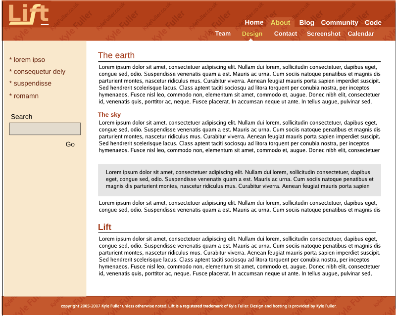
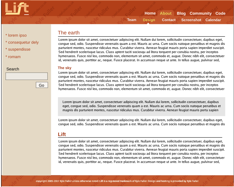
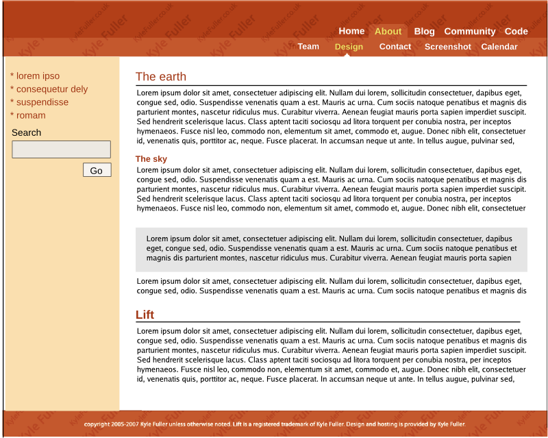
The final lift default design

David Pollak
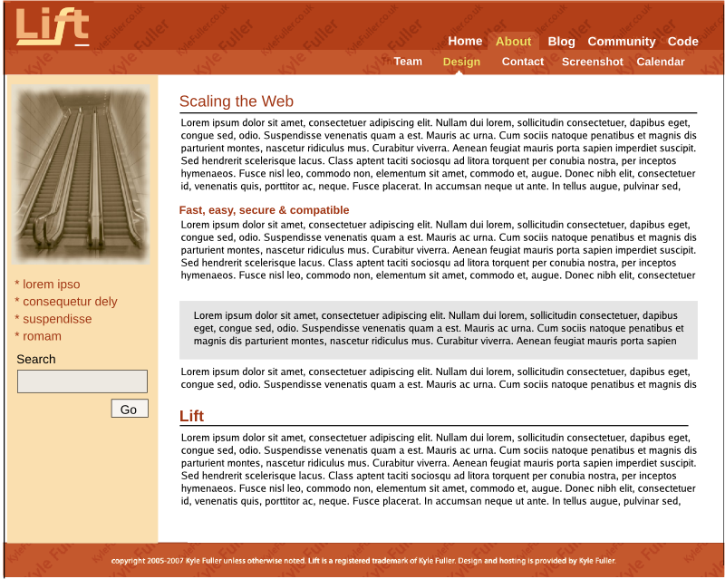
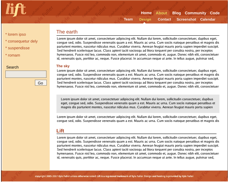
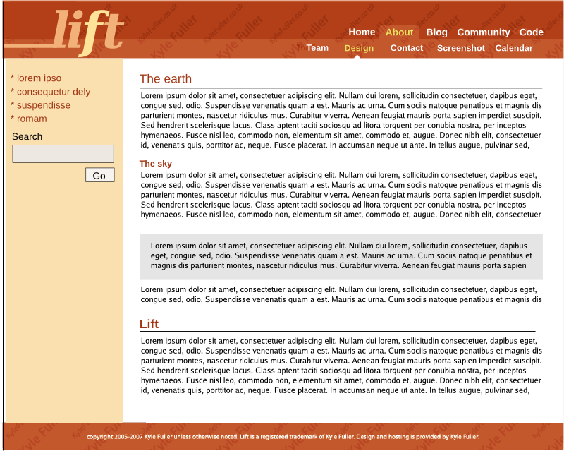
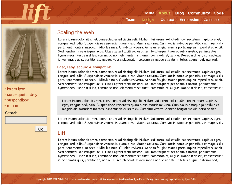
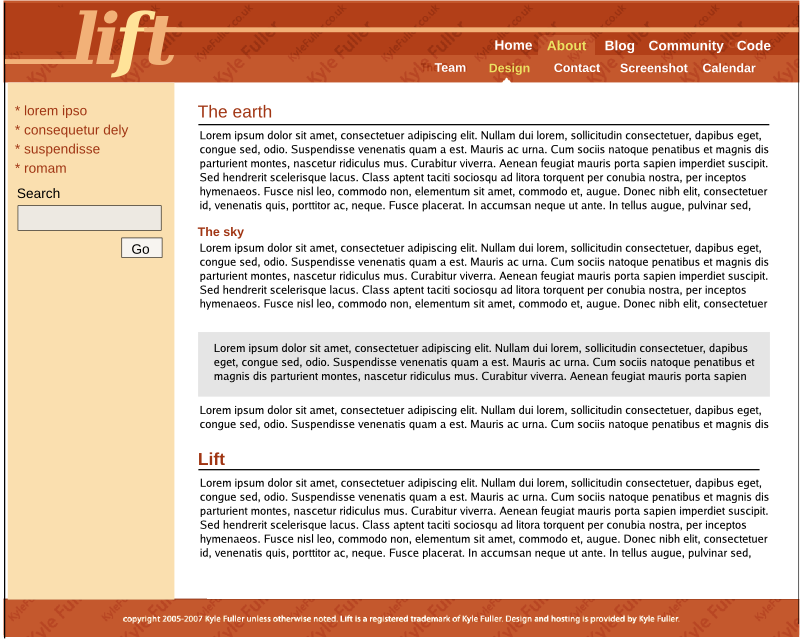
Barring any objection, I'm going to ask Kyle to put together a default template for this design:
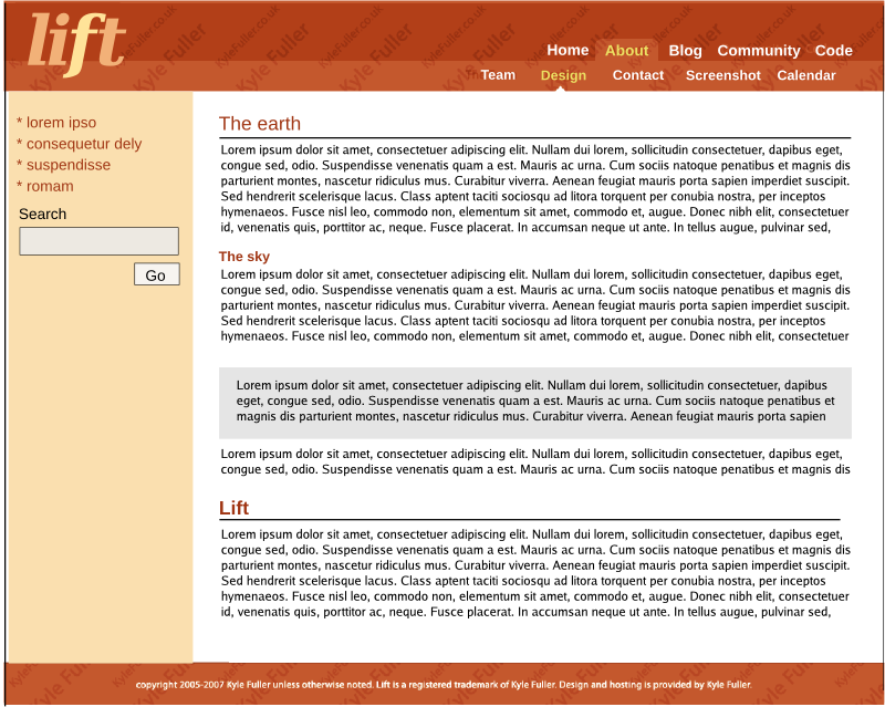
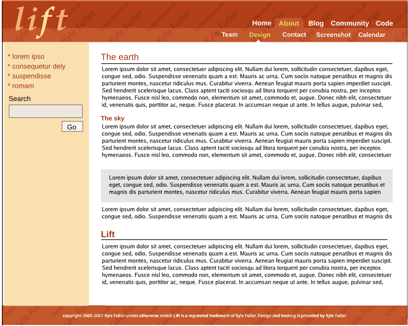
http://img440.imageshack.us/img440/990/onels2.png
We can work on the color and the logo, but this strikes me as the right design.
Objections?
Thanks,
David
--
lift, the secure, simple, powerful web framework
http://liftweb.net
Collaborative Task Management http://much4.us

David Bernard
/david B.

Viktor Klang
Folks,
Barring any objection, I'm going to ask Kyle to put together a default template for this design:
http://img440.imageshack.us/img440/990/onels2.png
We can work on the color and the logo, but this strikes me as the right design.
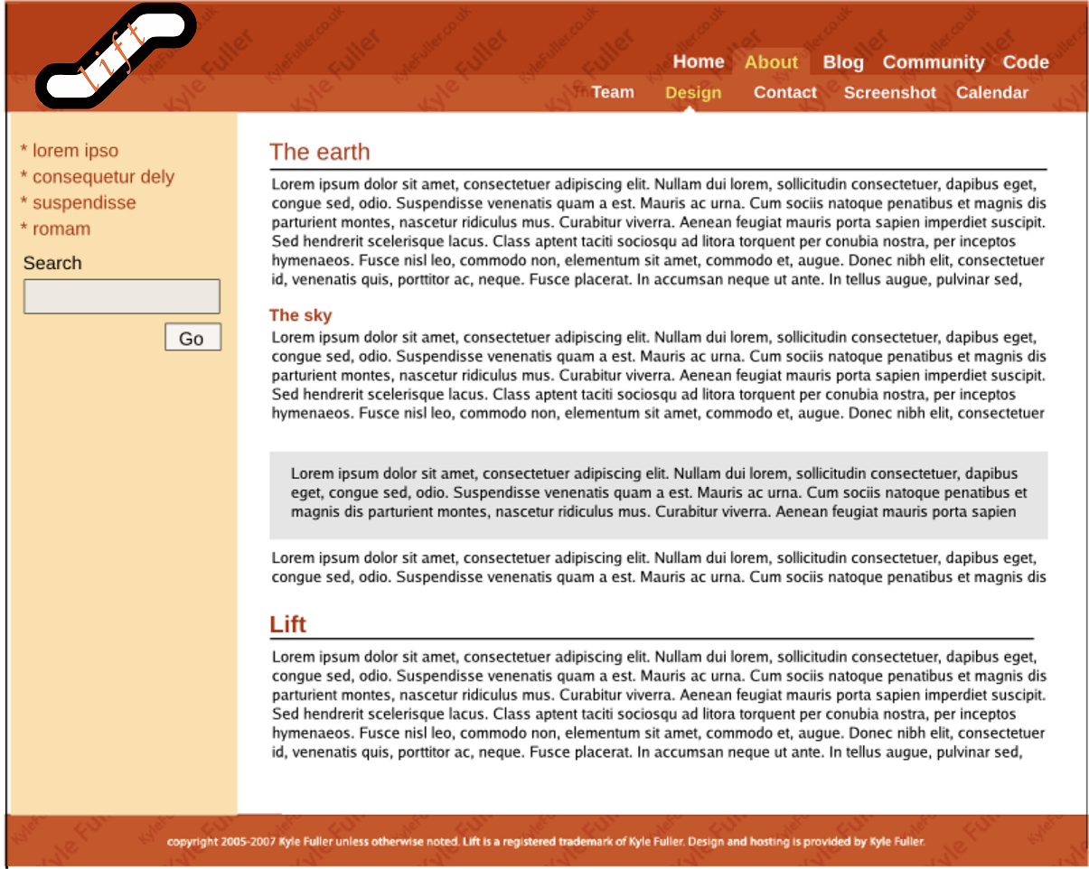
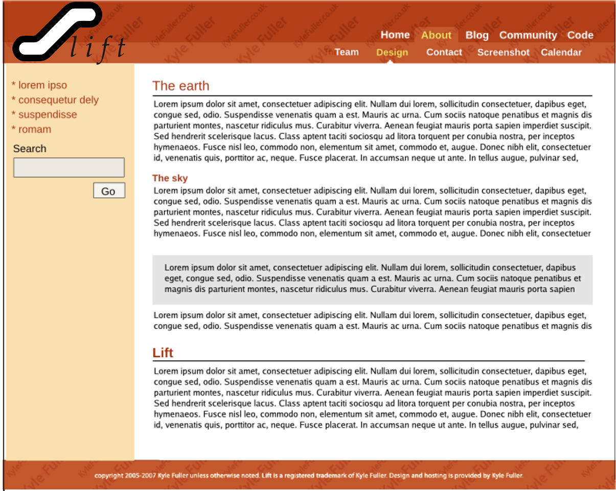
I second this.
Love the reddish tint.
As for the logo: /lift/ is it like hitchhiking or like something that elevates stuff?
I've got some ideas for a logo, but I'm no drawing champions by any means, but I've got some connections in the graphic production department at work, and perhaps I can get them to assist me. :)
Best regards
-Viktor
David Pollak
On Nov 18, 2007 10:30 PM, David Pollak <feeder.of...@gmail.com> wrote:Folks,
Barring any objection, I'm going to ask Kyle to put together a default template for this design:
http://img440.imageshack.us/img440/990/onels2.png
We can work on the color and the logo, but this strikes me as the right design.
I second this.
Love the reddish tint.
As for the logo: /lift/ is it like hitchhiking or like something that elevates stuff?
The origin of the name came from Scala -> Escalator -> lift (British idiom for an elevator)
It's also a pun on lambda lifting
It's also about raising things to a higher level of abstraction
I've got some ideas for a logo, but I'm no drawing champions by any means, but I've got some connections in the graphic production department at work, and perhaps I can get them to assist me. :)
Best regards
-Viktor
Objections?
Thanks,
David
--
lift, the secure, simple, powerful web framework
http://liftweb.net
Collaborative Task Management http://much4.us
Viktor Klang
On Nov 18, 2007 1:47 PM, Viktor Klang <viktor...@gmail.com> wrote:On Nov 18, 2007 10:30 PM, David Pollak <feeder.of...@gmail.com> wrote:Folks,
Barring any objection, I'm going to ask Kyle to put together a default template for this design:
http://img440.imageshack.us/img440/990/onels2.png
We can work on the color and the logo, but this strikes me as the right design.
I second this.
Love the reddish tint.
As for the logo: /lift/ is it like hitchhiking or like something that elevates stuff?
The origin of the name came from Scala -> Escalator -> lift (British idiom for an elevator)
It's also a pun on lambda lifting
It's also about raising things to a higher level of abstraction
Got it :)
Ok, I'm attaching a png-image with something to tickle the imagination.
What can we do with this guys?
Best regards
-Viktor

Harshad RJ
I am attaching the original Inkscape drawing as well, if you want to modify it.
-Harshad

Daniel Green
I really like the layout of the site and believe we're headed in the
right direction. I especially like the color choice.
Sharing the colors of the dawning sun, the website's palette signifies
the birth of a new era. Also, red symbolizes a pure spirit and its
luminous /ascension/ over matter.
*peers into his crystal ball* Very fitting ;-)
Viktor Klang
> Ok, I'm attaching a png-image with something to tickle the imagination.
Consider me tickled!
Daniel Green
> logo.
> There shouldn't be a doubt that the guy wearing the /lift/-tshirt is
> actually wearing a /lift/-tshirt ;)
>
/lift/-tshirts!!! New item for lift 1.0, paraphernalia!
Viktor Klang
> Personally I think it's important to have a simple, symmetric, powerful
> logo.
> There shouldn't be a doubt that the guy wearing the /lift/-tshirt is
> actually wearing a /lift/-tshirt ;)
>
/lift/-tshirts!!! New item for lift 1.0, paraphernalia!

David Pollak
Viktor Klang wrote:
>
>
> On 11/19/07, *Daniel Green* <octob...@gmail.com
> <mailto:octob...@gmail.com>> wrote:
>
>
> > Personally I think it's important to have a simple, symmetric,
> powerful
> > logo.
> > There shouldn't be a doubt that the guy wearing the /lift/-tshirt is
> > actually wearing a /lift/-tshirt ;)
> >
>
> /lift/-tshirts!!! New item for lift 1.0, paraphernalia!
Yep... once we have a logo, we can post it to CafePress.com and get
t-shirts, coffee mugs, etc.
>
>
> Wear it with pride!
And dominate JavaOne with dozens (hundred?) of people wearing /lift/
t-shirts.
> :)
>
> Cheers
> -Viktor
>
> On Nov 19, 2007 11:23 AM, Viktor Klang <viktor...@gmail.com
> <mailto:viktor...@gmail.com> > wrote:
> >
> >
> >
> > On 11/19/07, Daniel Green <octob...@gmail.com
> <mailto:octob...@gmail.com>> wrote:
> > >
> > > > Ok, I'm attaching a png-image with something to tickle the
> imagination.
> > > Consider me tickled!
> >
> >
> >
> > Sweet ;)
> >
> > Personally I think it's important to have a simple, symmetric,
> powerful
> > logo.
> > There shouldn't be a doubt that the guy wearing the /lift/-tshirt is
> > actually wearing a /lift/-tshirt ;)
> >
> > Cheers
> > -Viktor
> >
> >
> >
> > > I really like the layout of the site and believe we're headed
> in the
> > > right direction. I especially like the color choice.
> > > Sharing the colors of the dawning sun, the website's palette
> signifies
> > > the birth of a new era. Also, red symbolizes a pure spirit and its
> > > luminous /ascension/ over matter.
> > > *peers into his crystal ball* Very fitting ;-)
> > >
> > > On Nov 18, 2007 6:39 PM, Viktor Klang <viktor...@gmail.com
> <mailto:viktor...@gmail.com>> wrote:
> > > >
> > > >
> > > >
> > > > On Nov 18, 2007 11:09 PM, David Pollak <
> feeder.of...@gmail.com <mailto:feeder.of...@gmail.com>>
> > > > wrote:
> > > > >
> > > > >
> > > > >
> > > > >
> > > > > On Nov 18, 2007 1:47 PM, Viktor Klang <
> viktor...@gmail.com <mailto:viktor...@gmail.com> > wrote:
> > > > >
> > > > > >
> > > > > >
> > > > > >
> > > > > >
> > > > > > On Nov 18, 2007 10:30 PM, David Pollak
> > <feeder.of...@gmail.com
> <mailto:feeder.of...@gmail.com> >
Viktor Klang
Viktor Klang wrote:
>
>
> On 11/19/07, *Daniel Green* < octob...@gmail.com
> <mailto:octob...@gmail.com>> wrote:
>
>
> > Personally I think it's important to have a simple, symmetric,
> powerful
> > logo.
> > There shouldn't be a doubt that the guy wearing the /lift/-tshirt is
> > actually wearing a /lift/-tshirt ;)
> >
>
> /lift/-tshirts!!! New item for lift 1.0, paraphernalia!
Yep... once we have a logo, we can post it to CafePress.com and get
t-shirts, coffee mugs, etc.
>
>
> Wear it with pride!
And dominate JavaOne with dozens (hundred?) of people wearing /lift/
t-shirts.

Oscar Picasso
2- I find the design a little too aggressive
Oscar Picasso
1- like said before, the navigation bar is *not* visible enough
Daniel Green

Derek Chen-Becker
>
> Ok, I'm attaching a png-image with something to tickle the imagination.
> What can we do with this guys?
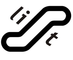
escalator :)
Derek
Viktor Klang
Cool!
And it would surely going to stirr up questions: "What the heck is that..." :)
Cheers!
-Viktor
Derek
Daniel Green

Viktor Klang
Oscar: I personally liked lift5.png best. The warmth of the color of the navbar was appealing to me.
Cheerios,
-Viktor
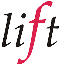
David Pollak
This is great guys, I love seeing creative people doing stuff. :)
Oscar: I personally liked lift5.png best. The warmth of the color of the navbar was appealing to me.
lift5 is cool.
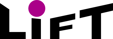
I have always thought: lift as in lower case l and italic. It looks very nice in serif fonts with kerning where the l touches the dot on the i.
Cheerios,
-ViktorOn Nov 24, 2007 10:02 PM, Oscar Picasso <oscarp...@gmail.com> wrote:Added a picture.On Nov 24, 2007 3:17 PM, Tyler Weir <tyler...@gmail.com> wrote:One more logo idea. It needs a bit of clean up, a graphic artist, I am not.
Daniel Green
Brings the page together nicely.
As for the logo, I'm also a fan of the lower case italicized serif
lift. Perhaps a little more tilted and with a little more flair...
hmm... I wonder if you could incorporate "/" on either side of it... I
must not be the only one who writes /lift/.
Daniel Green
and found that I take favor with the flamboyance of a Times New Roman
Italic lift. What about some cross between them? The boldness of sans
and the style of times new...
Oscar Picasso
Oscar Picasso
Or could you send the results of your investigation in GIMP?
Daniel Green
I really like that image in 23, but perhaps move the logo slightly
up, the f dips too far down
This is really cool stuff. Very exciting! Your time is greatly appreciated :-)
Oscar Picasso
Serif fonts can be very different one from the other, especially when in italic.
If time permits I will try Times and maybe Garamont tomorrow.
I want also do some coding after reading interesting stuff about monads... ;)
David Bernard
May it's for an other site, which one ?
/david B.

aniketvu
On Nov 25, 12:26 pm, "Oscar Picasso" <oscarpica...@gmail.com> wrote:
> A last one for today... and then I go to bed.
>
> I'll try with URW Palladio L Bold Italic tomorrow.
>
> I have yet to install it on my box.
>
>
>
>
> > Perhaps... URW Palladio L Bold Italic?
>
> > I really like that image in 23, but perhaps move the logo slightly
> > up, the f dips too far down
>
> > This is really cool stuff. Very exciting! Your time is greatly appreciated
> > :-)
>
> > > Do you think of a particular font between Times Italic and Sans Serif
> > bold,
> > > or do you want to mix both in the logo?
>
> > > Or could you send the results of your investigation in GIMP?
>
>
> > > > 10 is too cramped, but I like 11. hmm... I was playing around in GIMP
> > > > and found that I take favor with the flamboyance of a Times New Roman
> > > > Italic lift. What about some cross between them? The boldness of sans
> > > > and the style of times new...
>
> > > > > Some little variations on the logo.
>
>
> > > > > > > Added a picture.
> > > > > > Brings the page together nicely.
>
> > > > > > As for the logo, I'm also a fan of the lower case italicized serif
> > > > > > lift. Perhaps a little more tilted and with a little more flair...
> > > > > > hmm... I wonder if you could incorporate "/" on either side of
> > it... I
> > > > > > must not be the only one who writes /lift/.
>
> > wrote:
> > > > > > > Added a picture.
>
> > > > > > > On Nov 24, 2007 3:17 PM, Tyler Weir <tyler.w...@gmail.com>
> > > > > > > > One more logo idea. It needs a bit of clean up, a graphic
> > artist,
> > > I
> > > > > am
> > > > > > > not.
>
>
>
> 344KViewDownload
David Bernard
have you try to let the text horizontal in lift2.jpg logo?
Viktor Klang wrote:
> IANAGA (I Am Not A Graphical Artist)
>
> But here are some more sketches attached.
>
> Best regards,
> Viktor
>
> On Nov 25, 2007 11:05 AM, aniketvu < anik...@gmail.com
> <mailto:anik...@gmail.com>> wrote:
>
>
> +1 to lift24
>
> On Nov 25, 12:26 pm, "Oscar Picasso" < oscarpica...@gmail.com
> <mailto:oscarpica...@gmail.com>> wrote:
> > A last one for today... and then I go to bed.
> >
> > I'll try with URW Palladio L Bold Italic tomorrow.
> >
> > I have yet to install it on my box.
> >
> > On Nov 25, 2007 2:06 AM, Daniel Green <october...@gmail.com
> <mailto:october...@gmail.com>> wrote:
> >
> >
> >
> > > Perhaps... URW Palladio L Bold Italic?
> >
> > > I really like that image in 23, but perhaps move the logo slightly
> > > up, the f dips too far down
> >
> > > This is really cool stuff. Very exciting! Your time is greatly
> appreciated
> > > :-)
> >
> > > On Nov 25, 2007 1:57 AM, Oscar Picasso <oscarpica...@gmail.com
> <mailto:oscarpica...@gmail.com>> wrote:
> > > > Do you think of a particular font between Times Italic and
> Sans Serif
> > > bold,
> > > > or do you want to mix both in the logo?
> >
> > > > Or could you send the results of your investigation in GIMP?
> >
> > > > On Nov 25, 2007 1:45 AM, Daniel Green < october...@gmail.com
> <mailto:october...@gmail.com>> wrote:
> >
> > > > > 10 is too cramped, but I like 11. hmm... I was playing
> around in GIMP
> > > > > and found that I take favor with the flamboyance of a Times
> New Roman
> > > > > Italic lift. What about some cross between them? The
> boldness of sans
> > > > > and the style of times new...
> >
> > > > > On Nov 25, 2007 1:24 AM, Oscar Picasso <
> oscarpica...@gmail.com <mailto:oscarpica...@gmail.com>> wrote:
> > > > > > Some little variations on the logo.
> >
> > > > > > On Nov 24, 2007 11:36 PM, Daniel Green <
> october...@gmail.com <mailto:october...@gmail.com>>
> > > wrote:
> >
> > > > > > > > Added a picture.
> > > > > > > Brings the page together nicely.
> >
> > > > > > > As for the logo, I'm also a fan of the lower case
> italicized serif
> > > > > > > lift. Perhaps a little more tilted and with a little
> more flair...
> > > > > > > hmm... I wonder if you could incorporate "/" on either
> side of
> > > it... I
> > > > > > > must not be the only one who writes /lift/.
> >
> > > > > > > On Nov 24, 2007 4:02 PM, Oscar Picasso <
> oscarpica...@gmail.com <mailto:oscarpica...@gmail.com>>
> > > wrote:
> > > > > > > > Added a picture.
> >
> > > > > > > > On Nov 24, 2007 3:17 PM, Tyler Weir <
> tyler.w...@gmail.com <mailto:tyler.w...@gmail.com>>
> > > wrote:
> > > > > > > > > One more logo idea. It needs a bit of clean up, a
> graphic
> > > artist,
> > > > I
> > > > > > am
> > > > > > > > not.
> >
> >
> >
> > lift24.png
> > 344KViewDownload
>
>
>
>
> >
>
> ------------------------------------------------------------------------
>
>
> ------------------------------------------------------------------------
>
Viktor Klang
No, but I can rotate it a bit... :)
And here comes another shot (just for fun)
And now I need to grab something to eat before I starve to death.
Cheers man :)
David Pollak
Victor... what if the escalator was the italicized l and the ift were underneath it?
Viktor Klang
Personally, I like Oscar's #11 best. It's cool to hang the f highlighted... a reminder that lift and Scala are functional.
Victor... what if the escalator was the italicized l and the ift were underneath it?
David, you mean something like this? (Check the attachment.)
Cheers,
Viktor
Oscar Picasso
I didn't have URW Palladio and didn't find a free version on the web.
Do you know of a free font that is similar to Palladio?
Oscar Picasso
30 => Serif (which font exactly, I don't). The same as in lift11.png but I increased slightly the size
31 => Times New Roman
32 => URW Palladio.
I find Palladio elegant but both 31 and 32 are too thin for a logo.
I prefer 30. I think it has more strength and a "je ne sais quoi" both modern and retro.
Daniel Green
lettering slightly spaced.... Is the picture of the escalator a no or
a go? Personally, I'm for it.
David Pollak
<lift30.png>
<lift31.png>
<lift32.png>
Daniel Green
away when that notification has been acknowledged or dealt with?
Daniel Green
Daniel Green
spacing agrees with me
Oscar Picasso
As for the error/warning, I didn't have much thoughts about it.
I would suggest in the sidebar like in the current lift site.
Anyway I think the sidebar needs to be more precisely designed when we know what goes there.
Viktor, and everybody for that matter, I join a version without the logo so you can try to put your own logo.
Daniel Green
Daniel Green
Viktor Klang
Oscar: I think I used Palatino Linotype.
The f is hypnotizingly calming when I look at it.
Good for the soul. :)
David Pollak
On Nov 25, 2007 4:01 PM, David Pollak <feeder.of...@gmail.com> wrote:Personally, I like Oscar's #11 best. It's cool to hang the f highlighted... a reminder that lift and Scala are functional.
Victor... what if the escalator was the italicized l and the ift were underneath it?
David, you mean something like this? (Check the attachment.)
Kinda... only I wasn't thinking the ift would be rotated. I was thinking that the dot in the i would be at the top of the escalator.

Julien Wetterwald
This is my favorite so far. Good job.
Cheers,
Julien
Viktor Klang
Viktor Klang
Do we have any other suggestions for logos?
I have a hunch it'd be easier to gain acceptance if we'd have a graphical profile...
Cheers,
-Viktor, who cannot code until he has reinstalled Eclipse and all plugins and crap because the old install went corrupt.
David Pollak
Viktor -- please start a wiki page with logos on it and announce the page to the list. Folks can upload logos and talk about them on the wiki and maybe by end of week, we can have a design.
Viktor Klang
I have pinged Kyle and asked him to HTML-ize the design sans logo.
Viktor -- please start a wiki page with logos on it and announce the page to the list. Folks can upload logos and talk about them on the wiki and maybe by end of week, we can have a design.
How retarded of me not to think about that.
I'll get right on it.
Cheers Dave!
-Viktor
Viktor Klang
It's located at: http://www.liftweb.net/index.php/Logo
Please fill it in :)
Cheers,
-Viktor
David Bernard
/davidB
PS: strange, I don't have permission to edit on www.liftweb.net but on liftweb.net ???
Oscar Picasso
Viktor Klang
David Pollak
Derek Chen-Becker
> I added one more aswell (having trouble getting sleep lately :( )
on those? From the looks of it, all logos (save your "escalator" logo)
are solid color and would probably look better and show the same
compression as PNGs. Just a thought :).
Derek
David Pollak
For some reason, media wiki doesn't allow uploads of PNG so everything has to be JPG.
Sigh.
Derek
Viktor Klang
Derek Chen-Becker
>
> Yeah, the logos look much better in PNG, but the wii wouldn't allow me
> to upload PNGs, so I had to convert them to JPEG. Sad but true.
for the upload page has examples for PNGs... Anyways, I was inspired by
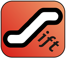
your "escalator" logo and put a new one up there:
http://www.liftweb.net/images/9/9a/Liftlogo-dcb-2.gif
I have it in a DXF file but I couldn't figure out how to export to SVG
(hence the lack of antialiasing). If anyone out there has a tool that
can convert DXF to SVG I'd really appreciate a conversion. Let me know
and I can send the original.
Derek
Viktor Klang
Viktor Klang wrote:
>
> Yeah, the logos look much better in PNG, but the wii wouldn't allow me
> to upload PNGs, so I had to convert them to JPEG. Sad but true.
Arggggh. That's really dumb, especially considering that the help text
for the upload page has examples for PNGs...
Anyways, I was inspired by
your "escalator" logo and put a new one up there:
http://www.liftweb.net/images/9/9a/Liftlogo-dcb-2.gif
Oscar Picasso
Look at, or add a line like:
$wgFileExtensions = array ('png','jpg','jpeg','ogg','doc' ,'xls','ppt','mp3','sxc','pdf', 'nse');
David Pollak
Oscar Picasso wrote:
> In the LocalSettings.php file of your mediawiki installation you can add
> support for uploading whatever file you want.
>
> Look at, or add a line like:
> $wgFileExtensions = array ('png','jpg','jpeg','ogg','doc'
> ,'xls','ppt','mp3','sxc','pdf', 'nse');
>
> On Dec 3, 2007 10:40 PM, David Pollak <feeder.of...@gmail.com
> <mailto:feeder.of...@gmail.com>> wrote:
>
>
>
> On Dec 3, 2007 7:27 PM, Derek Chen-Becker <dchen...@gmail.com
Derek Chen-Becker
> Changed. PLease try it now.
>
The file is corrupt or has an incorrect extension. Please check the file
and upload again.
:(
Derek
Oscar Picasso
Maybe it has to do with mime type detection. See:
http://www.mediawiki.org/wiki/Manual:Configuring_file_uploads#Configuring_file_types
and
http://www.mediawiki.org/wiki/Manual:Mime_type_detection
David Pollak
I had to add the FileInfo PHP module
lift, the secure, simple, powerful web framework http://liftweb.net

josh.app...@gmail.com
On Sunday, November 18, 2007 at 3:30:59 PM UTC-6, David Pollak wrote:
Folks,
Barring any objection, I'm going to ask Kyle to put together a default template for this design:
http://img440.imageshack.us/img440/990/onels2.png
We can work on the color and the logo, but this strikes me as the right design.
Objections?
Thanks,
David
