RFC: Breadcrumb on steroid

Kohsuke Kawaguchi
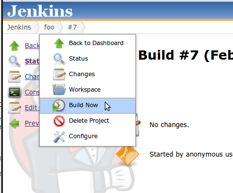
The code is currently in a branch [2]. The screenshot is attached.
Breadcrumb is now sticky --- when you scroll down, it sticks to the
top of the page and never goes out of the viewport. Hovering the mouse
over it will show the menu, and when you move your mouse out of the
menu, it'll disappear automatically. The breadcrumb itself is still
clickable as it has been.
As you see in the screenshot, the breadcrumb now occupies more space
(or easiler access to the context menu), and it's bordered.
I'm not a UX guy, and I'm not too crazy about borders here (it appears
somewhat out of style with the rest of Jenkins UI, although foldable
sidepanel might change that.) With that said, I ended up adding it to
create a boundary for sticky breadcrumb.
Internally, it ses sidepanel.groovy/jelly to generate the menu
contents by default, which lets us instantly activate this feature for
all those objects that people have been writing. But model classes can
override this behavior and completely take over the menu generation if
so choose.
Future enhancements include submenus.
Does this sound like what we want? Feedbacks from graphics/UX guys
(and I'm looking at Manfred!) would be especially appreciated.
[1] https://wiki.jenkins-ci.org/display/JENKINS/FOSDEM+UI+Enhancement+discussion+notes
[2] https://github.com/jenkinsci/jenkins/tree/breadcrumb
--
Kohsuke Kawaguchi

Andrew Gray
Andrew Gray
Say I wanted to queue a build for all jobs in a view at once.
Could we add a build all jobs in view button? Maybe at the bottom of the view dashboard page.
What to people think?

Emanuele Zattin
Emanuele Zattin
---------------------------------------------------
-I don't have to know an answer. I don't feel frightened by not
knowing things; by being lost in a mysterious universe without any
purpose — which is the way it really is, as far as I can tell,
possibly. It doesn't frighten me.- Richard Feynman

Jesse Farinacci
On Mon, Feb 20, 2012 at 11:43 PM, Andrew Gray
<andrew.p...@gmail.com> wrote:
> Say I wanted to queue a build for all jobs in a view at once.
I don't disagree that it could be more conveniently or prominently
displayed, but https://wiki.jenkins-ci.org/display/JENKINS/Bulk+Builder+Plugin
does have a way to bulk submit all jobs in a View.
-Jesse
--
There are 10 types of people in this world, those
that can read binary and those that can not.
Andrew Gray

domi

John Vacz
html page is just perfect. Tooltip might be the only thing that floats
over a html page.
But again, thats only my personal opinion.

Dean Yu
object, not just from the breadcrumb bar. For example, there have been many
times I wished I could quickly jump to the configuration or console of a job
from the upstream/downstream jobs section of a page. We could get rid of a
lot of custom dashboard view columns if the menu could be activated from the
links in the views.
This would mean refactoring all model object links in Jelly files to use a
modellink.jelly template, but it would be a consistent experience.
-- Dean

Kohsuke Kawaguchi
says, it already exists.
2012/2/22 Jesse Farinacci <jie...@gmail.com>:
--
Kohsuke Kawaguchi
Kohsuke Kawaguchi
what we have.
Definitely worth experimenting. Any thoughts on this from others?
2012/2/24 Dean Yu <d...@yahoo-inc.com>:
--
Kohsuke Kawaguchi
Kohsuke Kawaguchi
overriden, but I thought the argument from the other side is the
continuity from our previous name.
In FOSDEM and in SCALE 10x, I had several occasions where people who
didn't know about Jenkins came over and I was able to quickly convince
them that we are the natural continuation thanks to the similarity of
the UI.
The other thing is that the current color scheme is from Tango color
palette, where we draw icons from. So presumably colors look more
consistent with icons, etc.
2012/2/22 Andrew Gray <andrew.p...@gmail.com>:
--
Kohsuke Kawaguchi
domi
e.g. this could be useful in the executor list too
/Domi

Mirko Friedenhagen
My only concern would be to test this with bigger installations as well. When having 1000 jobs in one instance innocent looking 200 bytes of information per job may make a big difference :-D.
Regards Mirko
--
Sent from my phone
http://illegalstateexception.blogspot.com
http://github.com/mfriedenhagen/
https://bitbucket.org/mfriedenhagen/
Kohsuke Kawaguchi
loaded until you actually activate the menu (by hovering the mouse
over), so I think we are OK with this regard.
2012/2/24 Mirko Friedenhagen <mfried...@gmail.com>:
--
Kohsuke Kawaguchi
Kohsuke Kawaguchi
I've pushed this in
https://github.com/jenkinsci/jenkins/tree/breadcrumb
Most of the list view links now support navigation menus (it's just a
matter of adding class='model-link' to the <a> tag), so you can get the
sense of how this behaves.
You need to hover the mouse on <a> tags and wait for a bit before the
menu shows up. I added this delay intentionally --- without it, it's way
too easy for unintended menus to open as you move the mouse from one
part of the page to another.
I think I like it, but as always, feedback welcome.
I'm expanding the ui-samples plugin to describe how it works and how to
take advantages of this from plugins.
--
Kohsuke Kawaguchi | CloudBees, Inc. | http://cloudbees.com/
Try Nectar, our professional version of Jenkins
Dean Yu
-- Dean
Mirko Friedenhagen
looks really nice! One small issue:
- when using the menu from the dashboard hovering over one job name,
there is the option to return to the dashboard, which seems
superfluous to me :-).
Regards Mirko
--
http://illegalstateexception.blogspot.com/
https://github.com/mfriedenhagen/
https://bitbucket.org/mfriedenhagen/
Kohsuke Kawaguchi
I've add contextMenu="false" to various <l:task> to get rid of some
unwanted menu items.

Andreas Sandberg
Timestamp: Wed, 14 Mar 2012 12:08:12 UTC
Message: 'left' is null or not an object.
Line: 8
Char: 5672
Code: 0
URI: http://myJenkinsServer:8080/static/29830985/scripts/yui/dom/dom-min.js

Ross Simpson
I like the breadcrumb and think it's a good idea. I have, however, gotten several complaints from users (some of whom are UX people) about the drop-down menu appearance being distracting and not always desirable. Was any thought given to being able to control this behavior, through a config item or plugin or such?
Otherwise, great job!
R

Erik Molekamp
Op woensdag 14 maart 2012 13:25:49 UTC+1 schreef Andreas Sandberg het volgende:
Andreas Sandberg
https://issues.jenkins-ci.org/browse/JENKINS-13082
Regards!
// Andreas
Kohsuke Kawaguchi
> Hi,
>
> I like the breadcrumb and think it's a good idea. I have, however, gotten
> several complaints from users (some of whom are UX people) about the
> drop-down menu appearance being distracting and not always desirable. Was
> any thought given to being able to control this behavior, through a config
> item or plugin or such?
Maybe the time out is too short, or maybe it shouldn't be triggered by a
hover but should require some clicking instead?
Making it configurable is certainly possible, but it seems like we
should rather solve the underlying problem if we can.

Brian Smith
Kohsuke Kawaguchi
Anyone interested in mocking up a markup? I'm happy to put the logic
together.
Ross Simpson
On 20/03/2012, at 10:51 , Kohsuke Kawaguchi wrote:
> On 03/14/2012 05:43 PM, Ross Simpson wrote:
>> Hi,
>>
>> I like the breadcrumb and think it's a good idea. I have, however, gotten
>> several complaints from users (some of whom are UX people) about the
>> drop-down menu appearance being distracting and not always desirable. Was
>> any thought given to being able to control this behavior, through a config
>> item or plugin or such?
>
> Maybe the time out is too short, or maybe it shouldn't be triggered by a hover but should require some clicking instead?
Agreed -- either activate onclick, or via a longer hover period. either one would solve the issue I see (and hear).
>
> Making it configurable is certainly possible, but it seems like we should rather solve the underlying problem if we can.
Also sounds good -- less configuration is probably a good thing :)
Here's a use case where it affects me: I had a need to open the build page for several jobs. As I hovered over one job link to click it, the popup appeared and obscured the next job link below.
Thanks!
Ross
>
>>> <snip>
>

R. Tyler Croy
On Tue, 20 Mar 2012, Brian Smith wrote:
> I always prefer dropdowns to be onclick rather than hover. It stops them
> getting in the way if you accidentally mouse over them - and in this case
> they're dropping down over an area of the screen with lots of clickables
> and info in so I think that would really help.
>
> If you do this though it's helpful to have a little caret symbol next to
> the text to indicate there's a clickable. You probably only need this on
> the rightmost breadcrumb?
We solved this at my previous company with the following design: "rich" links
were denoted by "<icon> Link Text".
Hovering over the icon would provide the on-hover action (such as the
bread-crumbing), whereas a click on the link-text would also invoke the action.
The downside of such an approach here would be that it would require two clicks
if I really wanted to get to the linked page :/
- R. Tyler Croy
--------------------------------------
Code: http://github.com/rtyler
Chatter: http://twitter.com/agentdero
rty...@jabber.org