Two DataFrames in one plot - two legends possible?
2,275 views
Skip to first unread message

Benjamin Mewes
Nov 13, 2015, 5:16:45 AM11/13/15
to ggplot2
Hi,
I have data from two data frames and I want to plot these in one plot (which works). But I want to separate the legends:
Legend 1 for DataFrame1
Legend 2 for DataFrame2
Is that possible?
I have data from two data frames and I want to plot these in one plot (which works). But I want to separate the legends:
Legend 1 for DataFrame1
Legend 2 for DataFrame2
Is that possible?

Brian
Nov 13, 2015, 5:44:34 AM11/13/15
to Benjamin Mewes, ggplot2
yes. You will need to map a different variable to a different aesthetic
e.g. to "color" AND "size".
Need some code though.
> --
> --
> You received this message because you are subscribed to the ggplot2
> mailing list.
> Please provide a reproducible example:
> https://github.com/hadley/devtools/wiki/Reproducibility
>
> To post: email ggp...@googlegroups.com
> To unsubscribe: email ggplot2+u...@googlegroups.com
> More options: http://groups.google.com/group/ggplot2
>
> ---
> You received this message because you are subscribed to the Google
> Groups "ggplot2" group.
> To unsubscribe from this group and stop receiving emails from it, send
> an email to ggplot2+u...@googlegroups.com
> <mailto:ggplot2+u...@googlegroups.com>.
> For more options, visit https://groups.google.com/d/optout.
e.g. to "color" AND "size".
Need some code though.
> --
> You received this message because you are subscribed to the ggplot2
> mailing list.
> Please provide a reproducible example:
> https://github.com/hadley/devtools/wiki/Reproducibility
>
> To post: email ggp...@googlegroups.com
> To unsubscribe: email ggplot2+u...@googlegroups.com
> More options: http://groups.google.com/group/ggplot2
>
> ---
> You received this message because you are subscribed to the Google
> Groups "ggplot2" group.
> To unsubscribe from this group and stop receiving emails from it, send
> an email to ggplot2+u...@googlegroups.com
> <mailto:ggplot2+u...@googlegroups.com>.
> For more options, visit https://groups.google.com/d/optout.
Benjamin Mewes
Nov 13, 2015, 6:46:22 AM11/13/15
to ggplot2, bennam...@gmail.com
That did it!

Assa Yeroslaviz
Nov 13, 2015, 10:14:41 AM11/13/15
to ggplot2, bennam...@gmail.com
Hi,
can you please add the script you used, as I have had a similar problem and needed to circumvent it, as i didn't find a good way to plot the two data.frame. This is how i did it:
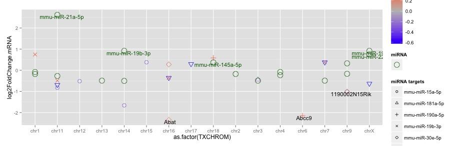
ggplot(data=target, mapping = aes(x=as.factor(TXCHROM), y=log2FoldChange)) +
scale_shape_manual(name = "targets", values = c(1:25)) +
geom_point(aes(size=3, colour=log2FoldChange.miRNA, shape=as.factor(ID))) +
scale_colour_gradient2(name = "log2FC", low="blue", mid="grey", high="red") +
geom_text(aes(label=label_gene), size=4, hjust=0.4, vjust=1, colour="black") +
xlab("chromosommal position") + ylab("log2 FC target mRNA") +
# this part adds the annotations from the second df to the plot in red and map them to the chromosomal locations
geom_point(data=target_chr, mapping=aes(y=log2FoldChange.mRNA), colour="darkgreen", size=5, shape=1) +
geom_text(data =target_chr, aes(label=miRNA), size=4, hjust=0.4, vjust=1, colour="darkgreen") +
guides(size=guide_legend(title="miRNA", override.aes = list(colour = "darkgreen", size=5, shape =1), label.theme = element_blank()))
first data frame - target with several columns to map, the second data.frame is target_chr. I didn't find a way to add the legend of the df target_chr to the legend, so I used guides() to change the size factor of the legend with a different title. But if i have two size factor I need to map i still don't know how to add them.
Is there a better way to do it?
thanks in advance
Assa
can you please add the script you used, as I have had a similar problem and needed to circumvent it, as i didn't find a good way to plot the two data.frame. This is how i did it:
ggplot(data=target, mapping = aes(x=as.factor(TXCHROM), y=log2FoldChange)) +
scale_shape_manual(name = "targets", values = c(1:25)) +
geom_point(aes(size=3, colour=log2FoldChange.miRNA, shape=as.factor(ID))) +
scale_colour_gradient2(name = "log2FC", low="blue", mid="grey", high="red") +
geom_text(aes(label=label_gene), size=4, hjust=0.4, vjust=1, colour="black") +
xlab("chromosommal position") + ylab("log2 FC target mRNA") +
# this part adds the annotations from the second df to the plot in red and map them to the chromosomal locations
geom_point(data=target_chr, mapping=aes(y=log2FoldChange.mRNA), colour="darkgreen", size=5, shape=1) +
geom_text(data =target_chr, aes(label=miRNA), size=4, hjust=0.4, vjust=1, colour="darkgreen") +
guides(size=guide_legend(title="miRNA", override.aes = list(colour = "darkgreen", size=5, shape =1), label.theme = element_blank()))
first data frame - target with several columns to map, the second data.frame is target_chr. I didn't find a way to add the legend of the df target_chr to the legend, so I used guides() to change the size factor of the legend with a different title. But if i have two size factor I need to map i still don't know how to add them.
Is there a better way to do it?
thanks in advance
Assa
Assa Yeroslaviz
Nov 14, 2015, 10:13:57 AM11/14/15
to ggplot2, bennam...@gmail.com
Hi,
here is an executable code with the examples files.
the two files for creating the plots were created by dput(). These two files as well as the plot itself and are attached below.
the command how I create it is this:
ggplot(data=target_sub, mapping = aes(x=as.factor(TXCHROM), y=log2FoldChange.mRNA)) +
scale_shape_manual(name = "miRNA targets", values = c(1:25)) +
geom_point(aes(size=3, colour=log2FoldChange.miRNA, shape=as.factor(ID.miRNA))) +
scale_colour_gradient2(name = "log2FC", low="blue", mid="grey", high="red") +
geom_text(aes(label=label_gene), size=4, hjust=0.4, vjust=1, colour="black") +
geom_point(data=target_miRNA_chr, mapping=aes(y=log2FoldChange.mRNA), colour="darkgreen", size=5, shape=1) +
geom_text(data =target_miRNA_sub, aes(label=miRNA), size=4, hjust=0.4, vjust=1, colour="darkgreen") +
geom_text(data =target_miRNA_sub, aes(label=miRNA), size=4, hjust=0.4, vjust=1, colour="darkgreen") +
guides(size=guide_legend(title="miRNA", override.aes = list(colour = "darkgreen", size=5, shape =1), label.theme = element_blank()))
the first geom_txt() uses the target_sub data to plot the "log2FC" and the "miRNA targets" values in the legend, second geom_text uses the target_miRNA_sub data to plot the "miRNA" part of the legend. But I can't find out how to uses the information from this data itself to add to the legend.
thanks for the help
Assa
thanks for the help
Assa
Assa Yeroslaviz
Nov 15, 2015, 4:39:09 AM11/15/15
to ggplot2, bennam...@gmail.com
sorry guys, there is a misspelling in the script.
The target_miRNA_chr and target_miRNA_sub suppose to be the same file. I have changed the names for the minimal code example but forgot to change this one.
the code is as such:The target_miRNA_chr and target_miRNA_sub suppose to be the same file. I have changed the names for the minimal code example but forgot to change this one.
ggplot(data=target_sub, mapping = aes(x=as.factor(TXCHROM), y=log2FoldChange.mRNA)) +
scale_shape_manual(name = "miRNA targets", values = c(1:25)) +
geom_point(aes(size=3, colour=log2FoldChange.miRNA, shape=as.factor(ID.miRNA))) +
scale_colour_gradient2(name = "log2FC", low="blue", mid="grey", high="red") +
geom_text(aes(label=label_gene), size=4, hjust=0.4, vjust=1, colour="black") +
geom_point(data=target_miRNA_sub, mapping=aes(y=log2FoldChange.mRNA), colour="darkgreen", size=5, shape=1) +
geom_text(data =target_miRNA_sub, aes(label=miRNA), size=4, hjust=0.4, vjust=1, colour="darkgreen") +
guides(size=guide_legend(title="miRNA", override.aes = list(colour = "darkgreen", size=5, shape =1), label.theme = element_blank()))
with these two i don't have any problems, but the third one is a problem.
the miRNA column from the second data set.
the miRNA column from the second data set.
Here
i would like to understand how to add a second aes() and / or a scale_*() to
put it separately in the legend, but can't figure out how to do it.
I hope you can help me to better understand the procedure, how the scales can be applied here.
thanks again,
AssaBrian
Nov 16, 2015, 7:57:00 AM11/16/15
to Assa Yeroslaviz, ggplot2, bennam...@gmail.com
Dear Assa,
attached is some code to get done approximately what you want to do. As
it is, you have repetitive information. That is, the color scale
represents the same information that is displayed on the yaxis. Next
time you just need to get your data more organized. This is a general
requirement for ggplot. Therefore:
library(ggplot2)
library(reshape2)
library(plyr)
target_sub <- dget("target_sub.txt")
target_miRNA_sub <- dget("target_miRNA_sub.txt")
target_sub <- rename(target_sub, c(ID.miRNA="miRNA"))
target <- rbind.fill(data.frame(target_sub, exp="standard"),
data.frame(target_miRNA_sub, exp="new method?"))
str(target)
ggplot(data=target, mapping = aes(x=as.factor(TXCHROM),
y=log2FoldChange.mRNA)) +
geom_point(aes(shape=as.factor(miRNA), color=log2FoldChange.mRNA),
size=3) +
If you want your two different data sets to have different colors here,
I recommend that you rethink how you're using the color aesthetic here.
I mean:
geom_text(aes(label=label_gene, color=exp))
The color aesthetic can only be used once. Any aesthetic can only be
used once in a single plot. Different variables require different
aesthetics.
Hope that helps. Please note how I've included code to do everything,
including reading in the data. Please do that similarly next time.
Cheers,
Brian
> <https://groups.google.com/d/optout>.
attached is some code to get done approximately what you want to do. As
it is, you have repetitive information. That is, the color scale
represents the same information that is displayed on the yaxis. Next
time you just need to get your data more organized. This is a general
requirement for ggplot. Therefore:
library(ggplot2)
library(reshape2)
library(plyr)
target_sub <- dget("target_sub.txt")
target_miRNA_sub <- dget("target_miRNA_sub.txt")
target_sub <- rename(target_sub, c(ID.miRNA="miRNA"))
target <- rbind.fill(data.frame(target_sub, exp="standard"),
data.frame(target_miRNA_sub, exp="new method?"))
str(target)
ggplot(data=target, mapping = aes(x=as.factor(TXCHROM),
y=log2FoldChange.mRNA)) +
geom_point(aes(shape=as.factor(miRNA), color=log2FoldChange.mRNA),
size=3) +
scale_shape_manual(name = "miRNA targets", values = c(1:25)) +
scale_color_gradient2(name = "log2FC", low="blue", mid="grey",
high="red") +
geom_text(aes(label=label_gene),
size=4, hjust=0.4, vjust=1)
geom_text(aes(label=label_gene),
If you want your two different data sets to have different colors here,
I recommend that you rethink how you're using the color aesthetic here.
I mean:
geom_text(aes(label=label_gene, color=exp))
The color aesthetic can only be used once. Any aesthetic can only be
used once in a single plot. Different variables require different
aesthetics.
Hope that helps. Please note how I've included code to do everything,
including reading in the data. Please do that similarly next time.
Cheers,
Brian
Reply all
Reply to author
Forward
0 new messages