An easier way to achieve this?
643 views
Skip to first unread message

Mike Lawrence
Mar 25, 2017, 9:49:53 AM3/25/17
to ggplot2
I'm working on visualizing posterior samples from a Bayesian analysis of a Gaussian Process, so I have data like:
set.seed(1)
nX = 100
nY = 1e3
dat = tibble(
x = rep(1:nX,each=nY)
, sample = rep(1:nY,times=nX)
, y = rnorm(nX*nY)
)
That is, an equal (and large-ish) number of samples of y at each of many values for x. I'm reluctant to simply do geom_density_2d as this smooths in the x axis as well as y, which is not appropriate for describing posterior samples like these.
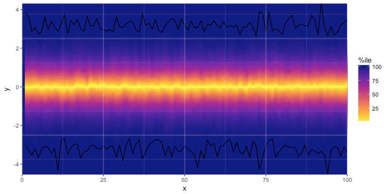
I've cobbled together code to implement what I'd like, which yields this:
But the code is rather cumbersome and I haven't worked out what to do when I want to apply it to a scenario with multiple facets, so I'm curious if I'm missing some easier tricks. I'll paste the code below with comments, and if anyone has any tips I'd be greatly appreciative! -Mike
#load tidyverse for all things good
library(tidyverse)
#load viridis for nice color scales
library(viridis)
# generate data
set.seed(1) #for reproducibility
nX = 100 #num obs on x
nY = 1e3 #num samples at each x
dat = tibble(
x = rep(1:nX,each=nY)
, sample = rep(1:nY,times=nX)
, y = rnorm(nX*nY) # random for example
)
#chain to add rank & dist data to each y at each x
dat %>%
dplyr::group_by(
x
) %>%
dplyr::arrange(
x
, y
) %>%
dplyr::mutate(
# rank: rank of y observation
rank = 1:n()
# dist: rank's distance from median rank
, dist = (abs(rank-median(rank))+.5)*2
# dist01: dist as % of max distance
, dist01 = (dist-1)/(n()-1)*100
) -> dat #just overwrite dat since we only added columns
#get unique distances
dist_list = rev(sort(unique(dat$dist)))
#toss the distance = 0 (only present if nY is odd)
dist_list = dist_list[dist_list>0]
# if nY is really big, the following for loop can hit stack limits, so use
# num_dists_to_vis to visualize a subset of the distances
num_dists_to_vis = 100
num_dists_to_vis = min(length(dist_list),num_dists_to_vis)
dist_list = dist_list[
round(seq.int(1,length(dist_list),length.out=num_dists_to_vis))
]
#start an empty plot that we'll add to in a loop
p = ggplot()
#loop over distances in dist_list
for(i in dist_list){
dat %>%
#filter to the distance for this loop
dplyr::filter(
dist==i
) %>%
#grab the upper and lower bounds, & distances
# note: dat is still grouped by x from above
dplyr::summarise(
lo = y[1]
, hi = y[2]
, dist = dist[1]
, dist01 = dist01[1]
) -> temp #assign to temporary obj
#add a ribbon for this distance
# note: using the dist01 for fill & colour
p = p + geom_ribbon(
data = temp
, mapping = aes(
x = x
, ymin = lo
, ymax = hi
, fill = dist01
, colour = dist01
)
)
}
#add a line for the upper & lower bound of the 100%ile interval
p = p + geom_line(
data = dat[dat$dist==max(dat$dist),]
, mapping = aes(
x = x
, y = y
, group = rank
)
)
#add color & fill scales
p = p +
scale_fill_viridis(
name = '%ile'
, direction = -1
, option = 'plasma'
)+
scale_color_viridis(
name = '%ile'
, direction = -1
, option = 'plasma'
)
# since the ribbons overlap on eachother, we can't use alpha to show the
# panel grid lines, so we need to grab them and use geom_vline & geom_hline
b = ggplot_build(p)
x_major = b$layout$panel_ranges[[1]]$x.major_source
x_minor = b$layout$panel_ranges[[1]]$x.minor_source
y_major = b$layout$panel_ranges[[1]]$y.major_source
y_minor = b$layout$panel_ranges[[1]]$y.minor_source
#add the grid lines
p = p +
geom_vline(
xintercept = x_major
, size = 1
, colour = 'white'
, alpha = .1
) +
geom_vline(
xintercept = x_minor
, size = .5
, colour = 'white'
, alpha = .1
) +
geom_hline(
yintercept = y_major
, size = 1
, colour = 'white'
, alpha = .1
) +
geom_hline(
yintercept = y_minor
, size = .5
, colour = 'white'
, alpha = .1
)
#remove the original grid lines and fill the background with
# the 100% color for aesthetics
p = p + theme(
panel.background = element_rect(
fill = viridis(1,option='plasma')
)
, panel.grid = element_blank()
)
#constrain the plot to only show the domain of the data
p = p +
scale_y_continuous(
expand = c(0,0)
) +
scale_x_continuous(
expand = c(0,0)
)
#done!
print(p)

Bill Harris
Mar 25, 2017, 12:20:56 PM3/25/17
to Mike Lawrence, ggplot2
Does the bayesplot package (built on ggplot2) have anything useful to offer? If not, would it be useful to channel it into there?
Bill
--
--
You received this message because you are subscribed to the ggplot2 mailing list.
Please provide a reproducible example: https://github.com/hadley/devtools/wiki/Reproducibility
To post: email ggp...@googlegroups.com
To unsubscribe: email ggplot2+unsubscribe@googlegroups.com
More options: http://groups.google.com/group/ggplot2
---
You received this message because you are subscribed to the Google Groups "ggplot2" group.
To unsubscribe from this group and stop receiving emails from it, send an email to ggplot2+unsubscribe@googlegroups.com.
For more options, visit https://groups.google.com/d/optout.

Jonah
Mar 25, 2017, 6:47:08 PM3/25/17
to ggplot2, mike....@gmail.com, bill_...@facilitatedsystems.com
bayesplot doesn't have anything yet, but I'm on it!
The loop with repeated calls to geom_ribbon can be avoided using something like this:
dat %>% filter(dist %in% dist_list) %>% group_by(x, dist) %>% summarise( lo = first(y), hi = nth(y, 2), dist01 = first(dist01) ) %>% ggplot() + geom_ribbon( mapping = aes( x = x, ymin = lo, ymax = hi, fill = factor(dist01, levels = rev(unique(dist01))) ), alpha = 0.8, show.legend = FALSE ) + scale_fill_viridis(discrete = TRUE)Jonah
Mike Lawrence
Mar 25, 2017, 6:57:05 PM3/25/17
to ggplot2, mike....@gmail.com, bill_...@facilitatedsystems.com
Ah, neat; I had tried a single ribbon with fill=dist01, but this yields the error "Error in f(...) : Aesthetics can not vary with a ribbon". I see that you get around that by turning dist01 into a factor, which works but means you have to turn off the legend. Thanks to your inspiration, I realized that the following works whilst keeping the legend:
dat %>%
filter(dist %in% dist_list) %>%
group_by(x, dist) %>%
summarise(
lo = first(y),
hi = nth(y, 2),
dist01 = first(dist01)
) %>%
ggplot() +
geom_ribbon(
mapping = aes(
x = x
, ymin = lo
, ymax = hi
, fill = dist01
, group = factor(dist01,levels = rev(unique(dist01)))
)
) +
scale_fill_viridis(
direction=-1
, option = 'plasma'
) +
scale_x_continuous(expand = c(0,0))
Now, the grid lines are still obscured, so one would still have to add them manually, but I think I have a fix for that too, just working it out so stay tuned!
Mike Lawrence
Mar 25, 2017, 8:59:12 PM3/25/17
to ggplot2, mike....@gmail.com, bill_...@facilitatedsystems.com
Ok, below is what I've come up with to eliminate the manual adding-back-in of the grid lines. I'm not 100% satisfied with it as there is still a bit of visibility of the ribbon edges despite colour='transparent'. Using transparency to see the grid lines also washes out the colours (should have foreseen this), and while maybe this tradeoff might be worth it if one desired to show multiple overlapping data sets in the same panel, I'll probably go back to doing the grid lines manually to avoid the washout.
#load tidyverse for all things goodlibrary(tidyverse)#load viridis for nice color scaleslibrary(viridis)# generate dataset.seed(1) #for reproducibilitynX = 100  #num obs on xnY = 1e3 #num samples at each xdat = tibble(	x = rep(1:nX,each=nY)	, sample = rep(1:nY,times=nX)	, y = rnorm(nX*nY) # random for example)
#chain to add rank & dist data to each y at each xdat %>%
dplyr::arrange( x , y ) %>% dplyr::group_by( x ) %>% dplyr::mutate( # rank: rank of y observation rank = 1:n() # dist: rank's distance from median rank , dist = (abs(rank-median(rank))+.5)*2 ) -> dat #just overwrite dat since we only added columns
#get unique distancesdist_list = rev(sort(unique(dat$dist)))#toss the distance = 0 (only present if nY is odd)dist_list = dist_list[dist_list>0]
# if nY is really big, the following for loop can hit stack limits, so use# num_dists_to_vis to visualize a subset of the distancesnum_dists_to_vis = 100num_dists_to_vis = min(length(dist_list),num_dists_to_vis)dist_list = dist_list[ round(seq.int(1,length(dist_list),length.out=num_dists_to_vis)) ]
#compute dat2, which will be what we plotdat %>% filter(dist %in% dist_list) %>% dplyr::mutate( # y_next: next rank's y y_next = c(y[2:n()],NA) # dist_next: next rank's distance from median rank , dist_next = c(dist[2:n()],NA) # dist_to_use: dist or dist_next, whichever's bigger , dist_to_use = pmax(dist,dist_next) ) %>% filter( !is.na(y_next) ) -> dat2
#compute min & max y per x for linesdat2 %>% group_by(x) %>% summarize( ymin = min(y) , ymax = max(y_next) ) -> #%>% # tidyr::gather( # key = 'minmax' # , value = 'y' # , -x # ) -> dat3
#start plotting!dat2 %>% ggplot()+ geom_ribbon( mapping = aes( x = x , ymin = y , ymax = y_next , group = factor(rank) , fill = dist_to_use ) #, colour = NA #, linetype = NA , colour = 'transparent' , alpha = .5 ) + geom_ribbon( data = dat3 , mapping = aes( x = x , ymin = -Inf , ymax = ymin ) , fill = viridis(1,option='plasma') , colour = 'transparent' , alpha = .5 ) + geom_ribbon( data = dat3 , mapping = aes( x = x , ymin = ymax , ymax = Inf ) , fill = viridis(1,option='plasma') , colour = 'transparent' , alpha = .5 ) + geom_line( data = dat3 , mapping = aes( x = x , y = ymin ) ) + geom_line( data = dat3 , mapping = aes( x = x , y = ymax ) ) + #add color & fill scales scale_fill_viridis( name = '%ile' , direction = -1 , option = 'plasma' )+ #constrain the plot to only show the domain of the dataMike Lawrence
Mar 26, 2017, 9:23:32 AM3/26/17
to ggplot2
In case anyone is interested, I wrapped this up in a function (fixing the dist01 computation, which was wrong, and adding a few extras), wrote up a quick demo using actual gp posterior data, and posted as an issue over at bayesplot. Here's the visual produced by the demo:


Hadley Wickham
Mar 27, 2017, 12:41:27 PM3/27/17
to Mike Lawrence, ggplot2, Bill Harris
BTW the theme setting panel.ontop will automatically put the grid
lines on top (you'll also need to make the panel background
transparent)
Hadley
--
http://hadley.nz
lines on top (you'll also need to make the panel background
transparent)
Hadley
> --
> --
> You received this message because you are subscribed to the ggplot2 mailing
> list.
> Please provide a reproducible example:
> https://github.com/hadley/devtools/wiki/Reproducibility
>
> To post: email ggp...@googlegroups.com
> To unsubscribe: email ggplot2+u...@googlegroups.com
> --
> You received this message because you are subscribed to the ggplot2 mailing
> list.
> Please provide a reproducible example:
> https://github.com/hadley/devtools/wiki/Reproducibility
>
> To post: email ggp...@googlegroups.com
> More options: http://groups.google.com/group/ggplot2
>
> ---
> You received this message because you are subscribed to the Google Groups
> "ggplot2" group.
> To unsubscribe from this group and stop receiving emails from it, send an
> email to ggplot2+u...@googlegroups.com.
>
> ---
> You received this message because you are subscribed to the Google Groups
> "ggplot2" group.
> To unsubscribe from this group and stop receiving emails from it, send an
--
http://hadley.nz
Mike Lawrence
Sep 18, 2019, 3:15:26 PM9/18/19
to ggplot2
For posterity, I thought I'd note that the ggfan::geom_fan() geom is an alternative solution for this:

Jesmin Lohy das
Apr 24, 2020, 11:39:19 AM4/24/20
to ggplot2
I cannot even upload this package:
Im newbie to R - can anyone help on this
Jesmin

Lorenzo Crippa
Apr 24, 2020, 11:47:51 AM4/24/20
to Jesmin Lohy das, ggplot2
Hi Jesmin,
Have you installed and called the ggfan package? geom_fan() is not part of ggplot2, so you need to install that one to find the function.
Best
Lorenzo
--
--
You received this message because you are subscribed to the ggplot2 mailing list.
Please provide a reproducible example: https://github.com/hadley/devtools/wiki/Reproducibility
To post: email ggp...@googlegroups.com
To unsubscribe: email ggplot2+u...@googlegroups.com
More options: http://groups.google.com/group/ggplot2
---
You received this message because you are subscribed to the Google Groups "ggplot2" group.
To unsubscribe from this group and stop receiving emails from it, send an email to ggplot2+u...@googlegroups.com.
To view this discussion on the web visit https://groups.google.com/d/msgid/ggplot2/f0d0b7b8-352b-48c9-815c-16e12fca5b0d%40googlegroups.com.

jcred...@gmail.com
Apr 24, 2020, 11:52:22 AM4/24/20
to Lorenzo Crippa, Jesmin Lohy das, ggplot2
Dear all,
I have used in the past somewhat similar plots using a "watercolor" function based on ggplot. I do not know if it still works as it is from 2012:
To view this discussion on the web visit https://groups.google.com/d/msgid/ggplot2/0F5FD55E-7EC5-45D3-8FFB-DFDB273E9DE3%40gmail.com.
Jesmin Lohy das
Apr 24, 2020, 2:10:24 PM4/24/20
to ggplot2
I load the package ggfan - and i was able to load that. Thank you
On Friday, April 24, 2020 at 11:47:51 AM UTC-4, Lorenzo Crippa wrote:
Hi Jesmin,Have you installed and called the ggfan package? geom_fan() is not part of ggplot2, so you need to install that one to find the function.
BestLorenzo
On 24 Apr 2020, at 17:34, Jesmin Lohy das <jesmin...@gmail.com> wrote:
I cannot even upload this package:Error in geom_fan() : could not find function "geom_fan"Im newbie to R - can anyone help on thisJesmin
On Wednesday, September 18, 2019 at 3:15:26 PM UTC-4, Mike Lawrence wrote:For posterity, I thought I'd note that the ggfan::geom_fan() geom is an alternative solution for this:On Sunday, March 26, 2017 at 10:23:32 AM UTC-3, Mike Lawrence wrote:In case anyone is interested, I wrapped this up in a function (fixing the dist01 computation, which was wrong, and adding a few extras), wrote up a quick demo using actual gp posterior data, and posted as an issue over at bayesplot. Here's the visual produced by the demo:
--
--
You received this message because you are subscribed to the ggplot2 mailing list.
Please provide a reproducible example: https://github.com/hadley/devtools/wiki/Reproducibility
More options: http://groups.google.com/group/ggplot2
---
You received this message because you are subscribed to the Google Groups "ggplot2" group.
To unsubscribe from this group and stop receiving emails from it, send an email to ggp...@googlegroups.com.
Reply all
Reply to author
Forward
0 new messages