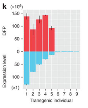
how to draw this pic - common x axis
31 views
Skip to first unread message


Brandon Hurr
Apr 15, 2014, 9:54:16 AM4/15/14
to Youhuang Bai, ggplot2
Can you provide an example data frame of this data in dput() format?
I would guess you could do it using two layers of geom_bar and modifying your axis label with a lot of spaces (but this would be manual so you couldn't do it reproducibly unless your axes were always the same).
--
--
You received this message because you are subscribed to the ggplot2 mailing list.
Please provide a reproducible example: https://github.com/hadley/devtools/wiki/Reproducibility
To post: email ggp...@googlegroups.com
To unsubscribe: email ggplot2+u...@googlegroups.com
More options: http://groups.google.com/group/ggplot2
---
You received this message because you are subscribed to the Google Groups "ggplot2" group.
To unsubscribe from this group and stop receiving emails from it, send an email to ggplot2+u...@googlegroups.com.
For more options, visit https://groups.google.com/d/optout.

Sylo Sam
Apr 15, 2014, 3:38:18 PM4/15/14
to ggp...@googlegroups.com
Hi group,
I have three columns -
Continent as column V3, Tobacco consumption (Male) as column V72, and Tobacco
consumption (Female) as column V73.
boxplot(food$V72 ~ food$V3)
gives the continent wise box plot of Tobacco consumption (Male) and
boxplot(food$V73 ~ food$V3) gives the continent wise box plot of Tobacco
consumption (Female).
But I want a box plot of
continent wise Male Vs Female Tobacco consumption. If anybody know the code,
pls help.
Thanks,
Sam

Roman Luštrik
Apr 15, 2014, 4:09:04 PM4/15/14
to Sylo Sam, ggp...@googlegroups.com
Can you provide a reproducible example? Here are a few tips on how to do that:
Cheers,
Roman
--
--
You received this message because you are subscribed to the ggplot2 mailing list.
Please provide a reproducible example: https://github.com/hadley/devtools/wiki/Reproducibility
To post: email ggp...@googlegroups.com
To unsubscribe: email ggplot2+u...@googlegroups.com
More options: http://groups.google.com/group/ggplot2
---
You received this message because you are subscribed to the Google Groups "ggplot2" group.
To unsubscribe from this group and stop receiving emails from it, send an email to ggplot2+u...@googlegroups.com.
For more options, visit https://groups.google.com/d/optout.
In God we trust, all others bring data.

Dennis Murphy
Apr 15, 2014, 6:29:25 PM4/15/14
to Sylo Sam, ggp...@googlegroups.com
1. This is a ggplot2 list, but the code you offered is from base graphics.
2. Reading deeply between the lines:
DF <- subset(food, select = c("V3", "V72", "V73")
names(DF) <- c("continent", "male", "female")
library(reshape2)
library(ggplot2)
DFm <- melt(DF, id.vars = "continent", variable.name = "gender")
# All on one plot
ggplot(DFm, aes(x = continent, y = value, fill = gender)) +
geom_boxplot(position = position_dodge(width = 0.8))
# Assuming continent is a factor, an alternative is
# to facet by continent:
ggplot(DFm, aes(x = gender, y = value)) +
geom_boxplot() +
facet_wrap(~ continent)
Untested in the absence of a reproducible example. Caveat emptor.
Dennis
Reply all
Reply to author
Forward
0 new messages