Second y-axis on a log scale?
981 views
Skip to first unread message

neil.christo...@gmail.com
Mar 21, 2018, 11:17:30 AM3/21/18
to ggplot2
Hello,
I was curious whether there is any way to make a second y-axis that is scaled differently from the first. I am doing PK/PD modeling and it's usual to plot two dependent variables vs time, but only one should be on a log scale. Appreciate the time!

Sam Albers
Mar 21, 2018, 12:10:57 PM3/21/18
to neil.christo...@gmail.com, ggplot2
HI Neil,
It might help if you were able to provide an example that illustrates the plot you are trying to create.
A word of caution though - two y-axes (and especially one that is scaled differently) are typically frowned (even scowled?) upon in the ggplot2 world for very good reason. These types of plots can be very misleading. A common accepted usage is plotting data with two different units on each axis (think feet and metres; Celsius and Fahrenheit). From what you are describing, you might be trying to do something that falls into the former category.
ggplot2 offers extremely flexible methods for faceting that might be appropriate here.
HTH,
Sam
On Wed, Mar 21, 2018 at 8:02 AM, <neil.christo...@gmail.com> wrote:
Hello,I was curious whether there is any way to make a second y-axis that is scaled differently from the first. I am doing PK/PD modeling and it's usual to plot two dependent variables vs time, but only one should be on a log scale. Appreciate the time!
--
--
You received this message because you are subscribed to the ggplot2 mailing list.
Please provide a reproducible example: https://github.com/hadley/devtools/wiki/Reproducibility
To post: email ggp...@googlegroups.com
To unsubscribe: email ggplot2+unsubscribe@googlegroups.com
More options: http://groups.google.com/group/ggplot2
---
You received this message because you are subscribed to the Google Groups "ggplot2" group.
To unsubscribe from this group and stop receiving emails from it, send an email to ggplot2+unsubscribe@googlegroups.com.
For more options, visit https://groups.google.com/d/optout.

Alexander Stevens
Mar 21, 2018, 12:46:32 PM3/21/18
to neil.christo...@gmail.com, ggplot2
There is a command for a second axis - I haven’t used it in a awhile but it looks something like this:
scale_x_continuous(sec.axis = sec_axis(trans = ~.*0.01361+0.51380, name = "Event Time",
breaks = c(0.00, 0.25,0.50,0.75,1.0)), name = "Postnatal day”,
breaks = c(0,5,10,15,20,30,45,160))
Good luck.
Alex
On Mar 21, 2018, at 8:02 AM, neil.christo...@gmail.com wrote:
Hello,
I was curious whether there is any way to make a second y-axis that is scaled differently from the first. I am doing PK/PD modeling and it's usual to plot two dependent variables vs time, but only one should be on a log scale. Appreciate the time!
--
--
You received this message because you are subscribed to the ggplot2 mailing list.
Please provide a reproducible example: https://github.com/hadley/devtools/wiki/Reproducibility
To post: email ggp...@googlegroups.com
To unsubscribe: email ggplot2+u...@googlegroups.com
More options: http://groups.google.com/group/ggplot2
---
You received this message because you are subscribed to the Google Groups "ggplot2" group.
To unsubscribe from this group and stop receiving emails from it, send an email to ggplot2+u...@googlegroups.com.
neil.christo...@gmail.com
Mar 21, 2018, 12:58:58 PM3/21/18
to ggplot2
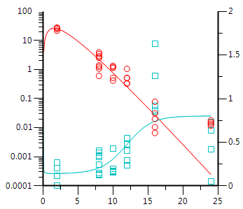
This is the type of graph I'm trying to replicate. I'd like to do this in R with ggplot2. I am aware that there are decisions made in the grammar of ggplot based on moral and aesthetic reasons. However, this is a common and central type of graph that is used in PK/PD modeling, one that's built into all already made programs that do it, so I would be surprised if this is not allowed.
Best,
Chris
On Wednesday, March 21, 2018 at 12:10:57 PM UTC-4, Sam wrote:
HI Neil,It might help if you were able to provide an example that illustrates the plot you are trying to create.A word of caution though - two y-axes (and especially one that is scaled differently) are typically frowned (even scowled?) upon in the ggplot2 world for very good reason. These types of plots can be very misleading. A common accepted usage is plotting data with two different units on each axis (think feet and metres; Celsius and Fahrenheit). From what you are describing, you might be trying to do something that falls into the former category.ggplot2 offers extremely flexible methods for faceting that might be appropriate here.HTH,Sam
On Wed, Mar 21, 2018 at 8:02 AM, <neil.christo...@gmail.com> wrote:
Hello,I was curious whether there is any way to make a second y-axis that is scaled differently from the first. I am doing PK/PD modeling and it's usual to plot two dependent variables vs time, but only one should be on a log scale. Appreciate the time!
--
--
You received this message because you are subscribed to the ggplot2 mailing list.
Please provide a reproducible example: https://github.com/hadley/devtools/wiki/Reproducibility
To post: email ggp...@googlegroups.com
To unsubscribe: email ggplot2+u...@googlegroups.com
More options: http://groups.google.com/group/ggplot2
---
You received this message because you are subscribed to the Google Groups "ggplot2" group.
To unsubscribe from this group and stop receiving emails from it, send an email to ggplot2+u...@googlegroups.com.
neil.christo...@gmail.com
Mar 21, 2018, 4:19:25 PM3/21/18
to ggplot2
Hi,
This is my current code:
ggplot(data, aes(x=Time, y = Indirect_Effect)) +
geom_point(aes(y= Concentration/10, stat = "summary", fun.y = mean,
na.rm = TRUE) +
geom_point(aes(y=Indirect_Effect), stat = "summary",
fun.y = mean, na.rm = TRUE) +
scale_y_continuous(sec.axis = sec_axis(~.*10, name = "Concentration (µM)")) +
facet_wrap(~Study) +
labs(y="Indirect_Effect",
x="Time (hrs)",
colour = "Parameter") +
xlim(0,25) +
geom_hline(aes(yintercept = 1), color = "cyan",
linetype = "dashed") +
geom_line(aes(y= Concentration/10), stat = "summary",
fun.y = mean, na.rm = TRUE) +
geom_line(aes(y=Indirect_Effect), stat = "summary",
fun.y = mean, na.rm = TRUE) +
stat_summary(aes(y = Indirect_Effect),
fun.data = mean_se, geom = "errorbar") +
stat_summary(aes(y = Concentration/10),
fun.data = mean_se, geom = "errorbar")
This issue with sec_axis is that it does not accept non-monotonous transformations. If I try ~log10(.) as part of the transformation argument, it returns an error:
Error in f(..., self = self) :
transformation for secondary axes must be monotonous
Thanks,
Chris
On Wednesday, March 21, 2018 at 12:46:32 PM UTC-4, stevenal wrote:
There is a command for a second axis - I haven’t used it in a awhile but it looks something like this:
scale_x_continuous(sec.axis = sec_axis(trans = ~.*0.01361+0.51380, name = "Event Time",breaks = c(0.00, 0.25,0.50,0.75,1.0)), name = "Postnatal day”,breaks = c(0,5,10,15,20,30,45,160))
Good luck.
Alex

Brandon Hurr
Mar 21, 2018, 8:44:41 PM3/21/18
to neil.christo...@gmail.com, ggplot2
The code is somewhat helpful... could you also give us some sample data?
I did find this: https://stackoverflow.com/questions/44589490/using-ggplots-sec-axis-with-a-non-monotonic-transformation
They might help with getting it to work.
HTH
B
To unsubscribe: email ggplot2+unsubscribe@googlegroups.com
More options: http://groups.google.com/group/ggplot2
---
You received this message because you are subscribed to the Google Groups "ggplot2" group.
To unsubscribe from this group and stop receiving emails from it, send an email to ggplot2+unsubscribe@googlegroups.com.
Sam Albers
Mar 22, 2018, 8:01:05 AM3/22/18
to neil.christo...@gmail.com, ggplot2
Hi Neil,
Here is a much more succinct distillation of why working with plots with separate y scales can be problematic: https://stackoverflow.com/a/3101876/5596534
I have noticed that the defense of two y-axis plots is usually of the "other people do it" variety which I think dodges the point that they are misleading. Whatever the case, sec_axis is implemented in ggplot2 and Alexander's approach should get you there.
Good luck!
Sam
To unsubscribe: email ggplot2+unsubscribe@googlegroups.com
More options: http://groups.google.com/group/ggplot2
---
You received this message because you are subscribed to the Google Groups "ggplot2" group.
To unsubscribe from this group and stop receiving emails from it, send an email to ggplot2+unsubscribe@googlegroups.com.

Priya Agarwal
Nov 5, 2019, 9:36:11 AM11/5/19
to ggplot2
I need to make a similar graph like you posted. Could you let me know how you resolve your issue?
One Yaxis in linear and one in log scale?
Reply all
Reply to author
Forward
0 new messages