scatter plot with random factor in mixed model

anvar sour
Dear all,
Hi,
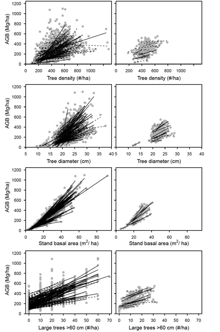
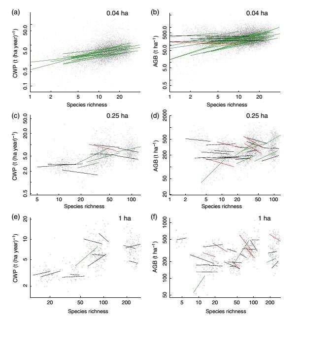
I used mixed model regression (LMM) with some random factors (Sites, Disturbances, Plant community types) to evaluate how aboveground biomass (AGB) changes is determined by biotic (Plant coverage, species richness and evenness) and some abiotic factors across 35 sites, 5 disturbance intensities and 18 Plant community types. now I want to show bivariate relationship between aboveground biomass (AGB) with plant richness (S), Plant coverage (C), Evenness (E), and some environmental factors. as mentioned I have 35 sites (as a random factor), that in bivariate relationships (for example between AGB and C, or AGB with C) I want to show significant sites (among 35 site) with continuous lines and non-significant sites with dashed lines in single graph or if be in different color types. But I do not know how I can do that by ggplot2.
I attached two sample graphs that are same with my idea.
Thanks in advance for any help.
Best Regards,
Anvar,

Crump, Ron
most of what you have written is not really relevant to the plotting
problem. Of more help would be some example data and the ggplot code you
have got so far.
Look at ?geom_line, particularly the linetype aesthetic (set the linotype
to be controlled by a TRUE/FALSE is/isn't significant) and maybe
?scale_linetype_discrete or ?scale_linetype_manual to set specific line
types for the signif/non-signif lines.
Ron.
anvar sour

Hadley Wickham
Hadley
> --
> You received this message because you are subscribed to the ggplot2 mailing
> list.
> Please provide a reproducible example:
> https://github.com/hadley/devtools/wiki/Reproducibility
>
> To post: email ggp...@googlegroups.com
> To unsubscribe: email ggplot2+u...@googlegroups.com
> More options: http://groups.google.com/group/ggplot2
>
> ---
> You received this message because you are subscribed to the Google Groups
> "ggplot2" group.
> To unsubscribe from this group and stop receiving emails from it, send an
> email to ggplot2+u...@googlegroups.com.
> For more options, visit https://groups.google.com/d/optout.
--
http://hadley.nz
anvar sour
anvar sour

Brandon Hurr
anvar sour
anvar sour
Crump, Ron
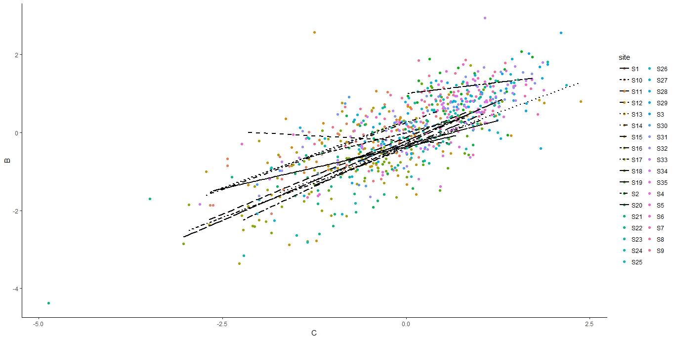
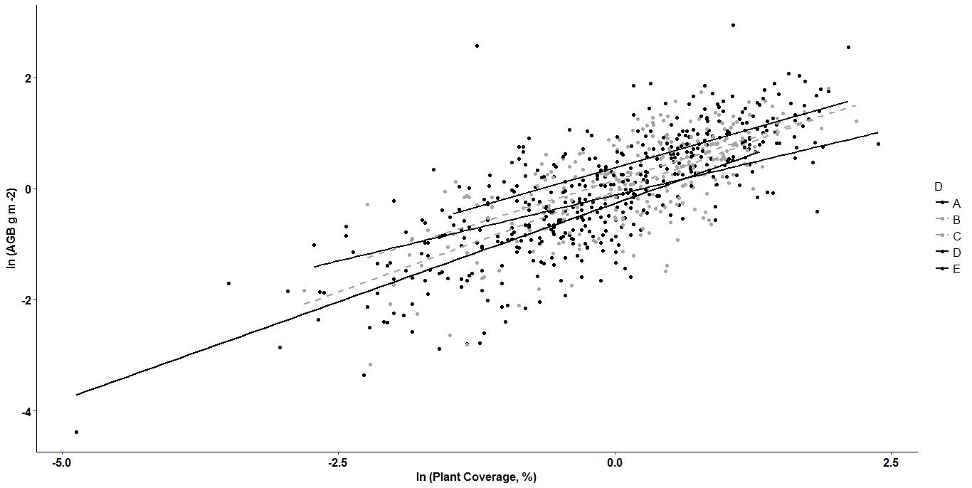
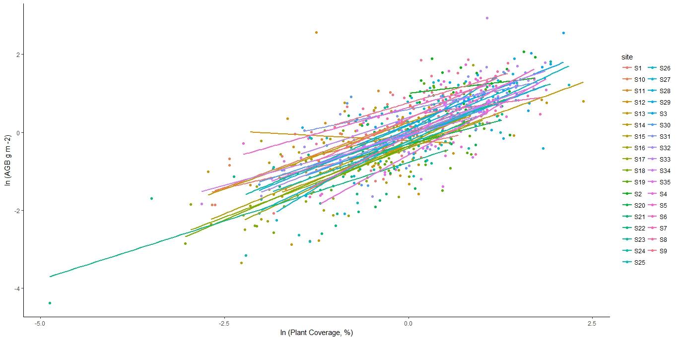
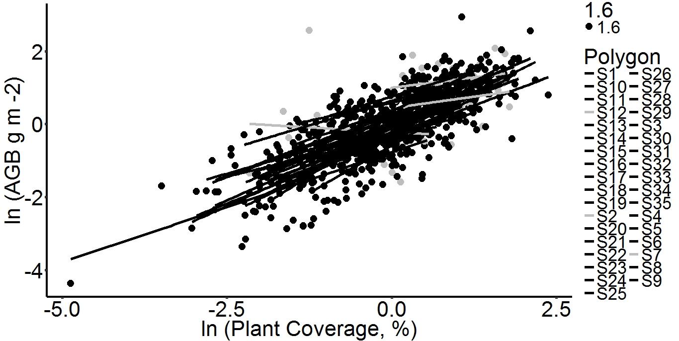
>I am trying to scatter plot between biomass (B) and Coverage (C) across
>35 sites, I want to fit regression lines in each site separately.
>I want to show regression lines in two categories (significant and non
>significant, significant with solid and non significant in dashed type)
>but points be the same for all 35 sites.
>here is my codes: in following codes grey color related to the non
>significant regression and black color for significant regression.
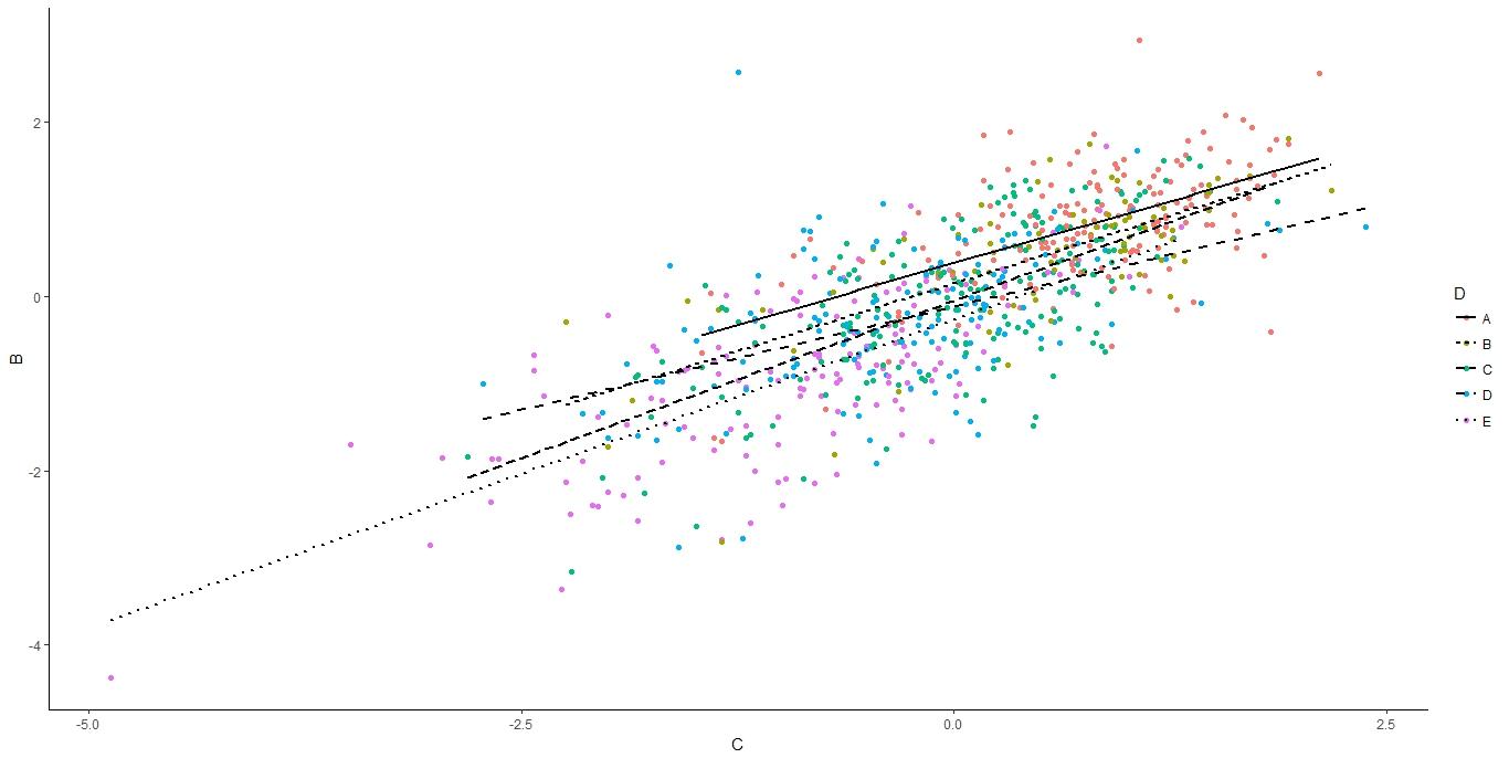
geom_smooth(), plot the predictions from your model"?
If you do this you wouldn't need to specify those 35 colours (although
I'm not sure that you need to anyway, as I think was also pointed out
elsewhere).
But, and this is a big but, if the model you are using outside of this
ggplot call does have a random factor in it (I presume site is the factor
fitted as a random effect), then this geom_smooth with lm is not a plot of
this model (as site would be fixed).
However, to stop the colour being applied to the geom_point as well as the
geom_line, take the colour=site out of the ggplot aesthetic and put it in
the geom_smooth aesthetic only. And as you are specifying a single point
size rather than mapping a variable to size, the size=1.6 should not be
inside an aes call for geom_point.
Ron.