geom_rect/facet_wrap
737 views
Skip to first unread message

Emperorfish
Dec 22, 2016, 2:13:19 AM12/22/16
to ggplot2
Hi
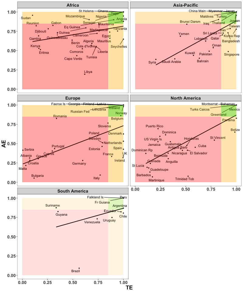
Im using ggplot2 Version: 2.2.0.9000 and trying to use geom_rect with a facet_wrap, see attached. However one of the images colours is not the same as the rest? Any idea why this would be and how could I fix it?
Here is my code:
ggplot(subset(table4, era == "2000s"),aes(TE,AE)) +
geom_smooth(method='lm',formula=y~x, se=FALSE,colour="black")+geom_point(size=1)+geom_text_repel(aes(label=Country))+facet_wrap(~Rname, ncol=2)+ coord_cartesian(ylim=c(0,1))+mytheme + geom_rect(aes(xmax=1, xmin=0.85, ymax=0.85, ymin=0), alpha=0.01, fill="orange")+ geom_rect(aes(xmax=1, xmin=0, ymax=1, ymin=0.85), fill="orange",alpha=0.01)+
geom_rect(aes(xmax=1, xmin=0.85, ymax=1, ymin=0.85), fill="green",alpha=0.01)+geom_rect(aes(xmax=0, xmin=0.85, ymax=0, ymin=0.85), fill="red",alpha=0.01)
Thanks in advance.

Crump, Ron
Dec 22, 2016, 4:06:30 AM12/22/16
to Emperorfish, ggplot2
Hi,
>Here is my code:
And how about some data? A reproducible example? You aren't just using
ggplot, are you? Not with geom_text_repel in there.
You could make it much easier for people to help you.
Maybe whatever is in mytheme is causing the problem. Maybe it is that in
you last geom_rect xmax is less than xmin and ymax less than ymin. Hard to
tell without some data and a reproducible example to play with.
And if you look at your image closely, more than one facet differs.
I refer you to the link below.
>ggplot(subset(table4, era == "2000s"),aes(TE,AE)) +
> geom_smooth(method='lm',formula=y~x,
>se=FALSE,colour="black")+geom_point(size=1)+geom_text_repel(aes(label=Coun
>try))+facet_wrap(~Rname, ncol=2)+ coord_cartesian(ylim=c(0,1))+mytheme +
>geom_rect(aes(xmax=1, xmin=0.85, ymax=0.85, ymin=0), alpha=0.01,
>fill="orange")+
> geom_rect(aes(xmax=1, xmin=0, ymax=1, ymin=0.85),
>fill="orange",alpha=0.01)+
> geom_rect(aes(xmax=1, xmin=0.85, ymax=1, ymin=0.85),
>fill="green",alpha=0.01)+geom_rect(aes(xmax=0, xmin=0.85, ymax=0,
>ymin=0.85), fill="red",alpha=0.01)
>Please provide a reproducible example:
>https://github.com/hadley/devtools/wiki/Reproducibility
>Here is my code:
And how about some data? A reproducible example? You aren't just using
ggplot, are you? Not with geom_text_repel in there.
You could make it much easier for people to help you.
Maybe whatever is in mytheme is causing the problem. Maybe it is that in
you last geom_rect xmax is less than xmin and ymax less than ymin. Hard to
tell without some data and a reproducible example to play with.
And if you look at your image closely, more than one facet differs.
I refer you to the link below.
>ggplot(subset(table4, era == "2000s"),aes(TE,AE)) +
> geom_smooth(method='lm',formula=y~x,
>se=FALSE,colour="black")+geom_point(size=1)+geom_text_repel(aes(label=Coun
>try))+facet_wrap(~Rname, ncol=2)+ coord_cartesian(ylim=c(0,1))+mytheme +
>geom_rect(aes(xmax=1, xmin=0.85, ymax=0.85, ymin=0), alpha=0.01,
>fill="orange")+
> geom_rect(aes(xmax=1, xmin=0, ymax=1, ymin=0.85),
>fill="orange",alpha=0.01)+
> geom_rect(aes(xmax=1, xmin=0.85, ymax=1, ymin=0.85),
>fill="green",alpha=0.01)+geom_rect(aes(xmax=0, xmin=0.85, ymax=0,
>ymin=0.85), fill="red",alpha=0.01)
>https://github.com/hadley/devtools/wiki/Reproducibility
Emperorfish
Dec 22, 2016, 5:13:15 AM12/22/16
to ggplot2
With a reproducible example...
library(ggrepel) #0.6.5
library(ggplot2) #2.2.0.9000
N <- 100
df <- data.frame(Country = 1:N, AE = runif(n = N) , TE=runif(n = N), Rname = sample(letters[1:5], size = N, replace = TRUE))
ggplot(df,aes(TE,AE)) + geom_rect(aes(xmax=1, xmin=0.85, ymax=0.85, ymin=0), alpha=0.01, fill="orange")+ geom_rect(aes(xmax=1, xmin=0, ymax=1, ymin=0.85), fill="orange",alpha=0.01)+
geom_rect(aes(xmax=1, xmin=0.85, ymax=1, ymin=0.85), fill="green",alpha=0.01)+geom_rect(aes(xmax=0.85, xmin=0, ymax=0.85, ymin=0), fill="red",alpha=0.01)+
Crump, Ron
Dec 22, 2016, 5:32:03 AM12/22/16
to Emperorfish, ggplot2
Hi.
>With a reproducible example...
Thanks. I think I have a solution.
People often mention (on here and R-help) that you should avoid naming
variables the same as R functions. I've taken note and try not to do it
myself, but I had never actually seen any problem manifest itself. Until
this morning.
I think if you just give your data.frame a different name (I used DF) it
will work. df is a density function.
Regards,
Ron.
>With a reproducible example...
Thanks. I think I have a solution.
variables the same as R functions. I've taken note and try not to do it
myself, but I had never actually seen any problem manifest itself. Until
this morning.
I think if you just give your data.frame a different name (I used DF) it
will work. df is a density function.
Regards,
Ron.
Crump, Ron
Dec 22, 2016, 6:29:06 AM12/22/16
to Emperorfish, ggplot2
>Thanks Ron
>I did try that but it produced this (attached):
>Colours are still different...
it to look right, but it definitely did.
Ron.

eipi10
Dec 22, 2016, 9:02:09 PM12/22/16
to ggplot2
I think what's happening is that because you're using geom_rect, the rectangle is getting overplotted multiple times, once for each time a given level of Rname is repeated. The shading varies because there are different numbers of rows for each level of Rname, and therefore different amounts of overplotting. Instead of geom_rect, use annotate.
The thing tipped me off (since I didn't initially notice the use of `geom_rect` instead of `annotate`) was the use of `alpha=0.01`. Such a small alpha value shouldn't have shown up as dark as it did. Then when I changed to `alpha=0.1`, the color was totally opaque.
First, look at number of rows for each level of Rname:
a b c d e
23 20 19 19 19
Here's the updated code:
The thing tipped me off (since I didn't initially notice the use of `geom_rect` instead of `annotate`) was the use of `alpha=0.01`. Such a small alpha value shouldn't have shown up as dark as it did. Then when I changed to `alpha=0.1`, the color was totally opaque.
First, look at number of rows for each level of Rname:
table(df$Rname)23 20 19 19 19
Here's the updated code:
ggplot(df,aes(TE,AE)) +
  annotate(geom="rect", xmax=1, xmin=0.85, ymax=0.85, ymin=0, fill="orange", alpha=0.2) +
  annotate(geom="rect", xmax=0.85, xmin=0, ymax=1, ymin=0.85, fill="orange", alpha=0.2) +  # Changed xmax to 0.85 here also
  annotate(geom="rect", xmax=1, xmin=0.85, ymax=1, ymin=0.85, fill="green", alpha=0.2) +
  annotate(geom="rect", xmax=0.85, xmin=0, ymax=0.85, ymin=0, fill="red", alpha=0.2) +
  geom_smooth(method='lm',formula=y~x, se=FALSE,colour="black") +
  geom_point(size=1) +
  geom_text_repel(aes(label=Country)) +
  facet_wrap(~Rname, ncol=2) +
  coord_cartesian(ylim=c(0,1)) +
theme_bw() # Added this to get rid of grey background so I could make sure colors were righteipi10
Dec 23, 2016, 11:06:29 AM12/23/16
to ggplot2
You can also add the background rectangles with a single call to annotate by supplying vectors with the relevant coordinates and colors:
annotate(geom="rect", xmin=c(0.85,0,0.85,0.85), xmax=c(1,0.85,1,0),
ymin=c(0,0.85,0.85,0), ymax=c(0.85,1,1,0.85),
fill=c("orange","orange","green","red"), alpha=0.2)
annotate(geom="rect", xmin=c(0.85,0,0.85,0.85), xmax=c(1,0.85,1,0),
ymin=c(0,0.85,0.85,0), ymax=c(0.85,1,1,0.85),
fill=c("orange","orange","green","red"), alpha=0.2)
Reply all
Reply to author
Forward
0 new messages