how to make a "grouped" and "stacked" barplot?
7,616 views
Skip to first unread message

Zongtai Qi
Aug 9, 2014, 3:37:39 PM8/9/14
to ggplot2
Hello ggplot2 supper users,
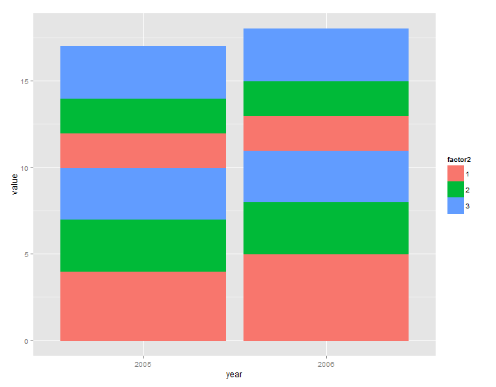
I am trying to make a "grouped" and "stacked" barplot using ggplot2 but ended up making either a grouped barplot or a stacked barplot. Anyone know how to combine these two features?
Here is the data:
| year | factor1 | factor2 | value |
| 2005 | A | 1 | 4 |
| 2005 | A | 2 | 3 |
| 2005 | A | 3 | 3 |
| 2005 | B | 1 | 2 |
| 2005 | B | 2 | 2 |
| 2005 | B | 3 | 3 |
| 2006 | A | 1 | 5 |
| 2006 | A | 2 | 3 |
| 2006 | A | 3 | 3 |
| 2006 | B | 1 | 2 |
| 2006 | B | 2 | 2 |
| 2006 | B | 3 | 3 |
I want to group by year and factor1. At the same time, I need to stack by factor 2.
The code I have tried are:
p <- ggplot(data,aes(x=year, y=value, fill=factor2, group=factor1, color=factor2))
p + geom_bar(stat='identity',postition='dodge') +
scale_x_discrete (limits = c('2005','2006'))
This gives me just the stacked barplot (shown below). I need to further break the barplot by factor1 for each year.
Anyone can help me on this?
Thanks,
Zongtai

Tom Philippi
Aug 9, 2014, 4:40:42 PM8/9/14
to Zongtai Qi, ggplot2
Not knowing exactly what you want it to look like, my simple answer is to facet by year, and make x=factor1 in your aesthetic.
If that's not what you want, please provide better explanation of what you want it to look like.
Tom 2
--
--
You received this message because you are subscribed to the ggplot2 mailing list.
Please provide a reproducible example: https://github.com/hadley/devtools/wiki/Reproducibility
To post: email ggp...@googlegroups.com
To unsubscribe: email ggplot2+u...@googlegroups.com
More options: http://groups.google.com/group/ggplot2
---
You received this message because you are subscribed to the Google Groups "ggplot2" group.
To unsubscribe from this group and stop receiving emails from it, send an email to ggplot2+u...@googlegroups.com.
For more options, visit https://groups.google.com/d/optout.
Zongtai Qi
Aug 9, 2014, 5:41:47 PM8/9/14
to Tom Philippi, ggplot2
Hi Tom,
Thanks for your response.
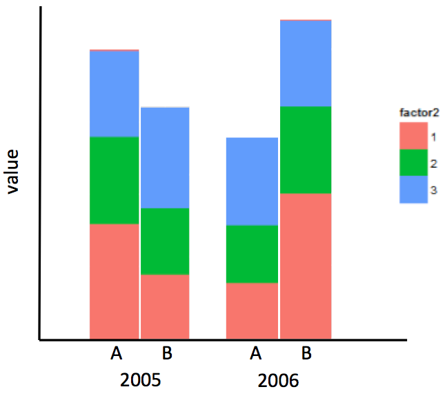
Facet by year is actually not what I want. Sorry for not explaining that clearly. Below is the graph I would like to have:
I made it in the powerpoint.
Thanks,
Zongtai

Dennis Murphy
Aug 9, 2014, 8:13:02 PM8/9/14
to Zongtai Qi, ggplot2
The simplest way to do this in ggplot2 is to follow Tom's advice about faceting by year:
# The way you should have presented your data, output from the dput() function
DF <- structure(list(year = c(2005L, 2005L, 2005L, 2005L, 2005L, 2005L,
2006L, 2006L, 2006L, 2006L, 2006L, 2006L), factor1 = structure(c(1L,
1L, 1L, 2L, 2L, 2L, 1L, 1L, 1L, 2L, 2L, 2L), .Label = c("A",
"B"), class = "factor"), factor2 = structure(c(1L, 2L, 3L, 1L,
2L, 3L, 1L, 2L, 3L, 1L, 2L, 3L), .Label = c("1", "2", "3"), class = "factor"),
value = c(4L, 3L, 3L, 2L, 2L, 3L, 5L, 3L, 3L, 2L, 2L, 3L)), .Names = c("year",
"factor1", "factor2", "value"), row.names = c(NA, -12L), class = "data.frame")
library(ggplot2)
ggplot(DF, aes(x = factor1, y = value, fill = factor2)) +
theme_bw() +
geom_histogram(stat = "identity", position = "stack") +
facet_wrap(~ year) +
theme(panel.margin = grid::unit(0, "lines"))
Why was it necessary to point out dput()? This was the output when I copied and pasted the data from your e-mail into R using read.table():
# read.table(header = TRUE, sep = "\t", text = "
# <your data copied/pasted here>
# ")
yearfactor1factor2value
1 2005A14
2 2005A23
3 2005A33
4 2005B12
5 2005B22
6 2005B33
7 2006A15
8 2006A23
9 2006A33
10 2006B12
11 2006B22
12 2006B33
This is why you don't copy and paste data into an e-mail that goes to a text-based list. The correct way to do it is to call dput() on your data object and paste its output into your e-mail, as I did above. For example, I kept your object in a data frame DF, so to get a text representation of the object, type
dput(DF)
which returns the part above starting with structure(. It took me six tries of space insertions to finally get your data read in; it should not have been necessary to do that.
To get the histogram as shown in your Excel graph requires a bit more work. Here's one attempt: it requires removing the legend in the left plot, the y-axis information in the right plot and then making some adjustments in plot margins to more or less equalize the widths of the bars.It isn't an aesthetic masterpiece, but it's an OK first draft.
p1 <- ggplot(subset(DF, year = 2005),
aes(x = factor1, y = value, fill = factor2)) +
theme_bw() +
geom_histogram(stat = "identity", position = "stack") +
xlab("2005") + scale_fill_hue(guide = "none") +
theme(plot.margin = unit(c(1, 0.5, 0.5, 0.5), "lines"))
p2 <- ggplot(subset(DF, year = 2006),
aes(x = factor1, y = value, fill = factor2)) +
theme_bw() +
geom_histogram(stat = "identity", position = "stack") +
labs(x = "2006", y = NULL) +
theme(axis.text.y = element_blank(),
axis.ticks.y = element_blank(),
legend.position = c(0.85, 0.9),
legend.text = element_text(size = rel(1)),
legend.title = element_text(size = rel(1.2)),
plot.margin = unit(c(1, 1.5, 0.5, 1.5), "lines"))
# library(gridExtra)
grid.arrange(p1, p2, nrow = 1)
I put the legend inside the second plot to avoid having to mess around too much with plot margins and to avoid having to use the gtable package to grab the legend and position it on the graphics page. There are a few posts floating around, mostly on StackOverflow, showing how to do such things if you're determined to have a legend on the right, but I'll let you chase that if you're inclined to do so.
Dennis

Ben Bond-Lamberty
Aug 9, 2014, 9:37:46 PM8/9/14
to ggplot2
A much simpler solution, though admittedly a bit of a hack, would be something like this:
ggplot(DF,aes(paste(year,factor1),value))+geom_bar(aes(fill=factor2),position="stack")
Ben
Zongtai Qi
Aug 10, 2014, 1:57:19 PM8/10/14
to Ben Bond-Lamberty, djm...@gmail.com, ggplot2
Hi Ben and Dennis,
Thank you so much for all the helps! You guys are awesome! I will never figure out how to make that plot myself.
For Ben,
Your code works pretty well! It is amazing! One question is that all the bars are evenly distributed across the x-axis. I want to make bars in 2005 as a group and 2006 as another group. Better physically be separated on the plot so people can easily scan by year. Is there anyway to do that? I am new to ggplot2, so please forgive me if my question is just "stupid"...
---------------------------------------------------
For Dennis,
The dput() function you mentioned is really the way I should have presented my data. Will do that for sure next time. It seems that doing by faceting is much simpler and gives me what I want. Although not exactly, enough to be satisfied. Your second attempt that tries to merge two plots into one is a great idea. I haven't thought about or even imagined that I can merge plots in R. Good to know that. As the gridExtra is new to me, I probably just stick to the "facet" idea for now.
Ben's code works fantastically and doesn't require "facet" but as I mentioned above the problem is all the bars are evenly distributed across the x-axis so that it is hard to read by years. I just asked him and see if we can position or group the bars by year. If possible, that is another way to go!
Thanks,
Zongtai
Zongtai
Zongtai Qi
Aug 10, 2014, 2:55:23 PM8/10/14
to djm...@gmail.com, ggplot2
Hi Dennis,
I forget one thing to ask. If using "facet", how can I control the number of panels per row.
Here is the data from dput() function. It has 8 years' data, and the previous one has only 2 years.
structure(list(year = structure(c(1L, 1L, 1L, 1L, 1L, 1L, 2L,
2L, 2L, 2L, 2L, 2L, 3L, 3L, 3L, 3L, 3L, 3L, 4L, 4L, 4L, 4L, 4L,
4L, 5L, 5L, 5L, 5L, 5L, 5L, 6L, 6L, 6L, 6L, 6L, 6L, 7L, 7L, 7L,
7L, 7L, 7L), .Label = c("2005", "2006", "2007", "2008", "2009",
"2010", "2011"), class = "factor"), factor1 = structure(c(1L,
1L, 1L, 2L, 2L, 2L, 1L, 1L, 1L, 2L, 2L, 2L, 1L, 1L, 1L, 2L, 2L,
2L, 1L, 1L, 1L, 2L, 2L, 2L, 1L, 1L, 1L, 2L, 2L, 2L, 1L, 1L, 1L,
2L, 2L, 2L, 1L, 1L, 1L, 2L, 2L, 2L), .Label = c("A", "B"), class = "factor"),
factor2 = structure(c(1L, 2L, 3L, 1L, 2L, 3L, 1L, 2L, 3L,
1L, 2L, 3L, 1L, 2L, 3L, 1L, 2L, 3L, 1L, 2L, 3L, 1L, 2L, 3L,
1L, 2L, 3L, 1L, 2L, 3L, 1L, 2L, 3L, 1L, 2L, 3L, 1L, 2L, 3L,
1L, 2L, 3L), .Label = c("1", "2", "3"), class = "factor"),
value = c(4L, 3L, 3L, 2L, 2L, 3L, 5L, 3L, 3L, 2L, 2L, 3L,
5L, 3L, 3L, 2L, 2L, 3L, 5L, 3L, 3L, 2L, 2L, 3L, 5L, 3L, 3L,
2L, 2L, 3L, 5L, 3L, 3L, 2L, 2L, 3L, 5L, 3L, 3L, 2L, 2L, 3L
)), .Names = c("year", "factor1", "factor2", "value"), row.names = c(NA,
-42L), class = "data.frame")
The codes I use are:
ggplot(data, aes(x = factor1, y = value, fill = factor2)) +
theme_bw() +
geom_histogram(stat = "identity", position = "stack") +
facet_wrap(~ year) +
theme(panel.margin = grid::unit(0, "lines"))
The default graph is:
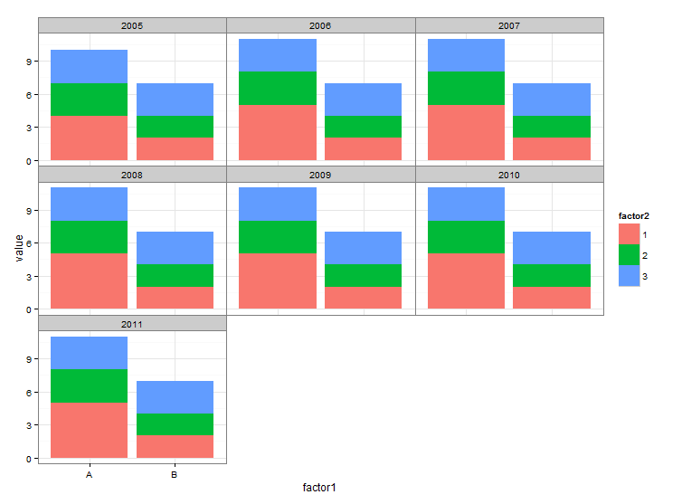
But, what I want is to plot all panels in one row. Not 3 panels per row as shown above. Do you know what parameters I have to specify in facet? I did research on the web but haven't get the things I wanted.
Thanks again,
Zongtai
Dennis Murphy
Aug 10, 2014, 4:53:25 PM8/10/14
to Zongtai Qi, ggplot2
In facet_wrap(), you'd add the argument nrow = 1. You'd probably want to control the aspect ratio of the result, though, since the default panels will be thin and tall. Here's one approach:
# Thank you for supplying data with dput() :)
DF <- structure(list(year = structure(c(1L, 1L, 1L, 1L, 1L, 1L, 2L,
2L, 2L, 2L, 2L, 2L, 3L, 3L, 3L, 3L, 3L, 3L, 4L, 4L, 4L, 4L, 4L,
4L, 5L, 5L, 5L, 5L, 5L, 5L, 6L, 6L, 6L, 6L, 6L, 6L, 7L, 7L, 7L,
7L, 7L, 7L), .Label = c("2005", "2006", "2007", "2008", "2009",
"2010", "2011"), class = "factor"), factor1 = structure(c(1L,
1L, 1L, 2L, 2L, 2L, 1L, 1L, 1L, 2L, 2L, 2L, 1L, 1L, 1L, 2L, 2L,
2L, 1L, 1L, 1L, 2L, 2L, 2L, 1L, 1L, 1L, 2L, 2L, 2L, 1L, 1L, 1L,
2L, 2L, 2L, 1L, 1L, 1L, 2L, 2L, 2L), .Label = c("A", "B"), class = "factor"),
factor2 = structure(c(1L, 2L, 3L, 1L, 2L, 3L, 1L, 2L, 3L,
1L, 2L, 3L, 1L, 2L, 3L, 1L, 2L, 3L, 1L, 2L, 3L, 1L, 2L, 3L,
1L, 2L, 3L, 1L, 2L, 3L, 1L, 2L, 3L, 1L, 2L, 3L, 1L, 2L, 3L,
1L, 2L, 3L), .Label = c("1", "2", "3"), class = "factor"),
value = c(4L, 3L, 3L, 2L, 2L, 3L, 5L, 3L, 3L, 2L, 2L, 3L,
5L, 3L, 3L, 2L, 2L, 3L, 5L, 3L, 3L, 2L, 2L, 3L, 5L, 3L, 3L,
2L, 2L, 3L, 5L, 3L, 3L, 2L, 2L, 3L, 5L, 3L, 3L, 2L, 2L, 3L
)), .Names = c("year", "factor1", "factor2", "value"), row.names = c(NA,
-42L), class = "data.frame")
library(ggplot2)
ggplot(DF, aes(x = factor1, y = value, fill = factor2)) +
theme_bw() +
geom_histogram(stat = "identity", position = "stack") +
facet_wrap(~ year, nrow = 1) +
theme(panel.margin = grid::unit(0, "lines"),
aspect.ratio = 2)
# compared to
ggplot(DF, aes(x = factor1, y = value, fill = factor2)) +
theme_bw() +
geom_histogram(stat = "identity", position = "stack") +
facet_wrap(~ year, nrow = 1) +
theme(panel.margin = grid::unit(0, "lines"))
If the modification is OK and you want to put it in a report, it's probably best to save it with ggsave() and specify height and width arguments so that you can control the amount of white space above and below the graph. See ?ggsave for details.
Dennis
Ben Bond-Lamberty
Aug 13, 2014, 2:42:03 PM8/13/14
to Zongtai Qi, Dennis Murphy, ggplot2
Hi Zongtai, sorry for the slow response--been traveling. To separate years, one option would be to use facets; another is to have dummy data that separate the years and are displayed with blank tick labels. For example:
# Create label information and add dummy data
DF$label <- paste(DF[[1]],DF[[2]] , sep="\n")
DF <- rbind(DF,data.frame(year=2005:2011,factor1="C",value=0,factor2=1,label=""))
# We want one label per year & factor1 combination, ordered correctly
labeldata <- subset(DF,factor2==1)
labeldata <- labeldata[order(labeldata$year,labeldata$factor1),]
# Plot
ggplot(DF,aes(paste0(year,"\n",factor1),value))+geom_bar(aes(fill=factor2),position="stack",stat="identity")+scale_x_discrete(labels=labeldata$label)
Dennis or others may have better ideas here.
Ben

theduke
Sep 9, 2016, 8:17:58 AM9/9/16
to ggplot2, qizo...@gmail.com, djm...@gmail.com
Old post, but for anybody interested, I created a simple beginner guide for creating grouped and stacked bar charts:

jpo...@hotmail.com
Dec 2, 2016, 6:51:43 PM12/2/16
to ggplot2, qizo...@gmail.com, djm...@gmail.com
I apologize I accidently posted the last message before I was finished.
The code I used to achieve the Rplot barplot is this:
d <- with(Alldata, Alldata[order(Julian, Sex),])
ggplot(data=Alldata, aes(x=Julian, y=Number, fill=Sex)) + geom_bar(stat="identity")
What I would like to have is a graph that compares the number of males and females captured per Julian day per year.
This would be grouped by year and Julian date with the Sex (M/F) stacked.
I was able to make a graphs using different code showing Individuals(both M and F) grouped/year.. I'd like to combine these too...
Do you have any advice of how to achieve this. ??
Thanks so much.
Reply all
Reply to author
Forward
0 new messages