Legend not showing fill and colors
49 views
Skip to first unread message

Stefanie Trop
Feb 26, 2018, 10:31:49 AM2/26/18
to ggplot2
Hi,
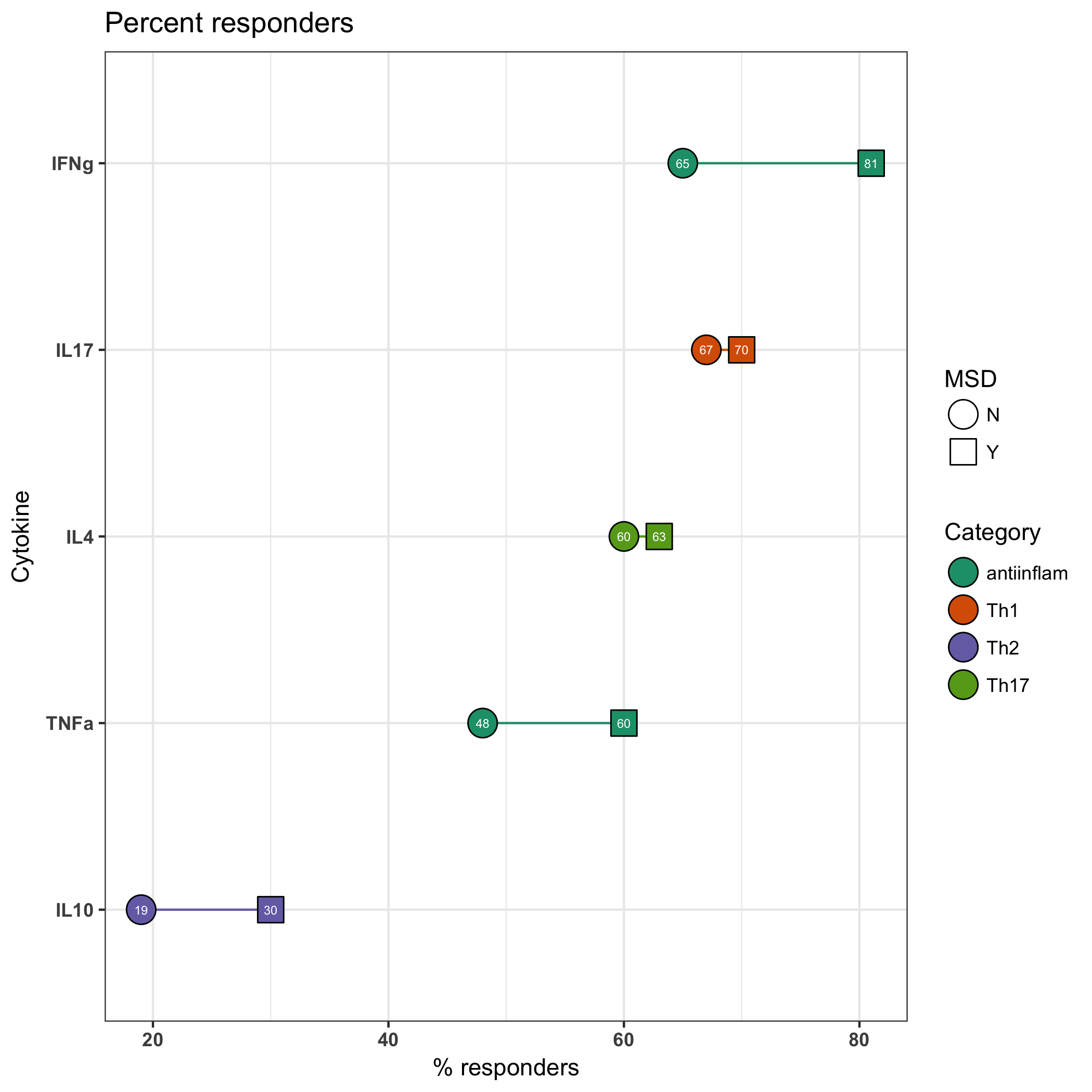
I am making a graph like below, where I am manually specifying colors (for lines) and fills (for points). It was working before, but then I made some change that made me lose the colors in the legend. Can you see what mistake I made and how to fix? ggplot(filter(forggplot), aes(reorder(cytokine, percent_res), percent_res, group = cytokine, label = percent_res))+
geom_line(aes(color = responseType))+
geom_point(aes(shape = MSD, fill = responseType), size = 6)+
scale_shape_manual(values = c(21, 22))+
scale_color_manual(values = c('#1b9e77', '#d95f02', '#7570b3', '#66a61e'),
labels = c('antiinflam', 'Th1', 'Th2', 'Th17'),
name = 'Category')+
scale_fill_manual(values = c('#1b9e77', '#d95f02', '#7570b3', '#66a61e'),
labels = c('antiinflam', 'Th1', 'Th2', 'Th17'),
name = 'Category')+
coord_flip()+
theme_bw()+
geom_text(color = 'white', size = 2, face = 'bold')+
labs(x = 'Cytokine',
y = '% responders',
title = paste('Percent responders'))+
theme(axis.text = element_text(face = 'bold'))

Brandon Hurr
Feb 26, 2018, 12:51:42 PM2/26/18
to Stefanie Trop, ggplot2
The change seems to happen when you take color = responseType out of the main ggplot() and put it only in geom_line().
library(tidyverse)
forggplot <- tibble(cytokine = rep(c("IFNg", "IL17", "IL4", "TNFa","IL10"), each = 2), responseType = rep(c('antiinflam', 'Th1', 'Th2', 'antiinflam','Th17'), each = 2), percent_res = c(65,81,67,70,60,63,48,60, 19, 30), MSD = rep(c("N", "Y"), 5) )
library(tidyverse)
forggplot <- tibble(cytokine = rep(c("IFNg", "IL17", "IL4", "TNFa","IL10"), each = 2), responseType = rep(c('antiinflam', 'Th1', 'Th2', 'antiinflam','Th17'), each = 2), percent_res = c(65,81,67,70,60,63,48,60, 19, 30), MSD = rep(c("N", "Y"), 5) )
#everything in the ggplot()
ggplot(forggplot, aes(reorder(cytokine, percent_res), percent_res, group = cytokine, color = responseType, fill = responseType, shape = MSD, label = percent_res))+
geom_line() +
geom_point(size = 6) +
geom_text(color = 'white', size = 2) +
scale_shape_manual(values = c(21, 22)) +
geom_line() +
geom_point(size = 6) +
geom_text(color = 'white', size = 2) +
scale_shape_manual(values = c(21, 22)) +
scale_color_manual(values = c('#1b9e77', '#d95f02', '#7570b3', '#66a61e')
, labels = c('antiinflam', 'Th1', 'Th2', 'Th17')
, name = 'Category') +
scale_fill_manual(values = c('#1b9e77', '#d95f02', '#7570b3', '#66a61e')
, labels = c('antiinflam', 'Th1', 'Th2', 'Th17')
, name = 'Category') +
coord_flip() +
theme_bw() +
theme_bw() +
labs(x = 'Cytokine',
y = '% responders',
title = paste('Percent responders')) +
theme(axis.text = element_text(face = 'bold'))
# only the colour not
ggplot(forggplot, aes(reorder(cytokine, percent_res), percent_res, fill = responseType, shape = MSD, group = cytokine, label = percent_res))+
geom_line(aes(colour = responseType)) +
geom_point(, size = 6) +
geom_text(color = 'white', size = 2) +
scale_shape_manual(values = c(21, 22)) +
geom_line(aes(colour = responseType)) +
geom_point(, size = 6) +
geom_text(color = 'white', size = 2) +
scale_shape_manual(values = c(21, 22)) +
scale_color_manual(values = c('#1b9e77', '#d95f02', '#7570b3', '#66a61e')
, labels = c('antiinflam', 'Th1', 'Th2', 'Th17')
, name = 'Category') +
scale_fill_manual(values = c('#1b9e77', '#d95f02', '#7570b3', '#66a61e')
, labels = c('antiinflam', 'Th1', 'Th2', 'Th17')
, name = 'Category') +
coord_flip() +
theme_bw() +
theme_bw() +
labs(x = 'Cytokine',
y = '% responders',
title = paste('Percent responders')) +
theme(axis.text = element_text(face = 'bold'))
Next time do try and attach a dataset with your code. Making one up from your data took longer than trying to understand what's going wrong with it.
--
--
You received this message because you are subscribed to the ggplot2 mailing list.
Please provide a reproducible example: https://github.com/hadley/devtools/wiki/Reproducibility
To post: email ggp...@googlegroups.com
To unsubscribe: email ggplot2+unsubscribe@googlegroups.com
More options: http://groups.google.com/group/ggplot2
---
You received this message because you are subscribed to the Google Groups "ggplot2" group.
To unsubscribe from this group and stop receiving emails from it, send an email to ggplot2+unsubscribe@googlegroups.com.
For more options, visit https://groups.google.com/d/optout.

Hadley Wickham
Feb 26, 2018, 2:10:49 PM2/26/18
to Stefanie Trop, ggplot2
I suspect it's because you're using shape = c(21, 22). You'll also
need to pass one of them to the scale by using override.aes
Hadley
--
http://hadley.nz
need to pass one of them to the scale by using override.aes
Hadley
> --
> --
> You received this message because you are subscribed to the ggplot2 mailing
> list.
> Please provide a reproducible example:
> https://github.com/hadley/devtools/wiki/Reproducibility
>
> To post: email ggp...@googlegroups.com
> To unsubscribe: email ggplot2+u...@googlegroups.com
> --
> You received this message because you are subscribed to the ggplot2 mailing
> list.
> Please provide a reproducible example:
> https://github.com/hadley/devtools/wiki/Reproducibility
>
> To post: email ggp...@googlegroups.com
> More options: http://groups.google.com/group/ggplot2
>
> ---
> You received this message because you are subscribed to the Google Groups
> "ggplot2" group.
> To unsubscribe from this group and stop receiving emails from it, send an
> email to ggplot2+u...@googlegroups.com.
>
> ---
> You received this message because you are subscribed to the Google Groups
> "ggplot2" group.
> To unsubscribe from this group and stop receiving emails from it, send an
--
http://hadley.nz
Brandon Hurr
Feb 26, 2018, 3:15:46 PM2/26/18
to Hadley Wickham, Stefanie Trop, ggplot2
Hadley and Stefanie,
Yes, that does correct the issue: ggplot(forggplot, aes(reorder(cytokine, percent_res), percent_res, group = cytokine, label = percent_res))+
geom_line(aes(colour = responseType)) +
geom_point(aes(fill = responseType, shape = MSD), size = 6) +
geom_text(color = 'white', size = 2) +
scale_shape_manual(values = c(21, 22)) +
scale_color_manual(values = c('#1b9e77', '#d95f02', '#7570b3', '#66a61e')
, labels = c('antiinflam', 'Th1', 'Th2', 'Th17')
, name = 'Category') +
, name = 'Category') +
scale_fill_manual(values = c('#1b9e77', '#d95f02', '#7570b3', '#66a61e')
, labels = c('antiinflam', 'Th1', 'Th2', 'Th17')
, name = 'Category') +
coord_flip() +
theme_bw() +
, name = 'Category') +
coord_flip() +
theme_bw() +
labs(x = 'Cytokine',
y = '% responders',
title = paste('Percent responders')) +
y = '% responders',
title = paste('Percent responders')) +
theme(axis.text = element_text(face = 'bold')) +
guides(fill = guide_legend(override.aes = list(shape = 21)))
You can specify color or fill or both and all of those print the plot as desired. guides(fill = guide_legend(override.aes = list(shape = 21)))
> To unsubscribe: email ggplot2+unsubscribe@googlegroups.com
> More options: http://groups.google.com/group/ggplot2
>
> ---
> You received this message because you are subscribed to the Google Groups
> "ggplot2" group.
> To unsubscribe from this group and stop receiving emails from it, send an
> email to ggplot2+unsubscribe@googlegroups.com.
--
--
You received this message because you are subscribed to the ggplot2 mailing list.
Please provide a reproducible example: https://github.com/hadley/devtools/wiki/Reproducibility
To post: email ggp...@googlegroups.com
To unsubscribe: email ggplot2+unsubscribe@googlegroups.com
More options: http://groups.google.com/group/ggplot2
---
You received this message because you are subscribed to the Google Groups "ggplot2" group.
To unsubscribe from this group and stop receiving emails from it, send an email to ggplot2+unsubscribe@googlegroups.com.
Stefanie Trop
Feb 26, 2018, 3:30:56 PM2/26/18
to Brandon Hurr, Hadley Wickham, ggplot2
Yes, thanks to you both! I have never used override.aes before.
Reply all
Reply to author
Forward
0 new messages