How to pile up several data curves like this?
66 views
Skip to first unread message

石浜裕太郎
Jul 31, 2017, 11:42:12 PM7/31/17
to ggplot2
Hello there,
I am a newbie for ggplot.
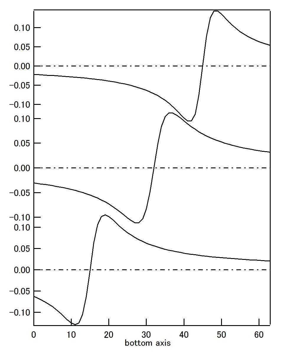
I would like to pile up data curves like attached graph.
When I tried with the following commands,
x <- 0:64
lor1 <- (x-15)/((x-15)^2+15)
lor2 <- (x-32)/((x-32)^2+20)
lor3 <- (x-45)/((x-45)^2+12)
library(ggplot2)
(a <- qplot(x, lor1))
(b <- qplot(x, lor2))
(c <- qplot(x, lor3))
library(gridExtra)
grid.arrange(c,b,a)
lor1 <- (x-15)/((x-15)^2+15)
lor2 <- (x-32)/((x-32)^2+20)
lor3 <- (x-45)/((x-45)^2+12)
library(ggplot2)
(a <- qplot(x, lor1))
(b <- qplot(x, lor2))
(c <- qplot(x, lor3))
library(gridExtra)
grid.arrange(c,b,a)
The result is different from the attached figure.
Apart from the point display, differences are
1 bottom ticks appears three times
2 separation between curves is bit too large
It would be of great help if you could suggest some URL
that explains how to contain several curves in a graph.
Suggestions about the appropriate commands to achieve
this are highly welcome!
Thanks in advance for your kind help,

Crump, Ron
Aug 1, 2017, 4:10:05 AM8/1/17
to 石浜裕太郎, ggplot2
Hi,
>I am a newbie for ggplot.
>I would like to pile up data curves like attached graph.
I'm not sure about that graph, with overlapping repeated y axes. Unless
you read the axes carefully it is quite misleading. That is, it implies
that one curve sits above another by quite a margin, whereas they are in
fact on quite similar scales but with a lag.
I presume the point of the graphic is to highlight the lag between the
maxima and minima?
If you really want to achieve the plot you sent, I think you would need to
offset the y values by some value (say 0.25 for lor2 and 0.50 for lor3),
plot them and then use custom scales to set the labels to be what you want
where you want them and theme() to adjust the grids. But I wouldn't do
that.
I would plot the three curves on a single axis and, if that doesn't show
the lag as clearly as you'd like then annotate it with horizontal lines
indicating the lags of interest.
>When I tried with the following commands,
>
>x <- 0:64
>lor1 <- (x-15)/((x-15)^2+15)
>lor2 <- (x-32)/((x-32)^2+20)
>lor3 <- (x-45)/((x-45)^2+12)
>library(ggplot2)
>(a <- qplot(x, lor1))
>(b <- qplot(x, lor2))
>(c <- qplot(x, lor3))
>library(gridExtra)
>grid.arrange(c,b,a)
# My solution, not creating the graphic you requested:
library(ggplot2)
library(grid) # we need this for the arrows later
y=c(lor1,lor2,lor3),
v=rep(c("lor1","lor2","lor3"),each=length(x)) )
# basic plot
ron_plot <- ggplot(DF)+geom_line(aes(x=x,y=y,colour=v))
#
# I'm going to use a custom grid to highlight
# the maxima and minima of the three curves
# and remove the minor grid to improve clarity
# (assuming that these points are the things of interest)
custom_x_grid <- c(0, x[which.min(lor1)],
x[which.max(lor1)], x[which.min(lor2)],
x[which.max(lor2)], x[which.min(lor3)],
x[which.max(lor3)], 60)
ron_plot <- ron_plot +
scale_x_continuous(breaks=custom_x_grid) +
theme(panel.grid.minor=element_blank())
# Add two annotations to further highlight the lags
ron_plot <- ron_plot +
annotate( 'segment',
x=x[which.max(lor1)], y=0.15,
xend=x[which.min(lor2)], yend=0.15,
arrow=arrow(ends='both',angle=90,length=unit(0.2,"cm"))) +
annotate('segment',
x=x[which.max(lor2)], y=0.15,
xend=x[which.min(lor3)], yend=0.15,
arrow=arrow(ends='both',angle=90,length=unit(0.2,"cm")))
# use black and white theme, because I like it and your example was BW.
ron_plot <- ron_plot + theme_bw()
You can view the plot at different points in this process and see what the
different functions are adding to the figure.
>The result is different from the attached figure.
>
>Apart from the point display, differences are
>
>1 bottom ticks appears three times
>2 separation between curves is bit too large
>
>It would be of great help if you could suggest some URL
>that explains how to contain several curves in a graph.
>
>Suggestions about the appropriate commands to achieve
>this are highly welcome!
As I said above, I would not recommend this, but this might get you going:
DF2 <-data.frame( x=rep(x,times=3),
y=c(lor1,lor2+0.25,lor3+0.5),
v=rep(c("lor1","lor2","lor3"),each=length(x)) )
custom_y_major <- c(0,0.25,0.50)
ggplot(DF2) +
geom_line(aes(x=x,y=y,group=v)) +
scale_y_continuous(breaks=custom_y_major,labels=c(0,0,0))
Regards,
Ron.
>I am a newbie for ggplot.
>I would like to pile up data curves like attached graph.
you read the axes carefully it is quite misleading. That is, it implies
that one curve sits above another by quite a margin, whereas they are in
fact on quite similar scales but with a lag.
I presume the point of the graphic is to highlight the lag between the
maxima and minima?
If you really want to achieve the plot you sent, I think you would need to
offset the y values by some value (say 0.25 for lor2 and 0.50 for lor3),
plot them and then use custom scales to set the labels to be what you want
where you want them and theme() to adjust the grids. But I wouldn't do
that.
I would plot the three curves on a single axis and, if that doesn't show
the lag as clearly as you'd like then annotate it with horizontal lines
indicating the lags of interest.
>When I tried with the following commands,
>
>x <- 0:64
>lor1 <- (x-15)/((x-15)^2+15)
>lor2 <- (x-32)/((x-32)^2+20)
>lor3 <- (x-45)/((x-45)^2+12)
>library(ggplot2)
>(a <- qplot(x, lor1))
>(b <- qplot(x, lor2))
>(c <- qplot(x, lor3))
>library(gridExtra)
>grid.arrange(c,b,a)
library(ggplot2)
library(grid) # we need this for the arrows later
x <- 0:64
lor1 <- (x-15)/((x-15)^2+15)
lor2 <- (x-32)/((x-32)^2+20)
lor3 <- (x-45)/((x-45)^2+12)
DF <-data.frame( x=rep(x,times=3),
lor1 <- (x-15)/((x-15)^2+15)
lor2 <- (x-32)/((x-32)^2+20)
lor3 <- (x-45)/((x-45)^2+12)
y=c(lor1,lor2,lor3),
v=rep(c("lor1","lor2","lor3"),each=length(x)) )
# basic plot
ron_plot <- ggplot(DF)+geom_line(aes(x=x,y=y,colour=v))
#
# I'm going to use a custom grid to highlight
# the maxima and minima of the three curves
# and remove the minor grid to improve clarity
# (assuming that these points are the things of interest)
custom_x_grid <- c(0, x[which.min(lor1)],
x[which.max(lor1)], x[which.min(lor2)],
x[which.max(lor2)], x[which.min(lor3)],
x[which.max(lor3)], 60)
ron_plot <- ron_plot +
scale_x_continuous(breaks=custom_x_grid) +
theme(panel.grid.minor=element_blank())
# Add two annotations to further highlight the lags
ron_plot <- ron_plot +
annotate( 'segment',
x=x[which.max(lor1)], y=0.15,
xend=x[which.min(lor2)], yend=0.15,
arrow=arrow(ends='both',angle=90,length=unit(0.2,"cm"))) +
annotate('segment',
x=x[which.max(lor2)], y=0.15,
xend=x[which.min(lor3)], yend=0.15,
arrow=arrow(ends='both',angle=90,length=unit(0.2,"cm")))
# use black and white theme, because I like it and your example was BW.
ron_plot <- ron_plot + theme_bw()
You can view the plot at different points in this process and see what the
different functions are adding to the figure.
>The result is different from the attached figure.
>
>Apart from the point display, differences are
>
>1 bottom ticks appears three times
>2 separation between curves is bit too large
>
>It would be of great help if you could suggest some URL
>that explains how to contain several curves in a graph.
>
>Suggestions about the appropriate commands to achieve
>this are highly welcome!
DF2 <-data.frame( x=rep(x,times=3),
y=c(lor1,lor2+0.25,lor3+0.5),
v=rep(c("lor1","lor2","lor3"),each=length(x)) )
custom_y_major <- c(0,0.25,0.50)
ggplot(DF2) +
geom_line(aes(x=x,y=y,group=v)) +
scale_y_continuous(breaks=custom_y_major,labels=c(0,0,0))
Regards,
Ron.
石浜裕太郎
Aug 1, 2017, 8:36:32 PM8/1/17
to ggplot2, R.E....@warwick.ac.uk
Thank you !!! Ron,
I regret about late acknowledgment, for
I was considering for long time about several options
you listed. Your info is very useful and really helpful.
Reply all
Reply to author
Forward
0 new messages