Visualizing and comparing size frequency distributions
10 views
Skip to first unread message

Matt Whalen
Aug 26, 2016, 10:03:19 AM8/26/16
to davi...@googlegroups.com
Hi D-RUG,
I'm working with several frequency distributions that I want to compare. They are size distributions of particles suspended in water before and after being exposed to filter feeding animals. What I want to do is ask whether these distributions change over time relative to a control without filter feeders. Essentially, is filter feeding by the animals I sampled size selective?
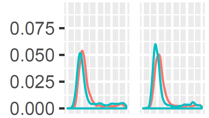
Here's a visual example:
Let's say the first panel shows the kernel density estimate of the particle size distribution from a filter feeder-free control before (green) and after (red) an experimental trial and the second panel shows the same for a treatment with a filter feeder. The x axis is cut off but goes from small to large particle sizes (the sizes are estimated using flow cytometry).
I have many of these distributions from different treatments and trials, so showing a couple dozen kernel density plots is visually overwhelming. Also, the differences between the distributions tends to be small, to my eye anyway, so there is a lot of overlap in the different panels (facets here for ggplot).
Can anyone suggest how I might better visualize the changes in size frequency relative to controls? I have tried binning data into size classes and finding the differences in each bin for each treatment, but I'm not totally satisfied with that approach. I'm also interested in a statistical test of these differences in distributions (again, relative to controls for each trial).
I would really appreciate any suggestions of strategies I might take to better visualize these data and to conduct a sensible statistical test. I've done some t-tests and mixed effects models already.
Thank you very much,
Matt
______________________________
Matt Whalen
PhD Candidate, Graduate Group in Ecology
Department of Evolution & Ecology
University of California, Davis
Bodega Marine Laboratory
Matt Whalen
PhD Candidate, Graduate Group in Ecology
Department of Evolution & Ecology
University of California, Davis
Bodega Marine Laboratory
Bodega Bay, CA 94923

Brandon Hurr
Aug 26, 2016, 10:35:06 AM8/26/16
to davi...@googlegroups.com
If I understand correctly, you want to emphasize where the two distributions are different visually. This is totally naive, but can you subtract one distribution from the other and plot the differences? Depending on your data you might have to go back to binning and subtract bins to keep things even steven.
I don't really know enough about the stats to tell you what to try there.
B
--
Check out our R resources at http://d-rug.github.io/
---
You received this message because you are subscribed to the Google Groups "Davis R Users' Group" group.
To unsubscribe from this group and stop receiving emails from it, send an email to davis-rug+unsubscribe@googlegroups.com.
Visit this group at https://groups.google.com/group/davis-rug.
For more options, visit https://groups.google.com/d/optout.

Noam Ross
Aug 26, 2016, 10:35:12 AM8/26/16
to davi...@googlegroups.com
1) Given the shape of the distributions (long-tailed), it may make sense to visualize density of the log values.
2) You could reduce one of these plots to a single value by calculating Kullback-Leibler divergence between the distributions, which measures how much of the information in one distribution is captured by the other. (Note that it is not transitive, i.e., KLD(A, B) != KLD(B, A) ), Its implemented in several R packages. I have no insight as to which is best, but the math is relatively simple so any of them is probably fine. Then you can compare these values visually across your treatments. The Kolmogorov–Smirnov statistic is another such metric, and has an associated nonparametric test.
3) Maybe a GLM on the log values, or a Gamma GLM would be appropriate?
--
Check out our R resources at http://d-rug.github.io/
---
You received this message because you are subscribed to the Google Groups "Davis R Users' Group" group.
To unsubscribe from this group and stop receiving emails from it, send an email to davis-rug+...@googlegroups.com.

Matt Whalen
Aug 26, 2016, 11:00:58 AM8/26/16
to davi...@googlegroups.com
Many thanks, Brandon and Noam. This is just what I had in mind. I'll share what I come up with.
Best,
Matt
To unsubscribe from this group and stop receiving emails from it, send an email to davis-rug+unsubscribe@googlegroups.com.
Visit this group at https://groups.google.com/group/davis-rug.
For more options, visit https://groups.google.com/d/optout.
--
Check out our R resources at http://d-rug.github.io/
---
You received this message because you are subscribed to the Google Groups "Davis R Users' Group" group.
To unsubscribe from this group and stop receiving emails from it, send an email to davis-rug+unsubscribe@googlegroups.com.

Duncan Temple Lang
Aug 26, 2016, 11:13:46 AM8/26/16
to davi...@googlegroups.com
Quantile-Quantile plots are very effective at comparing distributions.
D.
On 8/26/16 8:00 AM, Matt Whalen wrote:
> Many thanks, Brandon and Noam. This is just what I had in mind. I'll share what I come up with.
>
> Best,
>
> Matt
>
>
> On Aug 26, 2016 10:35 AM, "Noam Ross" <noam...@gmail.com <mailto:noam...@gmail.com>> wrote:
>
> 1) Given the shape of the distributions (long-tailed), it may make sense to visualize density of the log values.
> 2) You could reduce one of these plots to a single value by calculating Kullback-Leibler divergence between the distributions, which measures how much of the information in one distribution is captured by the other. (Note that it is not transitive, i.e., KLD(A, B) != KLD(B, A) ), Its implemented in several R packages. I have no insight as to which is best, but the math is relatively simple so any of them is probably fine. Then you can compare these values visually across your treatments. The Kolmogorov–Smirnov statistic is another such metric, and has an associated nonparametric test.
> 3) Maybe a GLM on the log values, or a Gamma GLM would be appropriate?
>
> On Fri, Aug 26, 2016 at 10:03 AM Matt Whalen <mawh...@ucdavis.edu <mailto:mawh...@ucdavis.edu>> wrote:
>
> Hi D-RUG,
>
> I'm working with several frequency distributions that I want to compare. They are size distributions of particles suspended in water before and after being exposed to filter feeding animals. What I want to do is ask whether these distributions change over time relative to a control without filter feeders. Essentially, is filter feeding by the animals I sampled size selective?
>
> Here's a visual example:
>
> Hi D-RUG,
>
> I'm working with several frequency distributions that I want to compare. They are size distributions of particles suspended in water before and after being exposed to filter feeding animals. What I want to do is ask whether these distributions change over time relative to a control without filter feeders. Essentially, is filter feeding by the animals I sampled size selective?
>
> Here's a visual example:
> Inline image 1
>
> Let's say the first panel shows the kernel density estimate of the particle size distribution from a filter feeder-free control before (green) and after (red) an experimental trial and the second panel shows the same for a treatment with a filter feeder. The x axis is cut off but goes from small to large particle sizes (the sizes are estimated using flow cytometry).
>
> I have many of these distributions from different treatments and trials, so showing a couple dozen kernel density plots is visually overwhelming. Also, the differences between the distributions tends to be small, to my eye anyway, so there is a lot of overlap in the different panels (facets here for ggplot).
>
> Can anyone suggest how I might better visualize the changes in size frequency relative to controls? I have tried binning data into size classes and finding the differences in each bin for each treatment, but I'm not totally satisfied with that approach. I'm also interested in a statistical test of these differences in distributions (again, relative to controls for each trial).
>
> I would really appreciate any suggestions of strategies I might take to better visualize these data and to conduct a sensible statistical test. I've done some t-tests and mixed effects models already.
>
> Thank you very much,
>
> Matt
>
>
> ______________________________
>
> Matt Whalen
> PhD Candidate, Graduate Group in Ecology
> Department of Evolution & Ecology
> University of California, Davis
> Bodega Marine Laboratory
> Bodega Bay, CA 94923
> mattwhalen.wordpress.com <http://mattwhalen.wordpress.com>
>
> Let's say the first panel shows the kernel density estimate of the particle size distribution from a filter feeder-free control before (green) and after (red) an experimental trial and the second panel shows the same for a treatment with a filter feeder. The x axis is cut off but goes from small to large particle sizes (the sizes are estimated using flow cytometry).
>
> I have many of these distributions from different treatments and trials, so showing a couple dozen kernel density plots is visually overwhelming. Also, the differences between the distributions tends to be small, to my eye anyway, so there is a lot of overlap in the different panels (facets here for ggplot).
>
> Can anyone suggest how I might better visualize the changes in size frequency relative to controls? I have tried binning data into size classes and finding the differences in each bin for each treatment, but I'm not totally satisfied with that approach. I'm also interested in a statistical test of these differences in distributions (again, relative to controls for each trial).
>
> I would really appreciate any suggestions of strategies I might take to better visualize these data and to conduct a sensible statistical test. I've done some t-tests and mixed effects models already.
>
> Thank you very much,
>
> Matt
>
>
> ______________________________
>
> Matt Whalen
> PhD Candidate, Graduate Group in Ecology
> Department of Evolution & Ecology
> University of California, Davis
> Bodega Marine Laboratory
> Bodega Bay, CA 94923
> ______________________________
>
>
>
> --
> Check out our R resources at http://d-rug.github.io/
> ---
> You received this message because you are subscribed to the Google Groups "Davis R Users' Group" group.
> To unsubscribe from this group and stop receiving emails from it, send an email to davis-rug+...@googlegroups.com <mailto:davis-rug+...@googlegroups.com>.
>
>
>
> --
> Check out our R resources at http://d-rug.github.io/
> ---
> You received this message because you are subscribed to the Google Groups "Davis R Users' Group" group.
> Visit this group at https://groups.google.com/group/davis-rug <https://groups.google.com/group/davis-rug>.
> For more options, visit https://groups.google.com/d/optout <https://groups.google.com/d/optout>.
>
> --
> Check out our R resources at http://d-rug.github.io/
> ---
> You received this message because you are subscribed to the Google Groups "Davis R Users' Group" group.
> To unsubscribe from this group and stop receiving emails from it, send an email to davis-rug+...@googlegroups.com <mailto:davis-rug+...@googlegroups.com>.
> --
> Check out our R resources at http://d-rug.github.io/
> ---
> You received this message because you are subscribed to the Google Groups "Davis R Users' Group" group.
> Visit this group at https://groups.google.com/group/davis-rug.
> For more options, visit https://groups.google.com/d/optout.
--
Director, Data Sciences Initiative, UC Davis
> For more options, visit https://groups.google.com/d/optout.
--
Professor, Dept. of Statistics, UC Davis
http://datascience.ucdavis.edu
http://www.stat.ucdavis.edu/~duncan

Myfanwy Johnston
Aug 26, 2016, 12:36:28 PM8/26/16
to davi...@googlegroups.com

To unsubscribe from this group and stop receiving emails from it, send an email to davis-rug+...@googlegroups.com.
Visit this group at https://groups.google.com/group/davis-rug.
For more options, visit https://groups.google.com/d/optout.
--
Myfanwy Johnston
Ph.D Candidate, UC Davis
Animal Behavior Graduate Group
Biotelemetry Laboratory
Reply all
Reply to author
Forward
0 new messages