Question - Adding letters/asterisks to denote statistical significance on graphs
3,627 views
Skip to first unread message

Marta Lima
Sep 21, 2016, 4:25:12 PM9/21/16
to davi...@googlegroups.com
Dear Davis R Users,
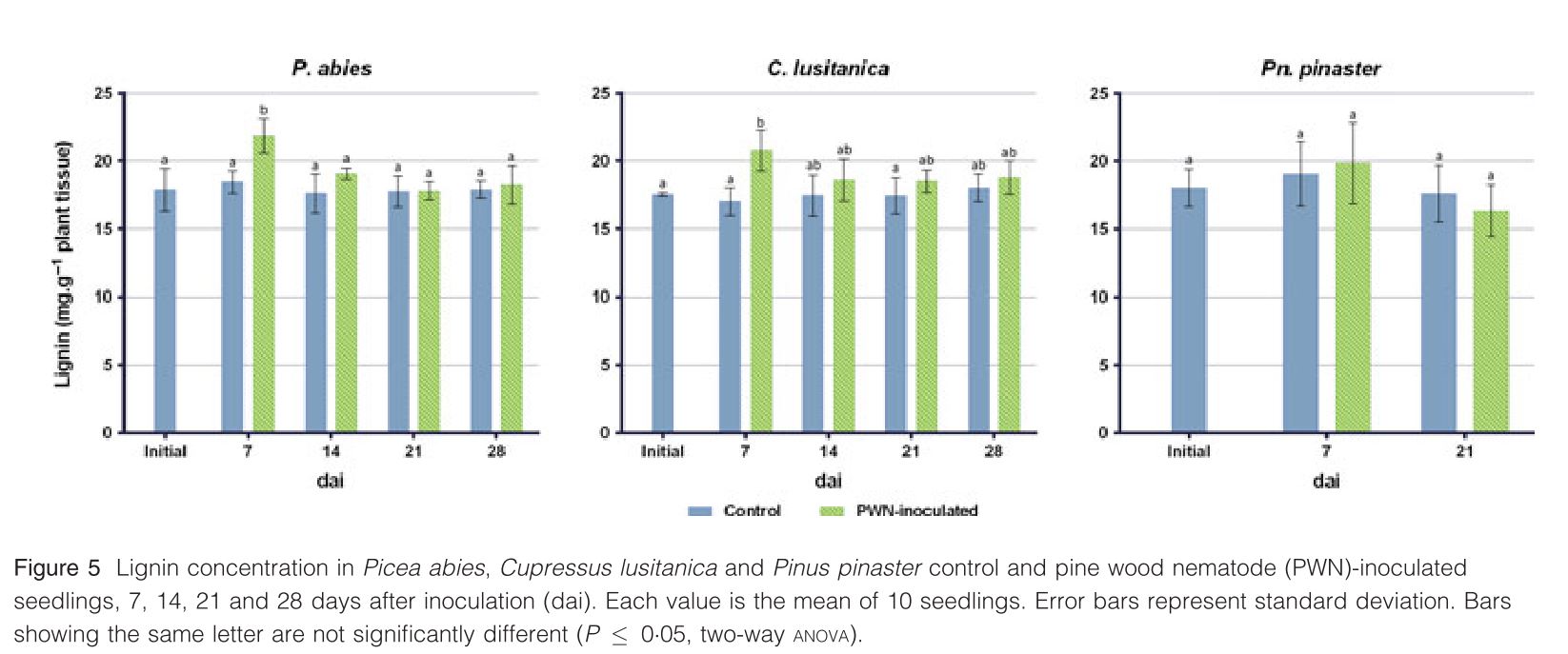
I wanted to know if there is available code/ R package that allows to add letters/asterisks to graphs denoting statistical significance (as calculated by a statistical test). See image attached showing what it would look like. Is there someone doing this using base graphics or ggplot?
Please let me know if you can help.
Thank you,
Marta

Myfanwy Johnston
Sep 21, 2016, 4:38:00 PM9/21/16
to davi...@googlegroups.com
If you're using ggplot2 and you only have a few bars to label, you could do this with geom_annotate(). See some examples here: http://docs.ggplot2.org/current/annotate.html
--
Check out our R resources at http://d-rug.github.io/
---
You received this message because you are subscribed to the Google Groups "Davis R Users' Group" group.
To unsubscribe from this group and stop receiving emails from it, send an email to davis-rug+...@googlegroups.com.
Visit this group at https://groups.google.com/group/davis-rug.
For more options, visit https://groups.google.com/d/optout.
--
Myfanwy Johnston
Ph.D Candidate, UC Davis
Animal Behavior Graduate Group
Biotelemetry Laboratory

Jaime Ashander
Sep 21, 2016, 4:47:28 PM9/21/16
to davi...@googlegroups.com
The package lsmeans can calculate tukey
groups and use compact letter display to plot them (in base graphics). You can also output the data underlying these groups as a data.frame which you can use to plot with ggplot. For doing that, annotate might work but also take a look at geom_label
On Wed, Sep 21, 2016 at 1:37 PM, Myfanwy Johnston <mrow...@gmail.com> wrote:
If you're using ggplot2 and you only have a few bars to label, you could do this with geom_annotate(). See some examples here: http://docs.ggplot2.org/current/annotate.html
On Wed, Sep 21, 2016 at 1:25 PM Marta Lima <lima.ma...@gmail.com> wrote:
--Dear Davis R Users,
I wanted to know if there is available code/ R package that allows to add letters/asterisks to graphs denoting statistical significance (as calculated by a statistical test). See image attached showing what it would look like. Is there someone doing this using base graphics or ggplot?
Please let me know if you can help.
Thank you,
Marta
Check out our R resources at http://d-rug.github.io/
---
You received this message because you are subscribed to the Google Groups "Davis R Users' Group" group.
To unsubscribe from this group and stop receiving emails from it, send an email to davis-rug+unsubscribe@googlegroups.com.
Visit this group at https://groups.google.com/group/davis-rug.
For more options, visit https://groups.google.com/d/optout.
--Myfanwy JohnstonPh.D Candidate, UC DavisAnimal Behavior Graduate GroupBiotelemetry Laboratory
--
Check out our R resources at http://d-rug.github.io/
---
You received this message because you are subscribed to the Google Groups "Davis R Users' Group" group.
To unsubscribe from this group and stop receiving emails from it, send an email to davis-rug+unsubscribe@googlegroups.com.

Daniel Fulop
Sep 21, 2016, 4:52:05 PM9/21/16
to Davis Rug
As Jamie suggests, in the past I’ve outputted the results as a data.frame, added a column for significance asterisks, and then used geom_label() to plot them.
To unsubscribe from this group and stop receiving emails from it, send an email to davis-rug+...@googlegroups.com.
Reply all
Reply to author
Forward
0 new messages