How to make plot like this
152 wyświetlenia
Przejdź do pierwszej nieodczytanej wiadomości

Zhiyuan Tian
14 sie 2015, 01:08:1614.08.2015
do Davis R Users' Group
Is anyone have idea how to make plot like this with R? From my understanding, there are three group data plotted with error bar. The dash line is a trend line. So how to make this line? And what is the green shadow standing for? Thanks so much for explanation :-)


Myfanwy Johnston
14 sie 2015, 01:29:0814.08.2015
do davi...@googlegroups.com
Hi Zhiyuan,
It's definitely possible to make a plot like this in R, but having reproducible data would really help us to help you with it - do you have a sample of the data you would like to plot? If so, can you put it into a small dataframe with some reproducible code? Even including the caption for the figure would help.
What do you mean by the green shaded area? If you're referring to the gray shaded area around the dotted line, I assume that's a 95% confidence interval or something close to it. The dotted line looks like a smoothing curve, but we'd have to know what the smoothing equation was (Loess, etc) in order to reproduce it.
Best,
Myfanwy
On Thu, Aug 13, 2015 at 10:08 PM, Zhiyuan Tian <zt...@ucdavis.edu> wrote:
Is anyone have idea how to make plot like this with R? From my understanding, there are three group data plotted with error bar. The dash line is a trend line. So how to make this line? And what is the green shadow standing for? Thanks so much for explanation :-)
--
Check out our R resources at http://www.noamross.net/davis-r-users-group.html
---
You received this message because you are subscribed to the Google Groups "Davis R Users' Group" group.
To unsubscribe from this group and stop receiving emails from it, send an email to davis-rug+...@googlegroups.com.
Visit this group at http://groups.google.com/group/davis-rug.
For more options, visit https://groups.google.com/d/optout.
Myfanwy Johnston
Ph.D Candidate, Animal Behavior
University of California at Davis
University of California at Davis
Biotelemetry Lab
Zhiyuan Tian
14 sie 2015, 02:58:2714.08.2015
do Davis R Users' Group
Hi Myfanwy,
Thank you for the reply! Yes, I attached some sample data that would like to be plotted in this way. I already made a figure in excel, and it looks like this.

I may need two smoothing curves to show different trends between soil and weathered bedrock. Not pretty sure what smoothing equation should be used in here. Could we try some (linear, expoential, or polynomial regression etc.) and find the best one to fit it?
Best,
Zhiyuan
Myfanwy Johnston
14 sie 2015, 13:08:3314.08.2015
do davi...@googlegroups.com
Hi Zhiyuan,
Here’s a quick attempt at creating the graph with the data you provided. Note: I think to get the best version of this you would actually want to write a linear model for your full dataset, then graph it as a regression plot of the linear model. There are lots of resources for doing this online - I think the best resource would probably be Chapter 4 of Richard McElreath’s Statistical Rethinking book - you can email him (rmcel...@gmail.com) to see if he’ll give you access to the pdf version of his book (he makes it available to students who have taken his class, but if you haven’t, I’m sure you could ask him permission, he's very nice).
library(readr) library(ggplot2) d <- read_csv("CarbonSampleData.csv") ## ggplot2 (raw data) way: p <- ggplot(d, aes(x = Elevation, y = Carbon)) + geom_point(aes(color = Type)) + geom_smooth() p## To group with single points, the best way I found was with this function, defined at this website: http://www.cookbook-r.com/Graphs/Plotting_means_and_error_bars_(ggplot2)/#Helper functions # first write function: summarySE <- function(data=NULL, measurevar, groupvars=NULL, na.rm=FALSE, conf.interval=.95, .drop=TRUE) { library(plyr) # New version of length which can handle NA's: if na.rm==T, don't count them length2 <- function (x, na.rm=FALSE) { if (na.rm) sum(!is.na(x)) else length(x) } # This does the summary. For each group's data frame, return a vector with # N, mean, and sd datac <- ddply(data, groupvars, .drop=.drop, .fun = function(xx, col) { c(N = length2(xx[[col]], na.rm=na.rm), mean = mean (xx[[col]], na.rm=na.rm), sd = sd (xx[[col]], na.rm=na.rm) ) }, measurevar ) # Rename the "mean" column datac <- rename(datac, c("mean" = measurevar)) datac$se <- datac$sd / sqrt(datac$N) # Calculate standard error of the mean # Confidence interval multiplier for standard error # Calculate t-statistic for confidence interval: # e.g., if conf.interval is .95, use .975 (above/below), and use df=N-1 ciMult <- qt(conf.interval/2 + .5, datac$N-1) datac$ci <- datac$se * ciMult return(datac) } ## Then use function on your data dsummary <- summarySE(d, measurevar = "Carbon", groupvars = c("Type", "Elevation")) ## Then Plot: p <- ggplot(dsummary, aes(x=Elevation, y=Carbon, colour=Type)) + geom_errorbar(aes(ymin=Carbon-se, ymax=Carbon+se), width=.1) + geom_point(size = 5) p + geom_smooth(data = d) # not sure how to combine these into a single 95% CI - you'll have to google around with ggplot2 p
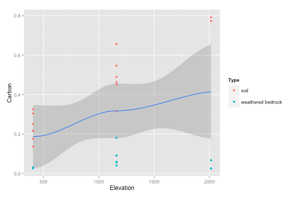
Zhiyuan Tian
14 sie 2015, 17:01:0314.08.2015
do davi...@googlegroups.com
Hi Myfanwy,
The second plot looks very close to what I want. Yes, your are right. A linear model will be better to fit these data. Thanks for the code and study resources!
Zhiyuan
You received this message because you are subscribed to a topic in the Google Groups "Davis R Users' Group" group.
To unsubscribe from this topic, visit https://groups.google.com/d/topic/davis-rug/r51HC0lALZU/unsubscribe.
To unsubscribe from this group and all its topics, send an email to davis-rug+...@googlegroups.com.
Zhiyuan Tian
14 sie 2015, 22:38:4714.08.2015
do Davis R Users' Group
Hi Myfanwy,
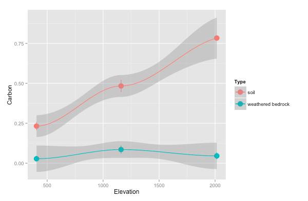
I made a plot with linear model for the carbon data, and it looks good.

However, when I plot another dataset for clay, the linear model doesn't fit very well.

I came back to loess, and it looks like this:

Do you have idea if I could make geom_smooth in linear regression for regolith, and loess regression for soil at one plot?
Here is the code I use and clay dataset. Thank you so much!
p + geom_smooth (data = d, method = "lm", level = 0.95, linetype=2 )
p + geom_smooth (data = d, method = "loess", level = 0.95, linetype=2 )
Zhiyuan
Odpowiedz wszystkim
Odpowiedz autorowi
Przekaż
Nowe wiadomości: 0