Changing legend key from symbol to color block in ggplot2
5,540 views
Skip to first unread message

Deirdre Griffin
Nov 3, 2015, 2:46:51 AM11/3/15
to Davis R Users' Group
Hi again,
2 questions...
1) Anyone know how to change legend keys for colour from the default colored circle to a colored block corresponding to the assigned color?
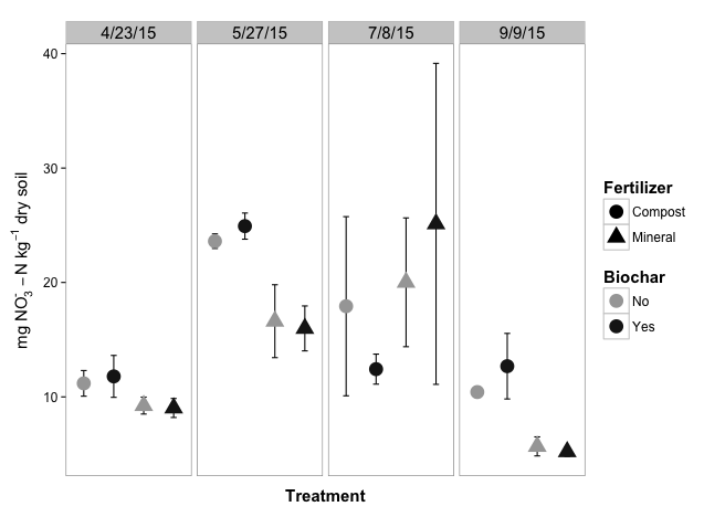
I've been trying to do this with the attached graph because having the circle could be confusing given that I have a circle and triangle designating other treatment factors. I tried a couple of things, including making the circle really huge with guides(colour = override.aes = list(size = 20) and then trying to keep the legend key box small with theme(legend.key = element.rect(size = 0.5). But alas that did not work and only caused a horrible disproportioned legend with giant circles...
And while I'm at it...
2) Does anyone know how I can make all of the shapes outlined in black but filled with the two assigned colors? I can't figure out how to do this without either making them all filled blank or changing all the points to be circles instead of having the designated shapes.
Any help would be much appreciated!
Thanks!
Deirdre
Deirdre
Here's my code:
| N2015 %>% | |
| group_by(Date, Treatment, Biochar, Fertilizer) %>% | |
| summarise(avgNO3 = mean(NO3_N, na.rm = TRUE), | |
| seNO3 = (sd(NO3_N, na.rm = TRUE)/sqrt(4))) %>% | |
| ggplot(aes(x = Treatment, y = avgNO3)) + | |
| geom_errorbar(aes(ymax = avgNO3 + seNO3, ymin = avgNO3 - seNO3, width = 0.2)) + | |
| geom_point(aes(shape = Fertilizer, colour = Biochar), size = 6) + | |
| labs(fill = "Biochar") + | |
| ylab(bquote('mg'*~NO[3]^`-`~-N~kg^-1 ~ dry ~ soil*'')) + | |
| scale_shape_discrete(labels = c("Compost", "Mineral")) + | |
| scale_colour_manual(values = c("grey65", "grey10"), labels = c("No", "Yes")) + | |
| facet_grid(~ Date) + | |
| guides(colour = guide_legend(order = 2, | |
| #override.aes = list(size = 20) | |
| ), | |
| shape = guide_legend(order = 1)) + | |
| theme_bw() + | |
| theme(axis.title.x = element_text(size = 15), | |
| axis.title.y = element_text(face = "bold", size = 15, vjust = 1), | |
| axis.text.x = element_blank(), | |
| axis.text.y = element_text(size = 12), | |
| legend.title = element_text(size = 15), | |
| legend.text = element_text(size = 12), | |
| #legend.key = element_rect(size = 0.5), | |
| panel.grid.minor = element_blank(), panel.grid.major = element_blank(), | |
| axis.ticks.x = element_blank(), | |
| strip.text.x = element_text(size = 15)) |

Michael Levy
Nov 3, 2015, 10:34:32 AM11/3/15
to davi...@googlegroups.com
Hi Deirdre,
My solutions both involve changing shape elements, the codes for which can be found here.
You got close with
aes.override… you can use it to change the shape directly.You can do this by mapping your Biochar variable to
filland then setting the color (which is the outline of points) to “black”, but you have to use a filled-point for this, such as shape 21.
Here’s a MWE:
library(ggplot2)
d = data.frame(x = rnorm(10), y = rnorm(10), z = sample(letters[1:2], 10, TRUE))
ggplot(d, aes(x, y, fill = z)) +
    geom_point(shape = 21, color = 'black', size = 5) +
    guides(fill = guide_legend(override.aes = list(shape = 22)))
--
Check out our R resources at http://www.noamross.net/davis-r-users-group.html
---
You received this message because you are subscribed to the Google Groups "Davis R Users' Group" group.
To unsubscribe from this group and stop receiving emails from it, send an email to davis-rug+...@googlegroups.com.
Visit this group at http://groups.google.com/group/davis-rug.
For more options, visit https://groups.google.com/d/optout.
Deirdre Griffin
Nov 3, 2015, 12:36:05 PM11/3/15
to Davis R Users' Group
Thanks, Michael.
Figured out the legend thing. Thanks!
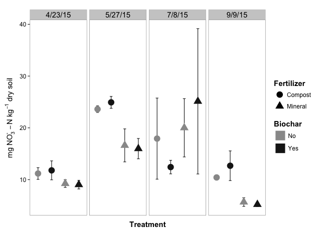
Still having a bit of trouble on the black outline. Managed to the shapes to two filled-point shapes, but for some reason, whenever I map Biochar to fill instead of color, the legend for this is filled black, even though I have scale_fill_manual(values = c("grey70", "grey10")) in there.
Please see two versions attached and code below. Any ideas how to fix this?
Thanks!
Deirdre
| N2015 %>% | |
| group_by(Date, Treatment, Biochar, Fertilizer) %>% | |
| summarise(avgNO3 = mean(NO3_N, na.rm = TRUE), |
| seNO3 = (sd(NO3_N, na.rm = TRUE) /sqrt(4))) %>% | |
| ggplot(aes(x = Treatment, y = avgNO3, fill= Biochar)) + |
| geom_errorbar(aes(ymax = avgNO3 + seNO3, ymin = avgNO3 - seNO3, width = 0.2)) + |
| geom_point(aes(shape = Fertilizer), size = 6) + |
| labs(fill = "Biochar") + | |
| ylab(bquote('mg'*~NO[3]^`-`~-N~kg^-1 ~ dry ~ soil*'')) + | |
| scale_shape_discrete(labels = c("Compost", "Mineral")) + |
| scale_shape_manual(values = c(21, 24)) + | |
| scale_fill_manual(values = c("grey70", "grey10"), labels = c("No", "Yes")) + | |
| facet_grid(~ Date) + | |
| guides(fill = guide_legend(order = 2, | |
| override.aes = list(shape = 15, size = 9)), |
| shape = guide_legend(order = 1)) + | |
| theme_bw() + | |
| theme(axis.title.x = element_text(size = 15), | |
| axis.title.y = element_text(face = "bold", size = 15, vjust = 1), | |
| axis.text.x = element_blank(), | |
| axis.text.y = element_text(size = 12), | |
| legend.title = element_text(size = 15), | |
| legend.text = element_text(size = 12), |
| legend.key = element_rect(color = "white"), |
| panel.grid.minor = element_blank(), panel.grid.major = element_blank(), | |
| axis.ticks.x = element_blank(), | |
| strip.text.x = element_text(size = 15)) |
Michael Levy
Nov 3, 2015, 5:27:55 PM11/3/15
to davi...@googlegroups.com
In that shape-guide I linked to, it looks like point-shapes 15-20 have a fill, but they don’t — they’re always solid black. So change the 15 in this line to a number between 21 and 25 and you should be good:
guides(fill = guide_legend(order = 2, override.aes = list(shape = 15, size = 9)), shape = guide_legend(order = 1))
--
Michael Levy
c: 304-376-4523
Reply all
Reply to author
Forward
0 new messages