Violin plot + latitude
23 views
Skip to first unread message

mmpr...@ucdavis.edu
Sep 12, 2016, 7:46:55 PM9/12/16
to Davis R Users' Group
Hi! I want to make a plot similar to the violin plot below, but instead of each violin shape a distribution of biomass I'd like to plot the distribution of biomass across latitude for each year. In the new plot the x-axis would remain 'year', the y-axis would instead be 'latitude', and the width of the violin would be abundance of biomass (at a certain latitude within each year).

I used ggplot to create this plot:
ggplot(data, aes(factor(YEAR), BIOMASS)) + geom_violin()
Any advice, suggestions are welcome. Thank you!
Best,
Mikaela

Brandon Hurr
Sep 12, 2016, 10:44:21 PM9/12/16
to Davis R Users' Group
Has anyone replied to you already? You really need to supply a dataset for us to understand what you want. Could you make one up or supply a dput() of your existing dataset?
B
B
--
Check out our R resources at http://d-rug.github.io/
---
You received this message because you are subscribed to the Google Groups "Davis R Users' Group" group.
To unsubscribe from this group and stop receiving emails from it, send an email to davis-rug+...@googlegroups.com.
Visit this group at https://groups.google.com/group/davis-rug.
For more options, visit https://groups.google.com/d/optout.
mmpr...@ucdavis.edu
Sep 13, 2016, 5:17:27 PM9/13/16
to Davis R Users' Group
This is my first post in the group so apologies for not providing a data set right away. Attached is a sample of my data. And here is the code I used to look at year vs biomass. Thanks again.
# get data
data.subset <- read.csv("~/fish_shift/scale/plots_in_progress/data.subset.csv")
# create a violin plot (year vs biomass)
gom1 <- ggplot(data.subset, aes(factor(YEAR), BIOMASS)) + geom_violin() +
xlab("year") + ylab("biomass") + theme(axis.text.x = element_text(angle = 90, hjust = 1))

Jaime Ashander
Sep 13, 2016, 5:41:32 PM9/13/16
to davi...@googlegroups.com
Hi Mikaela,
Welcome to the list. No worries! It's just often easier if folks have data / working code to play around with for an answer. Thanks for providing it.
Welcome to the list. No worries! It's just often easier if folks have data / working code to play around with for an answer. Thanks for providing it.
On your question, I'm unsure how to make geom_violin quantify position on the y-axis (LAT) while quantifying density on a third axis (BIOMASS). I'm curious to see if there's a way.
In the meantime, an alternative strategy to show the information is a 2d bin. Here's one possibility:
ggplot(data.subset, aes(factor(YEAR), y=LAT, z=BIOMASS)) + stat_summary_2d(fun = "sum")
(but note this has the downside of color information being scaled from the maximum to minimum sum of BIOMASS in a bin).
- Jaime
--
Check out our R resources at http://d-rug.github.io/
---
You received this message because you are subscribed to the Google Groups "Davis R Users' Group" group.
To unsubscribe from this group and stop receiving emails from it, send an email to davis-rug+unsubscribe@googlegroups.com.
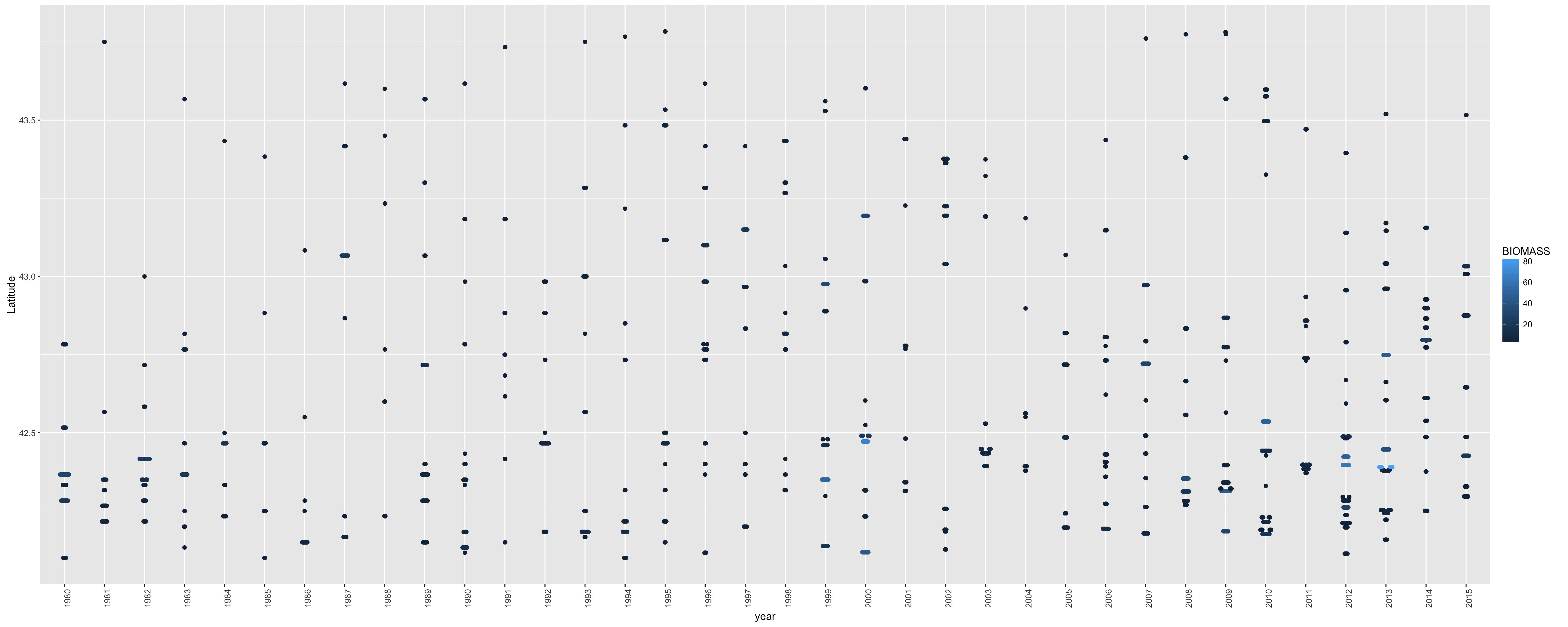
Brandon Hurr
Sep 13, 2016, 5:46:02 PM9/13/16
to davi...@googlegroups.com
Tough one...
Best I can come up with is a beeswarm plot (which this is the first time I've made one so YMMV).
require(ggbeeswarm) # install.packages("ggbeeswarm")
ggplot(data.subset, aes(x=factor(YEAR), y=LAT, colour=BIOMASS)) + geom_beeswarm() +
xlab("year") + ylab("Latitude") + theme(axis.text.x = element_text(angle = 90, hjust = 1))
HTH,
B
On Tue, Sep 13, 2016 at 2:17 PM, <mmpr...@ucdavis.edu> wrote:
--

Matt Espe
Sep 15, 2016, 12:22:16 PM9/15/16
to Davis R Users' Group
This might be a good place to look at base graphics. Although it can be cumbersome at times, it is much more flexible than ggplot, and the painters model means you can "draw" repeatedly to the same plot to create unique overlays. ggplot2 is great for making quick plots of the pre-coded styles, but a nightmare if you are trying to do something a bit unorthodox.
The plot you are trying to replicate is not displaying for me (and I cannot imagine the beeswarm plot is the goal). If you try to re-attach the image, I can take a stab at it in base graphics.
Matt
Reply all
Reply to author
Forward
0 new messages