Relative color scale in ggplot
79 views
Skip to first unread message

Michael
Jul 2, 2014, 2:26:41 PM7/2/14
to davi...@googlegroups.com
Hi all,
That produces the following.
I have a ggplot where colors scale by default to the global min and max of a variable. I'd like to scale the color to the max response within a particular x value. An example may be clearer:
set.seed(1)df <- data.frame(x=c(rep("a", 10), rep("b", 10)),                 y=c(sample(1:4, 10, replace=T), sample(1:6, 10, replace=T)))
ggplot(data=df, aes(x=x, y=y)) +   stat_sum(aes(group=x, color=y)) +  scale_size_area(max_size=15) +  scale_color_gradient(low="red", high="green")
That produces the following.

What I'd like is for the point at (a, 4) to be the same color as the one at (b, 6). There's probably a simple solution, but I'm stuck. Thanks in advance,
Michael

Noam Ross
Jul 2, 2014, 2:47:18 PM7/2/14
to Davis R Users Group
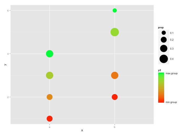
You can normalize the y values within the x groups and use these to assign colors. The numbers in the legend become meaningless, though, and you’ll want to modify or get rid of it:
require(ggplot2)
require(plyr)
set.seed(1)
df <- data.frame(x=c(rep("a", 10), rep("b", 10)),
                 y=c(sample(1:4, 10, replace=T), sample(1:6, 10, replace=T)))
df <- ddply(df, .(x), transform, y2=(y-min(y))/(max(y)-min(y)))  # <--- Normalized y values are "y2"
ggplot(data=df, aes(x=x, y=y)) +
  stat_sum(aes(group=x, color=y2)) +        # <---  Assign color to "y2"
  scale_size_area(max_size=15) +
  scale_color_gradient(low="red", high="green", breaks=c(0,1),  # <--- Modify the scale labels
                       label=c("min.group", "max.group"))
You get:
--
Check out our R resources at http://www.noamross.net/davis-r-users-group.html
---
You received this message because you are subscribed to the Google Groups "Davis R Users' Group" group.
To unsubscribe from this group and stop receiving emails from it, send an email to davis-rug+...@googlegroups.com.
Visit this group at http://groups.google.com/group/davis-rug.
For more options, visit https://groups.google.com/d/optout.
Michael Levy
Jul 2, 2014, 4:17:15 PM7/2/14
to davi...@googlegroups.com
Reply all
Reply to author
Forward
0 new messages